11 Yellow Kitchen Design Ideas
Yellow kitchens have this incredible ability to transform what’s often the busiest, most functional room in your home into a space that genuinely makes you smile every time you walk in. Whether you’re drawn to soft buttery tones that feel warm and welcoming, vibrant sunny shades that energize your mornings, or deep mustard hues that add unexpected sophistication, yellow brings an optimism and cheerfulness that few other colors can match. From bold yellow cabinets that make a statement to subtle yellow accents that add just a touch of brightness, there are so many ways to incorporate this happy color into your kitchen without it feeling overwhelming or childish. The key is finding the right shade and balance for your space—yellow can be modern or vintage, bold or subtle, playful or elegant depending on how you use it.
I’ll be honest, I was terrified of yellow in my kitchen at first because I’d seen so many examples that felt too intense or dated, like someone had gone overboard with sunshine and couldn’t pull back. But then I visited a friend’s kitchen with these gorgeous pale yellow walls that caught the morning light so beautifully, and I realized yellow doesn’t have to scream for attention—it can whisper and still completely transform a space. That visit sent me down a rabbit hole of researching yellow kitchens, and I discovered there’s this whole spectrum from barely-there creams to bold marigolds, each creating a completely different mood and energy.
What surprised me most about working with yellow in the kitchen is how it affects the whole atmosphere of cooking and gathering. Warm yellows make the space feel cozy and inviting even on grey days, while brighter yellows genuinely do boost your mood and energy in the mornings. I’ve also learned that yellow plays beautifully with so many other colors and materials—it makes white look crisper, wood tones richer, and even works with metallics like brass and copper in ways that feel both classic and fresh. The kitchens that do yellow really well understand that it’s about creating balance and intention, using the color strategically rather than just painting everything yellow and hoping for the best.
1. Sunny Yellow Shaker Cabinets with White Countertops
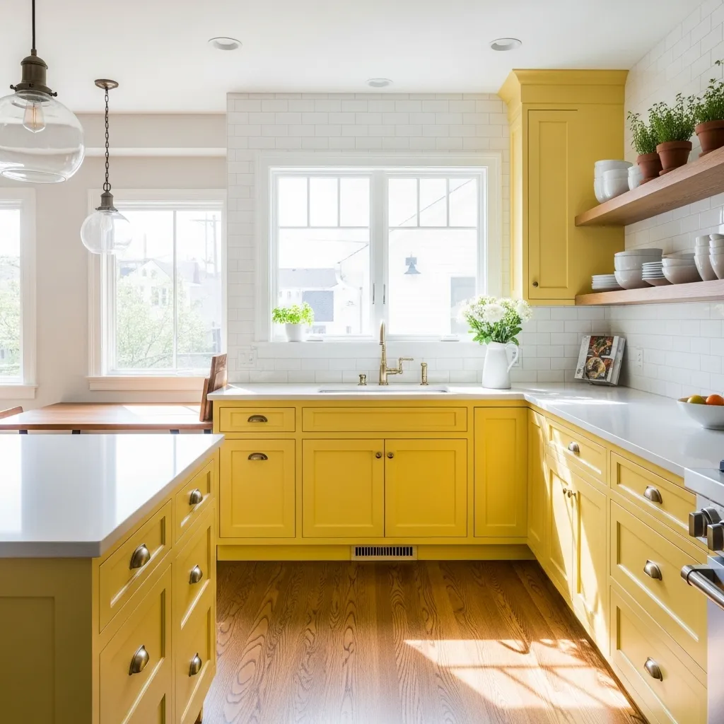
Painting my kitchen cabinets this sunny yellow was the boldest design decision I’ve ever made, and I still get a little rush of happiness every morning when I walk in for coffee. I agonized over the exact shade for weeks, testing at least fifteen different yellows on sample boards before landing on this one—it’s bright enough to feel energizing but not so intense that it’s overwhelming. The Shaker style keeps it feeling classic and timeless rather than trendy, which was important since this is a pretty committed color choice.
The white countertops and backsplash were essential for giving the eyes a place to rest and preventing the yellow from feeling claustrophobic. I initially considered yellow countertops too, but I’m so glad I went with white because it creates this fresh, clean contrast that makes the space feel bigger and brighter. The brass hardware adds warmth without competing with the yellow, and I love how it picks up the golden undertones. People always ask if I get tired of the bold color, but honestly, it still makes me smile three years later, and on gloomy winter days, this kitchen feels like sunshine even when there isn’t any outside.
2. Mustard Yellow Accent Wall with Grey Cabinets
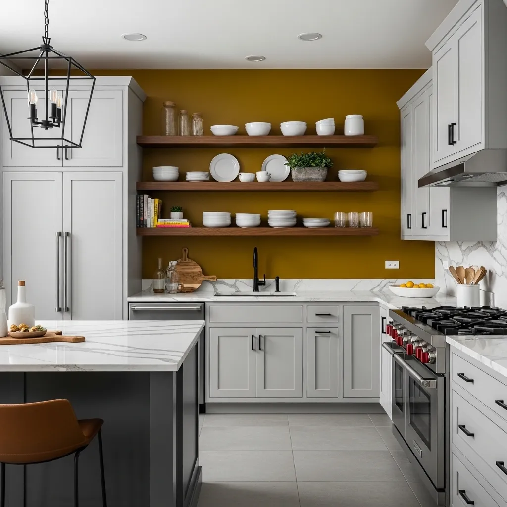
I wanted color in my kitchen but couldn’t commit to yellow cabinets, so the mustard accent wall became the perfect compromise—all the personality with way less permanence since I can always repaint one wall. The deep mustard shade is sophisticated and grounded rather than bright and cheerful, which works better with my modern aesthetic than a sunny yellow would. Against the soft grey cabinets, the mustard creates this beautiful depth and warmth that prevents the kitchen from feeling too cool or sterile.
The open shelving on the mustard wall was strategic because it breaks up the color and adds dimension—a solid wall of mustard would be too much, but having the wood shelves and white dishes interrupt it makes it feel intentional and curated. I painted the wall myself over a weekend, and it instantly transformed the kitchen from bland to bold without requiring any major renovation or expense. The grey and mustard combination feels very current but also timeless in a way that more trendy color pairings don’t. I’ve gotten so many compliments on this wall, and several friends have copied the idea in their own homes using different accent colors.
3. Pale Butter Yellow Walls with White Farmhouse Cabinets
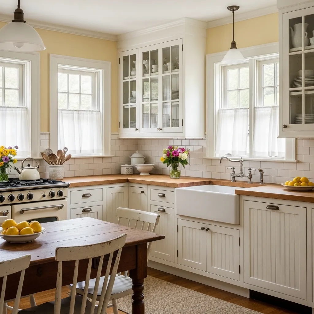
My pale yellow walls happened almost by accident—I was painting the kitchen white and added just a touch of yellow to the mix to warm it up, and the result was this incredibly soft, buttery tone that feels like perpetual morning light. It’s so subtle that in some lighting it almost reads as cream, but when the sun hits it, you get these beautiful warm undertones that make the whole space glow. The farmhouse aesthetic works perfectly with this gentle yellow because it reinforces that cozy, lived-in cottage feeling.
The white cabinets stay crisp and fresh against the yellow walls, and the combination never feels dated or overly sweet because the tones are so soft and natural. I’ve had this color scheme for seven years now, which in design terms is basically forever, and I still love it as much as day one. The butcher block counters bring in wood tones that bridge the yellow walls and white cabinets beautifully. This is the kitchen where I want to bake bread and make soup—it has that nurturing, homey energy that bolder yellows wouldn’t create. Friends always comment on how relaxed and comfortable they feel in here, which I think speaks to the power of getting the yellow tone exactly right.
4. Bold Yellow Kitchen Island with Navy Perimeter Cabinets
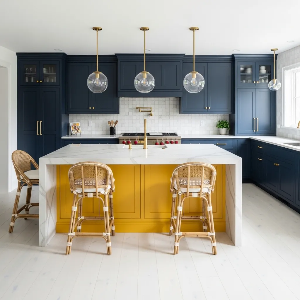
Choosing to make just my island yellow while keeping the perimeter cabinets navy was a calculated risk that absolutely paid off—it creates this focal point that draws you into the kitchen and makes the space memorable without overwhelming the whole room with bright color. The marigold yellow is bold and saturated, way more intense than I’d have dared to use on all the cabinets, but as an island it feels exciting rather than excessive. The white marble countertop on the island provides crucial visual relief and keeps the yellow from feeling too heavy or solid.
The navy and yellow combination is classic but feels fresh and modern when done in these rich, saturated tones rather than pale pastels. The brass hardware ties the two cabinet colors together and adds warmth that complements both the navy and yellow. I debated this color scheme for months before committing, but now I can’t imagine the kitchen any other way—the island is like the sun in the center of the space, and everything orbits around it. When we entertain, people naturally gather around the yellow island, and I genuinely think the cheerful color contributes to that magnetic quality. It’s proof that you can have bold color in a kitchen without committing to it on every surface.
5. Vintage Yellow Appliances with White Retro Kitchen
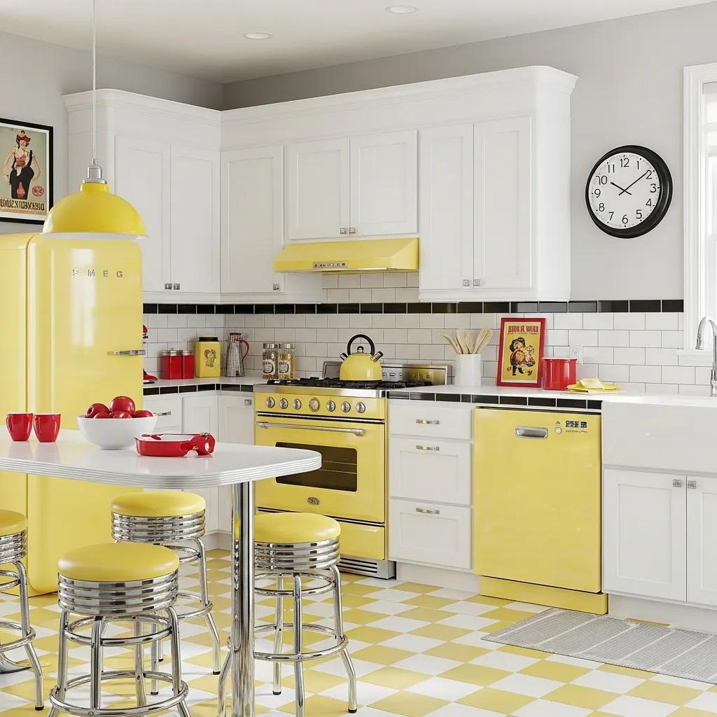
My obsession with vintage yellow appliances started after I toured a restored 1950s home and fell completely in love with the cheerful, optimistic aesthetic of that era. Finding modern appliances in vintage styles and colors has gotten so much easier with brands like SMEG making retro-inspired pieces that look period-perfect but have current functionality. The soft lemon yellow of the appliances feels authentically vintage without being garish, and they’ve become conversation pieces that guests always comment on.
The white cabinetry keeps the focus on the yellow appliances and prevents the kitchen from feeling too themed or costume-y. The checkerboard floor was a splurge but absolutely makes the vintage vision complete—every time I look at it, I smile at how committed we went to the retro aesthetic. The chrome details throughout add that authentic diner feel and catch the light beautifully. This kitchen is unabashedly fun and doesn’t take itself too seriously, which is exactly the energy I wanted. Cooking in here feels like stepping back in time but with the convenience of modern appliances, and there’s something really joyful about that combination.
6. Pale Yellow Zellige Tile Backsplash with Wood Cabinets
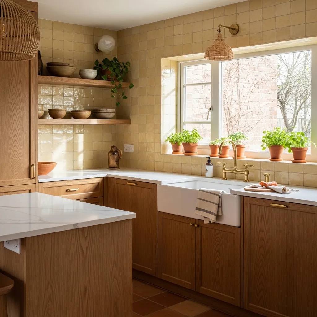
I discovered zellige tile while researching ways to add yellow to my kitchen without painting cabinets, and I fell in love with how the handmade quality creates this beautiful, organic variation that you can’t get with standard ceramic tiles. Each tile is slightly different in tone—some pieces read almost cream, others are more definitively yellow—and the irregular surface catches light in this magical way that makes the backsplash feel alive. Against my natural oak cabinets, the pale yellow creates warmth without competing with the wood grain.
The installation was more expensive than regular tile because zellige requires skilled installers who understand how to work with the irregular shapes and thicknesses, but it was absolutely worth it for the unique character it brings to the kitchen. The subtle yellow is sophisticated and understated—it reads as a warm neutral most of the time but reveals its color when light hits it directly. The combination of natural wood, pale yellow tile, and brass fixtures creates this cohesive earthy palette that feels current but won’t date quickly. I’ve learned that the best use of yellow isn’t always the boldest—sometimes subtle and textured is more interesting than flat and bright.
7. Bright Yellow Backsplash with Concrete Countertops
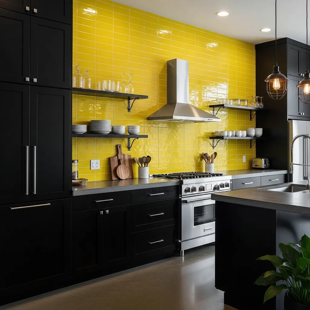
I wanted an industrial-modern kitchen but worried it would feel too cold and masculine, so the bright yellow backsplash became my solution for injecting energy and warmth into the black and concrete palette. The glossy finish on the tiles is crucial because it reflects light and prevents the yellow from being absorbed by all the dark surfaces around it—matte yellow would have disappeared against the black cabinets. The full-height installation makes a bold statement and creates this glowing focal wall that completely transforms the space.
The yellow and black combination is high-contrast and definitely not for everyone, but I love how graphic and intentional it feels. The concrete countertops add texture and an organic element that keeps the space from feeling too slick or sterile. At night with just the pendant lights on, the yellow backsplash creates this warm glow that makes the industrial materials feel less harsh. This kitchen proves that yellow can work in modern, edgy spaces—it doesn’t have to be farmhouse or vintage. The brightness is energizing in the mornings, and I’ve found the bold color makes me more intentional about keeping the counters clear and the space organized because any clutter is really visible against such a dramatic backdrop.
8. Soft Yellow Painted Brick with Open Shelving
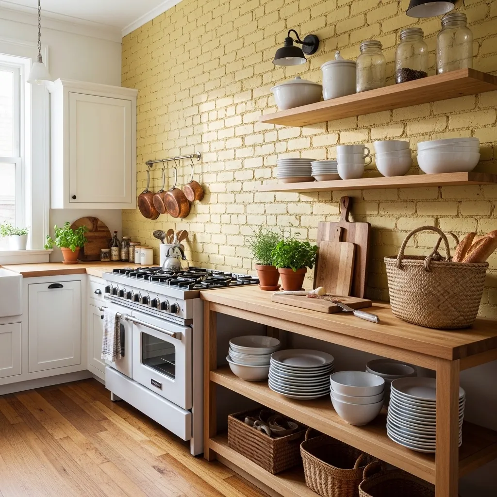
Painting our exposed brick wall yellow was one of those ideas that sounded potentially terrible but turned out beautifully—the key was using a translucent lime wash paint that lets the brick texture show through rather than a solid opaque paint that would have looked flat and artificial. The soft yellow tone warms up the whole kitchen and makes the brick feel intentional and decorative rather than just structural. The texture creates visual interest that a flat painted wall could never achieve.
The open shelving works perfectly against the brick because it continues the casual, unfussy aesthetic—everything is visible and accessible, which forces me to keep things organized but also lets me display pretty dishes and vintage finds. The combination of yellow brick, natural wood, and white dishes creates this earthy, organic palette that feels collected over time rather than designed all at once. I was worried the painted brick might feel too rustic or country, but paired with modern elements like the clean-lined cabinets and contemporary lighting, it feels fresh and eclectic. The yellow brick has become the soul of this kitchen—it adds character and warmth that new construction could never replicate.
9. Lemon Yellow Bar Stools with White Minimalist Kitchen
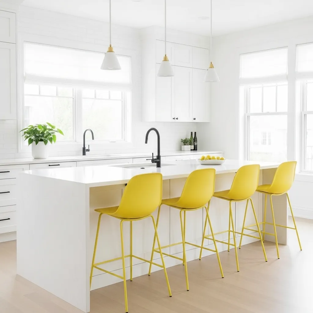
My all-white kitchen was intentional—I wanted that clean, minimalist Scandinavian aesthetic—but it definitely needed something to keep it from feeling sterile or cold. The lemon yellow bar stools were the perfect solution because they add personality and warmth without permanent commitment, and if I ever get tired of yellow, I can swap them out for a different color in an afternoon. The vibrant yellow creates these perfect punctuation marks of color that draw your eye and create visual interest in an otherwise neutral space.
The molded plastic design is a classic mid-century shape that feels timeless rather than trendy, which was important since these stools are pretty visible and I didn’t want them to date the kitchen. The yellow makes morning coffee at the island feel more cheerful and energizing, and when we have people over, everyone gravitates to those stools. I love how such a simple addition—four colorful chairs—can completely change the feeling of a room. The white kitchen provides a calm, clean backdrop for cooking and daily life, while the yellow adds just enough personality to keep it from feeling like a showroom. It’s the perfect balance of serene and cheerful.
10. Honey Gold Brass Fixtures with Cream Cabinets
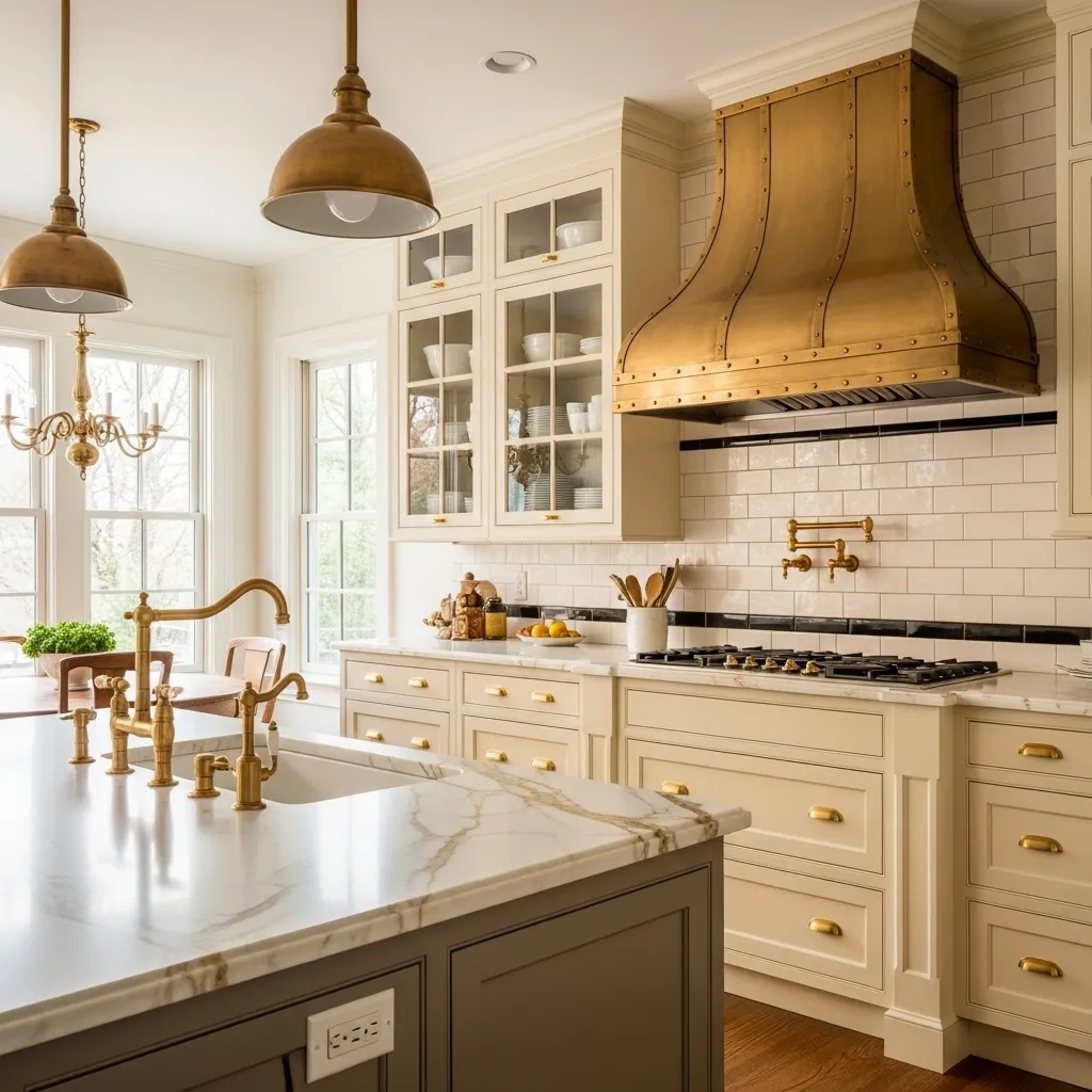
I initially planned for simple chrome fixtures in my cream kitchen, but then I discovered unlacquered brass and fell completely in love with how the warm honey gold tones interact with the creamy yellow of the cabinets. The brass develops a natural patina over time, which means it changes and ages with character rather than looking permanently polished and perfect. The living finish feels authentic and adds this layer of history and warmth that chrome never could.
Using brass on everything—from the tiny cabinet knobs to the dramatic range hood—creates this cohesive, intentional look that elevates the whole kitchen. The cream cabinets have just enough yellow undertone to pick up the warmth of the brass without feeling matchy-matchy or too coordinated. The combination feels both traditional and current, like something you’d find in a European home that’s been in a family for generations. The brass does require different maintenance than chrome—you can’t use harsh cleaners, and you have to embrace the patina—but I love how it develops over time. The warmth of brass and cream together creates this enveloping, cozy feeling that makes the kitchen feel like the heart of the home in a way that cooler finishes wouldn’t achieve.
11. Sunny Yellow Open Shelving with Sage Green Cabinets
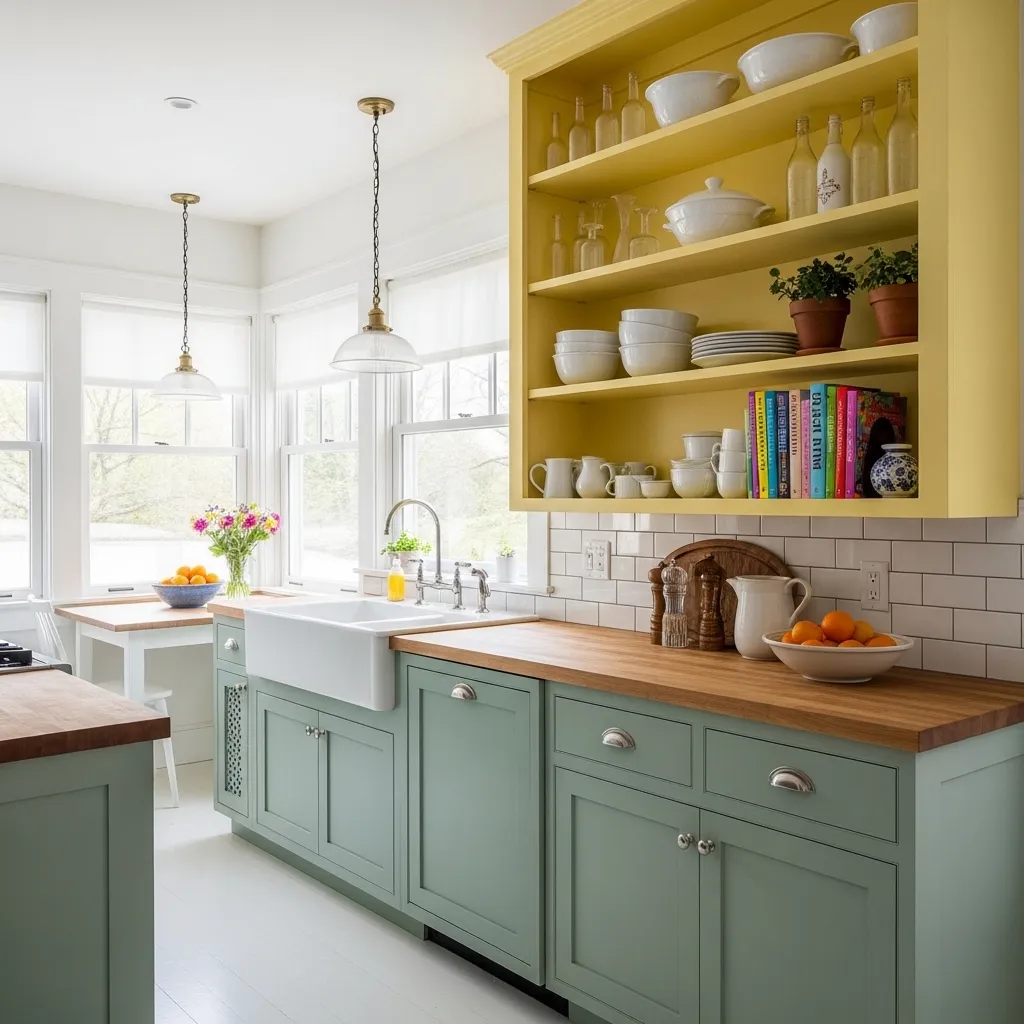
Combining sage green and sunny yellow in my kitchen was risky because those colors could easily feel Easter-themed or too pastel, but the key was getting the tones exactly right—the sage is muted and greyish, while the yellow is bright and saturated, creating enough contrast to feel intentional. The open shelving being yellow instead of the cabinets means the bright color is balanced with open space and displayed objects rather than being a solid mass. Against the more subdued green cabinets, the yellow shelves feel like rays of sunshine.
The color combination reminds me of gardens and spring mornings, which fits perfectly with the cottage aesthetic I was going for. I painted the shelves myself after agonizing over at least twenty shades of yellow—too pale and it would disappear, too orange and it would clash with the green, too bright and it would overwhelm. The white dishes on the yellow shelves create this crisp, fresh look, and I can easily change the vibe by swapping in colored dishes if I want. The open shelving forces me to keep things organized and pretty, which I’ve actually grown to appreciate—it’s made me more mindful about what I keep and how I display it. This kitchen proves that yellow doesn’t have to be the dominant color to make an impact; sometimes using it strategically in smaller doses creates more interest than painting everything yellow.