15 Grey Two-Color Combinations for the Living Room That Create Warmth, Sophistication, and Rooms You Actually Want to Live In
If you’ve been looking at grey as your living room foundation color and trying to decide what second color to pair with it — or if you’ve already committed to grey walls or grey furniture and are now trying to understand what direction to take the rest of the room — this guide covers every significant two-color combination that works with grey in a living room context, explains why each combination works at the level of color theory and atmospheric effect, and gives you enough specific detail about each pairing to make a genuinely informed decision rather than a tentative one. The fifteen combinations here span the complete tonal and atmospheric range available in grey two-color living room design: from the most classic and most universally successful pairings through the more unexpected and more dramatically specific ones, from combinations that create serene and restful rooms through combinations that create vibrant and energetic ones, from pairings that work in grey’s cooler tones through pairings that specifically require grey’s warmer versions.
Grey is the most complex and most versatile of all living room neutral colors precisely because it is not a single color but an entire family of colors that spans an extraordinary range of undertones — the cool blue-grey of slate, the warm taupe-grey of greige, the warm brown-grey of putty, the warm green-grey of sage, the warm purple-grey of mole, the cool charcoal, the warm mid-grey that’s closest to what most people mean when they say grey without qualification. Each of these different greys responds differently to the same second color, and understanding the undertone of your specific grey is the prerequisite for understanding which second colors will create harmony and which will create tension or discord.
What makes grey such a rich foundation for a two-color living room is its inherent quality of sophistication — grey reads as considered and deliberate in a way that beige and cream don’t quite achieve, because grey has a slight edge of architectural seriousness that the warmer neutrals lack. At the same time, grey is sufficiently neutral to allow a second color to be the room’s expressive character statement rather than competing with the foundation neutral for that role. The combination of grey’s sophistication and grey’s deference to a well-chosen second color creates two-color living rooms of extraordinary range — grey and mustard is a completely different room from grey and blush, which is a completely different room from grey and forest green, though all three are equally resolved and equally beautiful in their specific ways.
1. Grey and Warm White — The Foundation Combination
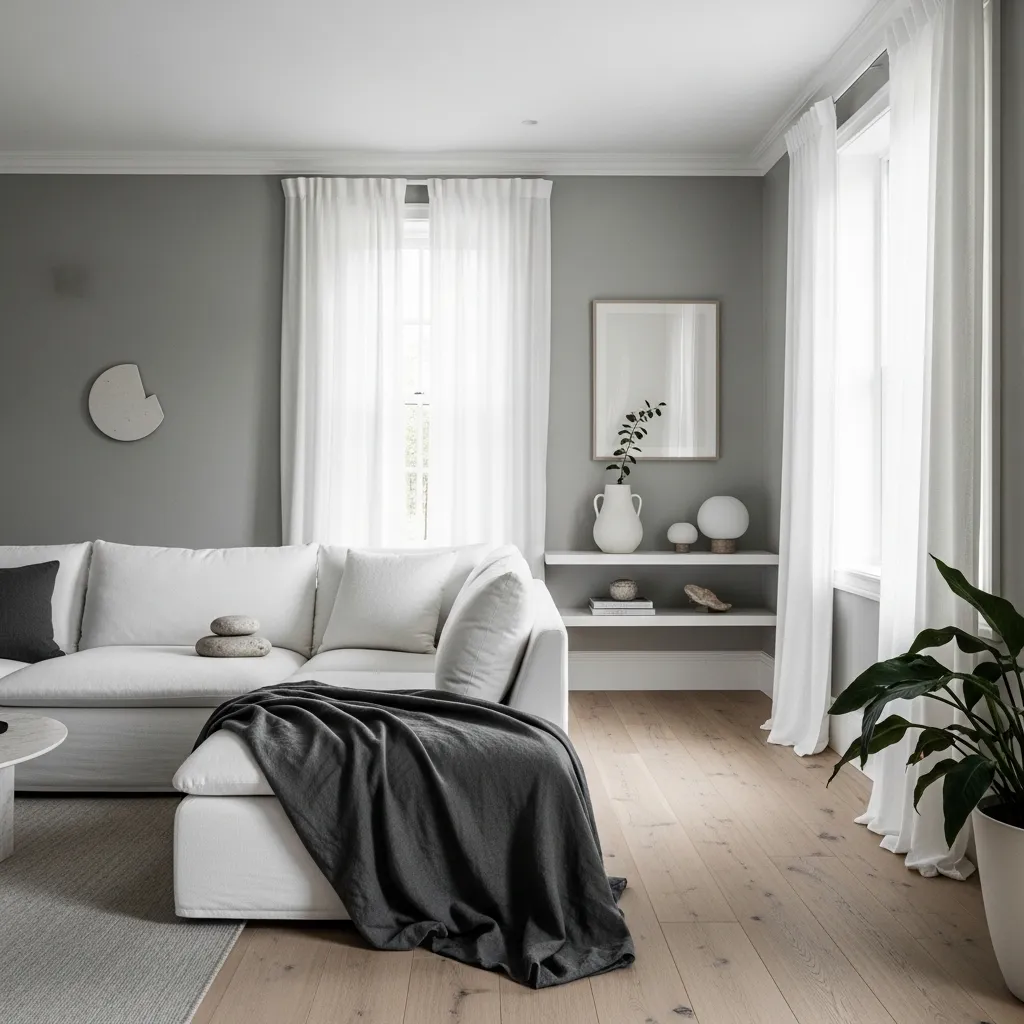
Grey and warm white is the two-color living room combination that creates the most serene and most universally successful result — not because it’s the most exciting or the most specifically atmospheric combination available, but because the relationship between grey and warm white is one of the most naturally resolved color relationships in interior design, creating rooms that feel simultaneously sophisticated and calm, contemporary and timeless, visually interesting and visually restful. The grey provides the sophistication and the visual weight; the warm white provides the lightness and the breathing room; and together they create a room where neither color dominates oppressively and neither disappears into meaninglessness.
The specific quality of the warm white is the detail that most determines whether this combination feels beautiful or merely safe — bright cool white against grey creates a slightly hard, slightly clinical contrast that works in contemporary architecture but lacks the warmth that makes a living room specifically inviting; warm white with a slight cream undertone against grey creates a contrast that’s simultaneously clear and warm, where the distinction between the two colors is obvious but where both colors are pulling toward warmth rather than coolness. This warmth direction is what most distinguishes a grey and warm white living room of genuine beauty from one that merely avoids being wrong.
2. Grey and Mustard Yellow — The Most Energizing Classic
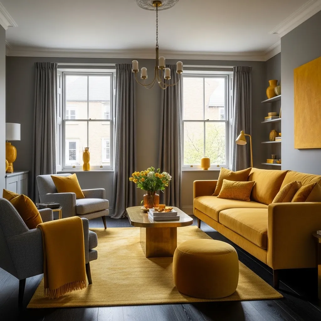
Grey and mustard yellow is the two-color living room combination with the most consistently positive emotional effect — mustard’s warm, saturated yellow creates energy and optimism and the specific quality of warmth associated with sunlight and golden fields, while the grey provides the sophisticated foundation that allows the mustard to read as a deliberate design choice rather than an accidental brightness. The combination consistently creates rooms that people describe as happy — not cheerful in the pastel sense but warm and energized in a way that creates the specific quality of a room you feel better in than you did when you entered.
The specific mustard tone that works best with grey is the one closest to dried mustard seed color — warm, slightly muted, with enough brown in its yellow to prevent it from reading as bright or acidic. A mustard that’s too bright or too acidic against grey creates a slightly unsettling contrast; a mustard that’s warm and slightly muted against grey creates the specific warmth that makes this combination so consistently successful. The warmth direction of the grey also matters — warm grey with warm mustard creates a room of harmonious warmth, while cool grey with mustard creates a slightly more tense relationship that some designers prefer for its higher energy but that requires more careful management.
3. Grey and Blush Pink — Sophisticated Femininity
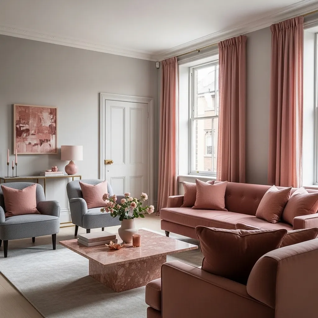
Grey and blush pink creates the living room combination of the most sophisticated femininity — using a pink that’s deep enough and dusty enough to read as genuinely refined rather than conventionally decorative, paired with a grey that’s warm enough to provide a gentle rather than stark backdrop. This combination has a specific quality of grown-up prettiness — a room that’s clearly and deliberately beautiful rather than accidentally pretty — that the most successful grey and blush living rooms consistently achieve.
The dusty quality of the blush is what most determines whether this combination reads as sophisticated or sweet — a pale, bright pink against grey reads as a bedroom color accidentally applied to a living room; a deep, dusty blush against warm grey reads as a considered color story of genuine sophistication. The dusty blush should have enough grey in it to connect to the wall tone, enough depth to read as genuinely rich in velvet or linen, and enough warmth to prevent the combination from feeling cold. Farrow and Ball’s Peignoir or Setting Plaster, or any equivalent dusty rose-pink with significant grey in its composition, creates the specific blush tone that works most beautifully with grey.
4. Grey and Navy Blue — The Most Classic Sophisticated Pairing
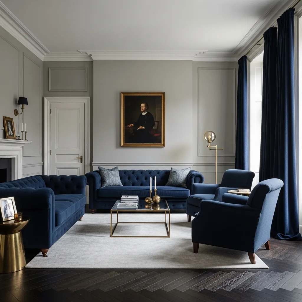
Grey and navy blue is the two-color living room combination with the most classical design pedigree — the pairing of grey and navy has been a cornerstone of British and American decorating tradition for over a century, appearing in the most respected interior design work of every period because it creates the specific combination of sophistication, authority, and warmth that the most considered living rooms consistently require. Grey provides the subtle, receding background; navy provides the depth, weight, and color authority that makes the room feel genuinely designed rather than merely assembled.
The specific quality of navy that works best with grey is a navy with enough warmth to prevent it from reading as cold or corporate — a navy with a slight purple warmth or a slight green depth has the richness and visual weight required without the coldness that a pure, bright navy can create. The warm brass accessories are the specific addition that most prevents the grey and navy combination from reading as too serious or too cold — the warm amber of brass against the grey and navy creates the warmth and luxury that the darker palette’s sophistication needs.
5. Grey and Forest Green — The Natural Contemporary Combination
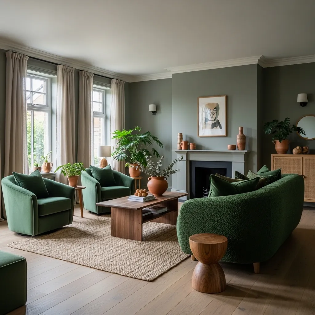
Grey and forest green is the two-color living room combination that most directly references the natural world — grey is the color of stone, of bark, of overcast sky; forest green is the color of leaves, of moss, of the specific deep green of a shaded woodland. Together they create a living room that feels connected to the outdoor natural world in a way that no other grey two-color combination quite achieves, with a quality of organic warmth and natural calm that’s specifically restful and specifically contemporary in the 2026 design moment.
The boucle fabric on the forest green sofa is the specific material that makes this combination read most beautifully in 2026 — boucle’s loopy, textural quality adds warmth and tactile richness to the forest green that a smooth velvet or flat fabric doesn’t provide, creating a sofa that reads as simultaneously organic and luxurious. The natural materials throughout — the walnut, the jute, the linen, the terracotta — reinforce the organic quality of the color combination by providing a material foundation that connects to the same natural world that the grey and forest green palette references.
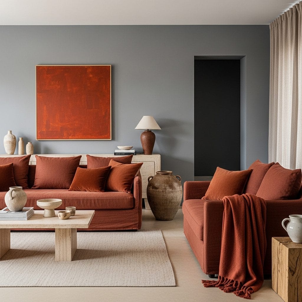
6. Grey and Terracotta — Earthy Warmth
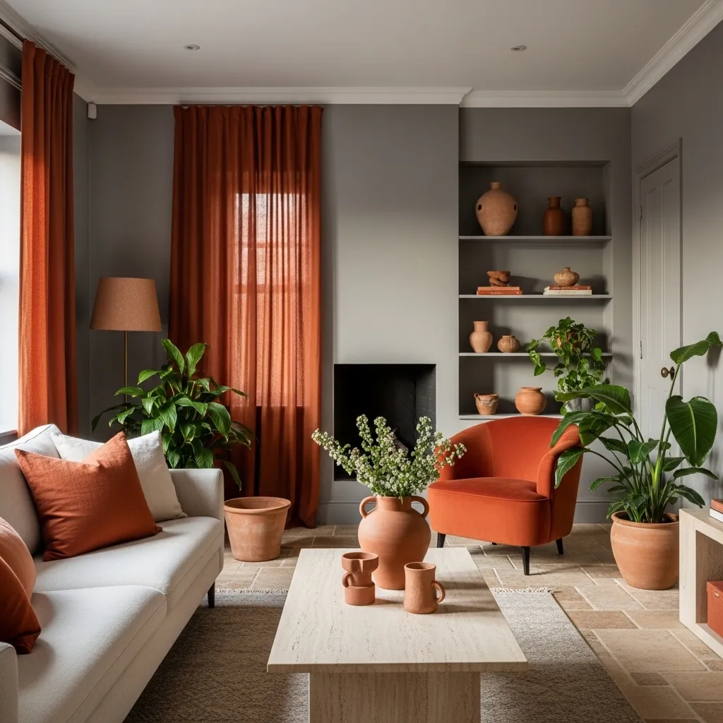
Grey and terracotta is the two-color living room combination that creates the most immediate and most pronounced warmth — terracotta’s specific warm orange-red-brown, the color of sun-baked clay and Mediterranean tile and ancient earthenware, is among the most warm-feeling colors available in interior design, and against grey it appears even warmer by the cool-warm contrast that the two colors create together. The specific quality of terracotta against grey is that the grey recedes into cool sophistication and the terracotta advances into warm, earthy presence, creating a room where the eye moves between the cool grey ground and the warm terracotta accents in a rhythm of contrast that keeps the room visually alive without creating visual tension.
The cool-to-mid grey specifically works better with terracotta than warm grey — a warm grey and warm terracotta together can create a room that reads as uniformly warm without the contrast that makes the terracotta appear at its most vivid and most specifically beautiful. The slight cool quality in the grey creates the contrast that makes the terracotta’s warmth apparent, while the grey’s sophistication prevents the room from feeling too rustic or too simply earthy.
7. Grey and Burnt Orange — Bold Energy
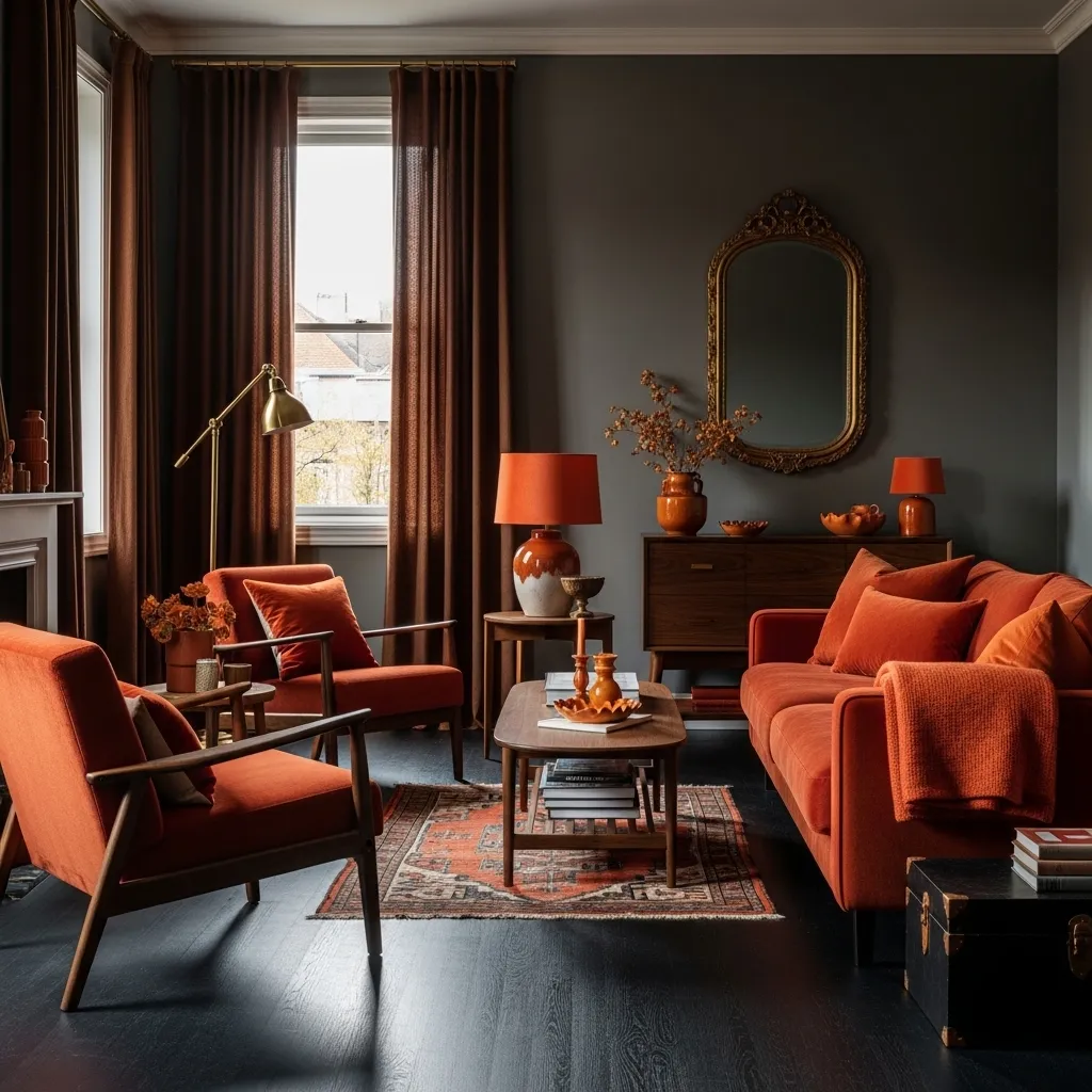
Grey and burnt orange is the two-color living room combination with the most dramatic energy and the most specifically autumnal warmth — burnt orange has the depth and complexity of a color that’s been worked and refined from a simpler starting point, sharing qualities with terracotta but with more saturation, more drama, and more specifically seasonal reference to the color of autumn at its most vivid. Against deep charcoal grey, burnt orange creates a combination of maximum warm-cool contrast and maximum color depth that produces living rooms of extraordinary visual energy and atmospheric warmth.
The deep charcoal grey specifically works better with burnt orange than lighter greys because the depth of the charcoal creates a visual drama that the burnt orange can match and intensify — a light grey with burnt orange creates a somewhat harsh combination where the orange appears garish against the pale grey background, while deep charcoal grey creates the sophisticated, weighty backdrop that allows the burnt orange to read as richly warm rather than aggressively bright.
8. Grey and Sage Green — Botanical Calm
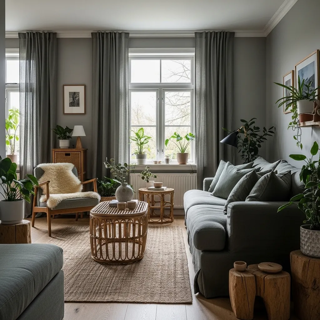
Grey and sage green creates the most botanically calm and most deeply restful of all grey two-color living room combinations — because grey and sage green are colors that share a common quality of grey in their composition, creating a tonal relationship of genuine visual harmony rather than color contrast. The effect of combining warm grey with sage green is a room where the two colors read as variations of the same atmospheric tone rather than as two separate colors in relationship, and that quality of tonal harmony creates a room of extraordinary visual calm that other two-color combinations don’t quite achieve.
The lack of strong contrast between grey and sage green is not a weakness of the combination but its specific strength — rooms need not create energy through color contrast, and the grey-and-sage room specifically creates its beauty through the quality of tonal harmony and the accumulated warmth of natural materials within a calm, botanical palette. The pale grey and the sage green together create the specific color environment that most directly references the misty, morning-light quality of an early spring garden, and that specific atmospheric reference is what makes the combination consistently beautiful and consistently restful.
9. Grey and Deep Plum — Jewel-Toned Drama
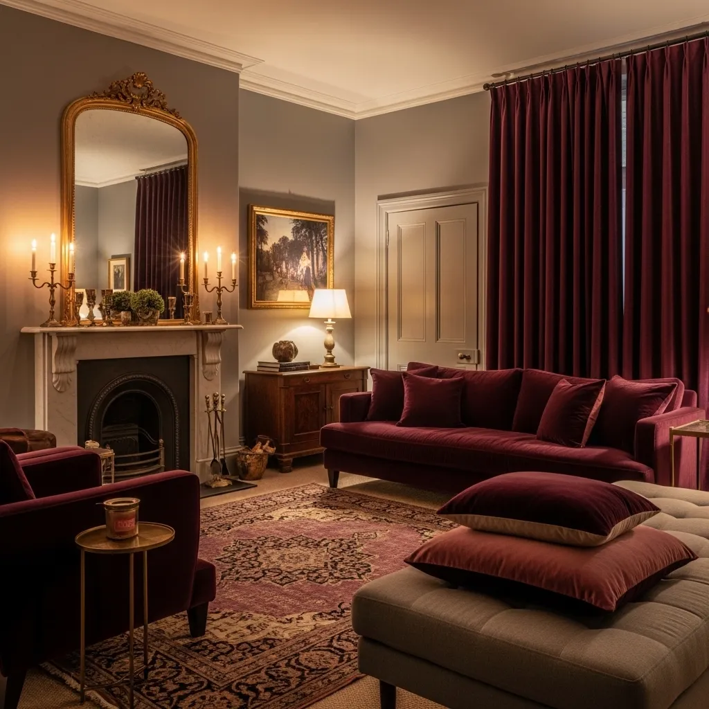
Grey and deep plum is the two-color living room combination with the most overtly luxurious and most specifically evening-oriented atmosphere — plum’s specific combination of warm red and cool blue creates a color of extraordinary depth and complexity that photographs beautifully and feels genuinely rich in velvet, and against warm grey it creates the specific quality of jewel-toned living room luxury that’s most fully realized in warm lamplight rather than natural daylight. This is the combination most suited to a living room designed for evening use — for dinner parties and late conversations and the warm, intimate atmosphere of a room lit entirely by lamps.
The velvet fabric is non-negotiable in a grey and plum living room of genuine quality — plum in any other fabric reads as adequately purple, but plum in velvet reads as deeply, warmly jewel-toned, because velvet’s directional pile creates depth and richness in the plum tone that flat fabrics eliminate. A plum velvet sofa in warm lamplight against warm grey walls is one of the most specifically beautiful color and material combinations available in living room design, and the investment in genuine velvet rather than velvet-look fabric is the investment with the highest visual return in this specific context.
10. Grey and Warm Caramel — Understated Luxury
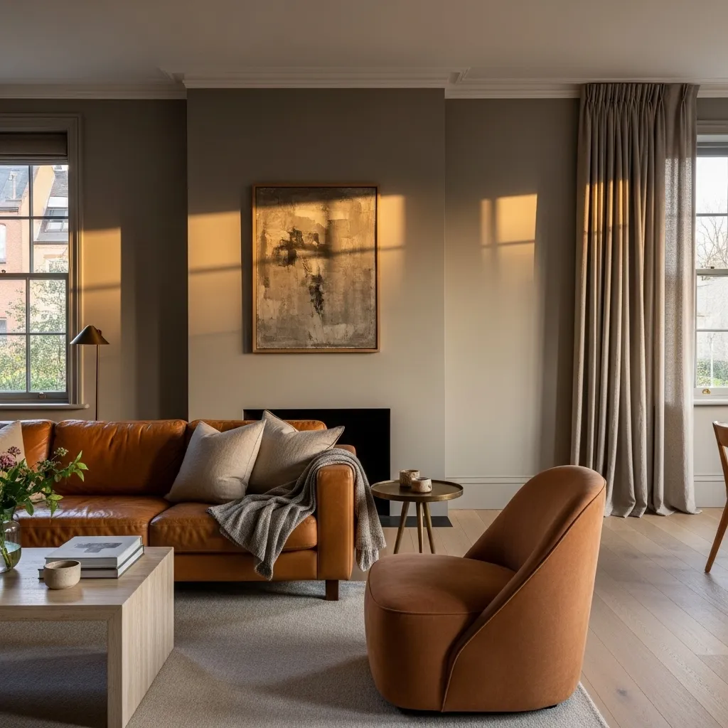
Grey and warm caramel — specifically caramel in its leather and natural material expressions rather than caramel as a painted or dyed color — creates the living room combination of the most natural and most understated luxury, one where the beauty comes from the quality and warmth of the materials rather than from the boldness or drama of the color relationship. The caramel leather sofa against warm grey walls is the specific furniture and wall color combination that most consistently photographs beautifully and feels most consistently beautiful in person, because both the leather’s warmth and the grey’s sophistication improve with use and age rather than degrading.
The aged leather sofa is the specific piece that most anchors the grey and caramel living room’s character — a sofa in new, stiff caramel leather against grey walls reads as expensive and slightly formal; the same sofa after years of use, when the leather has developed its specific warmth and its specific character of softness and use, reads as genuinely beautiful and genuinely warm. This quality of materials improving with use is the specific characteristic that connects the grey and caramel combination to the vintage tradition — both the grey walls and the aged caramel leather are surfaces that become more beautiful over time rather than requiring replacement or refresh.
11. Grey and Dusty Lavender — Quiet Elegance
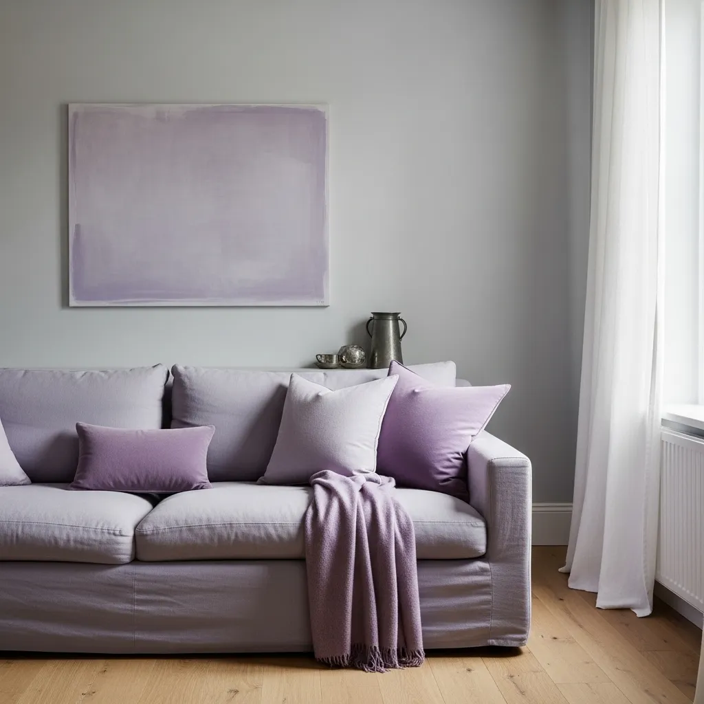
Grey and dusty lavender creates the living room combination of the most quietly surprising beauty — surprising because lavender is not a color that most people immediately associate with sophisticated living room design, yet a dusty, muted lavender against pale grey creates a room of extraordinary delicacy and refinement that few more expected color combinations achieve. The specific dustiness of the lavender — the grey in the lavender that prevents it from reading as sweet or girlish — connects it to the grey walls in a way that creates a tonal relationship of genuine visual harmony.
The light-sensitivity of the dusty lavender against pale grey is the quality that makes this combination specifically magical — in flat, grey light the lavender appears almost grey itself, creating a near-monochromatic room of extreme quiet and restraint; in warm afternoon light the lavender reads clearly as a warm purple-blue, creating a room of delicate botanical warmth; in warm lamplight the lavender deepens and reads as richer and more jewel-toned. This light-responsive quality — the room appearing genuinely different at different times of day — creates a living space with a quality of visual variety and daily discovery that more stable color combinations don’t provide.
12. Grey and Black — The Monochromatic Dramatic
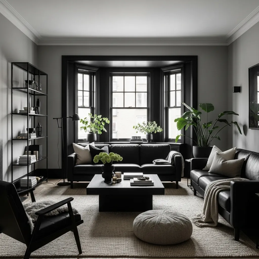
Grey and black is the most graphically bold and most specifically contemporary of all grey two-color combinations — by pairing grey with its own darkest expression rather than with a chromatic color, the combination creates a room that operates entirely within the neutral palette while achieving maximum visual contrast and maximum design seriousness. This is the combination for a living room where the architecture and the furniture forms are the primary design statement, where color is deliberately withheld to allow form, proportion, and material quality to be the room’s expressive vocabulary.
The texture becomes the room’s warmth in a grey and black combination precisely because color warmth has been deliberately removed — the natural wool rug, the cashmere throw, the boucle cushion, the leather sofa all contribute warmth through material quality and tactile richness rather than through color, and in the absence of warm color these textural warmths become more prominent and more specifically beautiful than they would be against a chromatic backdrop. The single large green plant is the most important accent in a grey and black room for the same reason — in the absence of any other chromatic color, the green of the plant reads as vivid and vivifying in a way that the same plant in a colorful room wouldn’t quite achieve.
13. Grey and Warm Gold — Timeless Glamour
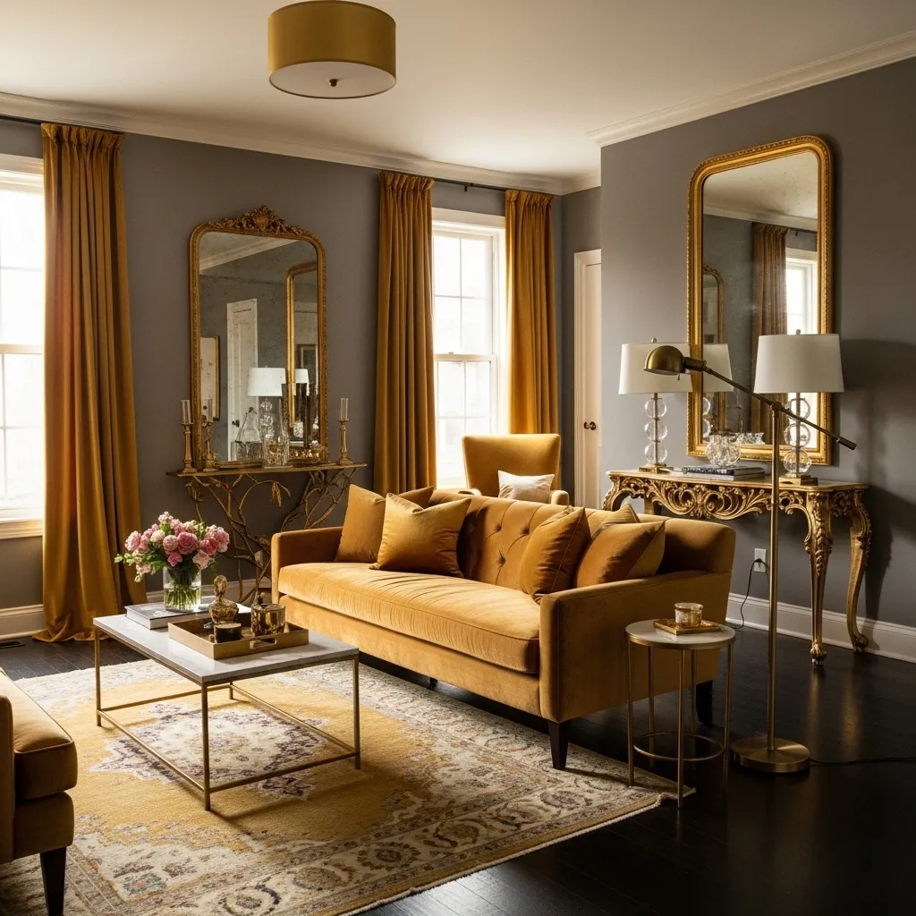
Grey and warm gold is the two-color living room combination with the most specific quality of timeless glamour — the specific combination of grey’s sophistication and aged gold’s warmth and richness creates living rooms that reference the most refined interiors of European decorating tradition, from the gilt-and-grey of French Rococo through the warm gold and grey of Georgian English drawing rooms through the warm gold accents of Hollywood Regency, all of which understood that grey and warm gold create a combination of extraordinary refinement and warmth simultaneously.
The aged, muted quality of the gold is what distinguishes a grey and gold living room of genuine sophistication from one that reads as merely shiny — bright, new gold against grey creates a room that reads as recently decorated and slightly corporate in its use of warm metal, while aged, muted gold with the specific warmth of antique gilding against grey creates a room with genuine historical resonance and genuine material warmth. The silk velvet sofa in antique gold, the gilt-framed mirrors with their slightly worn gilding, the Persian rug with its warm gold tones worn to softness — all contribute the specific quality of aged gold warmth that makes this combination timelessly beautiful.
14. Grey and Rust — Contemporary Warmth
Grey and rust is the two-color living room combination that feels most specifically of-the-moment in 2026 — rust’s specific quality as a color that bridges red and brown and orange in a warm, slightly industrial, specifically contemporary tone resonates with the current design moment’s movement toward warm, natural, earth-toned materials, and against cool grey it creates the maximum warm-cool contrast that makes both colors appear at their most vivid and most specifically beautiful. The rust makes the grey appear cooler and more sophisticated; the grey makes the rust appear warmer and more vivid; and together they create a room of contemporary energy and contemporary warmth simultaneously.
The specific distinction between rust and terracotta or burnt orange is important to understanding this combination’s character — rust has a specific quality of weathered metal in its color, a slightly darker, slightly more complex tone than terracotta’s sun-baked clay warmth or burnt orange’s autumn-leaf vibrancy. Against cool grey specifically, rust creates the specific combination of cool-architecture and warm-material that defines contemporary design at its most current and most specifically beautiful.
15. Grey and Deep Teal — The Most Sophisticated Unexpected Pairing
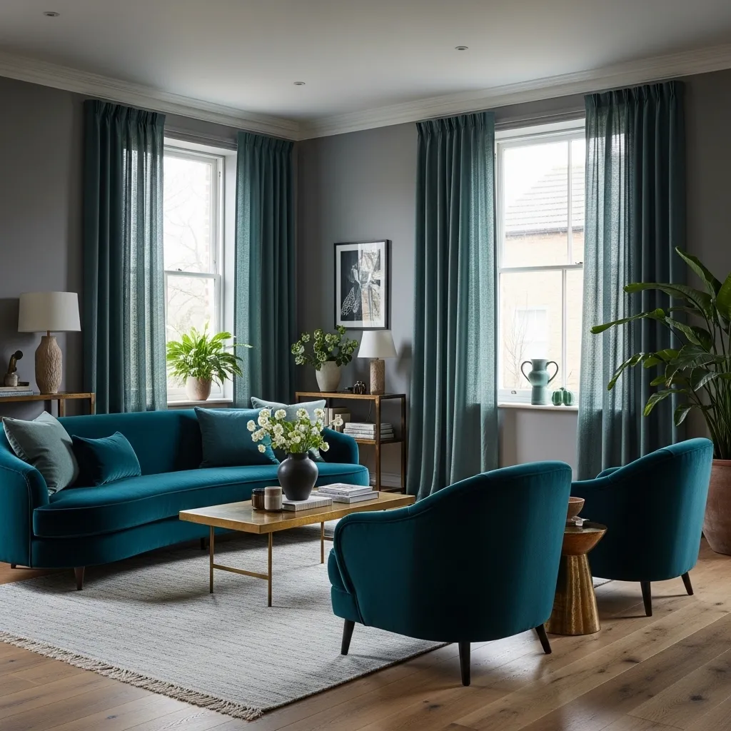
Grey and deep teal is the two-color living room combination that creates the most sophisticated and most unexpected result — unexpected because teal is not an obvious choice for a grey living room, yet when the specific quality of teal (its combination of blue depth and green warmth) is considered in relationship to grey (its neutrality and sophistication), the combination creates rooms of extraordinary contemporary beauty that feel both genuinely new and completely natural, as though they’ve always existed and have simply been waiting to be discovered.
The specific quality of deep teal that creates the most beautiful relationship with grey is its warmth — teal occupies the blue-green space where the cool of blue begins to be warmed by green, and a teal that has enough green in it to read as warm rather than cold creates a combination with grey that has both the drama of a cool-warm contrast and the harmony of shared undertones. The velvet fabric is specifically important in this combination because teal in velvet has a depth and richness that flat fabrics eliminate — deep teal velvet against warm mid-grey walls creates a combination of material luxury and color sophistication that’s among the most beautiful two-color living room combinations available in contemporary design.