15 Hallway Wall Decor Ideas That Make the Most Overlooked Space in Your Home Feel Intentional and Beautiful
If your hallway walls have been doing absolutely nothing except holding the ceiling up and occasionally receiving the scuff of a passing shoulder, you’re missing one of the most interesting decorating opportunities in the entire house — because a hallway is essentially a transitional gallery, a space people move through multiple times every day and that sets the tone for everything on either side of it, and when you actually pay attention to those walls the transformation can be genuinely striking. The ideas in this roundup cover every hallway wall treatment you might consider, from a properly curated gallery wall of family photographs and art prints in a cohesive frame mix, to dramatic floor-to-ceiling wallpaper that makes a narrow corridor feel like a destination, painted geometric accent walls, oversized singular artwork moments, vintage mirror collections, architectural molding treatments that add instant gravitas, botanical print arrangements, dramatic dark paint with sculptural wall objects, floating shelf vignettes, typographic and quote art, textile wall hangings, shadow box collections, and several more approaches that treat the hallway as the design opportunity it genuinely is rather than the transitional non-space it’s usually treated as.
My own hallway spent the better part of three years as a completely blank white corridor between the front door and the rest of the house — perfectly clean, perfectly forgettable, the visual equivalent of a held breath. I’d walk past it twenty times a day without seeing it. Then I spent a Saturday hanging a gallery wall of mismatched frames containing a mix of family photographs, botanical prints, and a few small abstract pieces, and suddenly the hallway was the room that people commented on first when they visited. Nothing else had changed. The walls weren’t wider, the ceiling wasn’t higher, the lighting wasn’t better. But the act of treating the space as worthy of decoration rather than just transition transformed it from somewhere you passed through without noticing into somewhere you paused and looked and felt something about.
What makes hallway wall decor different from decorating other rooms is the specific constraint of movement — people experience hallway art while walking, which means the composition needs to work both as a whole viewed from a distance and as a collection of individual pieces appreciated up close as you move past them. The best hallway wall treatments understand this dual viewing experience and work on both scales simultaneously, creating an overall visual impression that draws you in from one end of the corridor and rewards the closer inspection that happens naturally as you walk its length.
1. The Classic Family Gallery Wall
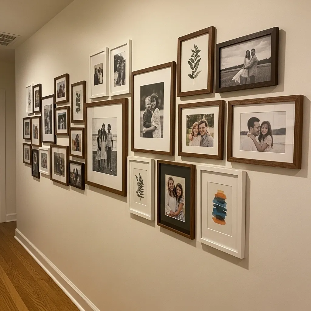
A family gallery wall in a hallway is the wall treatment that creates the most specifically personal and irreplaceable decorating in a home — it’s the wall that belongs only to the people who live there, that couldn’t exist in any other house, and that tells the story of a specific family’s specific life in a way that no purchased artwork or commercial decoration can approximate. Every time you walk past it you’re walking past your own history, and that daily visual encounter with your own life and the people you love has a genuinely positive effect on how the home feels to inhabit.
The arrangement of a family gallery wall is where most people struggle, and the principle that makes it consistently work is establishing a cohesive element that ties the variety of frames and images together as a collection rather than a random assembly. This can be a consistent frame finish (all black, all natural wood, or all white with one or two accent finishes), a consistent mat color, a consistent photographic treatment (all black and white, or all color), or a consistent arrangement logic (all frames the same size, or arranged in deliberate size gradation). One strong cohesive thread running through all the variety is what makes a gallery wall look curated rather than accumulated.
2. Dramatic Floor-to-Ceiling Wallpaper
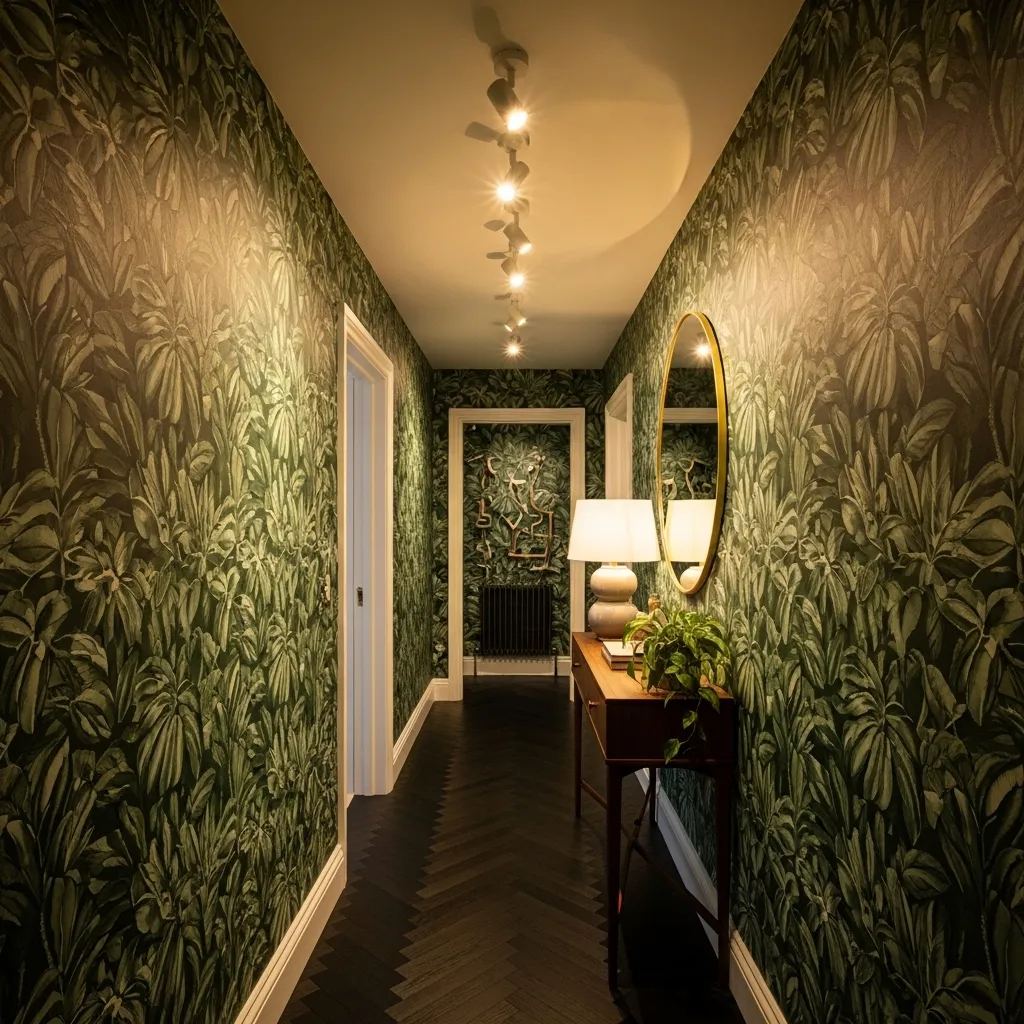
Floor-to-ceiling wallpaper in a hallway is the design decision that most completely transforms the spatial character of a corridor — where paint changes the mood of a space, wallpaper changes the nature of it entirely, turning a transitional passage into an environment with genuine atmosphere and presence. The hallway is the ideal candidate for a bold wallpaper choice precisely because it’s small enough that the investment is manageable, contained enough that a bold pattern doesn’t become overwhelming the way it might on the walls of a large room, and experienced in passing rather than for extended periods which makes a bolder and more complex pattern more sustainable to live with.
The large-scale botanical print specifically works in a hallway because the oversized leaves and organic forms create a sense of being surrounded by something living and verdant that makes the inevitably narrow corridor feel expansive rather than tight. Pattern scale in a small space is counterintuitive — small patterns in small spaces create visual busyness that makes the space feel smaller, while large patterns in small spaces create a visual confidence that reads as spacious and intentional. The botanical specifically adds the quality of nature and growth that makes dark, narrow corridors feel alive rather than enclosed.
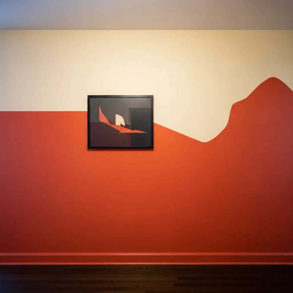
3. Oversized Single Artwork as a Statement
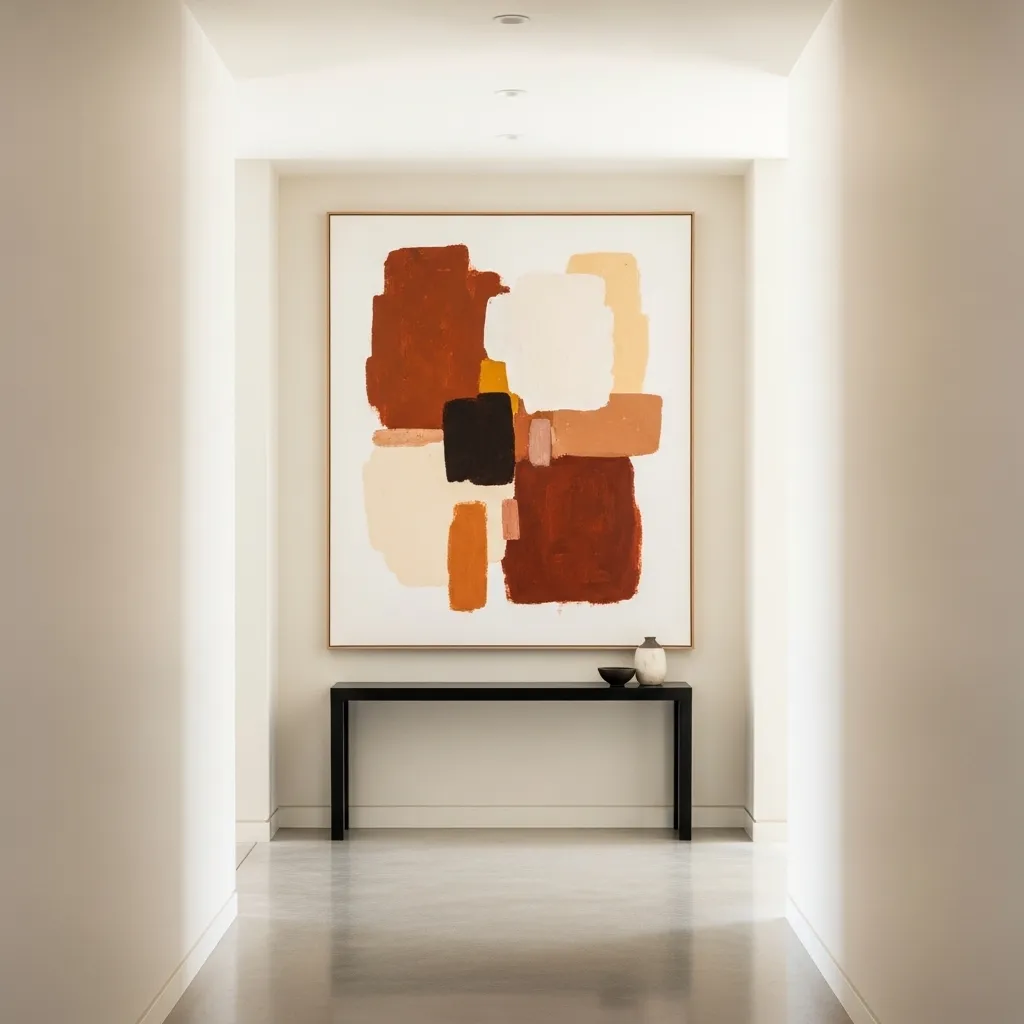
A single oversized artwork hung in a hallway makes a fundamentally different design statement from a gallery arrangement — where the gallery wall says collected and personal and abundant, the single large artwork says confident and considered and bold. It requires fewer decisions and more commitment simultaneously, because the one artwork has to carry the entire visual weight of the wall without companions to support it, which means it has to be genuinely excellent and genuinely large enough to hold the space rather than floating on too much empty wall.
The scale relationship between the artwork and the wall is the critical decision — the painting should feel generous relative to the wall rather than cautiously sized, covering somewhere between a third and half of the total wall surface including the negative space around it. Most people err toward artwork that’s too small for the space, and the single most common observation from interior designers is that clients who follow advice to go larger than feels comfortable are invariably happy with the result in a way they weren’t happy with the timid original choice.
4. Vintage Mirror Collection
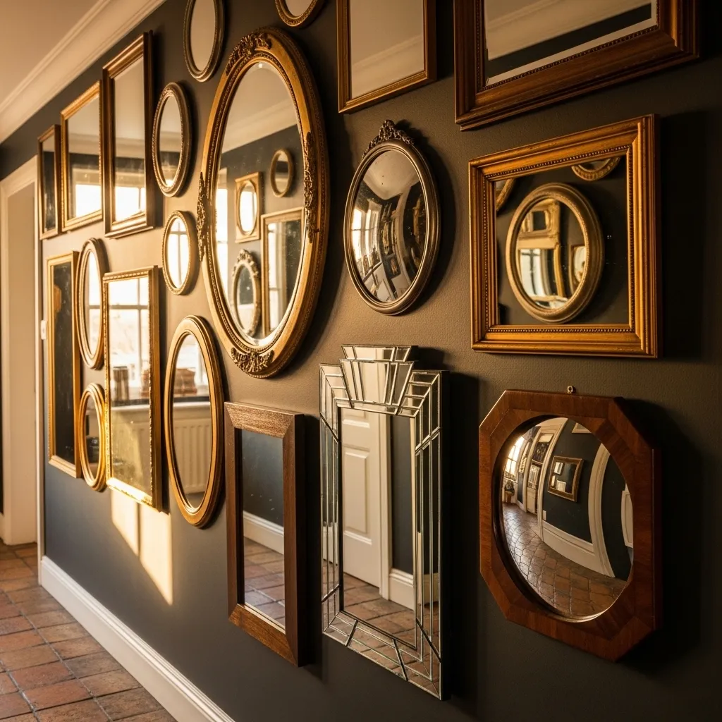
A collection of vintage mirrors on a hallway wall solves two design problems simultaneously — it decorates the wall with genuine visual interest and it makes the hallway feel dramatically larger and brighter by multiplying the available light and reflecting the corridor back on itself in multiple scales and perspectives. The mirror collection specifically makes more visual sense in a hallway than almost any other space in the home because people naturally check their appearance before leaving, and having multiple reflective surfaces at different heights and angles in the passage to the front door serves a practical function that’s perfectly aligned with its aesthetic one.
The variety within a vintage mirror collection is what makes it feel genuinely curated rather than just a bunch of mirrors — shapes that range from round to oval to rectangular to baroque, frames that span different periods and finishes within a consistent warm metallic family, sizes that vary dramatically from statement to accent, all create a composition that rewards the kind of slow, close attention that walking the length of a hallway naturally provides. Each mirror is different, each reflects a slightly different fragment of the space, and the cumulative effect of all those reflections is something genuinely magical in a confined corridor.
5. Architectural Molding Treatment
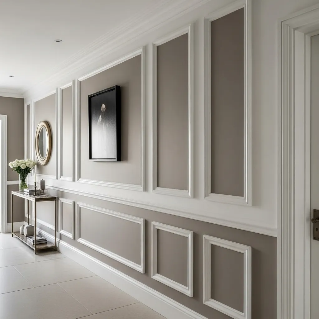
Applied molding treatments — picture rails, panel molding, dado rails, and chair rails — are the wall decor approach that adds architectural gravitas to a hallway in a way that hung artwork and wallpaper can’t quite replicate, because they become part of the structure of the wall rather than additions applied to its surface. A hallway with properly installed panel molding looks like it has always had that detail, like it was built with that level of care and quality, and that quality of apparent permanence and craftsmanship communicates something about the character of the whole home that no removable decoration achieves.
The color relationship between the panel interior and the surrounding wall is the detail that determines whether molding treatment looks architectural and refined or merely decorative — painting the panels a slightly deeper or slightly lighter tone of the same base color creates a sophisticated tonal variation that reads as intentional and considered without creating a strong pattern that would compete with art or other decor. The white of the molding itself provides the crispest possible line between the two tones and gives the whole treatment its clean, architectural quality.
6. Botanical Print Grid Arrangement
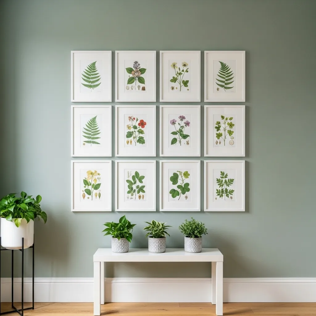
A grid arrangement of matching frames is the gallery wall approach that creates the most ordered, precise, and graphic visual impact — where an organic gallery wall composition has a collected, personal quality, a tight geometric grid has a deliberate, systematic quality that reads as strongly designed and specifically considered. In a hallway where the linear nature of the space naturally invites organized, sequential visual experiences, a grid of prints works with the architecture rather than against it, creating a rhythm that the eye follows pleasurably as you move through the corridor.
The botanical print content within the matching frames is what gives the precision of the grid its warmth and humanness — the organic, irregular forms of illustrated plants and flowers inside the rigid geometry of a perfectly spaced grid creates a productive tension between order and nature that’s one of the most satisfying visual combinations available in hallway wall decor. Victorian botanical illustration specifically has a quality of scientific observation and artistic beauty combined that makes it enduringly appealing in domestic settings across a wide range of aesthetic contexts.
7. Dark Drama With Sculptural Wall Objects
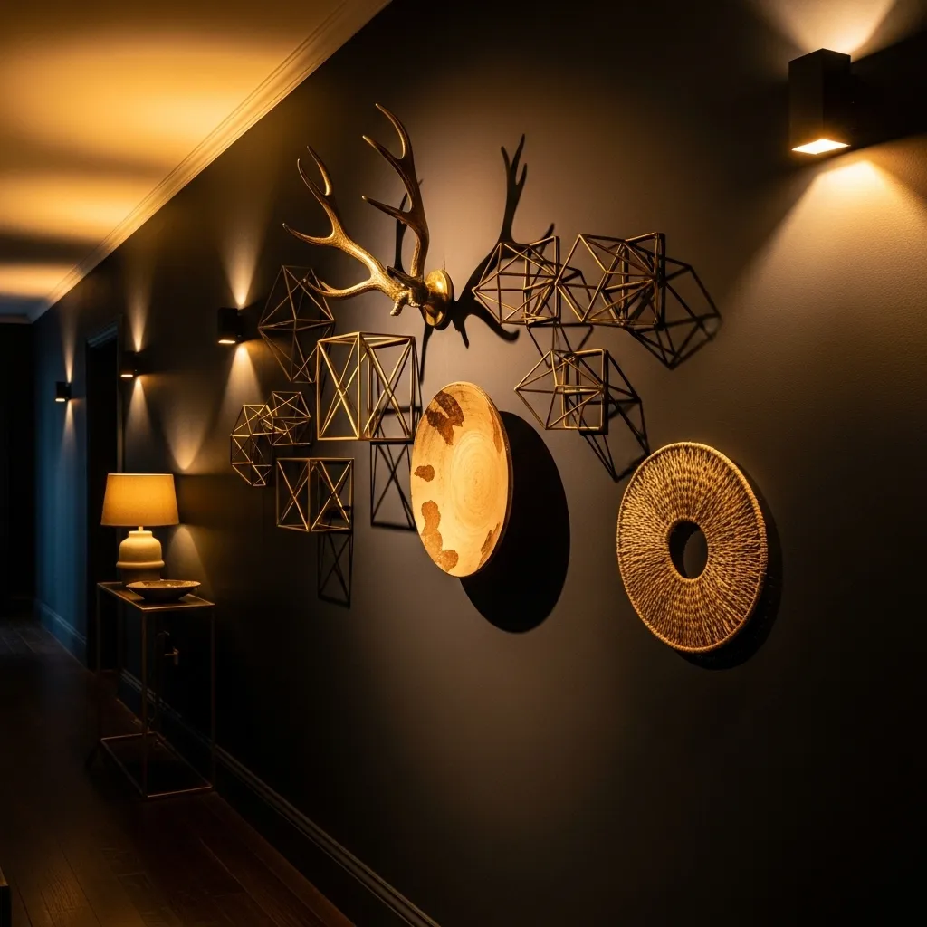
Dark painted walls in a hallway create the conditions for a completely different kind of wall display than light walls support — where light walls are backgrounds that make hung objects visible through contrast, dark walls become active participants in the display, creating shadows and depth that interact with three-dimensional wall objects in ways that flat light backgrounds cannot. A sculptural wall object on a pale wall reads as a shape against a background; the same object on a deep charcoal wall reads as a three-dimensional presence within a depth, the shadows it casts becoming part of the composition.
The combination of different object types — metal, ceramic, fiber, organic material — creates textural variety within the dark wall display that prevents it from feeling like a collection of matching things placed on a background, instead giving it the quality of objects gathered from different contexts that share a visual coherence through scale and curation rather than material similarity. The warm sconce lighting at regular intervals along a dark hallway creates a progression of light pools that both illuminates the sculptural objects and creates atmospheric rhythm as you move through the corridor.
8. Floating Shelf Vignettes Along the Hallway Length
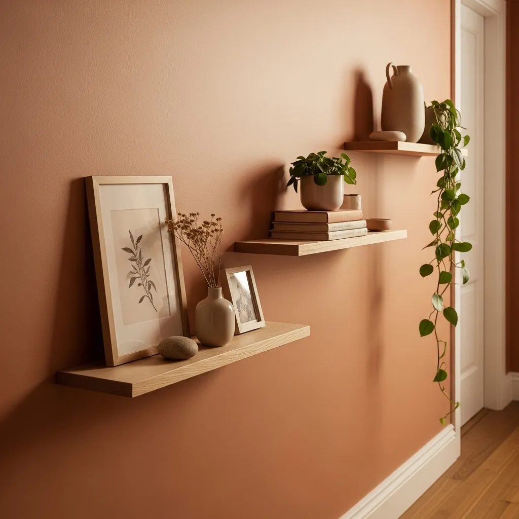
Floating shelves along a hallway wall create a hybrid between wall decor and furniture that works particularly well in corridors where the space is too narrow for full console table depth but where a purely flat wall treatment feels insufficient. The slim shelf extends only a few inches from the wall, taking up negligible floor space while providing a three-dimensional display surface that brings objects into the hallway at eye level and creates a layered, intimate relationship between the viewer and the displayed objects as they move through the space.
The sequential nature of multiple vignettes along a hallway is what makes the floating shelf approach specifically well-suited to corridors — each shelf is a small composed scene that you discover progressively as you move through the space, creating a narrative quality to the wall treatment that a single gallery wall arrangement doesn’t quite achieve. The experience of walking past a series of small, carefully considered vignettes has a quality similar to walking through a carefully curated exhibition, and that sense of things to notice and appreciate at regular intervals makes even the longest corridor feel like a rewarding space to move through.
9. Textile Wall Hanging as a Focal Point
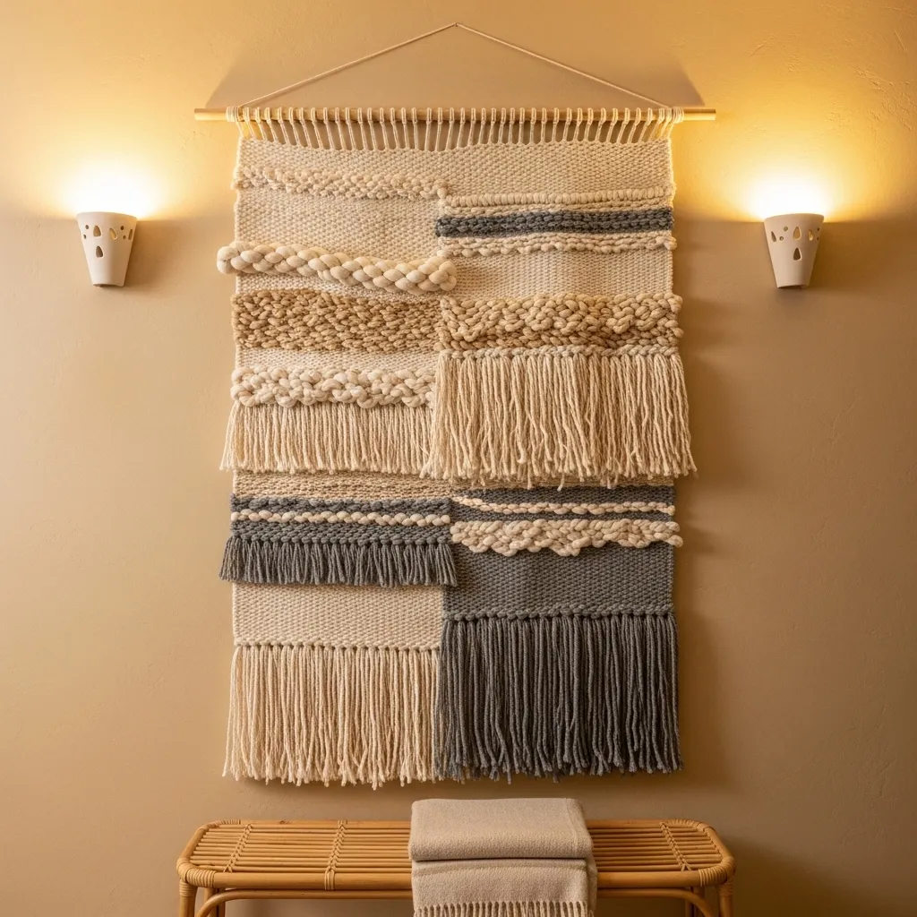
A large handwoven textile hanging in a hallway brings a quality of warmth, texture, and craft that painted walls and even most framed artwork can’t quite replicate — the dimensional quality of woven fiber, the way light plays differently across its raised and recessed surfaces, the organic irregularity of handwork, all create a visual richness that’s simultaneously quiet and complex and that improves with close inspection. A textile wall hanging is the wall treatment that makes a hallway feel most lived-in and most human, most connected to the material world of making and craft.
The scale of the textile is important in a hallway context — it should be generous enough to feel like a proper focal point rather than a small accent, covering enough of the wall that it reads as the primary wall treatment rather than one element among several. A four-foot-wide by three-foot-tall hanging in a standard hallway is approximately the right scale, large enough to command the wall while leaving enough negative space around it to breathe and be appreciated as an individual piece rather than competing with other elements for visual attention.
10. Typographic and Quote Art Arrangement
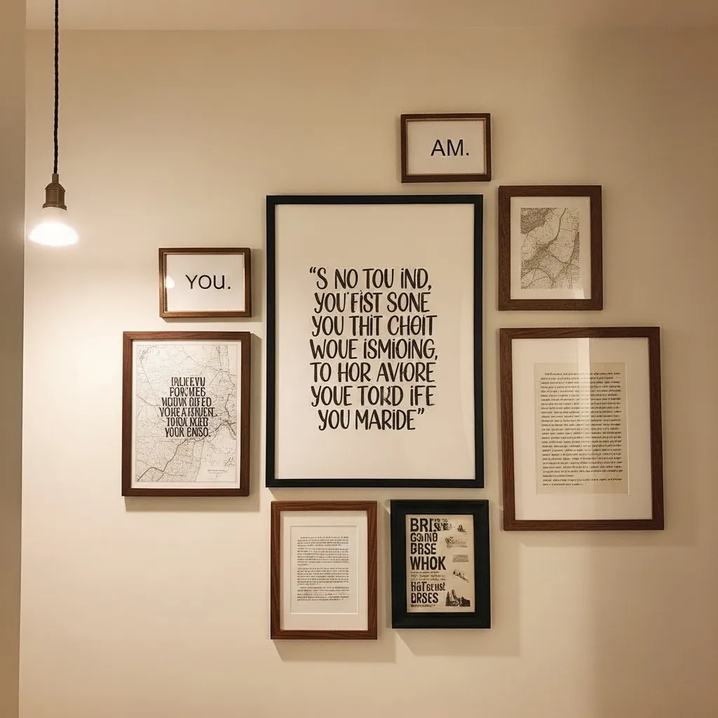
A typographic and quote art arrangement in a hallway creates a specific quality of meaningful engagement that image-based wall decor doesn’t — the words stop you as you pass, invite a moment of reading, offer something to think about as you move from one part of the house to another. The hallway as a transitional space is the perfect location for words that function as small daily reminders or inspirations, encountered in the brief passages between spaces rather than demanding extended attention in a room where you’re settled and focused on other things.
The curation of the text content is as important as the visual arrangement — a wall of words that feel personally meaningful, that have been chosen for genuine resonance rather than generic inspiration, creates a different experience from generic motivational prints that carry no specific weight. A quote from a favorite author, a phrase that belongs to the family’s private vocabulary, a piece of handwriting from someone meaningful — these specific, personal text choices are what elevate a typographic wall from decoration to genuine expression.
11. Color-Blocked Accent Wall With Geometric Shape
A color-blocked geometric wall treatment is the hallway wall approach that creates the most graphic impact and the most specifically contemporary design statement — it treats the wall as a canvas for a large-scale painted composition rather than as a background for hung objects, and the result is a hallway that feels genuinely designed and visually distinctive in a way that both conventional single-color painting and typical gallery walls don’t quite achieve. The painted geometry becomes the artwork rather than the support for it.
The organic curved boundary between the color zones — rather than a strict geometric line — is the detail that prevents the color-blocking from feeling corporate or clinical and gives it the quality of a handmade, slightly imperfect design gesture that feels warm and considered rather than mechanical. The slight imprecision of a freehand curved boundary communicates that a person made this decision and painted this wall rather than a formula, and that human quality is what makes the treatment feel livable and domestic rather than institutional.
12. Shadow Box Collection Display
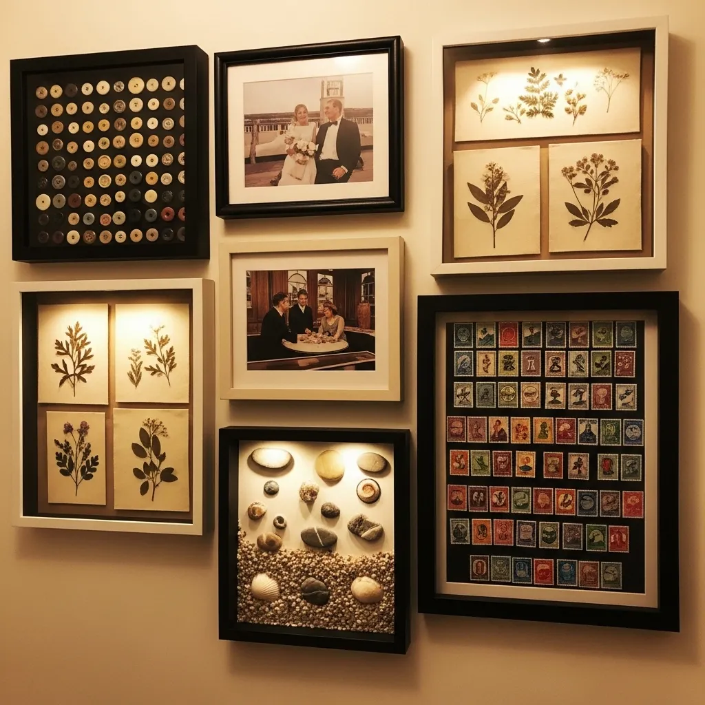
Shadow box displays in a hallway create a gallery of small worlds — each box is a contained three-dimensional scene that invites close inspection, that rewards the proximity that hallway viewing naturally creates as you walk past and stop to look more carefully. The depth of a shadow box — the space between the glass and the backing — creates a sense of looking into a small room rather than at a flat image, and that sense of depth and dimensionality makes shadow box displays uniquely engaging compared to flat artwork at the same scale.
The collections housed in shadow boxes work best in a hallway when they have genuine personal meaning — objects gathered from meaningful places, collections that represent real interests or memories or relationships, specimens that were actually found and chosen rather than purchased as a decorative set. The visible effort and care of a real collection arranged beautifully in a shadow box communicates something about the person who made it that generic decorative objects don’t, and that quality of genuine personality is what makes a shadow box hallway display genuinely interesting to everyone who walks past it.
13. Staircase Hallway Diagonal Gallery Wall
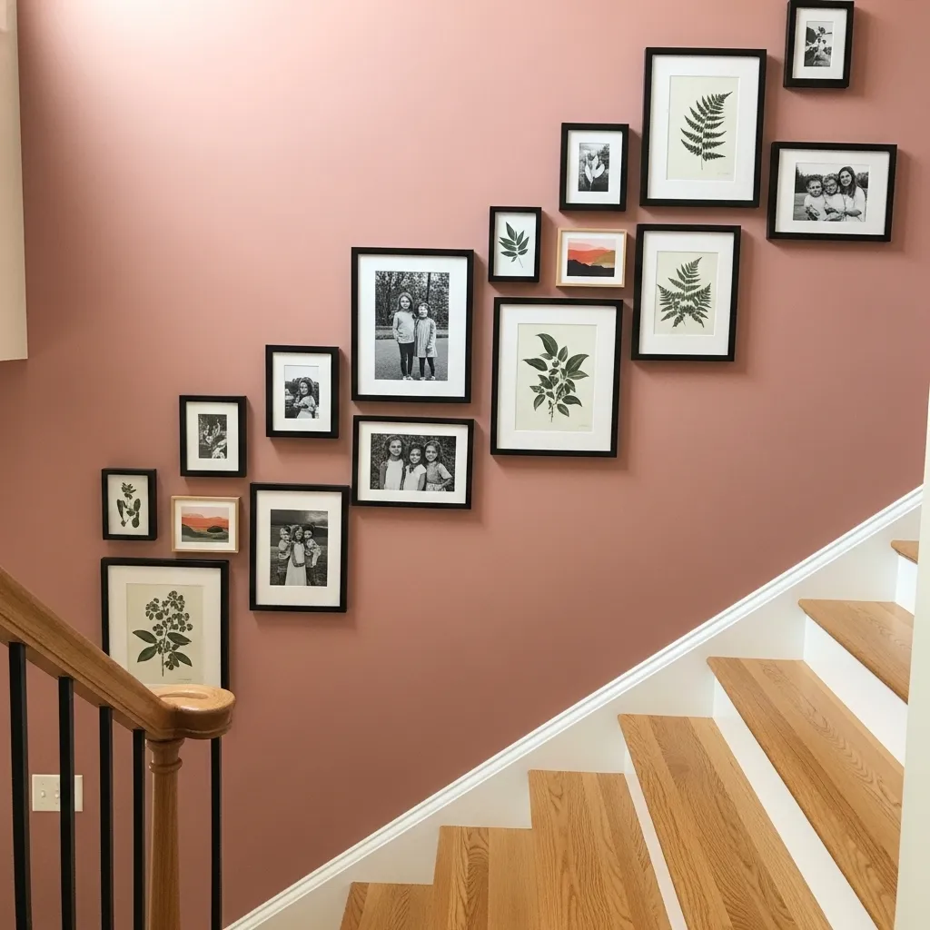
A gallery wall that follows the diagonal angle of a staircase is the hallway wall treatment that’s most specifically and cleverly adapted to its architectural context — rather than fighting the angled ceiling line that makes staircase walls awkward for conventional horizontal arrangements, the diagonal gallery embraces and celebrates the angle by using it as the organizing principle of the whole composition. The stepped, ascending arrangement of frames creates visual movement that reinforces the experience of climbing the staircase rather than competing with it.
The staircase gallery wall has the particular quality of being experienced differently going up than going down — ascending, you read the arrangement from bottom to largest frame at top, with the full composition appearing gradually as you climb. Descending, you see the full composition from above first and move toward its lower elements. This temporal dimension of the staircase gallery — its different character depending on the direction of travel — makes it more experientially interesting than a flat wall gallery that’s always seen from the same perspective.
14. Wainscoting and Wallpaper Upper Wall Combination
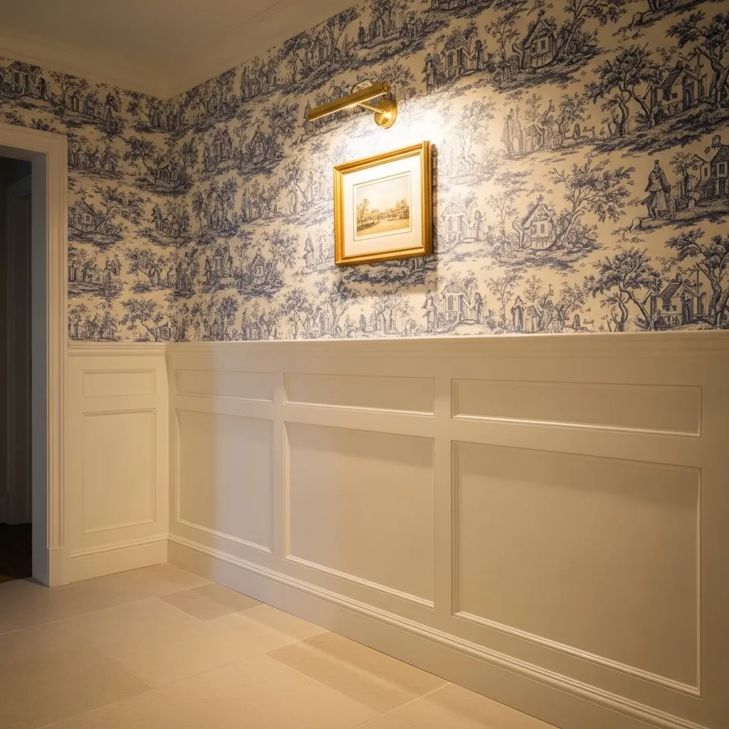
The combination of wainscoting on the lower wall and wallpaper on the upper is the hallway wall treatment with the longest pedigree in Western interior design and the one that most reliably creates a quality of established elegance — it references the best rooms of the eighteenth and nineteenth centuries while being completely achievable in a contemporary home, and it works across aesthetic contexts from traditional to transitional to even subtly contemporary depending on the specific wallpaper and paneling choices.
The practical virtue of wainscoting in a hallway is significant alongside its aesthetic one — the painted wooden panels of wainscoting protect the lower wall from the scuffs, marks, and general contact damage that hallways inevitably receive at the height of passing bags, coats, and furniture, while the wallpaper above the chair rail is protected from the contact zone entirely. The combination extends the life and maintains the beauty of the wall treatment in a high-traffic space in a way that either treatment alone doesn’t manage as gracefully.
15. Personalized Name and Monogram Art Installation
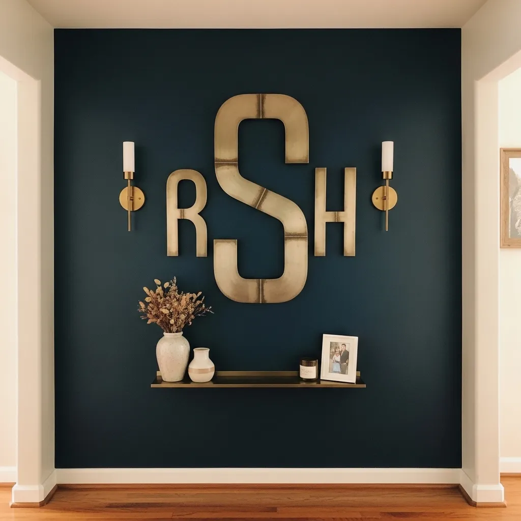
A personalized monogram or name art installation in a hallway creates the most direct possible statement of domestic identity — it says whose home this is, communicates something about the aesthetic sensibility of the inhabitants through the material and style of the lettering, and creates a focal point for the corridor that is completely unique to that specific household. In a space that every guest and family member passes through multiple times daily, the monogram is encountered with a frequency that makes its impact cumulative rather than immediate, building the sense of place and identity that makes a house feel specifically and irreplaceably like home.
The material choice for the monogram letter is the decision that carries the most design weight — a brushed brass letter communicates warmth and refinement, a matte black iron letter communicates industrial modernity, a painted wooden letter communicates craft and approachability, and a mirror-finished letter communicates glam and reflected light. The same letterform in different materials creates completely different impressions, and choosing the material that genuinely connects to the aesthetic of the rest of the home is the decision that makes the monogram feel like a considered design element rather than a decorative gesture disconnected from its context.