15 Ways to Paint Kitchen Cabinets (That’ll Make You Fall in Love With Your Kitchen Again)
If you’ve been staring at your kitchen cabinets wondering why they look so blah, you’re not alone — and the good news is that paint is genuinely one of the most transformative things you can do in a kitchen without ripping everything out. From moody deep hues to soft, airy neutrals, two-tone tricks, limewash finishes, and unexpected color combinations, there are so many directions you can take painted cabinets that it honestly gets a little overwhelming. That’s exactly why I pulled together this roundup — to help you figure out which direction actually fits your space, your style, and your life.
I’ll be honest: I put off painting my own kitchen cabinets for almost two years because I was terrified of picking the wrong color and being stuck with it. Then I finally did it — chose a soft sage green, spent a long weekend prepping and rolling, and stood in my kitchen on Monday morning with a cup of coffee absolutely floored by the difference. It didn’t feel like the same room. The bones were identical, the counters hadn’t changed, the appliances were the same ones that had been driving me crazy — but something about that color made everything feel intentional and considered and genuinely mine.
What I’ve learned since then (and from obsessively researching other people’s kitchen transformations) is that the technique and finish matter just as much as the color itself. A chalky matte on shaker cabinets hits completely differently than a high-gloss lacquer on flat fronts. A distressed antique finish tells a different story than a crisp two-tone combo. So whether you’re renting and going rogue with removable solutions or you’re ready to commit to a full repaint, there’s genuinely something here for every kitchen, every budget, and every personality.
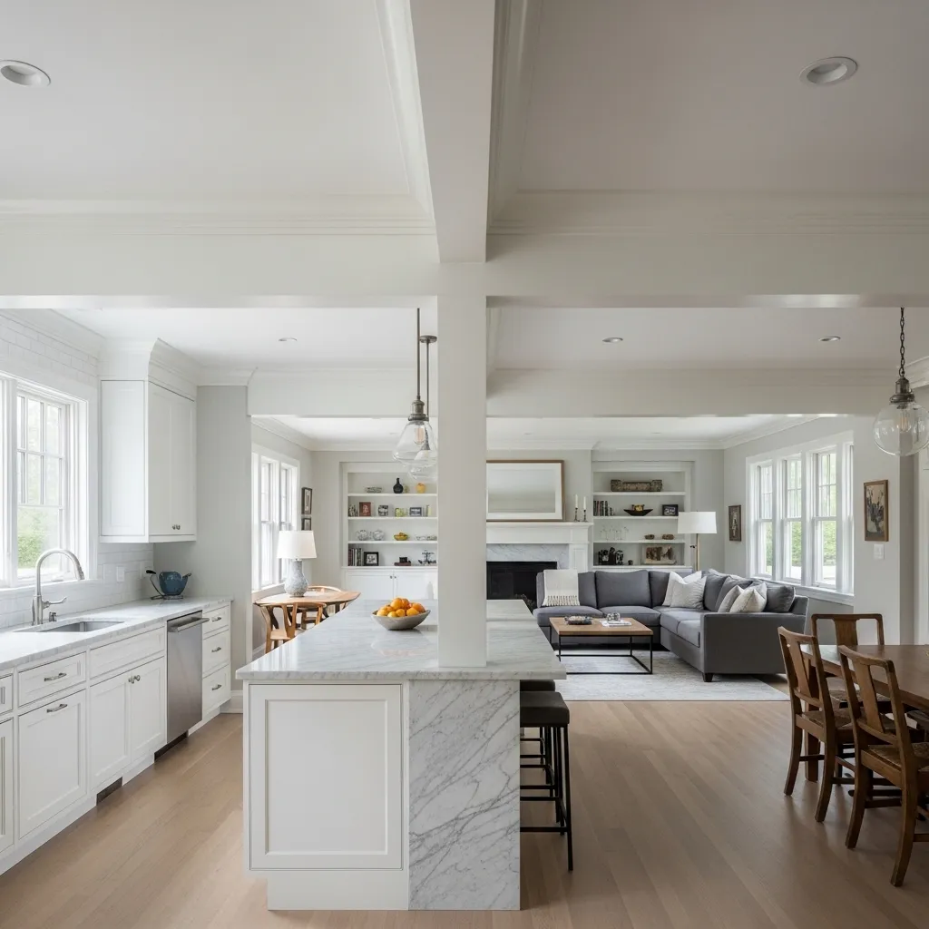
1. Classic White With a Satin Finish
There’s a reason white cabinets have never actually gone out of style — they just work. They make small kitchens feel bigger, they go with literally every countertop material on the planet, and they give you a blank canvas to layer in personality through hardware, textiles, and decor without the space ever feeling chaotic.
The key to making white cabinets look elevated rather than builder-grade is all in the finish. Satin is the sweet spot — it’s got just enough sheen to feel polished and wipe-clean practical, but it won’t show every fingerprint and brush mark the way a high-gloss does. Go with a warm white rather than a stark cool one if your kitchen gets good natural light, and you’ll get that glowy, magazine-worthy look without trying too hard.
2. Deep Navy Blue Lower Cabinets
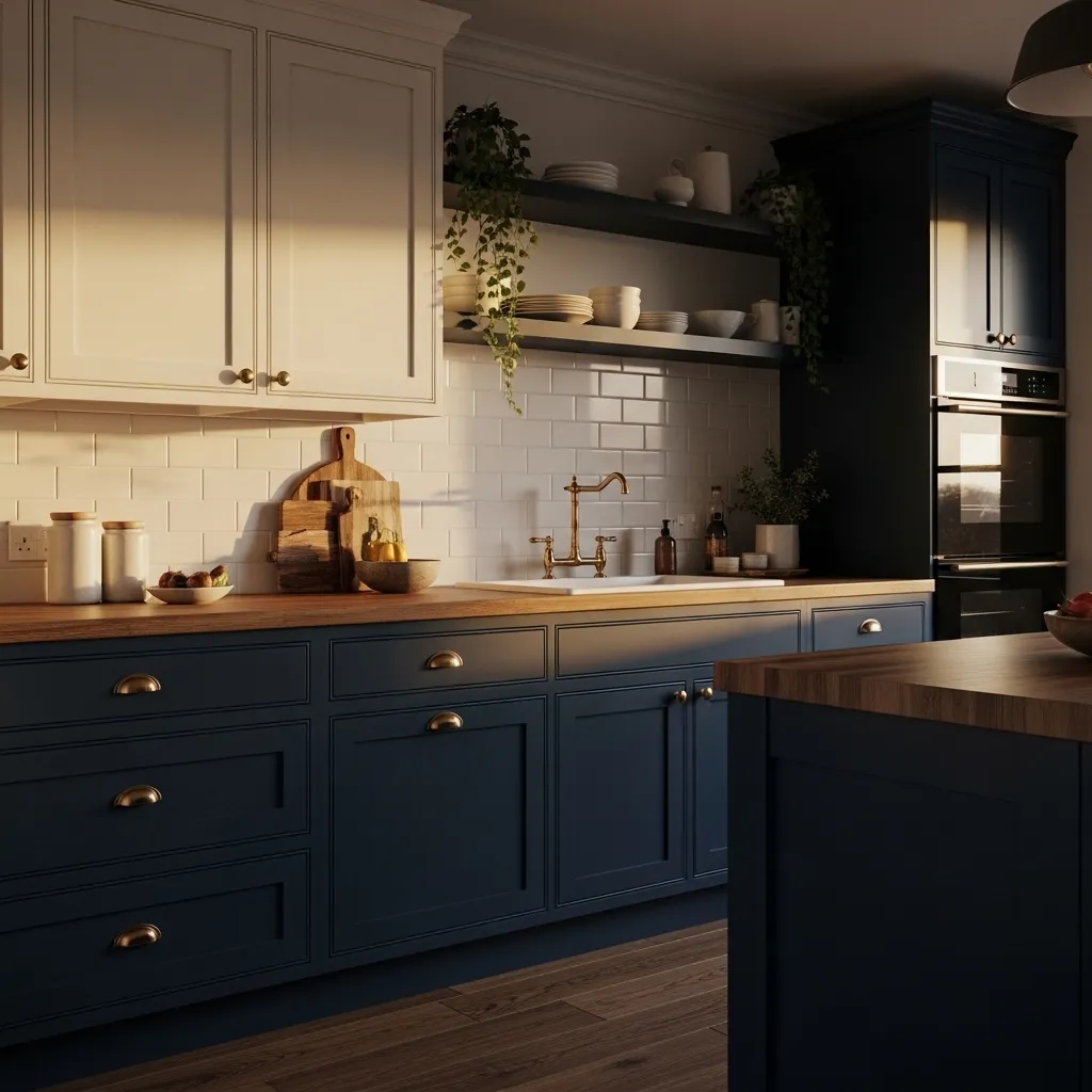
Navy lower cabinets are one of those choices that sounds bold until you actually see them in a kitchen — and then you immediately understand why everyone does it. That deep blue grounds the whole space without making it feel dark or heavy, especially when you pair it with lighter uppers and keep the walls neutral.
What I love most about navy is that it plays really well with so many different hardware finishes. Brass makes it feel warm and a little vintage. Matte black gives it that modern, slightly masculine edge. Even simple chrome can work if the rest of the space is clean and contemporary. It’s a versatile color masquerading as a statement.
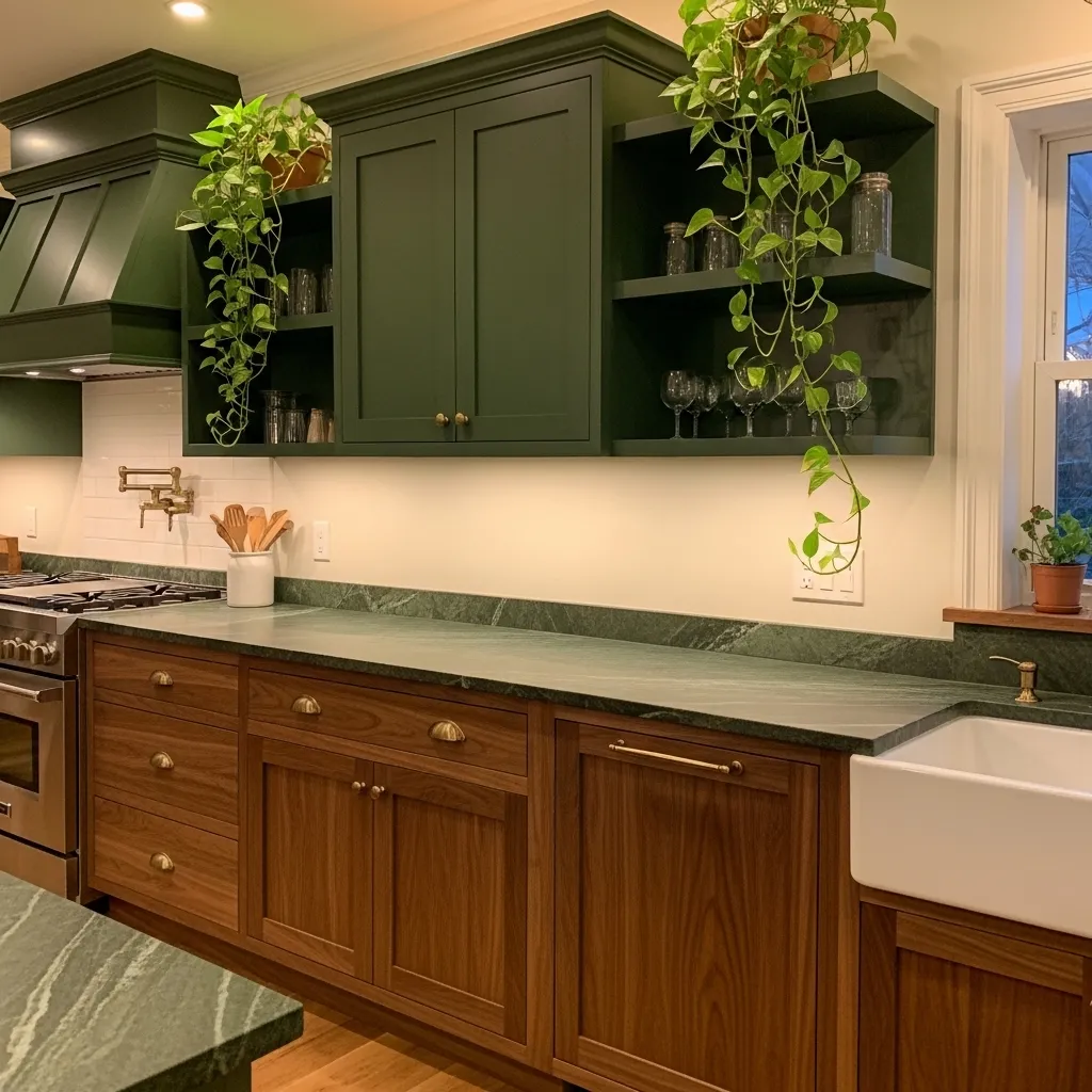
3. Sage Green All-Over
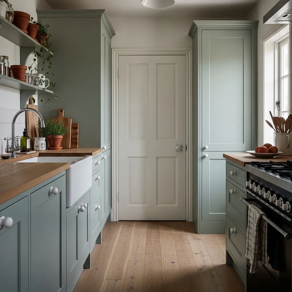
Sage green is having a serious moment and honestly, I don’t think it’s going anywhere soon — because it just feels so calming and right in a kitchen. It’s green enough to feel like a color choice but muted enough that it doesn’t compete with anything. It makes you feel like you’re in a cozy farmhouse even if you’re in a apartment in a mid-rise building.
The secret with sage is leaning into organic textures around it. Rattan, raw wood, linen, terracotta — these all play beautifully off that dusty green tone and keep the vibe feeling warm and collected rather than trendy. Pair it with unlacquered brass hardware that will patina over time and you’ve got a kitchen that looks like it took years to curate.
4. Two-Tone Cabinets With Contrasting Island
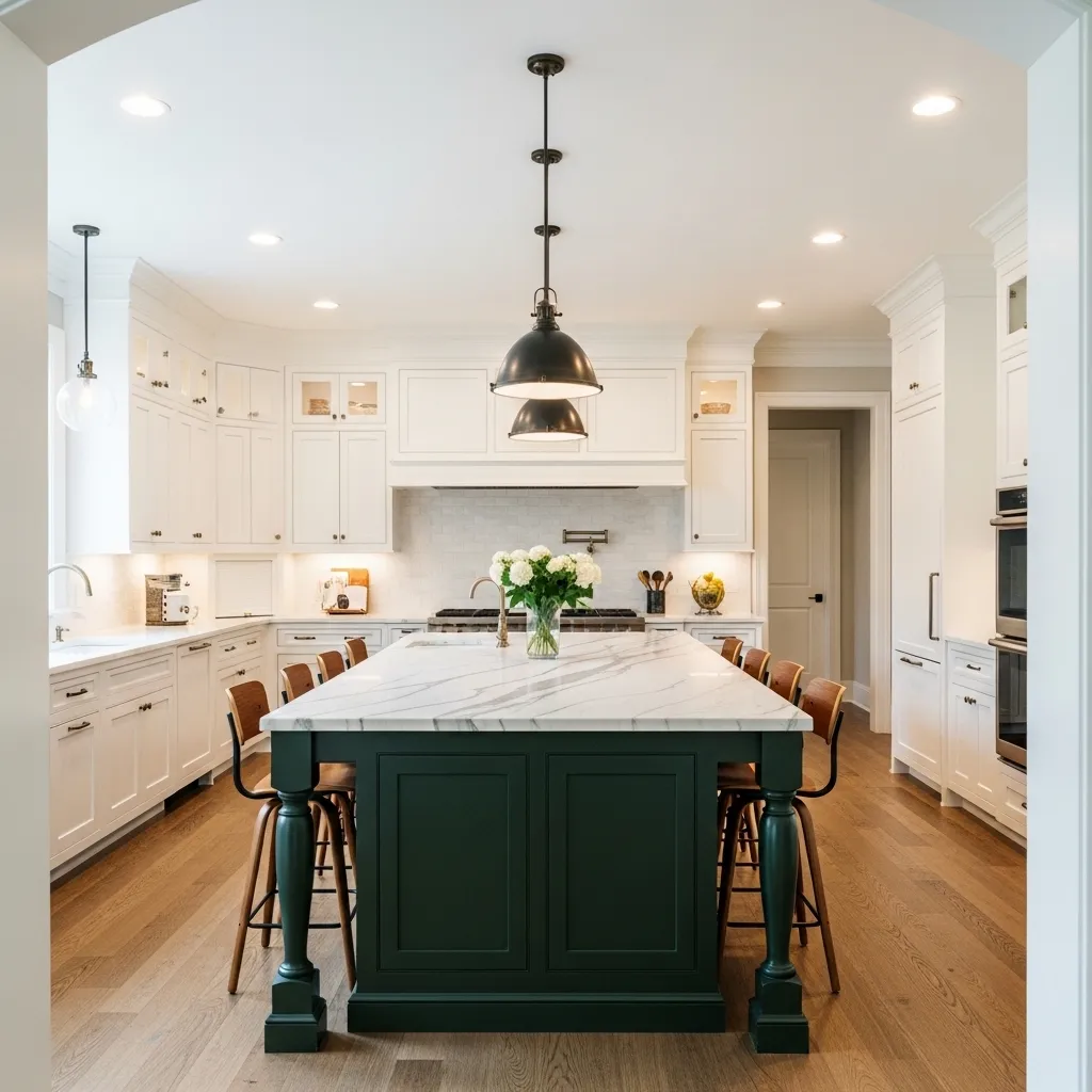
The two-tone kitchen trend is one of those design moves that feels like it should be risky but almost always pays off. Having your island in a completely different color from the perimeter cabinets adds so much visual interest and makes the kitchen feel more like a designed space rather than a box of matching furniture.
The trick is making sure the two colors are in conversation — not just randomly picked. Deep green island with white perimeter, navy island with cream uppers, charcoal island with light grey everything else. The contrast should feel intentional and complementary. And honestly, an island in a bolder color is a low-stakes way to experiment because it’s one piece — not the whole room.
5. Limewash Painted Cabinets
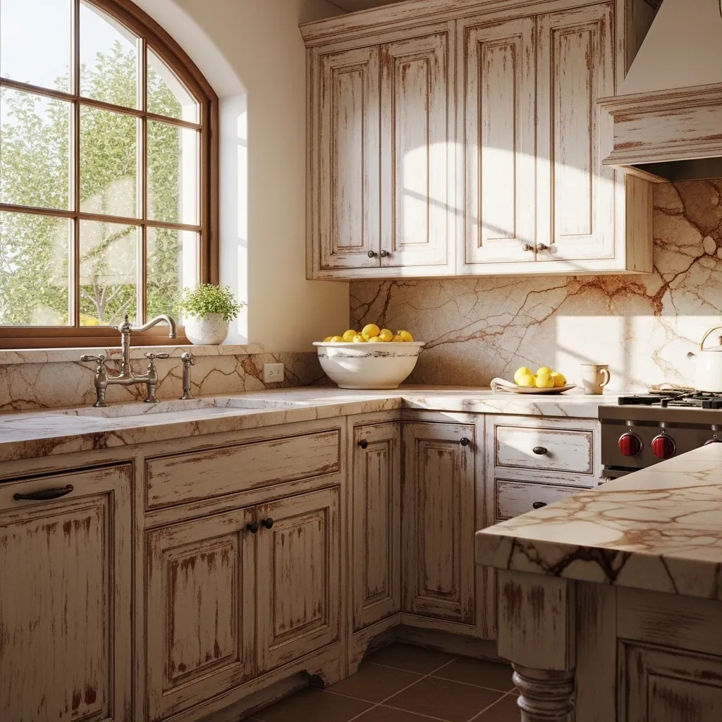
Limewash on cabinets is one of those techniques that most people have only seen on walls, but when you bring it onto cabinetry it creates something that feels genuinely one-of-a-kind and incredibly beautiful. The layered, faded quality of limewash gives cabinets an aged, almost European character that no flat paint can replicate.
It’s not for the person who wants perfection — and that’s exactly the point. The variation in tone, the way light plays differently across different sections, the subtle color shifts — all of that is what makes a limewashed cabinet feel like a piece of art rather than a furniture finish. It works especially well in kitchens with warm natural stone, terracotta tiles, or any kind of Mediterranean-inspired aesthetic.
6. Charcoal Grey With Black Hardware
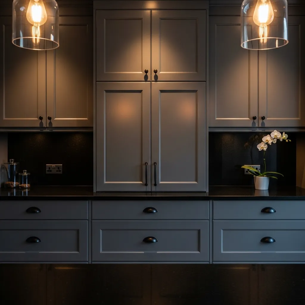
Charcoal grey is for the person who wants drama without going full black — it’s moody, it’s sophisticated, and it photographs beautifully. In a kitchen with good lighting, it shifts between almost-black and a rich dark grey depending on the time of day, which keeps the space feeling dynamic rather than static.
Pairing charcoal with matte black hardware is a move that works because it keeps the palette cohesive and intentional. You’re not breaking up the color story with metal tones — you’re letting the material contrasts (stone countertops, wood accents, soft textiles) do the work of adding interest. It’s a very confident design choice and it always lands.
7. Warm Terracotta Lower Cabinets
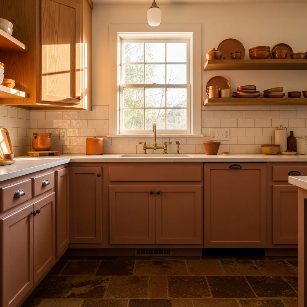
Terracotta in a kitchen sounds like it could easily tip into retro-cheesy territory, but done with intention it’s one of the most grounding, soulful colors you can bring into the space. It pulls in warmth that white and grey simply can’t manufacture, and it makes a kitchen feel genuinely alive in a way that’s hard to put into words.
The natural pairing for terracotta cabinets is organic textures and earthy tones — think wood, wicker, linen, handmade ceramics. Avoid anything too sleek or modern alongside it, and instead let the space feel layered and a little collected. It’s a color that rewards a slightly imperfect, lived-in approach to decorating.
8. Soft Black (Not Quite Black) Cabinets
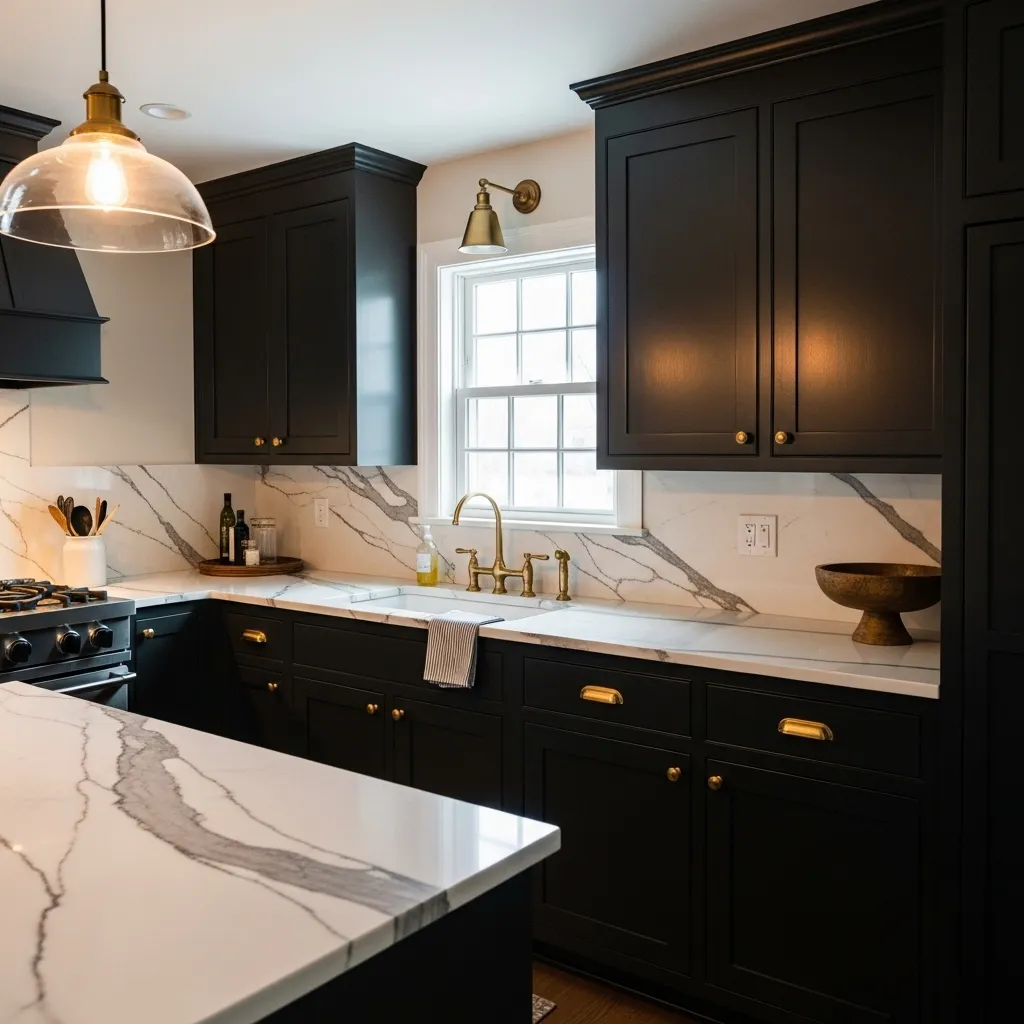
There’s a huge difference between true black cabinets and a soft near-black, and that difference is everything. A soft black has warmth baked in — it doesn’t feel cold or harsh, and it reads more like a deeply saturated dark tone than a void. Colors like Iron Ore, Tricorn Black, or Wrought Iron all do this beautifully.
In a kitchen with white countertops and natural light, soft black cabinets look genuinely stunning. The contrast is high but not jarring, and the warmth of the undertones keeps it from feeling cold. It’s one of those color choices that looks intimidating on a paint chip and then you put it up and immediately wonder why you waited so long.
9. Pale Blue-Grey Cabinets
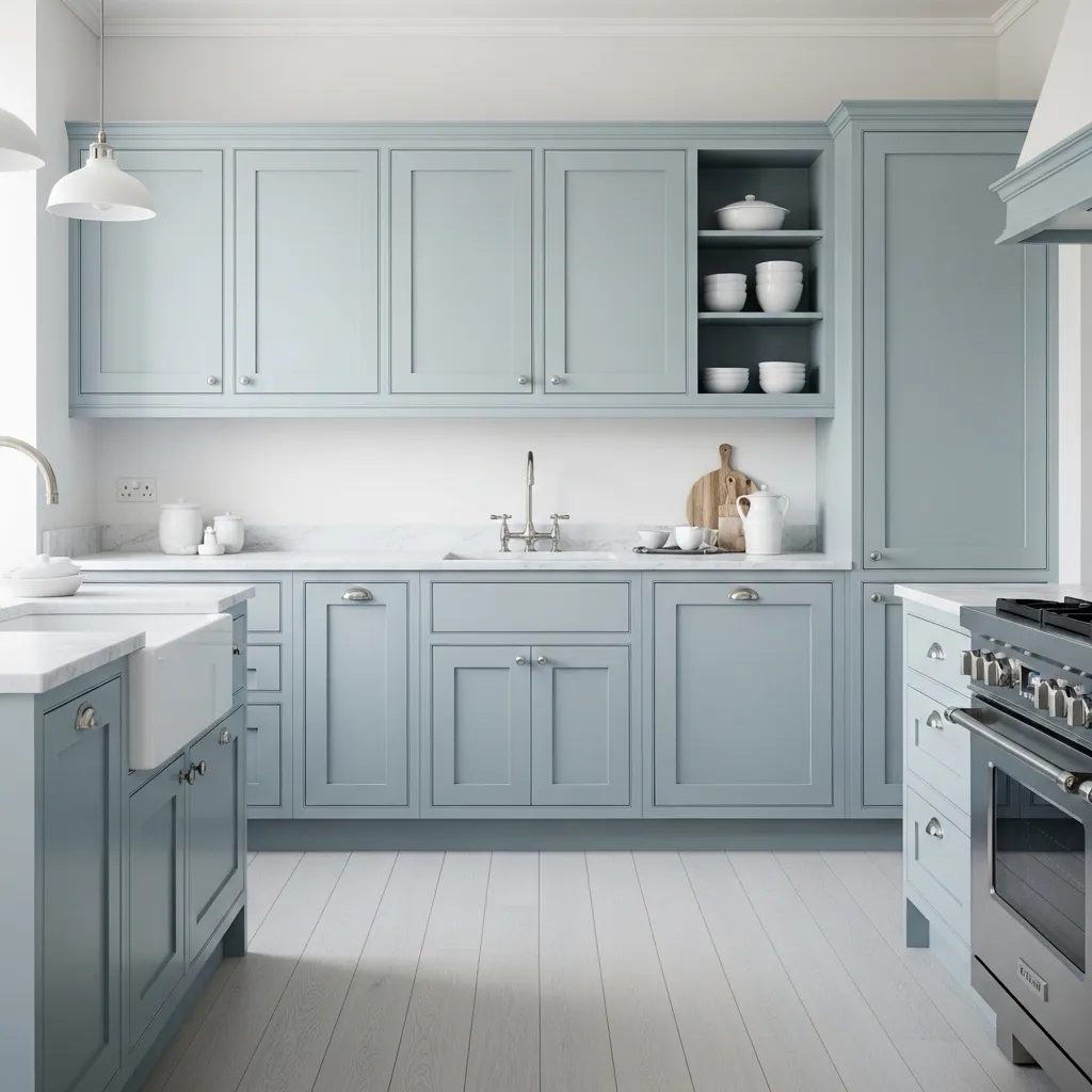
Blue-grey is one of the most underrated cabinet colors because it works in so many different design directions. It’s cool enough to feel modern and fresh but soft enough that it doesn’t feel stark. In north-facing kitchens where light is naturally cooler, it actually looks better than warm whites that can go a little yellow.
What I love about it is the calm, almost spa-like quality it brings. It’s not trying to make a statement — it just quietly makes the whole kitchen feel considered and clean. Pair it with light countertops, simple hardware, and minimal decor and you’ve got something that looks effortlessly beautiful without over-decorating.
10. Distressed Antique White
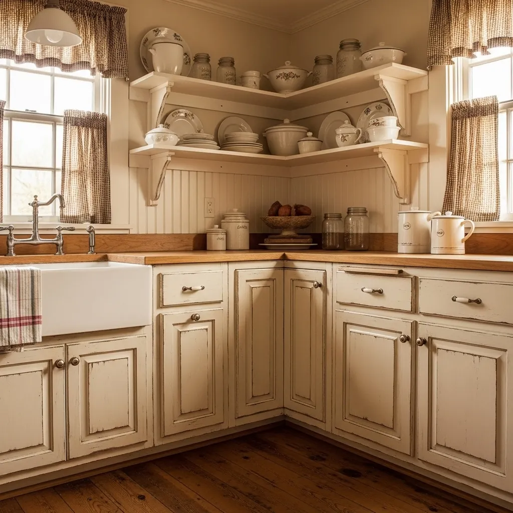
Distressed antique white cabinets are the stuff of farmhouse kitchen dreams — they look like they’ve been in the family for generations, accumulated character over decades, and tell a story that newly installed cabinets simply can’t. The beautiful thing about a distressed finish is that every single kitchen ends up looking completely unique.
The technique itself is pretty approachable as a DIY project. You paint your base coat, let it dry, then lightly sand at the edges and high-wear points to reveal the layer beneath. Sometimes people do two colors intentionally — a cream over a darker base — to get more visible layering. The result is something that feels warm and genuine and really hard to replicate with any factory finish.
11. Forest Green Uppers With Natural Wood Lowers
The combination of painted uppers and natural wood lowers is one of those ideas that feels completely fresh right now, and forest green is the perfect color to make it work. The green feels botanical and grounded, and when you put it next to warm natural wood, the two materials just sing together in a way that no manufactured pairing can touch.
It’s also a really practical combination — wood lowers tend to handle wear and tear differently than painted surfaces, and in a busy kitchen that’s actually useful. But mostly it just looks incredible. Rich, layered, warm, and interesting in a way that an all-painted or all-wood kitchen never quite achieves.
12. Creamy Off-White With Warm Undertones
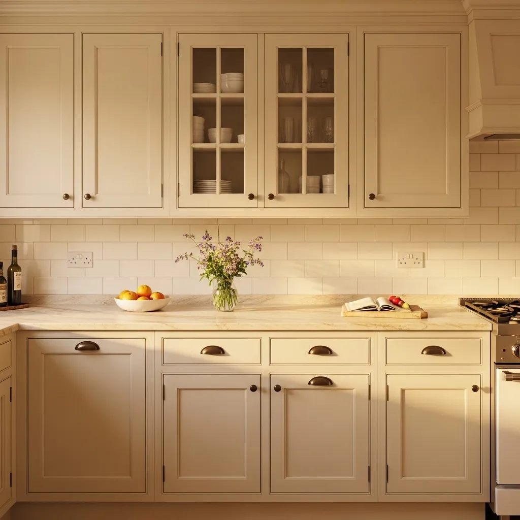
Creamy off-white is what you choose when you love the idea of white cabinets but want something that feels a little more human and lived-in. Pure white can feel a bit clinical in certain kitchens — creamy off-white always feels cozy. It reads as light and bright without the coldness that stark white can bring, especially in kitchens with warmer natural light.
The undertones really matter here — look for colors with yellow or beige bases rather than pink or grey ones, which can go muddy in artificial light. Classics like Benjamin Moore White Dove, Sherwin-Williams Alabaster, or Behr Swiss Coffee all do this beautifully. They’re the kind of colors you never get sick of because they feel natural and easy.
13. Moody Olive Green
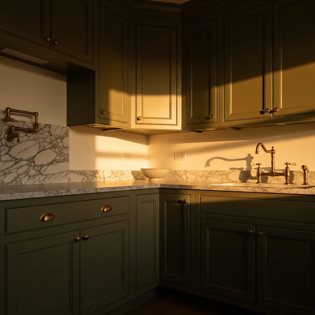
Olive green is the darker, moodier sibling of sage — where sage is soft and fresh, olive is complex and brooding in the best possible way. It’s one of those colors that shifts dramatically depending on the light, going from almost gold in warm afternoon sun to a deep, forest-like tone on an overcast day.
It pairs beautifully with brass hardware because of the shared warm yellow undertones — they feel like they were made for each other. And in a kitchen with white or cream walls, that olive green against white creates a color story that feels rich and traditional without being stuffy. It’s sophisticated in a way that doesn’t take itself too seriously.
14. Bold Cobalt Blue Statement Cabinets
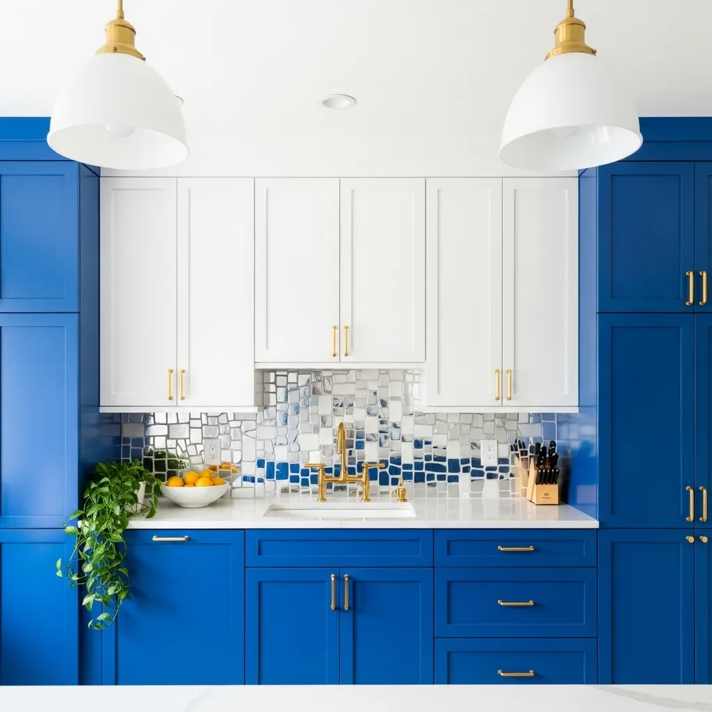
Cobalt blue cabinets are not for everyone and that’s precisely what makes them so wonderful for the people they are for. If you’ve always felt like your kitchen was too beige, too safe, too whatever — cobalt blue is the full-commitment color that says you’re done playing it small. It’s joyful and energetic and makes the whole room feel like a party.
The semi-gloss finish is important with a bold color like this — you want the light to bounce off it and really let that color sing. Keep everything else clean and simple so the cabinets can be the star. White counters, white uppers, light walls, and then just let that blue do all the work. It will absolutely do the work.
15. Soft Dusty Pink Cabinets
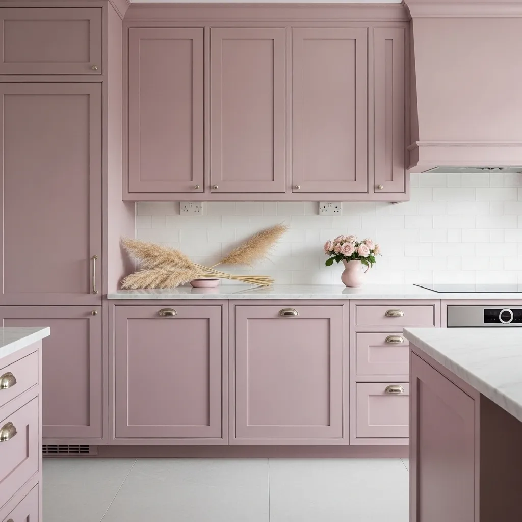
Dusty pink cabinets are the kind of thing people pin secretly for years before they finally commit, and every single person who does commit always says the same thing: they should have done it sooner. It’s not a bubblegum pink, not a millennial pink — it’s a sophisticated, faded, almost Parisian rose tone that makes a kitchen feel incredibly romantic and special.
The key to making it work is the dusty, muted quality of the color — it needs to have grey in it to feel grown-up and considered rather than juvenile. Pair it with white or pale stone countertops to keep it light, use brushed gold hardware to lean into the warmth, and add dried botanicals for texture. It’s a look that photographs beautifully and feels even better to actually live in.