15 Ways to Style a Small Space So It Feels Bigger, More Generous, and Genuinely Beautiful to Live In
If you live in a small apartment, a compact house, a single room that needs to serve multiple purposes, or any space where the square footage feels like it’s working against you rather than with you — this is the guide that covers every significant tool available for making that space feel more generous, more open, more livable, and more genuinely beautiful than its dimensions might initially suggest. The ideas here range from the foundational spatial illusions that interior designers have understood for decades, to the more nuanced and contemporary approaches to small space styling that go beyond the standard advice and address the specific quality of how a small space feels to be in rather than just how it photographs. Because the goal of small space design is not to trick a camera into thinking a room is larger than it is — it’s to create a space that actually feels comfortable and generous and personal to live in every day, which is a different and considerably more interesting design problem.
I’ve lived in small spaces for most of my adult life and I’ve learned that the conventional advice about small rooms — all white, minimal furniture, no pattern, no dark colors, mirrors everywhere — produces rooms that are aesthetically inoffensive and completely characterless, rooms that feel like they’re trying not to take up too much space rather than making the most of the space they have. The small spaces that genuinely feel generous and genuinely feel beautiful are almost never the ones that follow the conventional advice rigidly; they’re the ones that understand the specific principles behind the conventional advice and apply those principles thoughtfully, including knowing which conventional small space rules are actually worth following and which ones can be safely ignored or actively contradicted for a better result.
What I’ve come to understand about small space styling is that the primary enemy of spatial generosity is not the room’s actual dimensions but the visual complexity and spatial confusion that poorly considered styling creates. A small room that’s visually calm and spatially clear — where the eye can move through the space without interruption, where the floor is largely visible, where the ceiling feels connected to the walls, where surfaces are clear enough to read as surfaces rather than accumulation zones — feels considerably larger than its square footage. A small room that’s visually complex and spatially confused — where furniture crowds the floor, where surfaces are covered, where every wall has different treatment, where the eye can’t rest anywhere — feels smaller than its actual dimensions regardless of how light or how white it is. Spatial generosity in a small room is primarily about visual calm and spatial clarity, and those qualities can be created in dark rooms, in rooms with pattern, in rooms with collections and books and personality — the rules about white and minimal are not the only path to spatial calm, and they’re often not the most interesting one.
1. Take the Furniture Off the Walls
Pulling furniture away from the walls is the single counterintuitive small space styling decision that creates the most immediate and most dramatic improvement in how a small room feels — and it’s counterintuitive because the instinct in a small room is to push everything against the walls to maximize the central floor space, which produces the exact opposite effect from what’s intended. When every piece of furniture is pushed against a wall, the room’s center becomes an empty vacuum and the perimeter becomes a crowded ring of furniture, and the eye reads the crowded perimeter as the room’s dominant quality. When furniture is pulled inward and arranged in relationship to each other rather than in relationship to the walls, the room’s center becomes the functional zone and the perimeter becomes the breathing space — and the visible floor between the furniture backs and the walls creates a quality of spatial generosity that the wall-hugging arrangement entirely eliminates.
The eighteen-inch gap between the sofa back and the wall behind it is the specific detail that most transforms a small living room — it’s enough space to be clearly visible as a gap, suggesting that the room extends beyond the furniture arrangement, while being small enough not to create dead unusable space. The floor visible behind the sofa extends the room visually in the direction the sofa faces, creating the impression that the room continues beyond the seating arrangement rather than terminating at the sofa’s back edge.
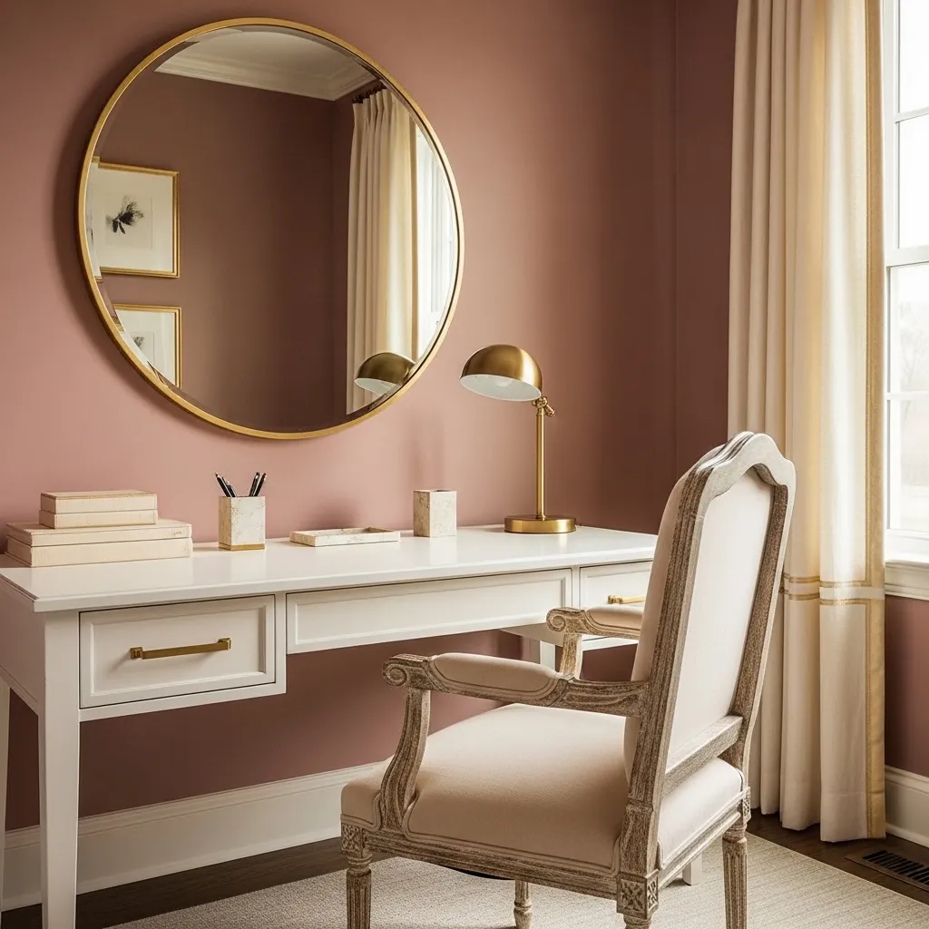
2. Take the Curtains to the Ceiling
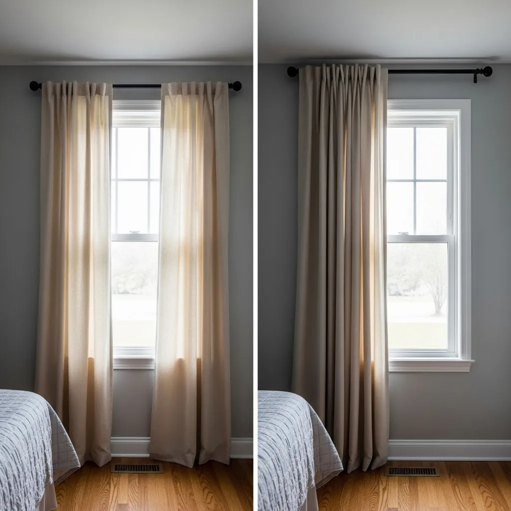
Hanging curtains from the ceiling rather than from just above the window frame is the single most effective technique for making a small room feel taller — because the continuous vertical line of fabric from ceiling to floor trains the eye to read the full height of the room as the curtain’s height rather than registering the ceiling above and the window below as separate elements. The eye follows vertical lines upward, and floor-to-ceiling curtains create the most insistent possible upward vertical line from the floor plane to the ceiling plane, connecting them in a single visual movement that makes the ceiling feel higher and the room feel taller.
The curtain width matters as much as the curtain height — curtains that extend well beyond the window frame on both sides, so that when open they reveal the full window glass and stack against the wall on either side, create a window that appears considerably wider than it actually is. The combined effect of ceiling-height hanging and extra-wide curtain panels is a window treatment that makes the window look like it takes up the entire wall, creating a sense of openness and connection to the outside that a properly sized window treatment never achieves.
3. Use One Large Rug Instead of Multiple Small Ones
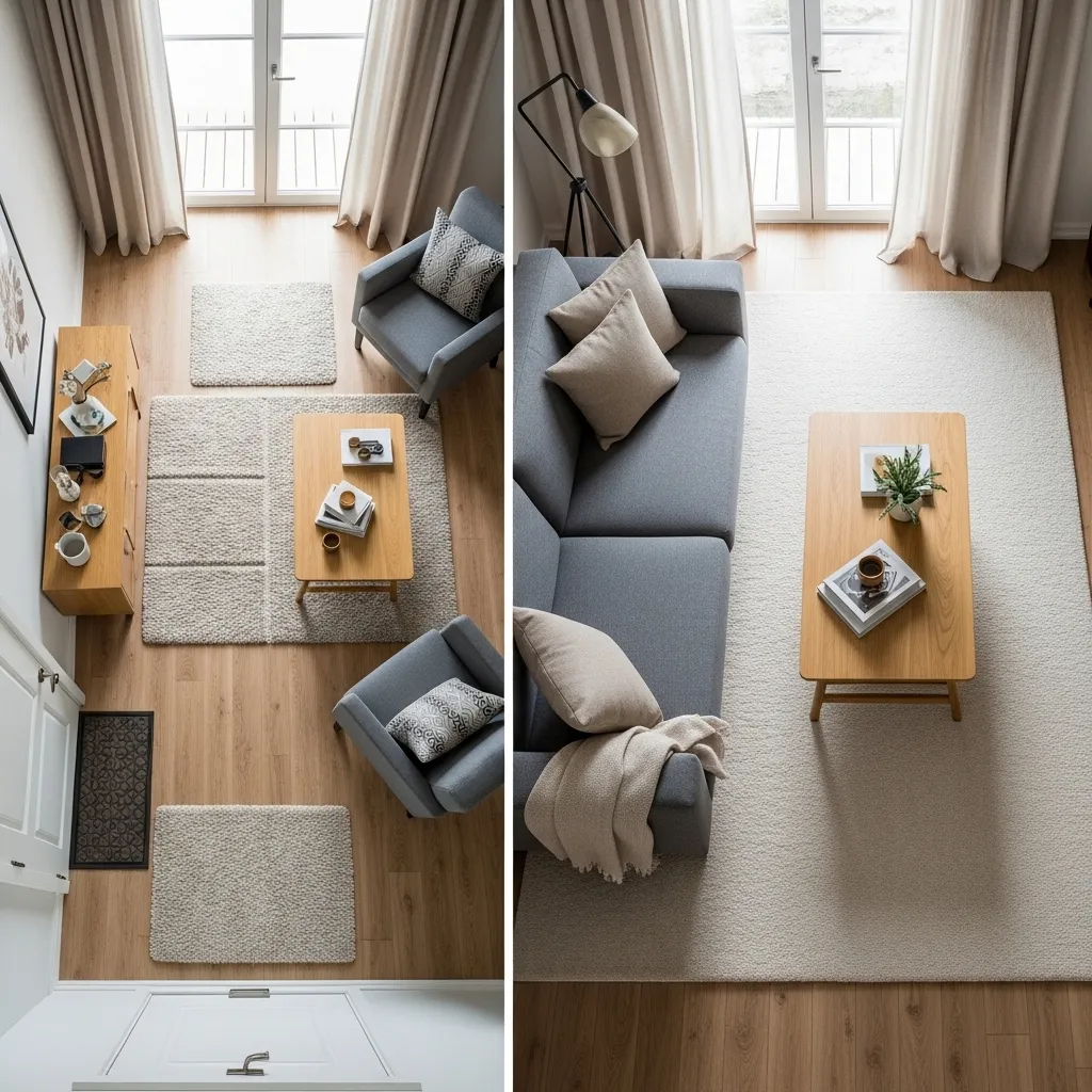
One large rug that extends generously under the seating group creates a dramatically more spacious feeling than multiple small rugs or a rug that’s too small for the furniture arrangement — because the single large rug reads as a continuous visual plane rather than a series of small zones, and continuous visual planes suggest generous, uninterrupted space in a way that fragmented zones don’t. The most common small room rug mistake is buying a rug that fits between the furniture rather than under it, which creates a small mat in the center of the room surrounded by exposed floor, making both the rug and the room appear smaller than either actually is.
The correct rug size for a living room seating arrangement is one where at least the front legs of all the major seating pieces sit on the rug — the sofa, the chairs, the ottoman — creating a unified furniture zone anchored by a single continuous rug. This placement connects all the furniture pieces to each other through the shared rug plane and creates a room-within-a-room quality that makes the seating area feel like a generous, specifically defined space rather than furniture floating on an exposed floor.
4. Edit Ruthlessly and Display Intentionally
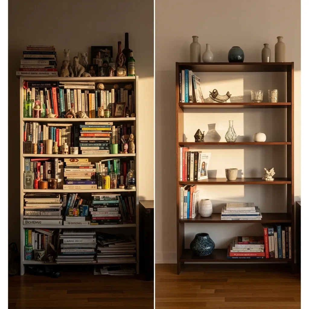
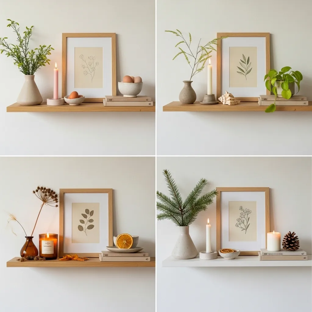
Ruthless editing of what’s displayed in a small space — combined with intentional, considered placement of what remains after editing — creates more visual spaciousness than any amount of mirrors or light paint colors, because the primary source of spatial compression in a small room is visual complexity, and the most direct way to reduce visual complexity is to remove the things that create it rather than trying to visually expand around them. A small room with fifty well-chosen, well-placed objects feels more spacious than the same room with three hundred objects of equal individual quality, because visual complexity consumes the space optically in a way that no physical object can compensate for.
The display principle that most effectively uses what remains after editing is the grouping-and-breathing-room approach — clustering related or visually similar objects in deliberate groupings with genuine empty space between the groupings rather than distributing objects evenly across every available surface. The empty space between groups allows the eye to rest and the room to breathe, and the contrast between the filled group and the empty space around it makes the displayed objects appear more beautiful and more deliberately chosen than the same objects would appear distributed without spacing across a fully covered surface.
5. Match the Largest Surfaces to Each Other
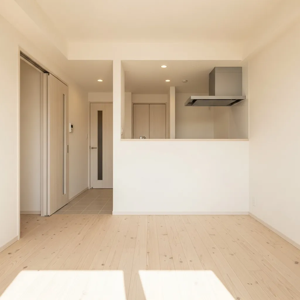
Matching the largest surfaces — floor, walls, and ceiling — across connected spaces or throughout a single room creates the most fundamental and most powerful spatial expansion available through purely decorative means, because the eye reads continuous surfaces as continuous space. When the floor transitions from wood to tile at the threshold between living room and kitchen, the eye reads a boundary, a room-end, a spatial conclusion — and the space on either side of that boundary reads as smaller because the boundary defines its limits. When the same floor continues without transition, the eye reads continuous, uninterrupted space and the perceived dimensions of the combined space expand beyond either individual zone.
The specific matching that creates the most expansion in a small space is floor continuity — keeping the same floor material and tone throughout rather than transitioning at doorways or between zones. This single decision is often worth more spatial expansion than any furniture arrangement or decorative technique because the floor is the room’s largest single surface and its continuity or interruption determines more than any other element whether the space reads as one generous room or several small ones.
6. Use Vertical Space With Floor-to-Ceiling Storage
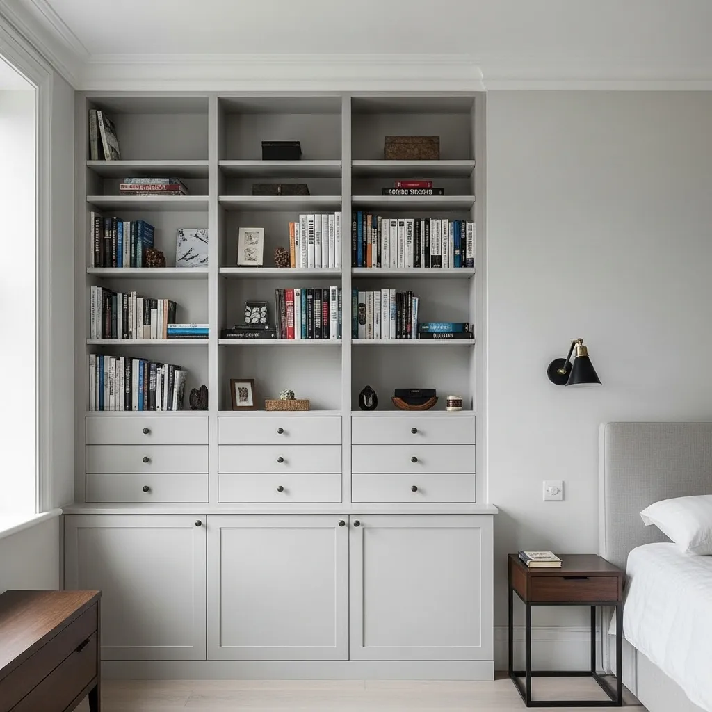
Floor-to-ceiling storage in a small room achieves two things simultaneously that no other furniture configuration can — it maximizes storage in the vertical dimension that small rooms typically under-use, and it creates the strong vertical line from floor to ceiling that makes the room feel taller. Storage that stops at standard bookshelf height — typically six to seven feet — leaves a gap between the top of the shelving and the ceiling that the eye reads as wasted space, and that wasted space makes the ceiling feel lower rather than higher because it creates a zone of unoccupied vertical space that reads as architectural limitation rather than spatial generosity.
Built-in floor-to-ceiling shelving that spans the full width of a wall has an additional spatial benefit beyond its vertical line — it reads as architecture rather than furniture, as a permanent feature of the room rather than a piece that was placed there. This distinction matters spatially because furniture reads as an addition to the room’s space while built-in architecture reads as the definition of the room’s space, and rooms where the storage is architecturally integrated always feel more spacious than rooms where the same storage exists as freestanding pieces that occupy the floor plane.
7. Choose Furniture With Exposed Legs
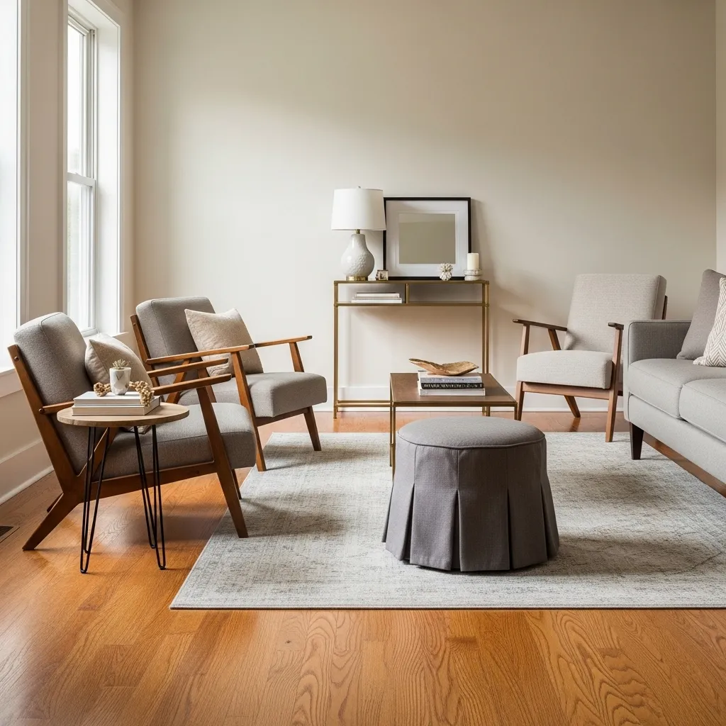
Furniture with visible legs that raise the piece above the floor creates the most effective continuous floor plane in a small room — because the floor, which is the room’s largest single surface, is only visible where furniture isn’t sitting on it. Every piece of floor-length furniture (a sofa with a skirted base, a credenza that reaches to the floor, a bed with a solid platform) eliminates the floor beneath it from the room’s visual equation, shrinking the perceived floor area. Every piece of furniture with legs that raise it clearly above the floor contributes the floor beneath it back into the room’s visual floor plane, creating the impression of a larger, more continuous floor surface than the furniture’s footprint would otherwise allow.
The height of the legs matters — the higher the furniture is raised above the floor, the more floor is visible beneath it and the more spatially generous the effect. A sofa on six-inch tapered legs creates a comfortable visual gap that reads as continuous floor plane; a sofa on two-inch bun feet creates so small a gap that it reads as effectively floor-length. The slim leg is also specifically better than the thick leg because thin legs interrupt the floor plane visually less than thick legs — a sofa on four slim tapered legs appears to float above the floor in a way that a sofa on four substantial square legs doesn’t.
8. Embrace One Bold Design Decision Instead of Many Small Ones
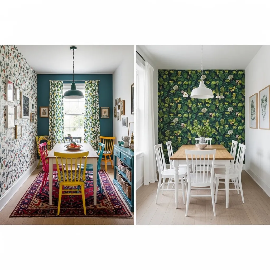
Making one bold design decision in a small room — one dramatic wallpaper wall, one deep paint color, one statement piece of furniture, one significant artwork — while keeping everything else as simple and quiet as possible, creates a room with both strong character and visual calm simultaneously. This approach contradicts the conventional small space advice to keep everything safe and neutral, but it produces better results because a room with one bold focal point and calm surroundings reads as more spatially generous than a room with many competing small decisions, which create visual noise that the eye reads as spatial compression.
The single bold decision creates a focal point — a specific place where the eye goes first and rests meaningfully before moving through the rest of the space. A room with a clear focal point feels organized and navigable in a way that a room without one doesn’t, and that quality of visual organization reads as spatial clarity, which the eye interprets as spaciousness. The simplicity of everything around the focal point is what makes both the focal point and the space feel generous — the bold wallpaper wall reads as more dramatic against simple white walls than it would against other competing elements, and the simple white walls read as more spacious when they’re not competing with other design decisions for the eye’s attention.
9. Use Mirrors Strategically, Not Prolifically
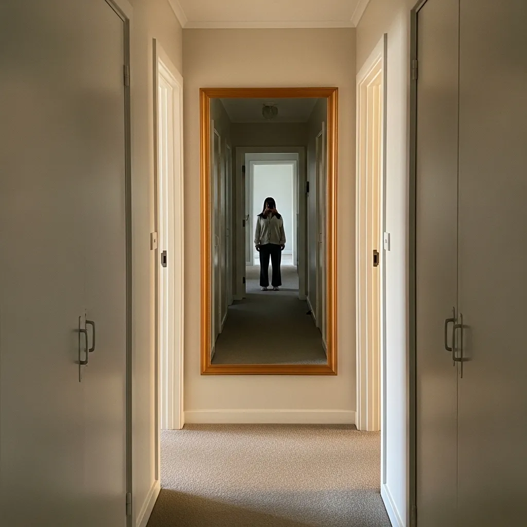
A single large mirror in a strategically chosen position creates more spatial expansion than multiple small mirrors distributed throughout a room — because the spatial expansion effect of a mirror depends on the reflected view being large enough and clear enough to read as a credible extension of the actual space. A large mirror reflecting a significant view of the room back into the room creates the impression that the room continues beyond the mirror’s surface; multiple small mirrors create multiple small reflections that the eye reads as decorative rather than spatial, as reflective surfaces rather than spatial expansions.
The strategic position for a mirror in a small space is opposite or adjacent to the room’s best light source — typically a window — so that the mirror reflects daylight into the room from an additional direction and reflects the view of the window itself, creating the impression that there’s a second source of natural light in the space. A mirror positioned to reflect a window makes a room feel brighter and more open than its single window would suggest, and that quality of apparent additional natural light source is the most effective single spatial expansion a mirror can create.
10. Keep the Ceiling Light and the Walls Slightly Darker
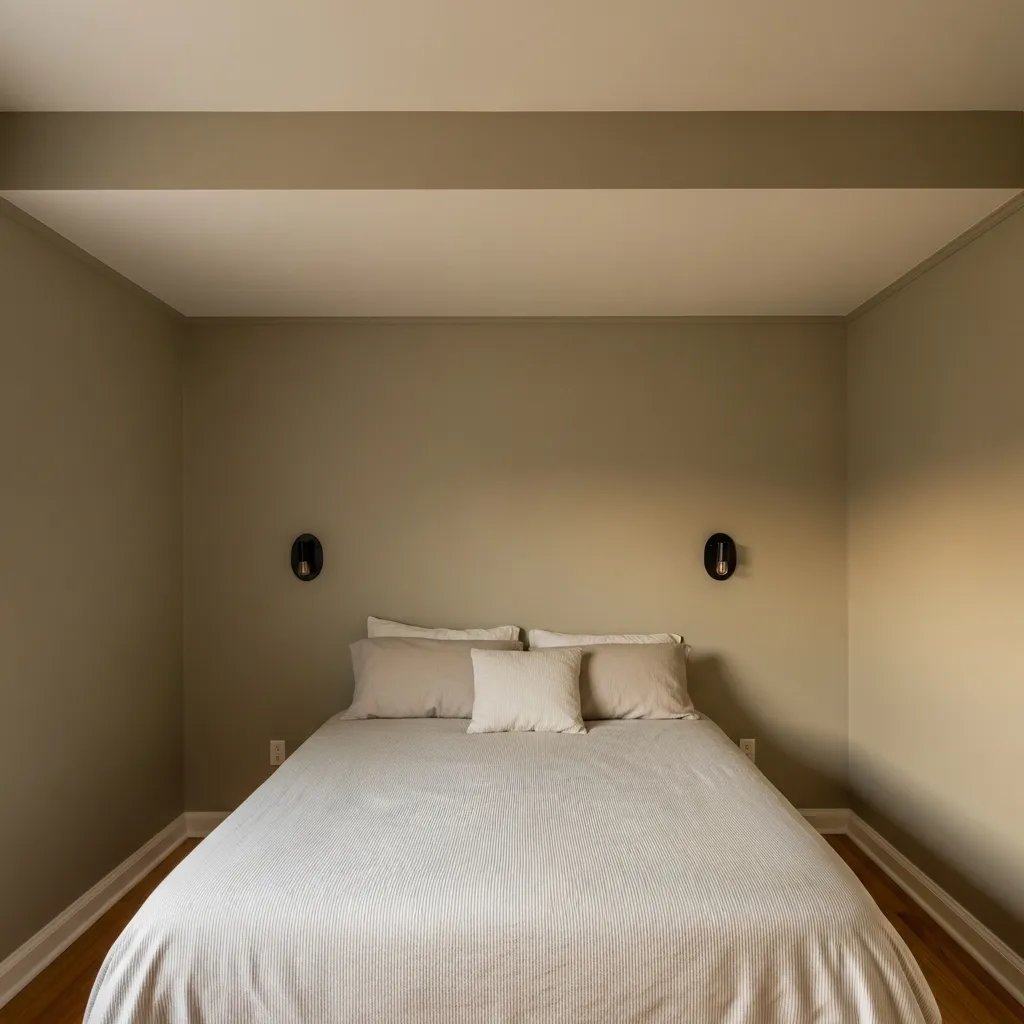
A ceiling painted slightly lighter than the walls — rather than the conventional bright white ceiling against any wall color — creates a more sophisticated and more spatially effective relationship between the room’s vertical surfaces than the standard approach of contrasting white ceiling and colored walls. When the ceiling is bright white against colored walls, the eye reads the boundary between wall and ceiling as a sharp contrast line that effectively defines the room’s height limit, drawing attention to the ceiling plane and making it feel lower. When the ceiling is a lighter version of the wall color, the transition from wall to ceiling is gentle and continuous, and the ceiling appears to float rather than press down.
The corollary — painting the trim the same light tone as the ceiling rather than in bright white — creates an even more complete envelope effect where the ceiling, cornice, and trim all form a single lighter plane that visually recedes from the slightly deeper wall color. This creates a room where the walls are the defining architectural element and the ceiling is a light, receding surface above them, which is the spatial relationship that makes the ceiling feel highest and most generously proportioned.
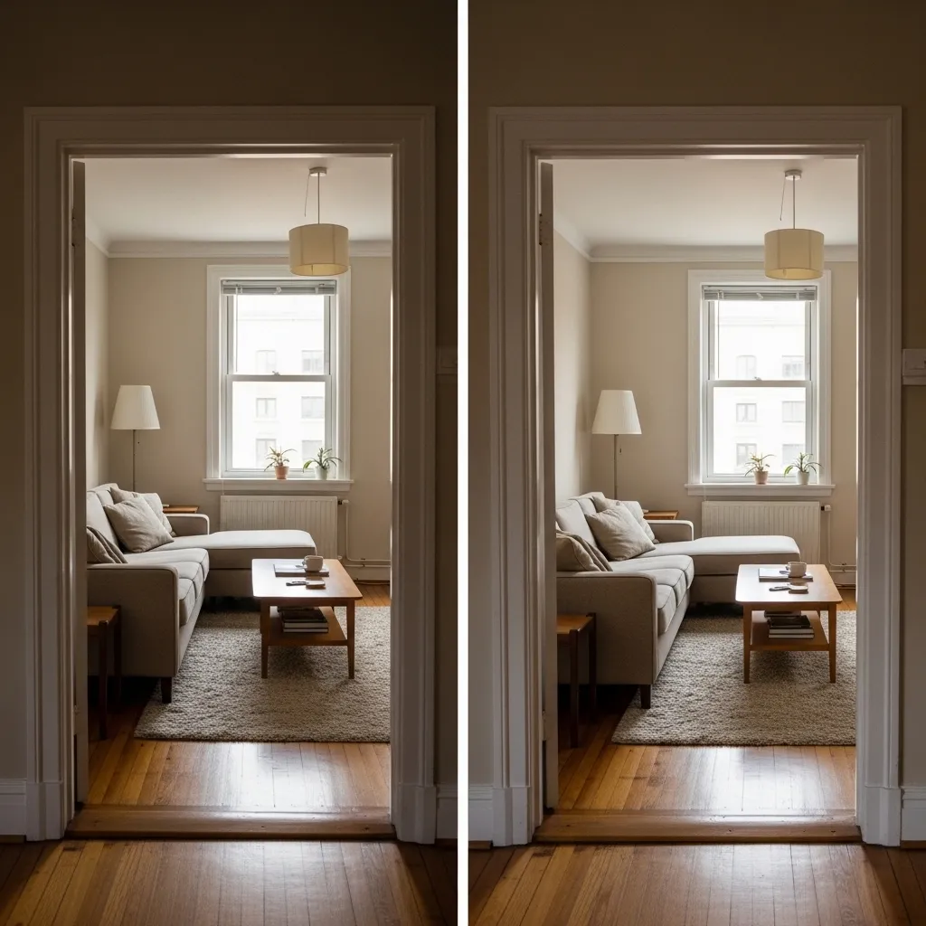
11. Create Zones With Lighting Rather Than Furniture
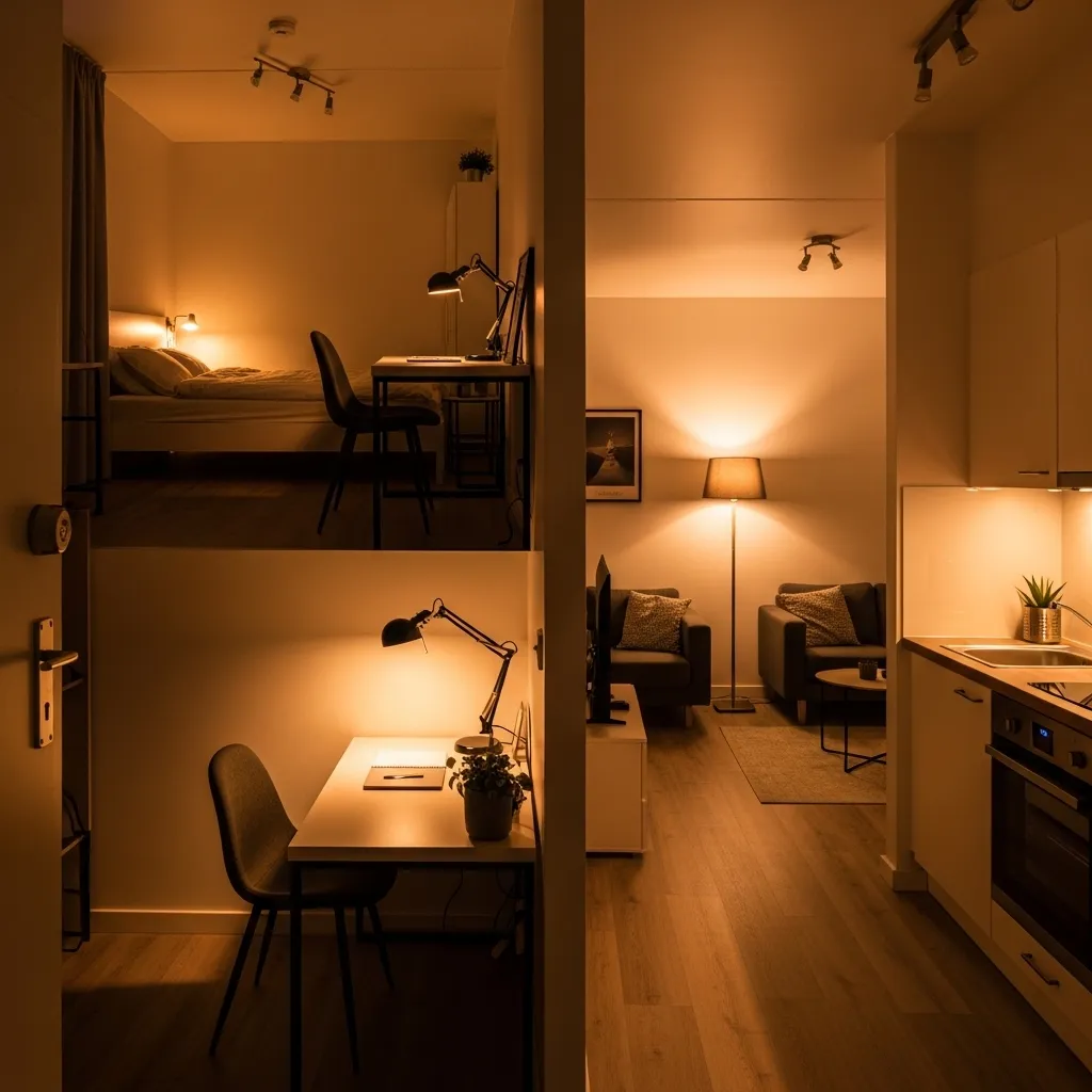
Creating zones with lighting rather than furniture or physical dividers is the small space technique that adds the most spatial and functional complexity to a single room without adding any furniture, without reducing floor space, and without creating the visual divisions that make a small room feel smaller. Furniture-based zoning — using a shelving unit or sofa as a room divider — creates zones but reduces each zone’s size and adds to the visual complexity of the space. Lighting-based zoning creates zones through the atmospheric quality of different light rather than through physical separation, which means the space is simultaneously one cohesive room and multiple distinct areas.
The quality of each zone’s light should be specifically matched to the activity it supports — warm, low-level, ambient light in the living and sleeping zones that creates relaxation and comfort, focused task light in the working and kitchen zones that supports concentration and food preparation, accent lighting in any display zones that draws attention to specific objects or surfaces. The difference in light quality between zones creates a perceptual separation that the brain reads as spatial distinction even when there’s no physical boundary between them.
12. Use Stripes and Vertical Pattern to Extend Height
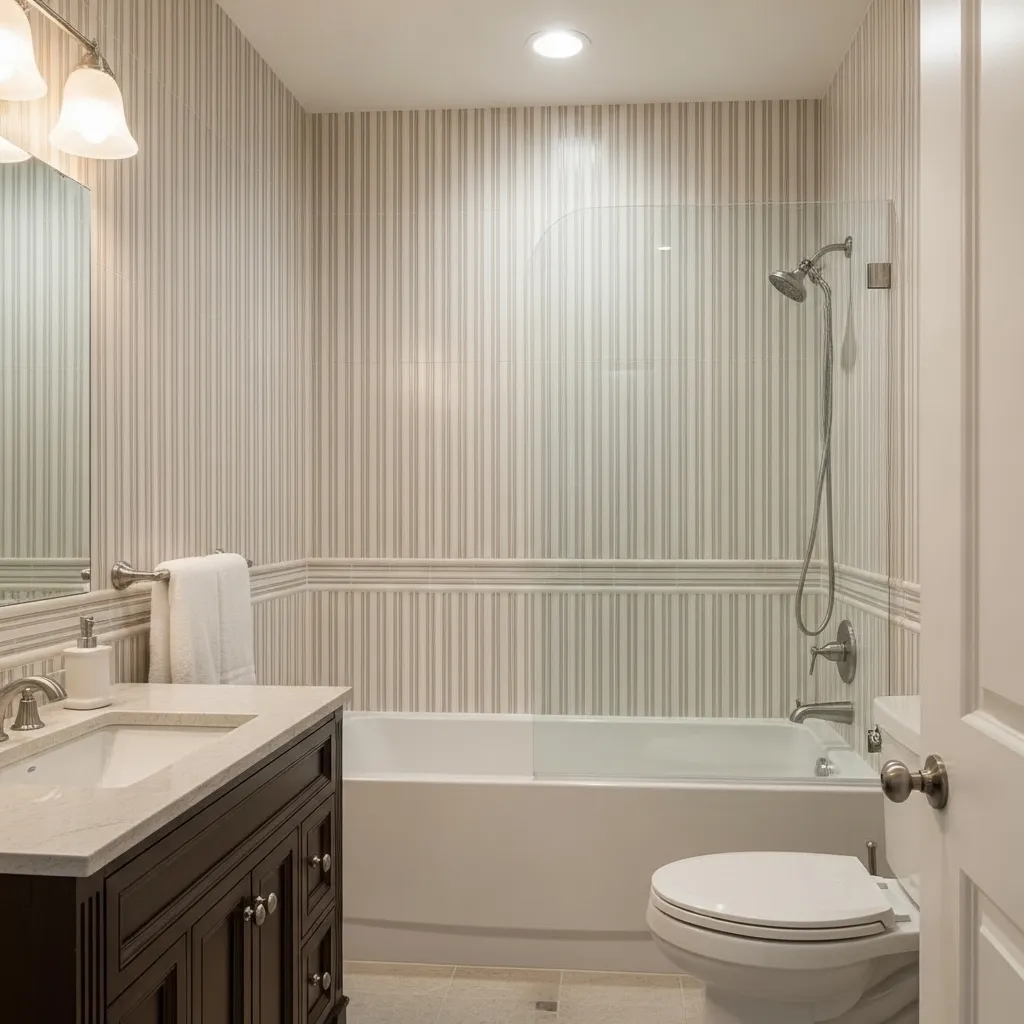
Vertical stripes in pattern, tile format, or wall treatment create perceived height in a small room because the vertical line is the direction of height, and a surface covered in vertical lines trains the eye to move in the direction of height rather than across the room’s width or depth. The effect is consistently powerful regardless of whether the stripes are bold and contrasting or subtle and tonal — the direction of the line matters more than its visual weight, which means that vertically stacked tiles in the same color create height expansion almost as effectively as dramatically contrasting vertical stripes.
The bathroom is the room where vertical tile format most consistently creates the greatest spatial improvement because bathroom tiles are typically seen at very close range in a very small space, and at close range the direction of the tile format’s longest dimension becomes the dominant visual line in the room. Tall, narrow tiles installed vertically create a room that feels genuinely taller; wide, short tiles installed horizontally create a room that feels lower and more compressed. The same square footage of tile in a different format creates a measurably different quality of perceived space.
13. Reduce Visual Clutter at Eye Level
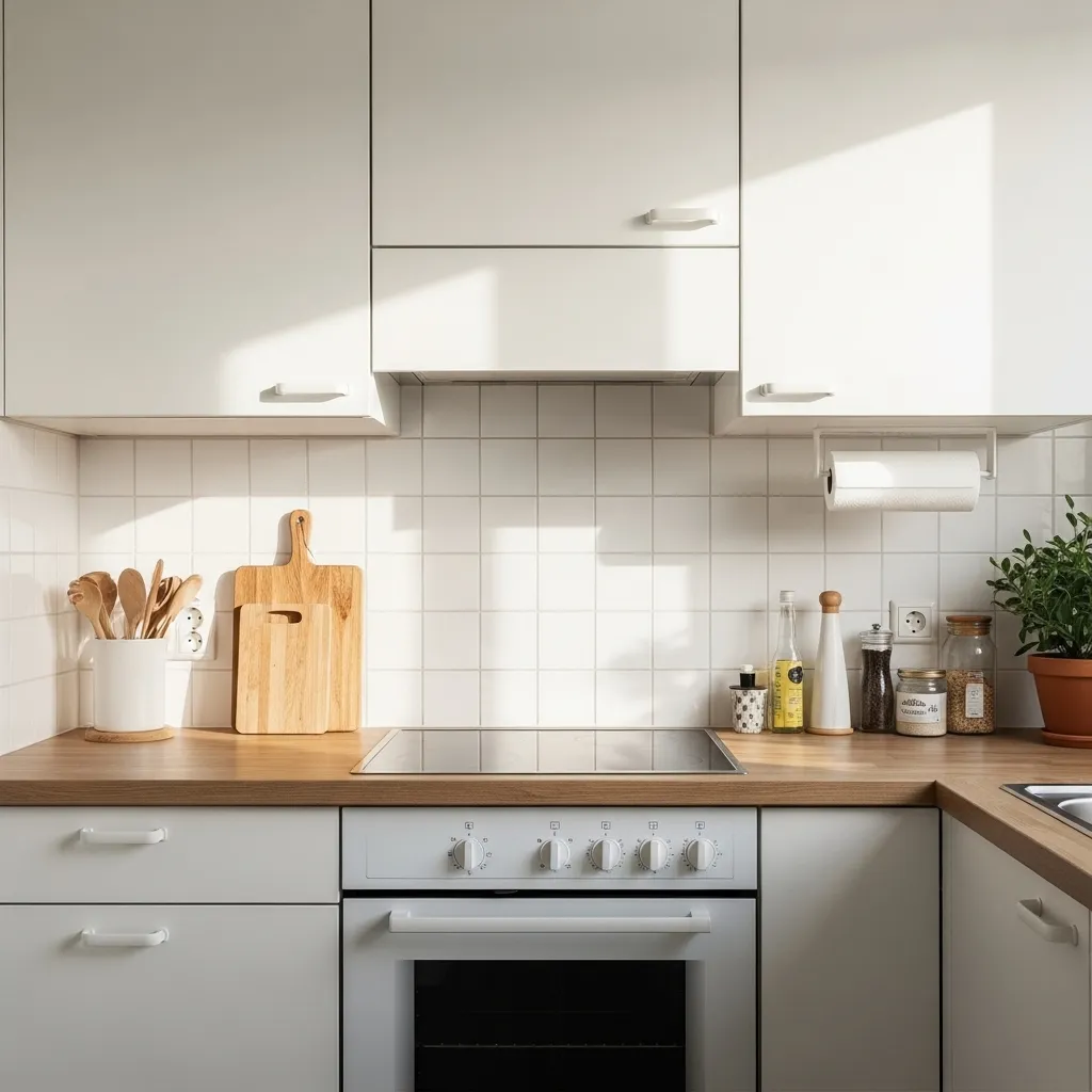
The eye-level zone — approximately the eighteen inches of vertical space between four feet and six feet from the floor — is where visual clutter is most spatially damaging in any room because it’s the zone that the eye naturally scans most consistently when moving through a space. Visual clutter at eye level is experienced as the room’s primary spatial quality, while visual clutter at floor level or above head height is experienced as less dominant because the eye spends less time there. Clearing eye-level surfaces of everything except intentional, beautiful, or actively functional objects creates more perceived spaciousness than clearing any other zone in the room.
The kitchen is the room where eye-level clutter most consistently accumulates and most consistently compromises spatial quality — small appliances on countertops, paper towel holders, knife blocks, mail, keys, charging cables, and the accumulated objects of daily kitchen life all tend to gather at counter height, creating a visual complexity that makes even generous kitchens feel cluttered and small kitchens feel genuinely oppressive. The discipline of clearing and maintaining the kitchen eye-level zone is the single maintenance habit with the highest ongoing return on perceived spatial quality.
14. Use Transparent and Reflective Furniture
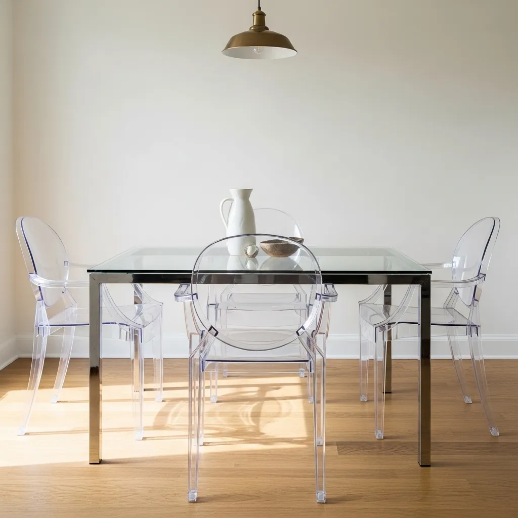
Transparent and reflective furniture — glass-top tables, acrylic chairs, mirrored surfaces — creates the spatial expansion effect that solid furniture prevents, because transparent furniture returns the floor and wall space it physically occupies to the room’s visual equation. A solid wood dining table with four solid wood chairs occupies the dining area both physically and visually — the floor beneath the table and the wall behind the chairs disappear behind solid surfaces. A glass-top table with acrylic chairs occupies the same physical space but returns most of it visually — the floor beneath the glass table remains visible, the wall behind the clear chairs remains visible, and the dining area reads as considerably less occupied than it actually is.
The specific furniture pieces where transparency or reflectivity creates the most spatial benefit are those with the largest surface area relative to the room — dining tables, coffee tables, side tables, and chairs — because these are the pieces that occupy the most floor and wall space in a room and whose transparency therefore returns the most visual space. A glass coffee table floating over an area rug is particularly effective because both the floor and the rug are visible through the glass, creating a layered floor surface that appears more generous than the same space covered by a solid table.
15. Design for One Life, Not for Resale or Approval
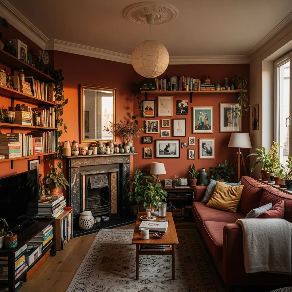
Designing a small space for one specific life — your actual life, with your actual objects and your actual aesthetic preferences and your actual functional needs — rather than for the imagined approval of guests or potential future buyers creates a space that feels genuinely generous because it feels genuinely right. The small spaces that feel most cramped and most uncomfortable are almost never the ones with the strongest personalities and the most personal expression; they’re the ones designed to the generic standard of inoffensive neutrality that forecloses personal expression in the hope of universal approval and instead creates universal indifference.
The deep terracotta wall in a small room, painted because the person who lives there finds deep terracotta genuinely beautiful, creates a spatial quality that a cautious greige wall in the same room doesn’t — it creates the quality of a room that has been chosen, that has been specifically created for a specific person’s pleasure, that communicates intention and commitment. And rooms that communicate intention and commitment feel more generously designed than rooms that communicate caution and compromise, regardless of their square footage. The most powerful tool for making a small space feel bigger is the conviction that it can be beautiful exactly as it is — not despite its smallness but within it, through the specific, personal, committed design decisions that only someone living fully and happily in that space would make.