15 Ways to Style Shelves, Consoles, and Corners So They Look Intentional, Layered, and Genuinely Beautiful
If the shelves in your home currently look like either a storage solution that got slightly out of hand or a series of objects placed there because they had nowhere else to go — if your console table is functioning as a landing zone for whatever arrived in the house most recently, if your room corners are empty because you genuinely don’t know what to do with them, if you’ve bought beautiful objects that somehow don’t look beautiful once you put them somewhere — this guide is the one that addresses the actual mechanics of why some styled surfaces look effortlessly composed and others look like they’re trying very hard and still not quite working. The fifteen approaches here cover every category of styling challenge: the foundational triangle principle that creates visual stability in almost any arrangement, the specific art of the bookshelf vignette, how to layer objects at different depths to create dimension, the console table as a complete design moment, what to do with corners at floor level versus at ceiling height, how to mix textures and materials within a single vignette, the role of negative space and when emptiness is the point, how living plants and botanicals change every arrangement they enter, the principles of height variation that prevent flatness, how to style a shelf when books are involved, the mantelpiece as its own distinct styling environment, how to approach a corner with large-scale objects, the floating shelf cluster approach, the difference between a styled surface and a collected surface, and the seasonal update approach that keeps styled spaces feeling alive rather than permanent and finished.
Shelf and surface styling is the area of home design where I consistently see the widest gap between the quality of the individual objects people own and the quality of the arrangements those objects end up in — beautiful ceramics sitting in rows like suspects in a lineup, interesting books arranged spine-out with nothing to break the uniform regiment, genuinely lovely objects accumulated on a surface without any organizing principle until the surface disappears under its own contents. The objects are right; the arrangement is what’s missing. And arrangement is a learnable skill — it’s not taste or intuition or the mysterious gift of some people and not others, it’s a set of principles that can be understood and applied and practiced until they become second nature, and this guide is where those principles live.
What makes a styled surface look genuinely beautiful rather than merely filled is the quality of the relationships between objects — the way a tall object creates height that a medium object beside it uses as context, the way a textured surface makes a smooth surface beside it appear smoother, the way a living plant beside a ceramic object makes the ceramic appear more crafted and the plant appear more deliberately chosen, the way negative space around a group of objects makes the group more visible and more beautiful than the same objects with no space around them. These relationships are what you’re designing when you style a surface — not a collection of individual objects but a composition of objects in relationship, and the composition is what the eye actually sees.
1. The Triangle Principle — The Foundation of Every Vignette
The triangle principle — arranging objects so that their highest points form an implied triangle rather than a straight horizontal line — is the foundational composition principle that creates visual stability and visual interest in almost any styled surface, because the triangle is the most stable geometric form and the most visually satisfying. A row of objects at the same height creates a flat, boring horizon; a random scattering of objects at different heights creates visual chaos; objects arranged so their heights form an implied triangle creates a composition that the eye can read as organized and intentional while remaining dynamic and interesting.
The specific power of the triangle as a compositional form is that it creates movement — the eye enters the composition at the lowest point, travels up to the peak, moves across to the medium height, and returns to the lowest point in a circuit that keeps the eye engaged without requiring conscious effort. This eye movement is what makes a triangular arrangement feel alive and interesting while a flat linear arrangement feels static and resolved, and it’s why the triangle principle applies not just to three-object vignettes but to any grouping of any number of objects — you’re always looking for the implied triangular movement in the height relationships of the group.
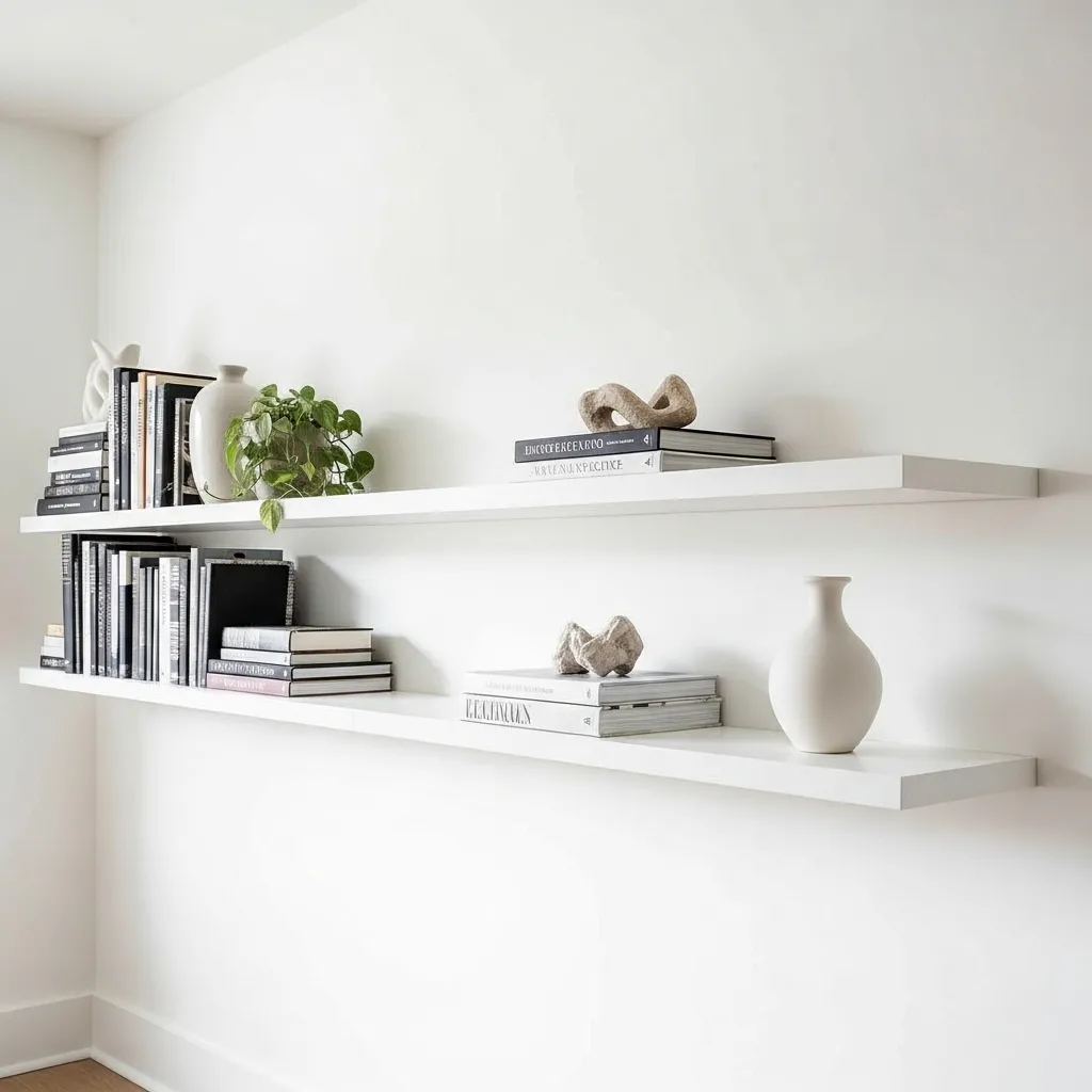
2. The Bookshelf Vignette — Breaking the Book Regiment
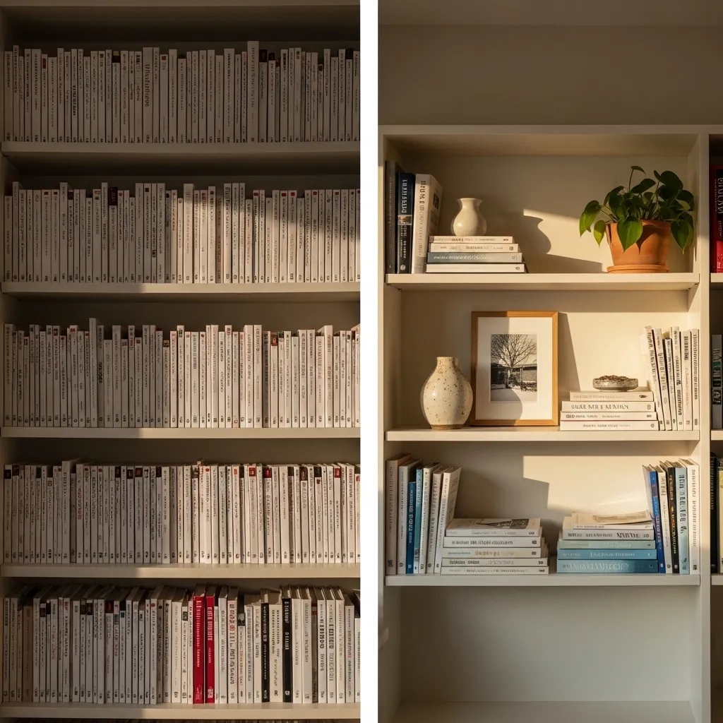
Breaking the uniform regiment of books on a shelf — the arrangement where every book stands upright, packed as densely as possible from left edge to right edge with no variation — is the single change that most transforms a bookshelf from storage into styled surface, because the introduction of horizontal book stacks, object groupings, and genuine empty space between book clusters creates the variation in height, depth, and texture that makes the eye read a shelf as a composed arrangement rather than a filled container.
The specific techniques for breaking the book regiment are: creating horizontal book stacks at regular intervals (two or three books laid flat create a platform for a small object and break the uniform vertical direction of the spine row), leaving the occasional section of empty shelf back visible as breathing room between groupings, leaning one framed piece against the back of the shelf rather than hanging it (the lean creates casualness and depth), and placing one plant, one ceramic, and one personal object within each major shelf section so that no shelf section is ever more than two-thirds books. These techniques applied together transform a bookshelf from reference library to styled display without compromising its functional capacity.
3. The Depth Layering Technique
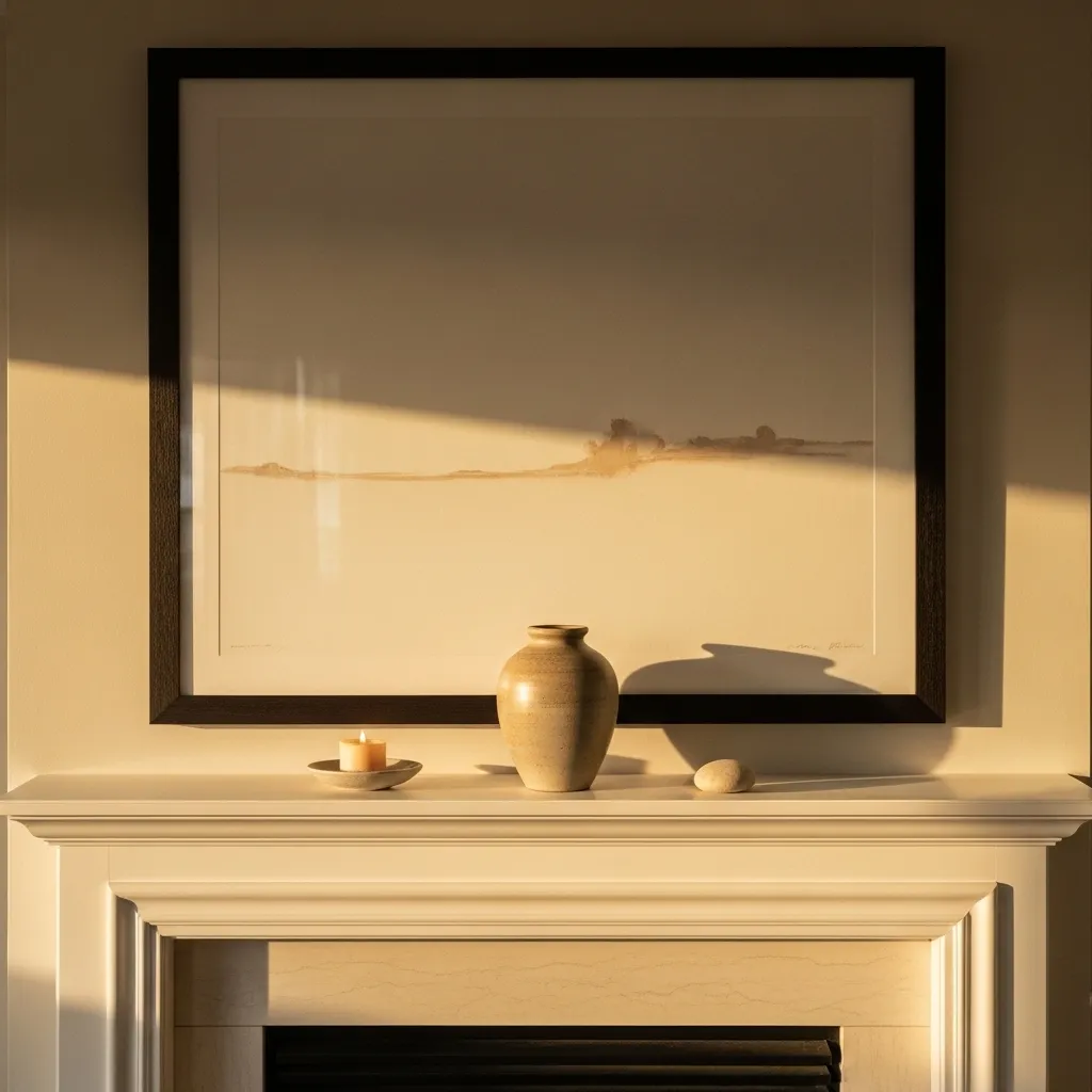
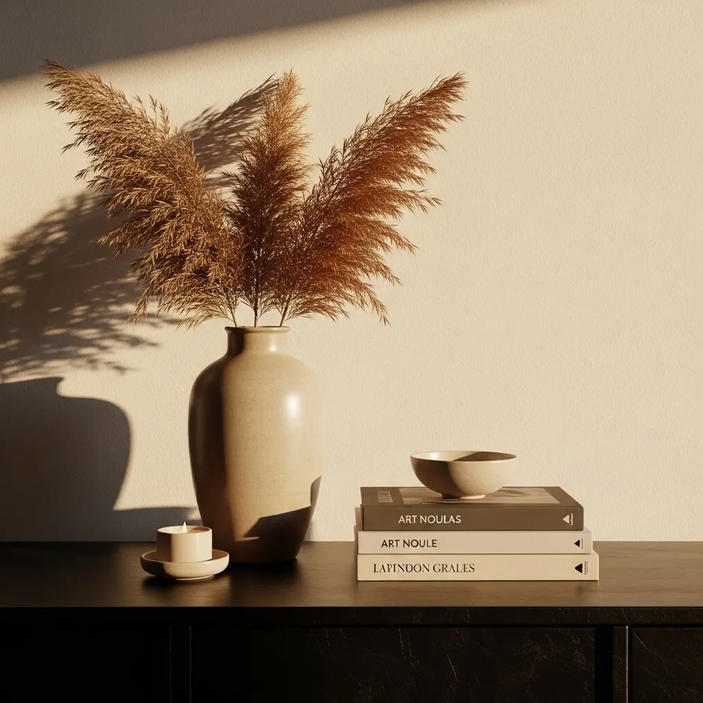
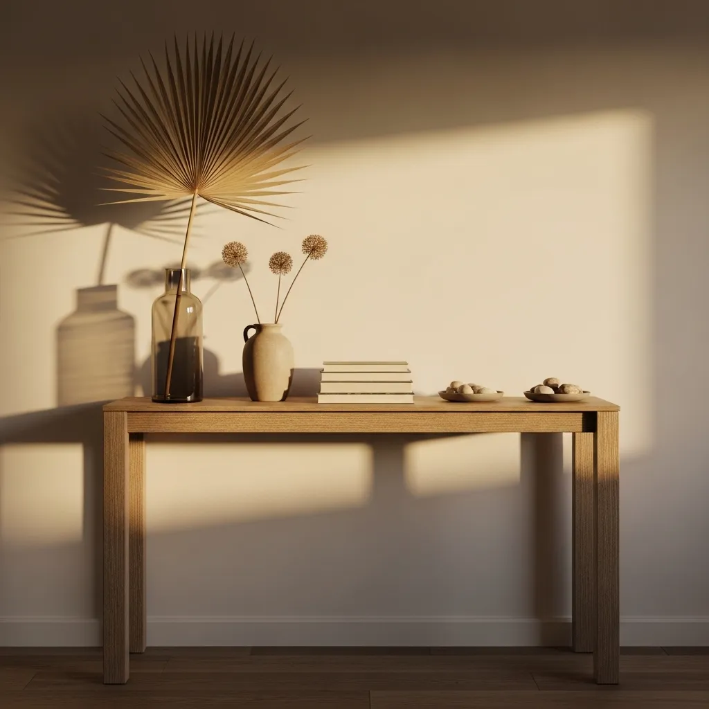
Depth layering — arranging objects at different distances from the wall so that the composition has a front layer, a middle layer, and a background layer — creates the three-dimensional quality that distinguishes a genuinely styled surface from a flat arrangement of objects placed on a horizontal surface. When all objects sit at the same depth — all pushed back against the wall, all pulled forward to the edge, or all in a single line — the arrangement reads as flat and one-dimensional. When objects are distributed across three depths, the eye reads genuine spatial recession into the arrangement and the surface appears to have a dimension of depth that the wall-flat arrangement entirely lacks.
The background layer is typically the largest or tallest element — a large framed piece leaning against the wall, a tall vase, a mirror. The middle layer is typically the medium-sized objects that create the primary composition — ceramics, smaller vases, stacked books with objects on top. The foreground layer is the smallest and most delicate objects — a candle, a stone, a small leaf or botanical — that sit closest to the viewer and create the visual invitation to look more closely at the arrangement. This front-to-back progression of scale — largest at the back, smallest at the front — creates the same spatial logic as theatrical staging and creates an arrangement that reads correctly from across the room and rewards close inspection simultaneously.
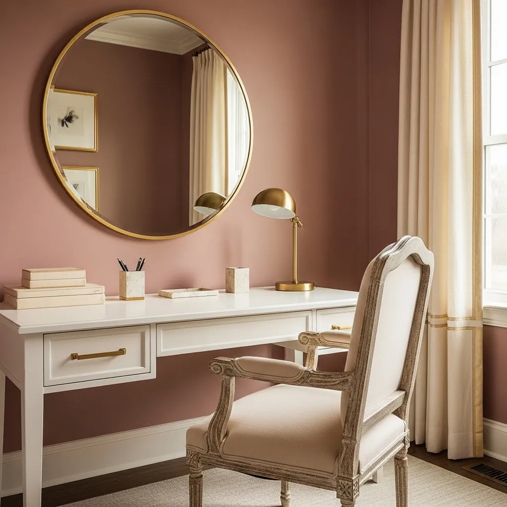
4. The Console Table as a Complete Design Moment
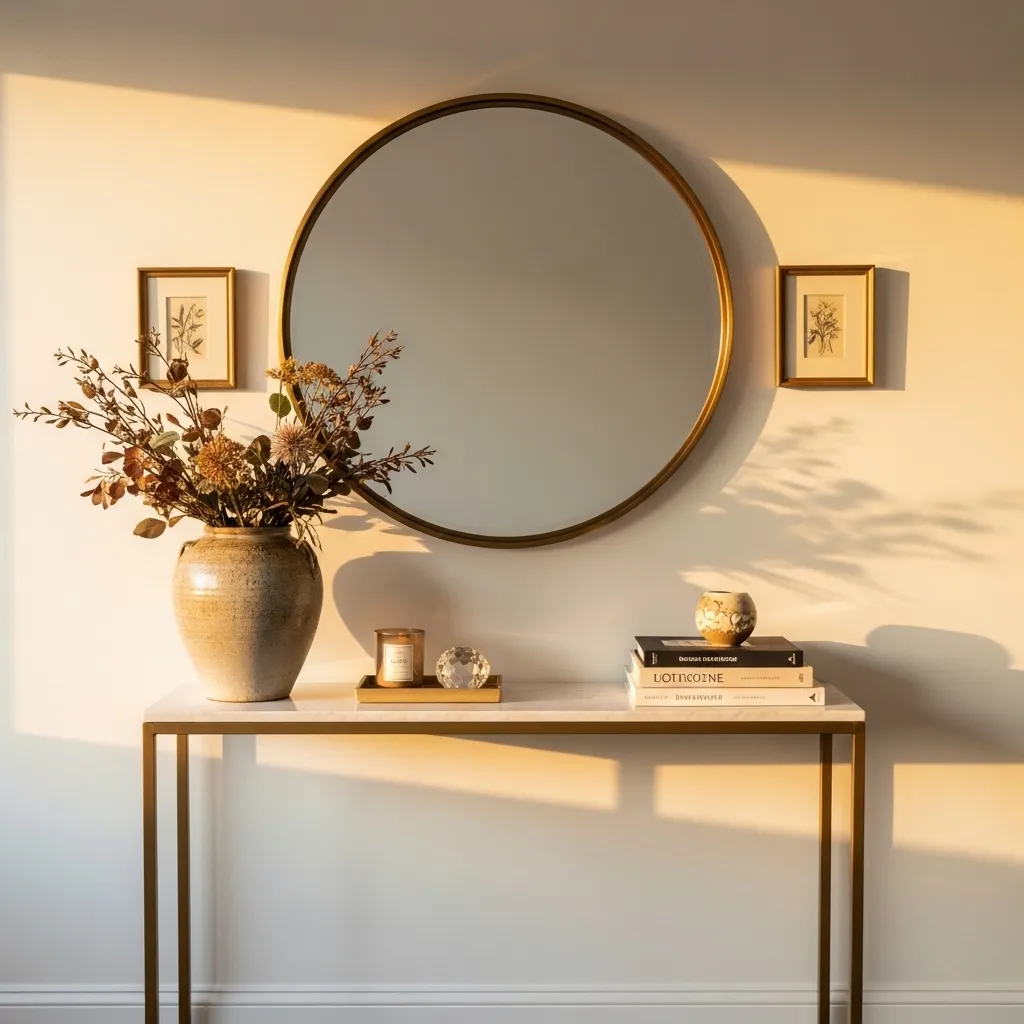
A console table styled as a complete design moment — where the table surface, the wall above it, and the objects on and around it are considered as a single composition rather than as independent elements — creates a spatial focal point of genuine presence and genuine design intention. The console table that has only been styled on its surface, with the wall above left bare, reads as an incomplete composition — the eye moves through the table objects, arrives at the wall, finds nothing and nowhere to go, and the arrangement feels unresolved. The console table with a complete wall treatment above it — a mirror, an artwork, a grouped arrangement of framed pieces — creates a composition that fills the full vertical zone from tabletop to the height of the mirror or artwork and reads as a complete, resolved design moment.
The mirror above the console table is the most consistently successful wall element because it fulfills multiple functions simultaneously — it creates the vertical completion that the composition needs, it reflects the objects on the table surface making them appear more dimensional and more beautiful, it reflects light into the hallway or room creating spatial expansion, and it creates a practical functional element (checking your appearance as you leave) that justifies the console table’s existence as a piece of functional furniture rather than purely decorative. The mirror size relative to the table width is the critical proportion — a mirror that’s approximately the same width as the table or slightly narrower creates the most balanced relationship, while a mirror significantly narrower than the table looks undersized and a mirror significantly wider looks disproportionate.
5. Odd Numbers and Why They Work
Odd numbers in object groupings — groupings of three, five, or seven rather than two, four, or six — create visual dynamism that even numbers lack because odd-number groupings can’t be divided into two equal halves, which means the eye reads them as unified compositions rather than as balanced pairs. An even-number grouping of objects has an inherent symmetry that the eye resolves into two halves and immediately categorizes as symmetrical — complete, stable, resolved, but visually static. An odd-number grouping has an inherent asymmetry that the eye must read as a whole rather than as two halves, creating the visual movement and interest that static symmetry doesn’t generate.
The group of three is the smallest odd grouping and the most versatile compositional unit in shelf and surface styling — three objects of different heights, textures, and scales create the complete triangle composition that provides both height variation and horizontal variety within the smallest possible footprint. Three objects thoughtfully selected and placed can create a complete, beautiful vignette on a surface as small as a bedside table or as large as a long console, and the principle scales up — five objects create a more abundant version of the same triangular logic, seven objects create a genuinely rich vignette.
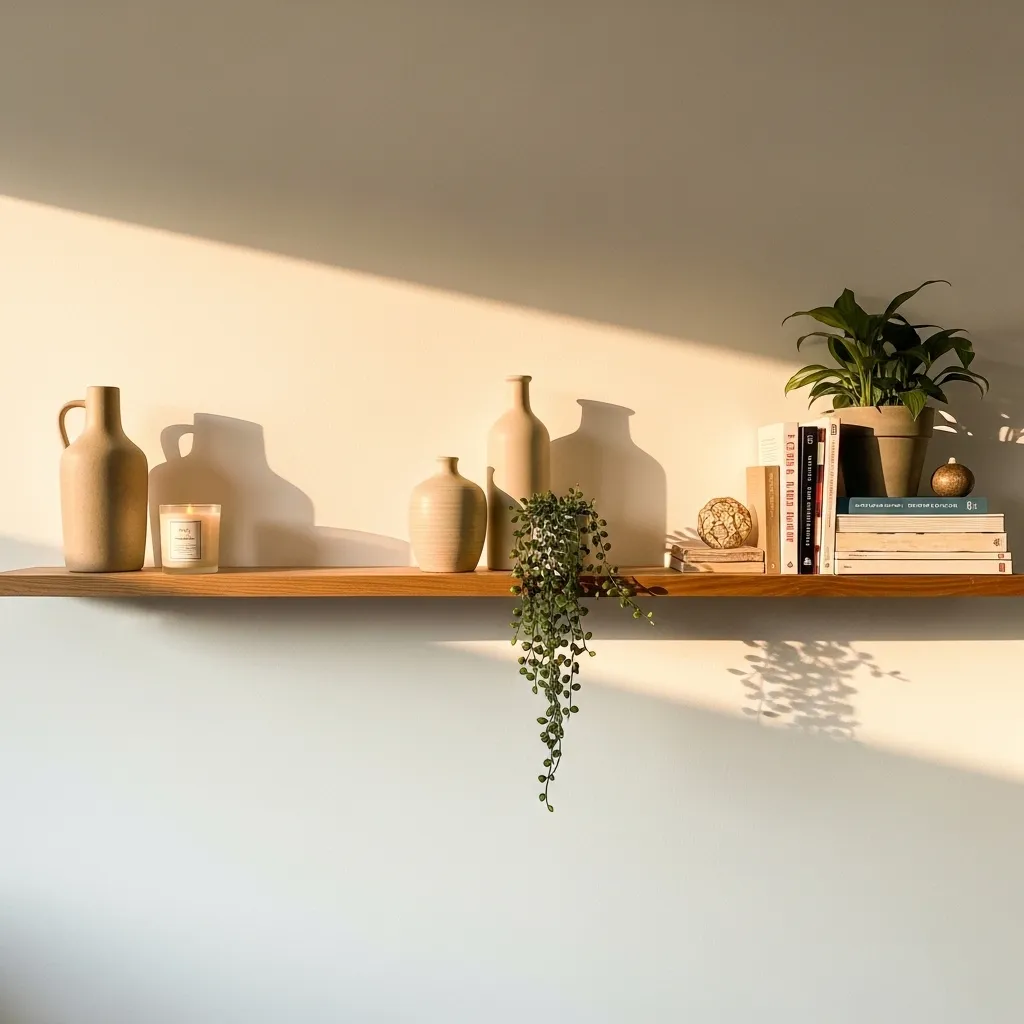
6. The Role of Living Plants and Botanicals
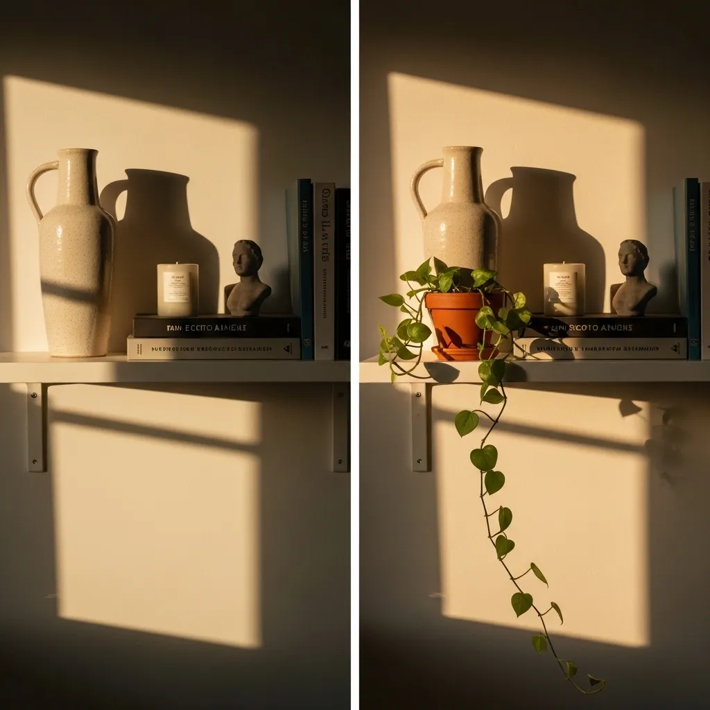
A living plant or fresh botanical element in a shelf or surface arrangement is the addition that most transforms a styled surface from a still life into something alive — because living plants have the specific quality of organic irregularity and genuine growth that ceramic and glass and wood objects, however beautiful, can never replicate. A trailing pothos whose vine has grown beyond the shelf edge, a small succulent whose rosette form is perfectly geometric in its own botanical way, a stem of eucalyptus in a small vase whose leaves create a specific quality of soft grey-green — these are not decorative objects that happen to be made of plant material; they are living things, and their presence in an arrangement of non-living objects creates a quality of natural energy that changes the entire atmosphere of the composition.
The specific botanical additions that work best in shelf styling are those with a quality of casual, natural growth rather than arranged floral composition — trailing plants that grow beyond their pot and shelf edge, dried botanicals with interesting structural forms (dried allium heads, cotton stems, pampas grass), single stems of foliage in small vases rather than full arrangements. These naturalistic botanical elements create the quality of nature having inhabited the shelf rather than having been placed on it, and that quality of natural inhabitation is the atmospheric element that transforms a beautifully styled shelf into a shelf that feels genuinely alive.
7. Negative Space — When Emptiness Is the Point
Intentional negative space — empty sections of shelf or surface left deliberately clear of objects — is the styling technique that most experienced designers use and that most beginners find most difficult to execute because it requires resisting the instinct to fill available space rather than actively creating emptiness as a design element. The empty space around an object grouping is not wasted space; it’s the visual breathing room that allows the objects in the grouping to be fully seen, that creates the contrast between filled and empty that makes both the objects and the emptiness more beautiful, and that communicates the deliberate editing and curation that distinguishes a styled surface from an accumulated one.
The practical ratio of filled to empty shelf space that creates the most beautiful result is approximately sixty percent occupied and forty percent empty — enough objects to create richness and visual interest, enough empty space to allow the eye to rest and the objects to breathe. A shelf that’s eighty percent occupied feels crowded regardless of the beauty of the individual objects; a shelf that’s twenty percent occupied feels sparse and unresolved. The sixty-forty ratio can be achieved by distributing objects in grouped clusters with clear empty sections between them rather than distributing objects evenly across the full shelf length, which tends to create a uniform low-level visual density that reads as neither rich nor spacious.
8. Texture Mixing Within a Single Vignette
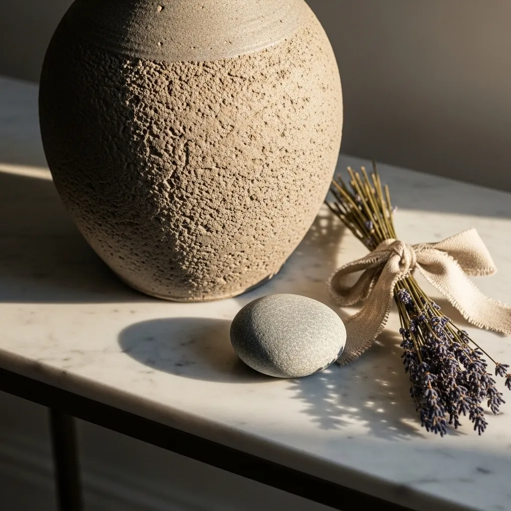
Mixing textures within a single vignette — ensuring that the objects in a grouping have clearly different surface qualities rather than sharing the same texture type — creates the tactile and visual richness that makes a vignette feel genuinely luxurious rather than merely decorative. A grouping of all smooth, shiny objects (a glass vase, a ceramic with a glossy glaze, a polished stone) looks monotonous despite the objects’ individual beauty because there’s no textural contrast to give the eye interest. A grouping that includes rough stoneware, smooth stone, dried botanical, and a woven element creates a composition where the eye travels from texture to texture finding something new to notice at each stop.
The four texture families that mix most beautifully together are rough natural (unglazed ceramic, raw stone, rough wood), smooth natural (polished stone, smooth marble, glass), organic fibrous (dried botanicals, woven material, linen, rattan), and metallic (brass, copper, silver) — and a vignette that includes one representative from each family creates the most complete textural range. In practice, you’re rarely including all four families in a single small vignette, but the principle of including at least two or three clearly different textures applies to every styled grouping regardless of scale.
9. Height Variation — Preventing the Flat Arrangement
Height variation — ensuring that the objects in a styled arrangement span a genuinely wide range of heights rather than clustering within a narrow band — is the most consistently important principle in shelf and surface styling after the triangle principle, because flatness (objects all at approximately the same height) is the most common single reason that otherwise well-chosen objects fail to create beautiful arrangements. A grouping of objects all between six and eight inches tall appears flat and undifferentiated from across the room, regardless of how beautiful the individual objects are; the same objects with one at twelve inches, one at four inches, and one at two inches creates a composition with visual movement and visual depth that reads correctly from any distance.
The specific height relationships that create the most dynamic arrangements are those where the tallest object is at least two to three times the height of the medium object and at least four to five times the height of the shortest object — these proportions create height variation dramatic enough to be clearly read as intentional rather than coincidental. Height variation of less than fifty percent between the tallest and shortest objects in a group creates the flat arrangement where the objects appear to be at roughly the same height; height variation of two hundred percent or more creates the dynamic, visually interesting arrangement where each height level is clearly distinct.
10. The Corner at Floor Level — Large Scale Objects
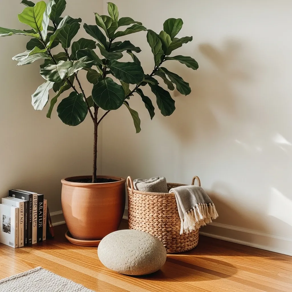
A floor corner styled with large-scale objects is the room element that most consistently goes unaddressed in home design — most people treat floor corners as architectural dead zones that furniture doesn’t quite reach and decor doesn’t quite extend to, and the result is rooms where the floor corners are simply empty and the room feels slightly unfinished and slightly small as a consequence. Large-scale objects at floor level in room corners — tall plants, large ceramic vessels, floor lamps, sculptural objects with genuine physical presence — fill the room’s extremities in a way that makes the whole room feel more fully inhabited and more spatially generous.
The large indoor plant is the most universally successful floor corner object because it fills the corner at multiple heights simultaneously — the pot at floor level, the trunk or stems through the middle zone, the canopy of leaves at or above eye level — creating a vertical presence that fills the full height of the corner rather than just its base. A tall plant in a floor corner creates a vertical column of life and texture that makes the corner feel like a designed element of the room rather than an architectural leftover, and it does so with a quality of organic naturalness that no furniture or decorative object can replicate.
11. The Mantelpiece — Its Own Distinct Styling Environment
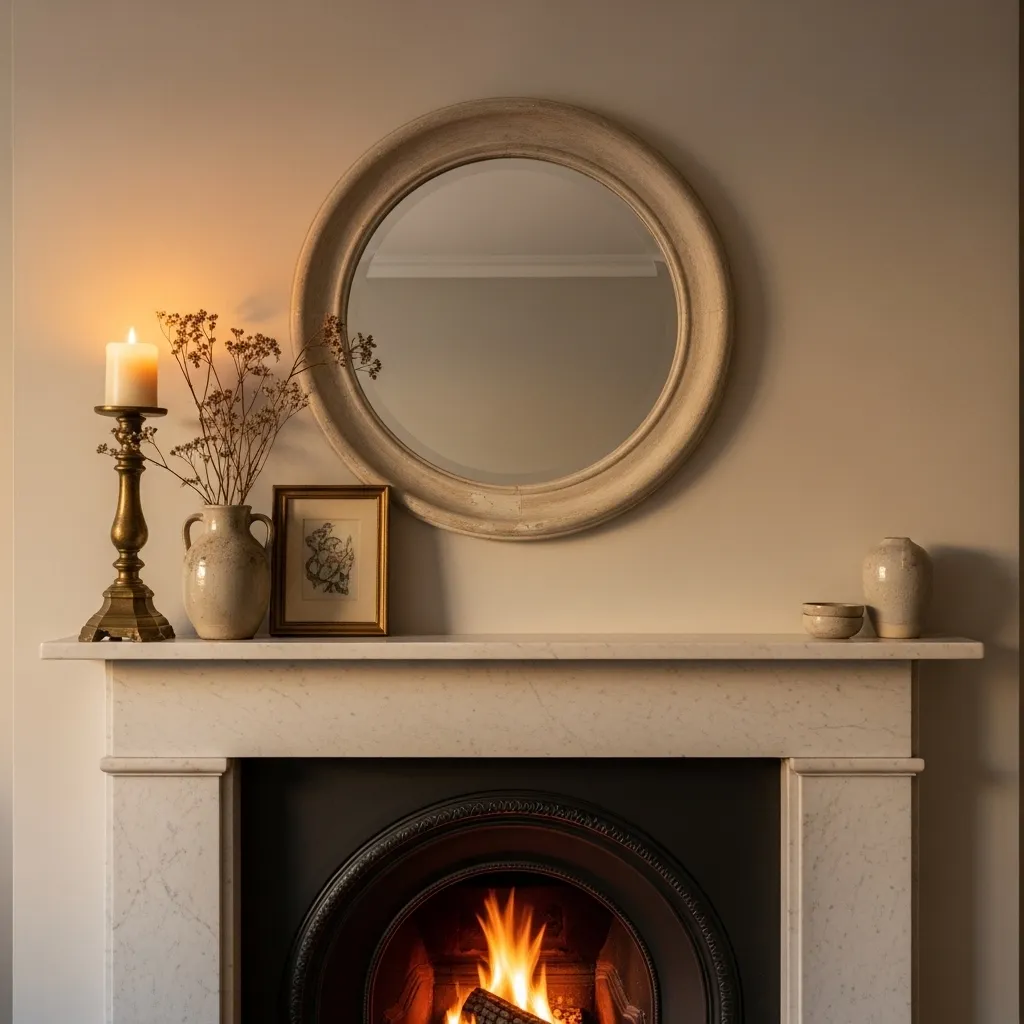
The mantelpiece is the styling environment in domestic interiors with the longest and richest tradition — the mantel shelf as a display surface has been the primary decorative focus of the European domestic interior for centuries, and the conventions that have developed around mantel styling (the centrally placed mirror or artwork, the flanking candlesticks, the seasonal botanical additions) are conventions because they work, creating a composition that’s both visually resolved and functionally familiar. Contemporary mantel styling can work within or against these conventions, but understanding them is the prerequisite for either.
The mantelpiece’s specific styling challenge is the wall zone above it — the section of wall between the mantel shelf and the ceiling that is defined by the mantelpiece surround below and typically receives either a mirror, an artwork, or an arrangement of smaller pieces. This wall zone is neither a standard wall section nor a shelf surface but something in between — a framed wall zone whose styling is architecturally defined by the mantelpiece structure below it — and it requires objects or artworks that understand their specific context. A mirror that fills most of the available zone, a single large artwork scaled to the zone, or a group of smaller pieces organized to fill the zone without spilling beyond it — these are the approaches that acknowledge the architectural specificity of the mantel zone and work within it rather than ignoring it.
12. The Floating Shelf Cluster
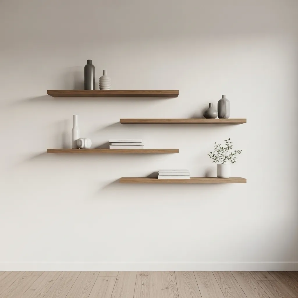
A cluster of floating shelves at different heights and lengths — arranged as an integrated wall composition rather than as a series of parallel horizontal shelves at regular intervals — creates a wall element with genuine visual interest and genuine spatial flexibility, because the varying heights allow different scale objects to be displayed at each shelf and the horizontal staggering creates a composition that the eye reads as dynamic rather than repetitive. Three or four shelves at the same height and same length, evenly spaced — the standard shelf installation approach — creates a wall that looks like a filing system regardless of what’s displayed; the same three or four shelves at different heights and slightly different lengths creates a wall composition that looks designed and inhabited.
The staggering principle for floating shelf clusters is to vary both the vertical height and the horizontal position of each shelf — no two shelves at the same height, and no two shelves aligned at their left or right edges. This creates a cluster with genuine visual movement — the eye moves from shelf to shelf in a path that’s neither purely vertical nor purely horizontal but diagonal, which is the most dynamic eye movement and the one that makes a wall composition feel most alive.
13. The Styled Versus the Collected Surface
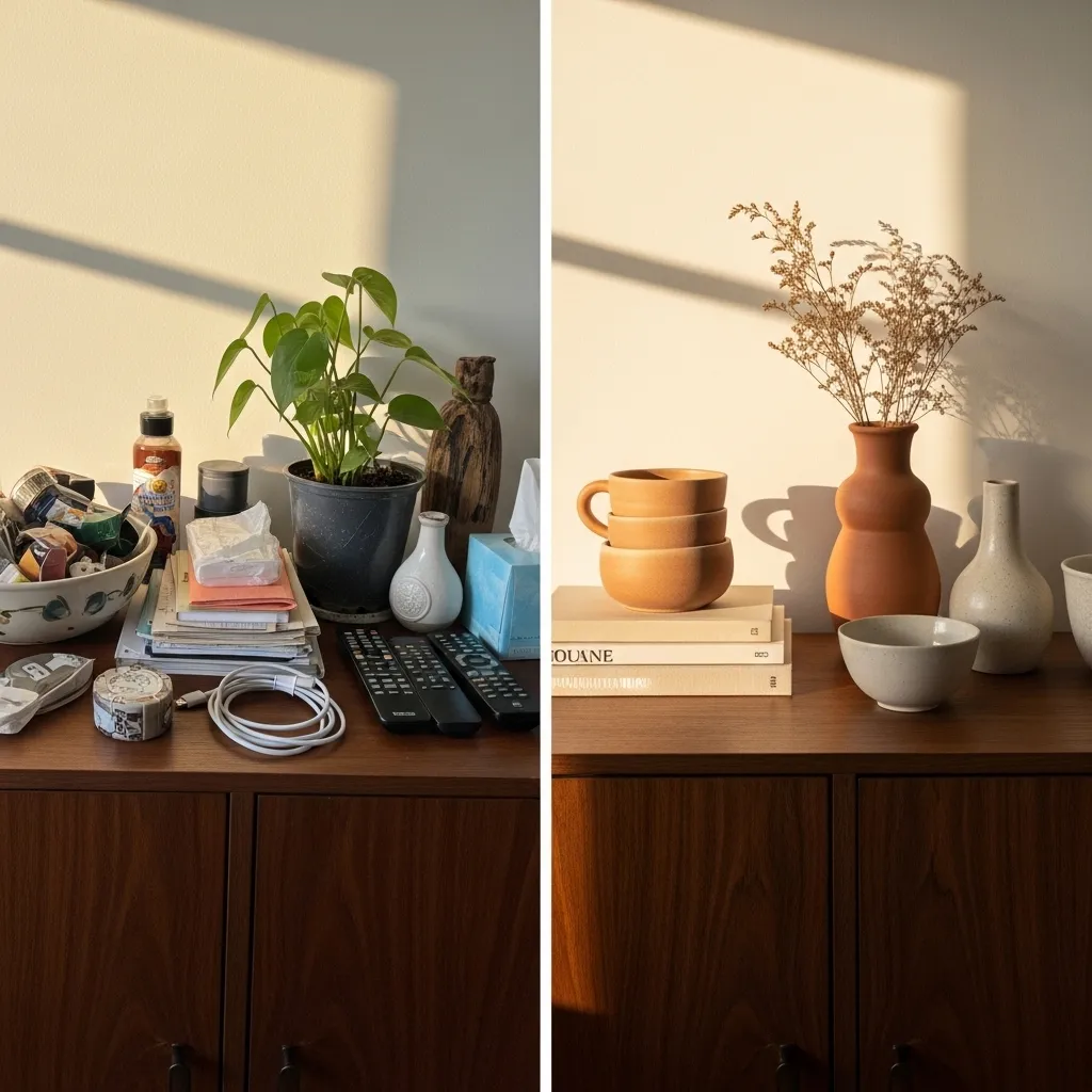
The distinction between a styled surface and a collected surface is the organizing principle — or its absence. A styled surface has been edited to contain only objects that serve the composition’s aesthetic intention, arranged according to principles of height, texture, and scale that create a specific visual effect. A collected surface contains whatever has arrived there through the normal accumulation of daily life without editing or organizing principle. Both surfaces are filled with objects; only one creates an aesthetic experience.
The practical transition from collected to styled surface requires two sequential steps that most styling advice collapses into one: the editing step, which removes everything from the surface and returns only what genuinely contributes to the desired aesthetic, and the arranging step, which places the selected objects in relationship to each other using composition principles. The editing step is the one that most people skip or perform insufficiently — bringing objects back onto the surface before genuinely evaluating whether each one contributes or detracts from the composition’s overall quality. A styled surface should contain fewer objects than you initially think, and the editing step should be more ruthless than feels comfortable until the skill becomes natural.
14. How to Style a Corner With a Chair and Light
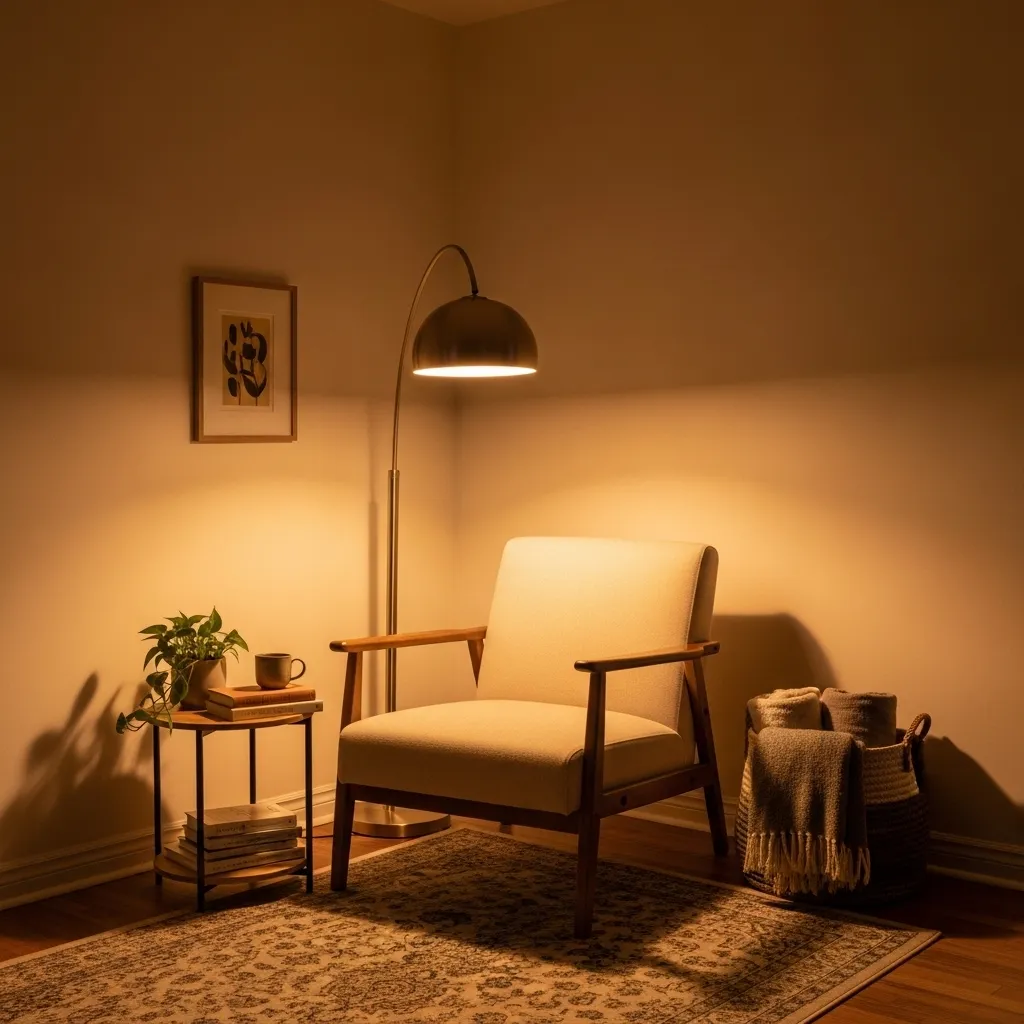
A corner styled with a chair and floor lamp creates the most transformative and most functionally valuable corner treatment available — it converts what is typically the room’s most under-used architectural zone into a specific, inhabitable destination with its own light, its own purpose, and its own quality of enclosure that the rest of the room’s open floor plan doesn’t provide. The reading corner created by the specific combination of chair, lamp, and side table creates a room-within-a-room quality that makes the larger room feel more spatially complex and more richly organized — a room with a clearly defined reading corner has more spatial variety than a room without one, regardless of their relative sizes.
The angle of the chair within the corner is the detail that most determines whether the reading corner feels like a designed destination or a chair that got pushed into a corner — a chair placed flush against both walls at ninety degrees to each wall reads as stored rather than placed, while the same chair turned slightly inward at approximately forty-five degrees to the corner’s bisecting line reads as positioned for the purpose of being sat in, facing outward toward the room rather than facing the walls. The slight inward angle creates the sense that someone placed the chair there specifically to sit in it and look out into the room — which is exactly the sense a well-styled reading corner should create.
15. The Seasonal Update Approach
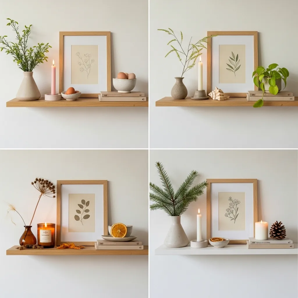
A seasonal update approach to styled shelves and surfaces — maintaining the primary composition throughout the year while introducing small seasonal additions and substitutions that connect the interior to the season outside — is the practice that keeps styled spaces feeling alive and current rather than permanently finished and therefore gradually invisible. The styled shelf that never changes becomes invisible to the person who lives with it within a few weeks of its completion; the same shelf that introduces a spring stem in March, a summer shell in July, an autumn seed head in October, and a winter evergreen sprig in December maintains a quality of freshness and intention that keeps it visible and appreciated throughout the year.
The seasonal update requires minimal effort and minimal cost because it works through addition and substitution rather than wholesale change — removing the spring stem and adding a summer shell, replacing the pale spring candle with a deep amber autumn one, introducing one small seasonal natural object that references what’s happening in the landscape outside. These small changes are gestures rather than redesigns, but their cumulative effect over a year is a styled space that participates in the rhythm of the seasons and communicates that someone is paying attention to it and caring for it rather than having set it once and forgotten it — and that quality of ongoing care and attention is precisely what distinguishes a genuinely beautiful home from a merely well-decorated one.