11 Blue Living Room Design Ideas
Blue is one of the most versatile and universally beloved colors for living rooms, offering an incredible spectrum from the palest sky blues that barely whisper color to deep navy and indigo tones that create drama and sophistication. What makes blue so special in living spaces is its inherent calming quality—psychologically proven to lower blood pressure and create a sense of tranquility—while still being dynamic enough to feel interesting and intentional rather than boring or safe. Unlike neutrals that can sometimes fade into the background, blue brings personality and presence while maintaining the versatility to work across countless design styles from coastal and traditional to modern and eclectic.
The range of moods that different blues can create is truly remarkable. Soft powder blues and robin’s egg tones feel fresh, airy, and optimistic—perfect for creating bright, welcoming spaces. Medium blues like cobalt or cerulean bring energy and vibrancy without being overwhelming. Deep navy, midnight blue, and indigo create sophistication, drama, and cocoon-like intimacy that feels luxurious and grounded. Teal and turquoise bridge blue and green, bringing that organic, nature-connected quality with slightly more warmth. And the beauty is that blue works gorgeously with nearly every other color—it pairs classically with white and cream, creates striking contrast with coral and orange, feels fresh with yellow and green, and combines elegantly with gray, brown, and natural materials.
What I particularly appreciate about blue in living rooms is how it adapts to light throughout the day. Blues shift and change with natural light in the most beautiful ways—morning light might reveal undertones you didn’t know were there, afternoon sun makes colors more vibrant, and evening artificial light creates completely different moods. This dynamic quality keeps blue rooms interesting and alive rather than static. Whether you’re drawn to blue because of coastal inspirations, traditional elegance, modern sophistication, or simply because it’s your favorite color, there’s a shade and application that will create exactly the living room atmosphere you’re seeking. Let’s explore these blue living room ideas and discover how to harness this incredible color’s full potential.
1. Navy Blue Accent Wall with Brass Accents
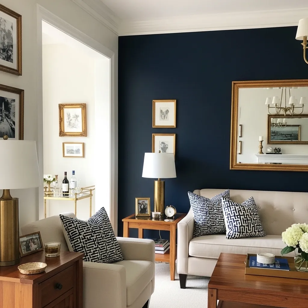
A navy blue accent wall creates instant sophistication and depth without overwhelming your living room with darkness. Navy is one of those magical colors that reads as both bold and neutral—it’s dramatic enough to make a statement but versatile enough to work as a backdrop for various furniture styles and colors. When paired with brass or gold metallic accents, you create this timeless, elegant combination that feels both classic and current.
The brass brings essential warmth that prevents navy from feeling too cool or serious. Those metallic touches catch light beautifully and create moments of shine and reflection that add luxury and interest. Keep furniture and other walls light—cream, white, or soft gray—to balance the navy and maintain brightness. The navy wall provides that grounding, sophisticated element while the lighter surrounding keeps the room feeling spacious and welcoming. This combination works beautifully in traditional, transitional, and even modern living rooms. Add natural materials like wood, leather, and linen to layer warmth and prevent the space from feeling too formal. The result is a living room with genuine elegance and timeless appeal.
2. Soft Powder Blue Throughout
Painting an entire living room in soft powder blue—walls, ceiling, trim—creates this incredibly serene, enveloping experience that feels peaceful and calming. The key is choosing a truly soft, pale shade with enough gray to be sophisticated rather than juvenile. When applied to all surfaces, the pale blue creates a cohesive backdrop that makes furniture and accessories stand out beautifully while maintaining an overall sense of calm.
This approach works wonderfully in smaller living rooms where the unified color actually makes the space feel larger by eliminating visual breaks, or in spaces where you want maximum tranquility. The pale blue reads almost as a neutral—it’s present enough to add personality but subtle enough to work as a foundation for various furniture colors and styles. Layer in plenty of white and cream through furniture, textiles, and accessories to provide contrast and prevent the blue from feeling too monochromatic. Natural materials add essential warmth. This creates a living room that feels like a peaceful retreat—perfect for relaxation and unwinding. The soft blue is inherently calming, making it ideal for spaces dedicated to rest and comfort.
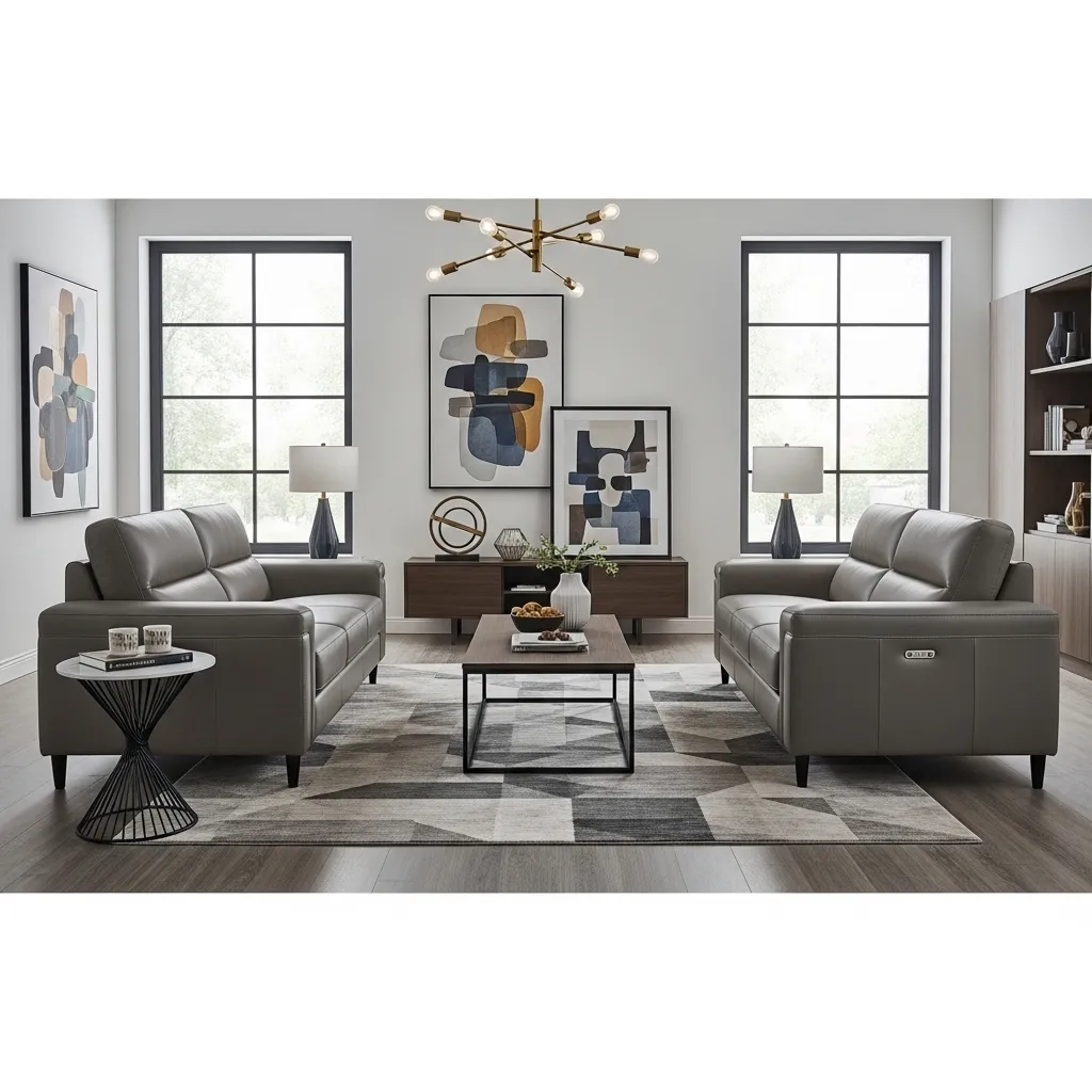
3. Cobalt Blue Velvet Sofa
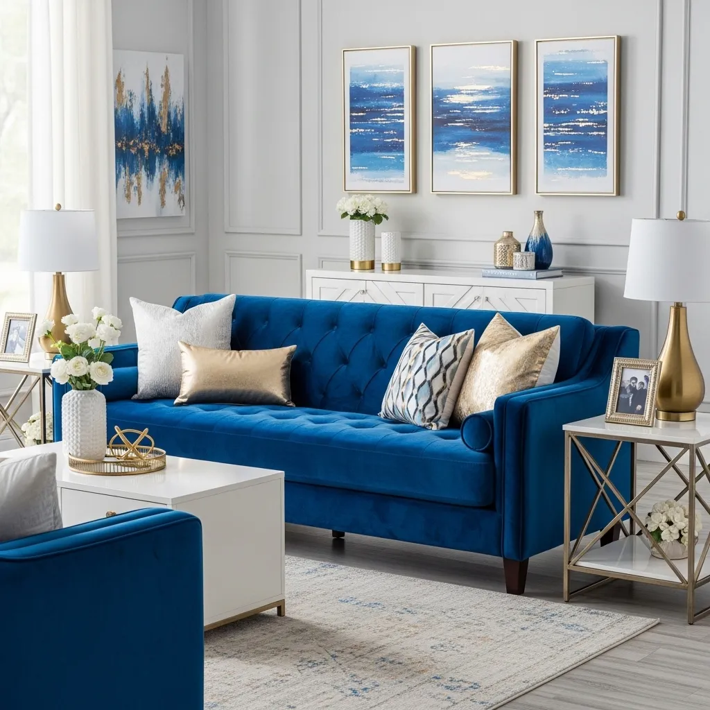
A cobalt blue velvet sofa is a bold, confident choice that instantly becomes the focal point and conversation piece in your living room. The rich, saturated blue is vibrant without being garish, and the plush velvet texture adds luxury and visual depth that flat fabrics can’t achieve. This is statement furniture that brings personality and drama while still being versatile enough to work with various design styles.
The key to making a bold blue sofa work is keeping surrounding elements relatively neutral and simple. White or light gray walls let the sofa be the star without competing for attention. The velvet’s inherent luxury pairs beautifully with metallic accents in brass or gold, creating an elevated, sophisticated aesthetic. Layer in textures through pillows, throws, and rugs to add interest without introducing too many competing colors. The cobalt works gorgeously with white, cream, gray, gold, and even warm woods. This approach allows you to have that pop of color and personality you crave while maintaining overall balance and sophistication. The blue sofa can anchor various color schemes depending on your accessories—add coral and pink for vibrancy, stick with metallics and neutrals for elegance, or layer in other jewel tones for richness.
4. Blue and White Coastal Palette
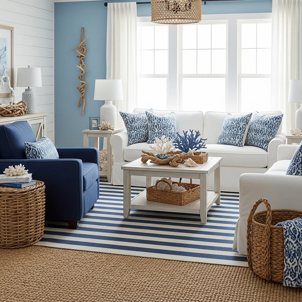
The classic blue and white combination creates instant coastal vibes that feel fresh, clean, and timeless. This palette references the ocean, sky, and sandy beaches, bringing that vacation-like, breezy quality into your living room. The combination works because of the inherent contrast—the blue provides color and interest while the white keeps everything feeling light, airy, and spacious. Together they create a balanced, harmonious space.
The key to coastal blue and white is layering natural textures to prevent it from feeling too nautical or themed. Jute, sisal, seagrass, driftwood, linen, and cotton add organic warmth and keep the palette grounded rather than overly beachy. Use blue in varied shades—soft sky blue on walls, navy in patterns and accents, medium blues in artwork—to create depth within the color family. Stripes are classic coastal pattern, but you can also incorporate other patterns like ikat, coral prints, or geometric designs. Keep it edited and sophisticated rather than loading up on obvious nautical symbols. The result is a living room that feels like a coastal retreat—relaxed, welcoming, and perpetually refreshing.
5. Teal with Warm Wood Tones
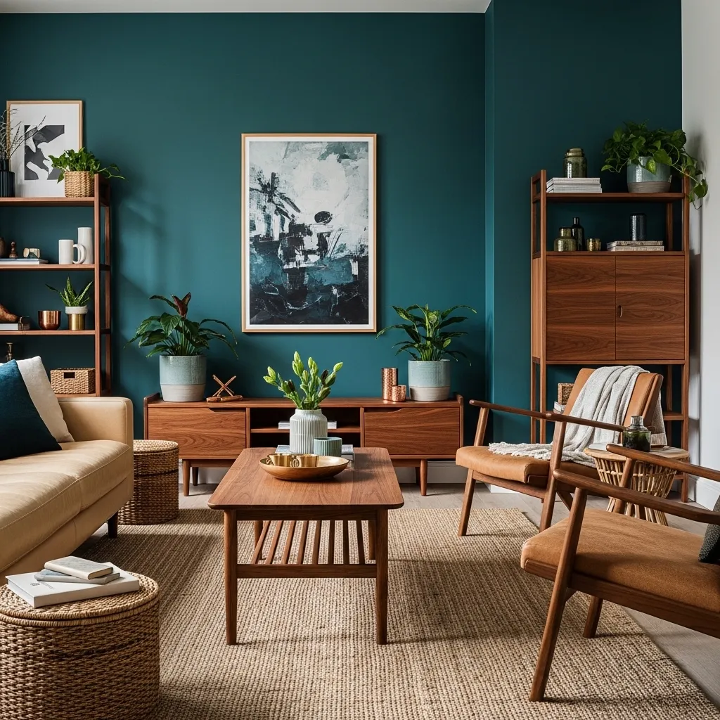
Teal is a fascinating hybrid color that bridges blue and green, bringing the calming qualities of blue with the organic, grounded nature of green. It’s warmer than pure blue, making it incredibly versatile and easier to live with. When paired with warm wood tones—walnut, oak, teak—you create this beautiful, organic combination where the colors enhance each other. The wood’s warmth balances any coolness in the teal, while the teal provides color and interest that highlights the wood’s natural beauty.
This combination works across styles from mid-century modern to bohemian to transitional. The teal provides sophisticated color without being overly bold, and the wood brings natural warmth and texture that prevents the space from feeling too cool or artificial. Layer in natural materials—leather, linen, jute, cotton—to enhance the organic feeling. Metallic accents in warm tones like brass, copper, or gold coordinate beautifully with both the teal and wood. Plants look particularly stunning against teal walls, their green tones creating natural harmony. The result is a living room that feels rich, layered, and genuinely welcoming—sophisticated enough for entertaining but comfortable enough for everyday living.
6. Monochromatic Blue Layers
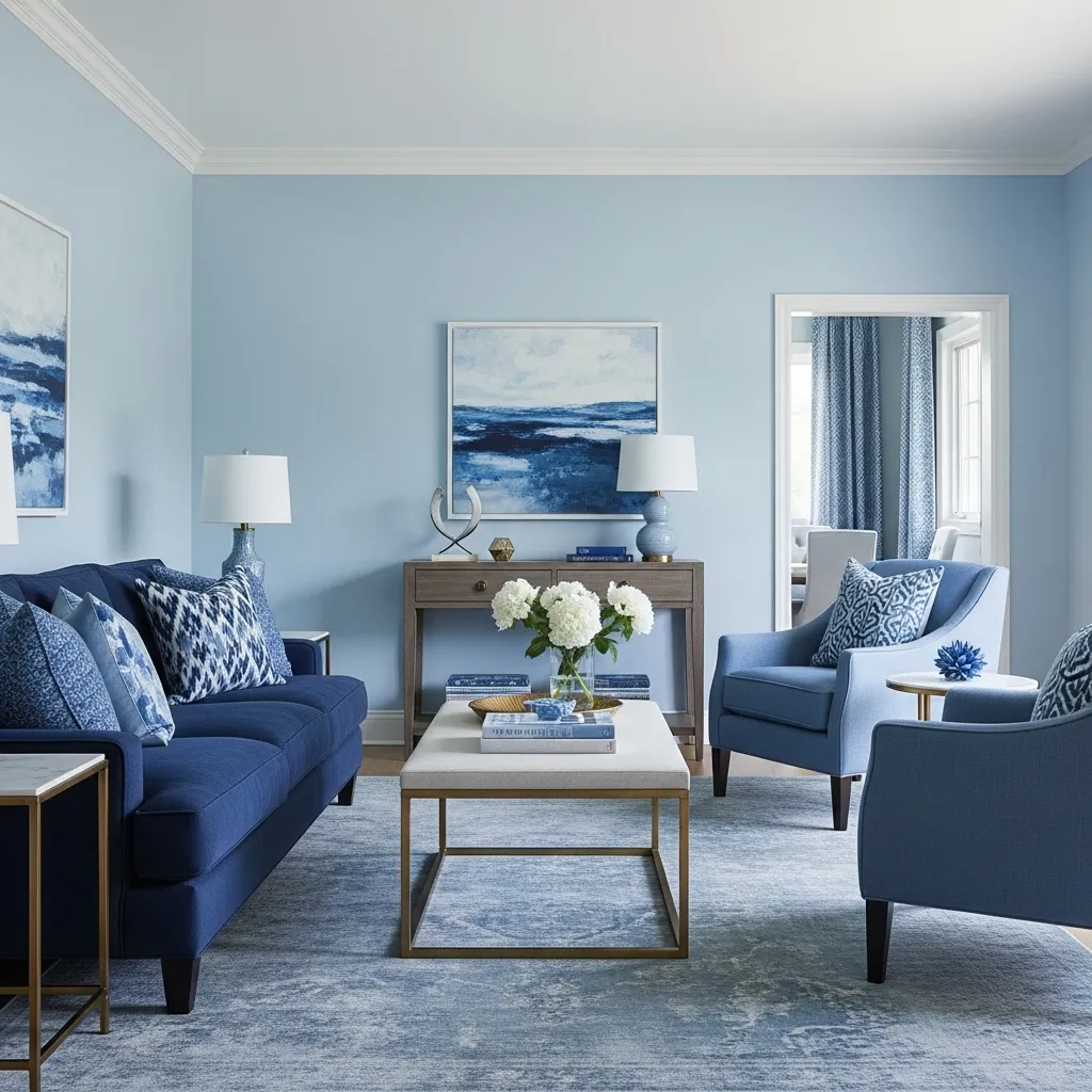
A monochromatic blue color scheme uses multiple shades and tones of blue to create a sophisticated, cohesive living room with depth and interest despite using essentially one color family. Instead of relying on contrasting colors for visual interest, you create variety through tonal shifts—pale blues, medium blues, deep navy, blue-grays—all working together harmoniously. The result is calming and elegant with subtle complexity.
The key to successful monochromatic design is including enough tonal variation to create depth—you need lights, mediums, and darks within your chosen color family. A pale blue wall, medium blue chairs, navy sofa, and blue-patterned rug create layers of the same basic color at different saturations and values. This creates sophistication and cohesion without being boring or flat. Add white or cream to provide visual rest and brightness—white trim, ceiling, and perhaps white accent pieces. Introduce warm neutrals through wood and natural fibers, and metallic accents in brass or gold to add warmth. The monochromatic blue creates a serene, pulled-together space that feels intentional and beautifully edited.
7. Royal Blue with Emerald Green Accents
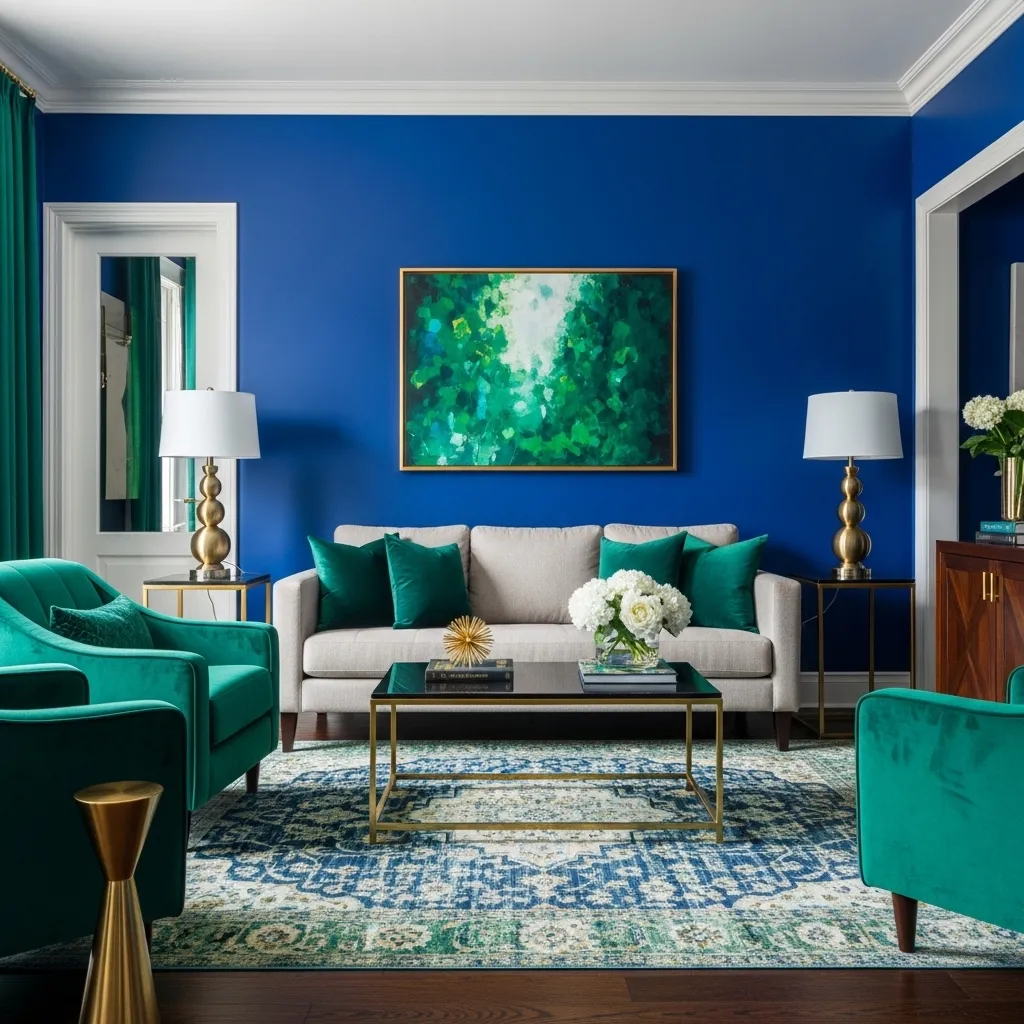
Royal blue and emerald green together create this incredibly rich, jewel-box aesthetic that’s bold and confident while remaining harmonious because blue and green are analogous colors. Both are saturated and intense, creating visual drama and personality, but their position next to each other on the color wheel means they work together rather than clash. This combination feels luxurious, sophisticated, and unapologetically bold.
The key to making such saturated colors work is grounding them with plenty of neutrals—cream, beige, gray, or even white—to provide visual rest and prevent overwhelm. A neutral sofa between blue walls and green chairs creates breathing room. Metallic accents in gold or brass enhance the luxe feeling and add warmth that prevents the cool colors from feeling too stark. Natural materials like wood, leather, and natural fibers add organic warmth. This palette works particularly well in formal living rooms, sophisticated spaces, or anywhere you want to make a dramatic statement. It’s not for the timid, but for those who love color and want their living room to have serious personality and presence.
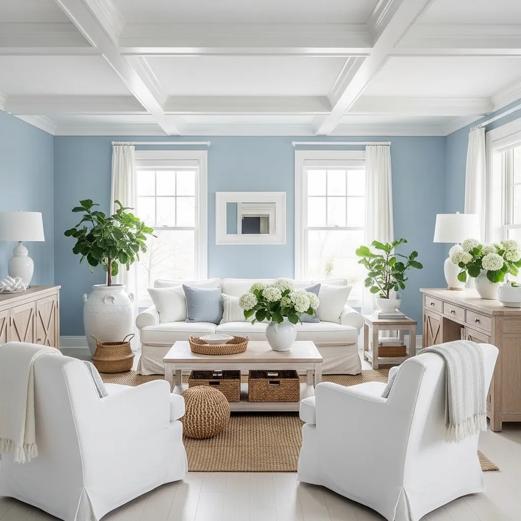
8. Light Blue with Natural Linen and White
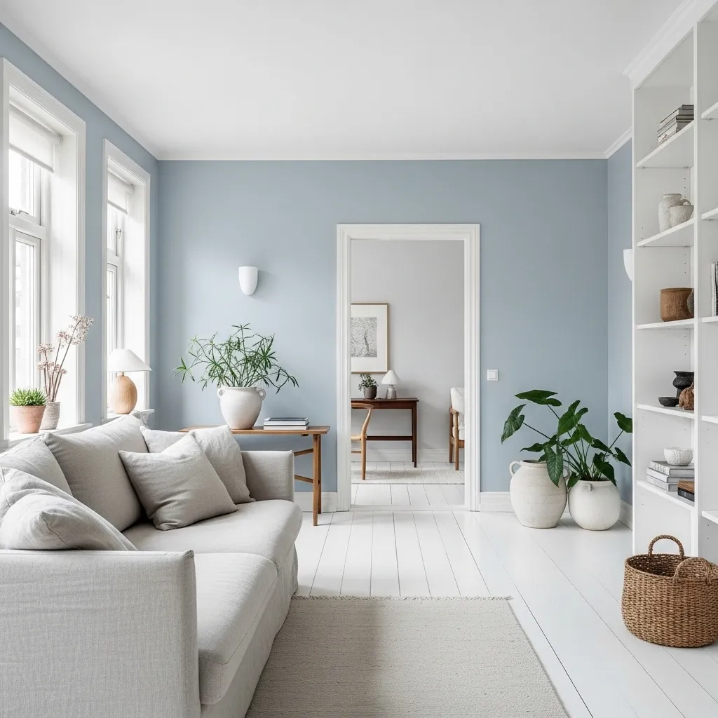
Light blue paired with natural linen and white creates this incredibly peaceful, Scandinavian-inspired aesthetic that’s all about simplicity, natural materials, and serene beauty. The soft blue provides just enough color to be interesting while remaining fundamentally calm and neutral-adjacent. The natural linen brings organic texture and warmth, while the white keeps everything bright and airy. Together they create a living room that feels like a breath of fresh air.
This palette is rooted in Scandinavian design principles—simplicity, functionality, connection to nature, and emphasis on light. The light blue references the Nordic sky and waters, while the natural materials connect to the landscape. Keep the space edited and minimal—quality over quantity, with each piece serving a purpose. Natural light is essential to this aesthetic, so maximize windows and keep treatments minimal. Wood in light tones, plants for life, and perhaps one or two carefully chosen accessories complete the look. The result is a living room that feels calm, clean, and genuinely restful—a sanctuary from the complexity and noise of modern life.
9. Indigo with Warm Neutrals
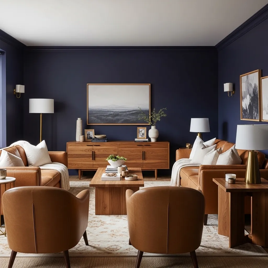
Indigo is that deep, mysterious blue that’s darker than navy and often has slight purple or violet undertones, creating incredible depth and sophistication. It’s a color that creates intimacy and atmosphere—perfect for living rooms where you want a cozy, enveloping feeling rather than bright and airy. When paired with warm neutrals in tan, camel, cognac, and warm beige, you create beautiful balance between the cool deep blue and warm, inviting furnishings.
The warm neutrals are essential to making indigo walls feel welcoming rather than cold or oppressive. Leather in tan or cognac tones, textiles in warm beiges and camels, and wood in warm tones all provide that crucial warmth. The contrast between dark walls and lighter furniture creates definition and prevents the room from disappearing into darkness. This palette works beautifully in spaces with good natural light during the day and warm, layered artificial lighting in the evening. Add metallic accents in brass or gold to enhance warmth. The result is a living room with serious sophistication and mood—perfect for evening entertaining, cozy movie watching, or creating that intimate, library-like atmosphere.
10. Cerulean Blue with Coral Accents
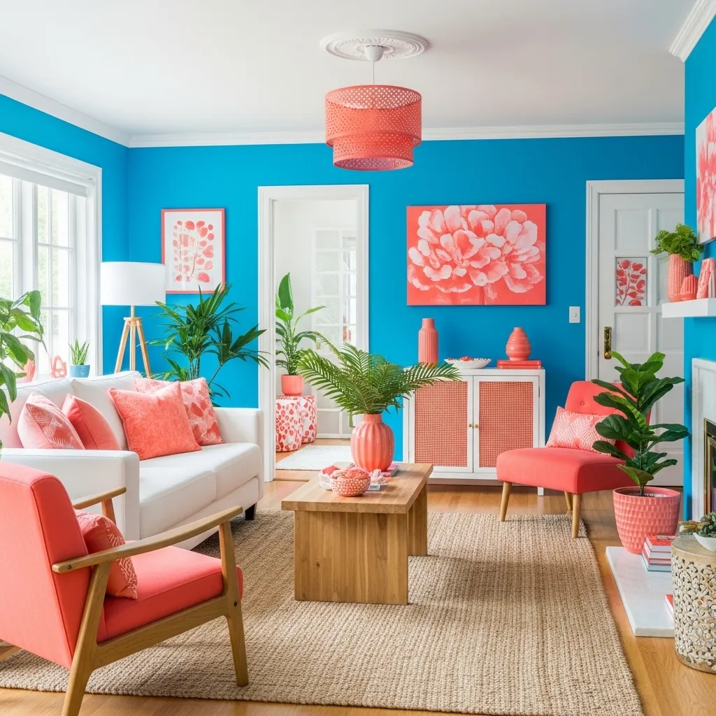
Cerulean blue and coral create one of the most energizing, happy color combinations—they’re complementary colors (opposite on the color wheel) which creates natural vibrancy and contrast, but both are bright and saturated enough to feel playful and optimistic rather than serious. This palette has tropical, beachy influences and brings genuine joy and energy to living spaces. It’s bold without being dark, colorful without being overwhelming.
The key to making this vibrant combination work is balancing it with plenty of neutrals—white, cream, natural wood—to provide visual rest and prevent color overload. Use the blue as your dominant color through walls or a large sofa, then bring coral in through accents that can be changed if you tire of the boldness—pillows, throws, artwork, maybe an accent chair. The combination works beautifully in coastal homes, tropical climates, or anywhere you want your living room to feel energetic and welcoming. Natural light enhances the vibrancy, and plants look particularly good against this palette. This is for people who love color and want their living room to reflect that enthusiasm and optimism.
11. Slate Blue with Charcoal and White
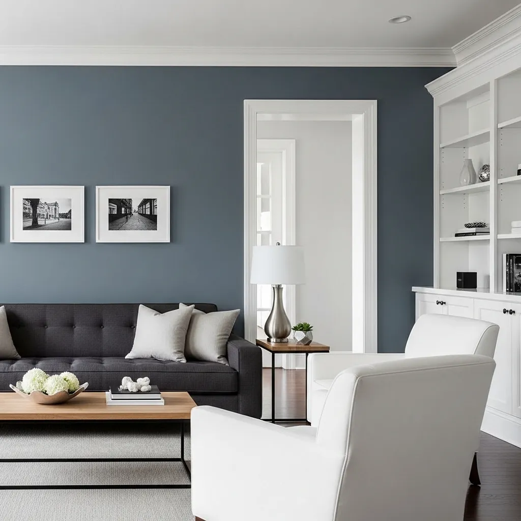
Slate blue is that perfect ambiguous color that sits beautifully between blue and gray—it’s blue enough to have color personality but gray enough to be incredibly versatile and sophisticated. This muted tone works gorgeously in modern and contemporary living rooms where you want subtle color without boldness. When paired with charcoal gray and white, you create a tonal, sophisticated palette with depth and interest despite the restrained color scheme.
The beauty of this combination is its versatility and timelessness. Slate blue works as an almost-neutral backdrop that’s more interesting than pure gray but still neutral enough to work with virtually any accent color you might want to introduce. The charcoal provides grounding and definition, while white keeps things bright and provides contrast. This palette feels inherently modern and sophisticated—it’s edited and intentional without being stark or cold. Add natural wood for warmth, layer in various textures for interest, and keep lines clean for contemporary elegance. The result is a living room that feels current and sophisticated while remaining fundamentally calm and livable—perfect for those who want subtle sophistication over bold statements.