18 Orange Two Colour Combination For Bedroom Walls in 2026 That Transform Your Space From Ordinary to Genuinely, Beautifully Alive
Because orange — in all its terracotta warmth, vivid brilliance, peachy softness, and deep spice depth — pairs more beautifully, more surprisingly, and more personally than almost any other colour on the spectrum
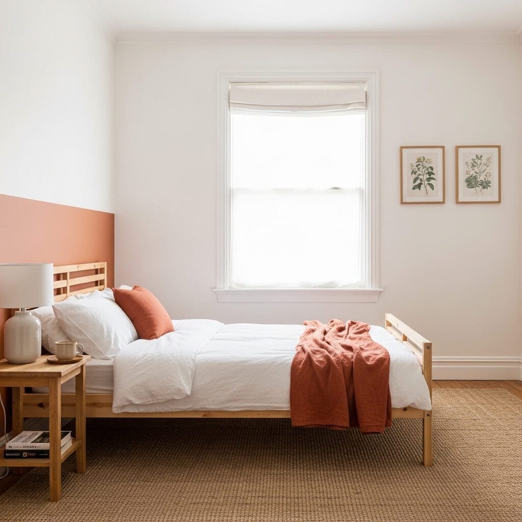
If you’ve been searching for the right two-colour combination for your bedroom walls and keep finding yourself drawn back to orange — that warm, alive, endlessly variable colour that sits somewhere between fire and earth and the specific gold of late afternoon — then this article is the place to start. What follows covers the full range of what orange can do in a bedroom when paired thoughtfully: burnt orange against deep forest green, terracotta beside warm cream, vivid orange anchored by charcoal, peach softened further with dusty sage, rust paired with the cool quiet of slate blue, spice tones deepened with chocolate brown, bright orange given breathing room by crisp white, and combinations that feel simultaneously ancient and completely contemporary. Some of these are bold enough to stop you in the doorway; others are so quietly harmonious you feel them more than see them. All of them treat orange as the serious, sophisticated colour it actually is rather than the accent-only afterthought it’s so often reduced to.
I came to orange walls the way most people come to colours they end up loving — reluctantly, then completely. For years I treated orange as a colour for cushions and throws, something to be introduced in small quantities and quickly diluted. The first time I painted a full bedroom wall in a deep terracotta — Fired Earth’s Pimento, specifically, which sits somewhere between burnt clay and aged brick — I stood in the doorway at dusk and felt something shift. The room looked inhabited in a way it never had before. It looked like somewhere a real person lived rather than a staging exercise. That experience taught me that orange’s warmth isn’t a liability to be managed but a quality to be used deliberately, paired carefully, and trusted.
What makes orange specifically powerful as a bedroom wall colour — rather than merely striking — is its relationship to light. Orange is one of the few colours that genuinely changes character across the day: it reads terracotta and earthy in morning light, warm and rich in afternoon, and almost glowing in lamplight. This means that a well-chosen orange combination doesn’t give you one room but several versions of the same room, each one suited to a different hour and mood. The pairing colour — whether that’s the cool relief of blue-grey, the grounding depth of navy, the naturalistic harmony of green, or the luminous contrast of cream — determines which of orange’s many personalities gets foregrounded. Getting that pairing right is the specific art this article is designed to help you master.
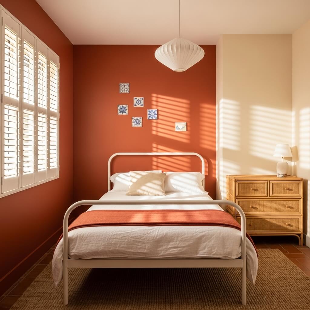
1. Burnt Orange and Ivory White — The Combination That Feels Like Sunlight Held in Clay
Burnt orange paired with ivory white is the combination that most fully honours what orange does best — which is specifically its capacity to hold warmth the way a clay pot holds heat, radiating it outward even after the direct source has moved on. This is not orange as a statement of boldness but orange as a statement of lived-in comfort, and the ivory white — not stark pure white, which would fight it, but a warm ivory that leans toward cream — is precisely what allows the orange to read as earthy and generous rather than aggressive. The pairing works because both colours share an undertone of warmth: the white contains yellow, the orange contains brown, and together they occupy the same atmospheric register. You feel it before you analyse it.
The specific thing to get right in this combination is the boundary between the two colours. If you’re using the orange as a single feature wall with the other three walls in ivory, the junction line — where orange meets white at the corner — needs to be clean and deliberate, not feathered or hesitant. The difference between a corner painted precisely and one that bleeds slightly is the difference between a considered design decision and an incomplete one. On the ceiling, always continue the ivory rather than taking the orange up — the moment orange climbs onto the ceiling it begins to feel enclosing rather than enveloping, which is a different, less pleasant sensation entirely.
2. Terracotta and Sage Green — The Combination Borrowed Directly From the Earth
Terracotta and sage green is the two-colour combination that requires the least justification because it requires no justification — it is, quite literally, the colour of baked earth beside growing things, a pairing so embedded in nature that it arrives in a room already feeling right before a single piece of furniture is placed. But understanding why it’s specifically effective rather than merely pleasant matters for getting it right. Terracotta reads warm because it carries both red and yellow undertones simultaneously; sage green reads cool-neutral because it carries blue and grey within its green, which is precisely why the two don’t compete. They don’t sit on opposite sides of the colour wheel creating visual tension; they sit in adjacent territory, close enough to harmonise and different enough to interest.
The specific detail that most affects this combination’s success is the saturation level of the sage green relative to the terracotta. If the sage is too vivid — too close to a true green — it pulls away from the terracotta rather than complementing it, and the room begins to feel like a deliberate colour statement rather than an organic environment. The version to aim for is sage that has been significantly greyed — something in the territory of Farrow & Ball’s Mizzle or Sulking Room Pink’s green cousin, a colour that reads as green only in the right light and as warm grey in others. This is what allows the terracotta to remain the dominant warmth in the room while the green provides genuine relief without competition.
3. Bright Orange and Charcoal Grey — The Combination That Makes Both Colours More Themselves
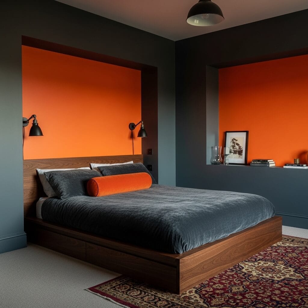
Bright orange and charcoal grey is the combination that most people imagine won’t work before they see it and can’t imagine living without once they do — because it does something specific that gentler combinations can’t: it makes each colour more completely itself. The orange, against grey, loses any trace of muddiness or visual ambiguity and reads as pure, saturated warmth; the grey, against orange, loses any tendency toward cold or depression and reads as sophisticated depth. This mutual clarification is the specific design principle at work, and it’s why the combination is more energising than either colour alone. In a bedroom, which needs to balance stimulation with rest, this means the proportion matters enormously — more orange than grey tips toward relentlessness; more grey than orange allows the orange to function as the punctuation it’s best suited to be.
What gets this combination wrong most often is the specific grey chosen. Charcoal with a blue undertone — which is the majority of commercial charcoals — creates a cool-warm tension with bright orange that reads as conflict rather than contrast. The grey that works is one with a slightly warm or neutral undertone: graphite that leans toward brown rather than blue, something that shares the orange’s earthiness even while opposing its brightness. Farrow & Ball’s Down Pipe, which sits in warm-neutral charcoal territory, does this better than almost any other commercially available colour. The specific undertone is the decision that separates a room that vibrates with intentional energy from one that simply vibrates.
4. Peach and Dusty Rose — The Softest Orange Combination and the Most Underestimated
Peach is the orange that most people don’t think of as orange, and this is precisely the quality that gives it specific power in a bedroom: it delivers all of orange’s warmth — its capacity to make a room feel inhabited and skin-flattering and alive in lamplight — without any of the connotations of boldness that keep people from committing to orange in the first place. Paired with dusty rose, it creates a combination that is softer than any single-colour room in either hue alone, because the two colours share an atmosphere of warmth and femininity without either one dominating. The effect is not pink and not orange but something genuinely in between — a room that feels like late afternoon feels, warm and gently golden, unhurried.
The specific risk with peach and dusty rose is that the combination tips into saccharine if the saturation levels aren’t managed carefully. The version that works is the version where both colours have been significantly muted — desaturated toward their grey-adjacent selves — so that they function as sophisticated neutrals with warmth rather than as candy colours. Benjamin Moore’s Pale Peach, paired with something in the territory of Farrow & Ball’s Setting Plaster, is the specific register to aim for. What happens when you get this right is that the room looks expensive in the way that subtle things look expensive — not by announcing themselves but by rewarding sustained attention with qualities that take a moment to name.
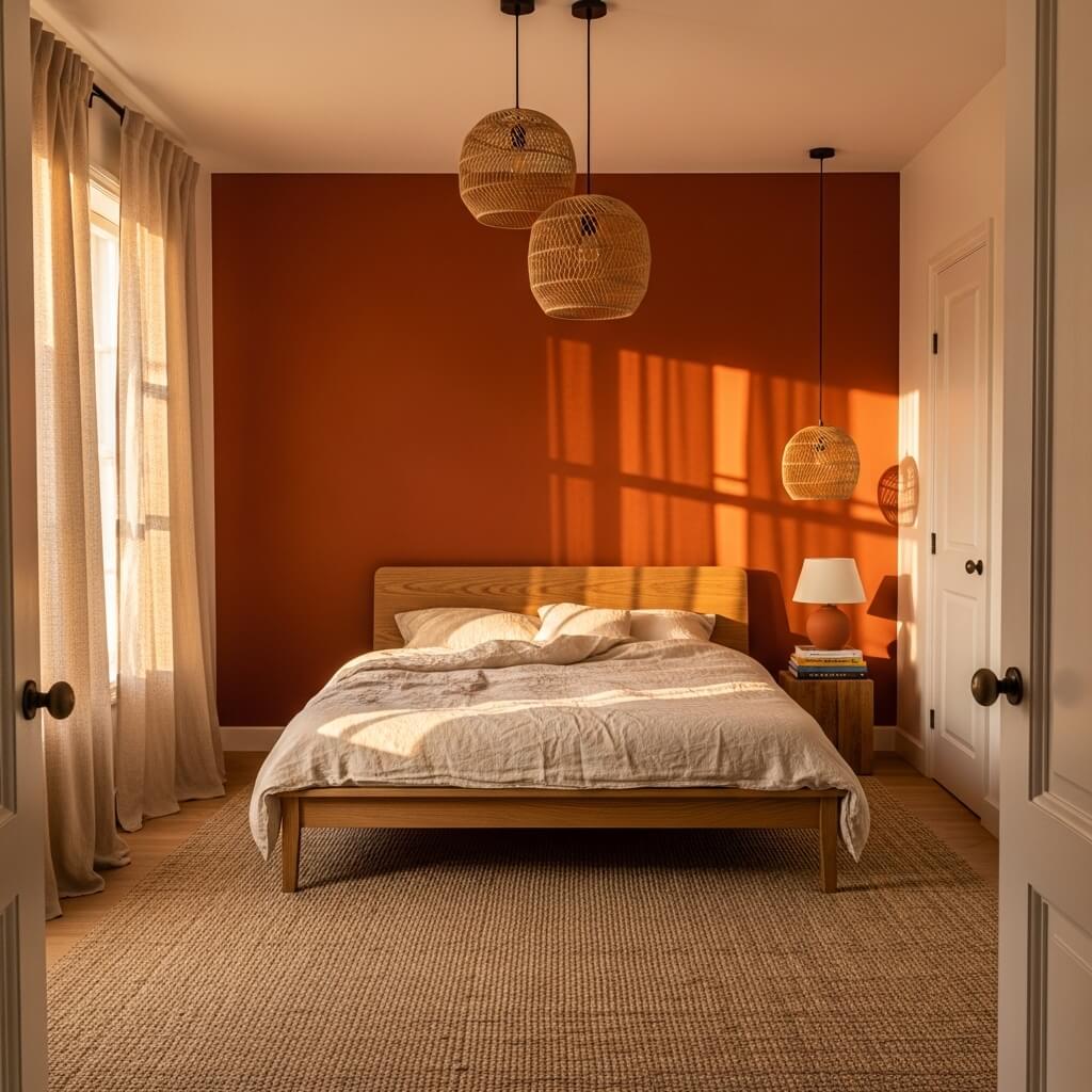
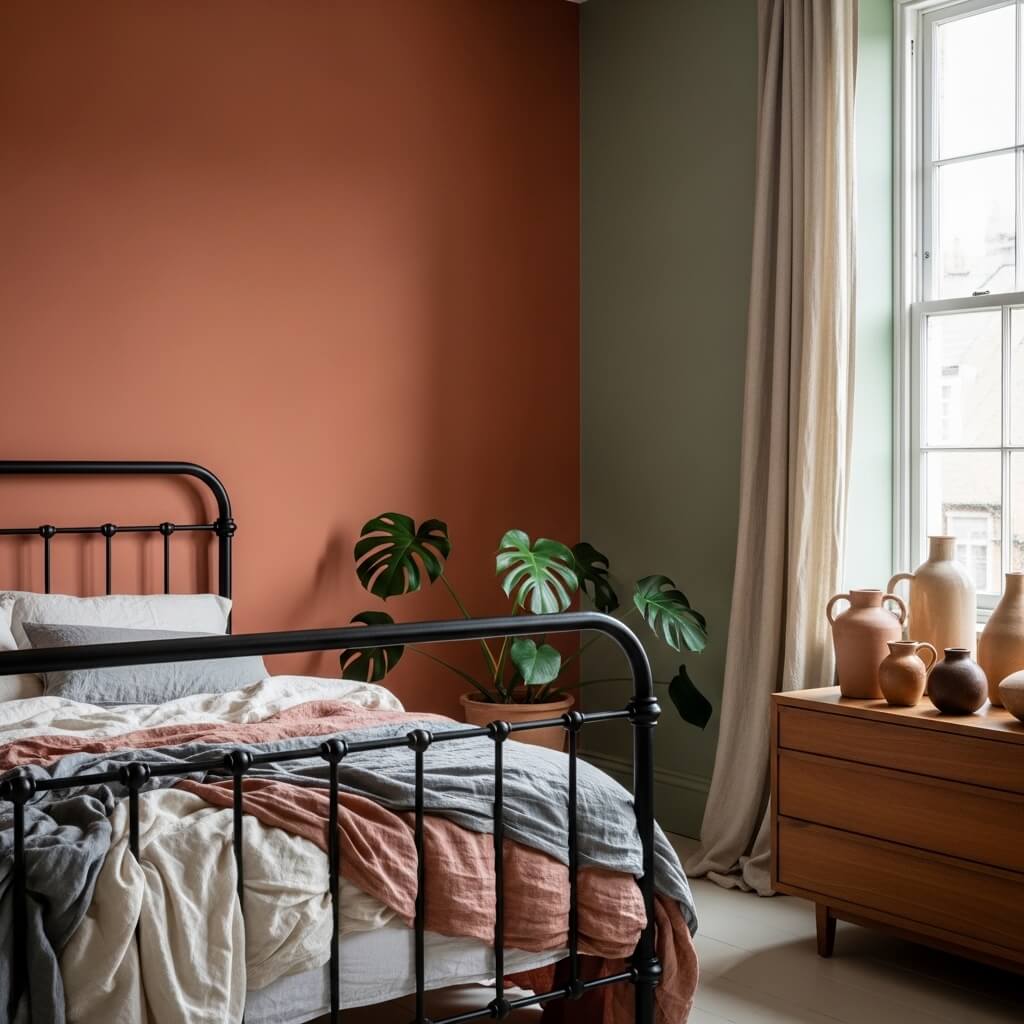
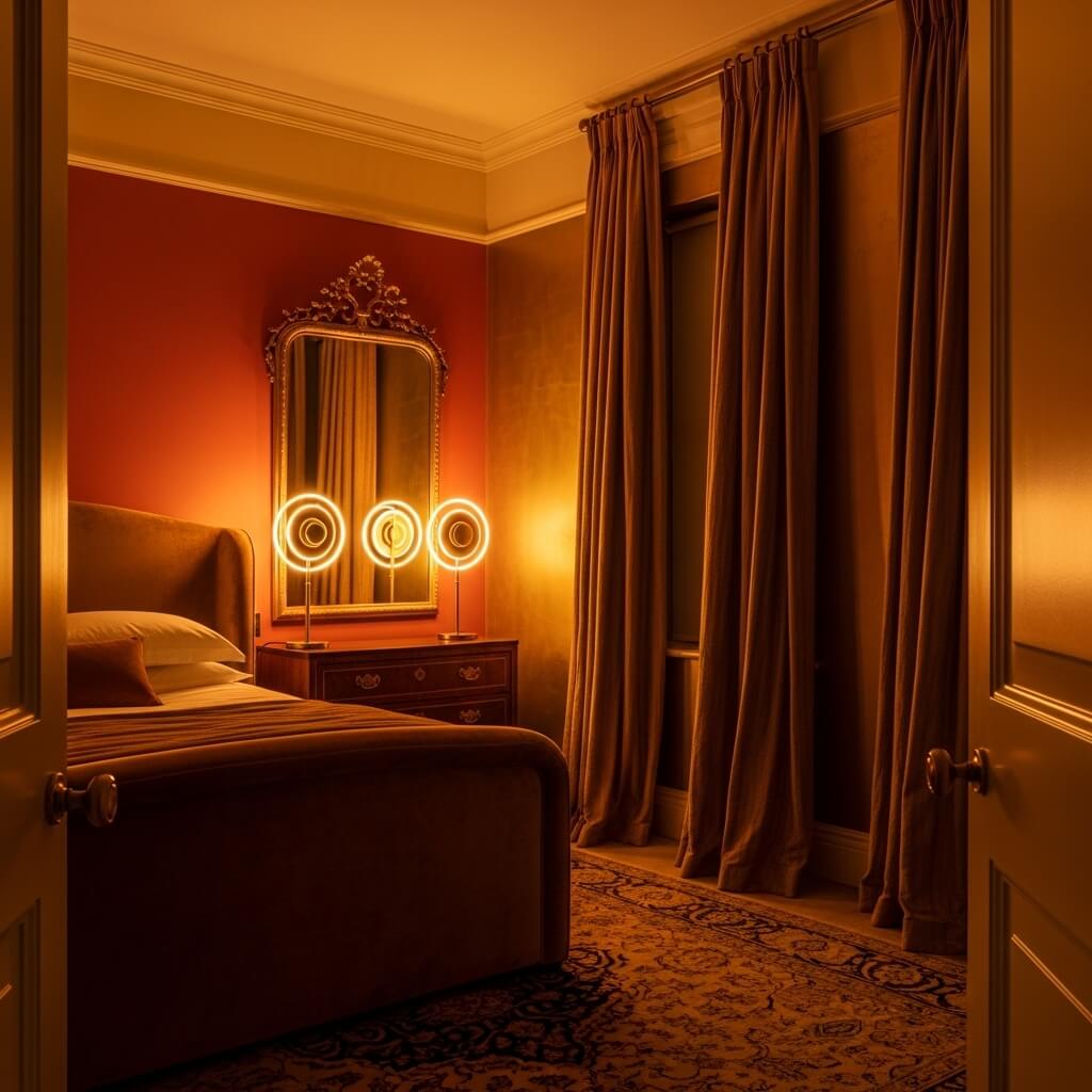
5. Deep Rust and Navy Blue — The Combination That Reads as History
Deep rust and navy blue is the combination with the longest history behind it — both colours appear in Islamic geometric tilework, in Persian textiles, in the painted woodwork of Moroccan riads, and in the colour schemes of Victorian studies and libraries — which is precisely why it arrives in a contemporary bedroom already carrying associations of depth, knowledge, and deliberate craft. This is not a combination you stumble into; it announces that the person who chose it thought about it, which is itself a quality that makes a room feel more considered and interesting. The rust, at this depth, no longer reads as orange in any obvious sense — it reads as a warm, complex dark that happens to glow when light moves across it.
The specific thing navy does for deep rust — which no other colour does quite as effectively — is provide a cool counterpoint that keeps the rust from reading as merely warm or decorative. Navy carries the gravitas that rust, alone, sometimes lacks; rust carries the life and warmth that navy, alone, can feel too austere to provide. The pairing works because each colour addresses precisely the quality the other lacks. In practice, this means the navy should be at full saturation — not diluted toward grey-blue — and the rust should be deeply pigmented, not a mid-tone terracotta. The combination only works at depth; in lighter versions, both colours lose the specific quality that makes their pairing meaningful.
6. Burnt Orange and Forest Green — The Combination That Brings Autumn Inside
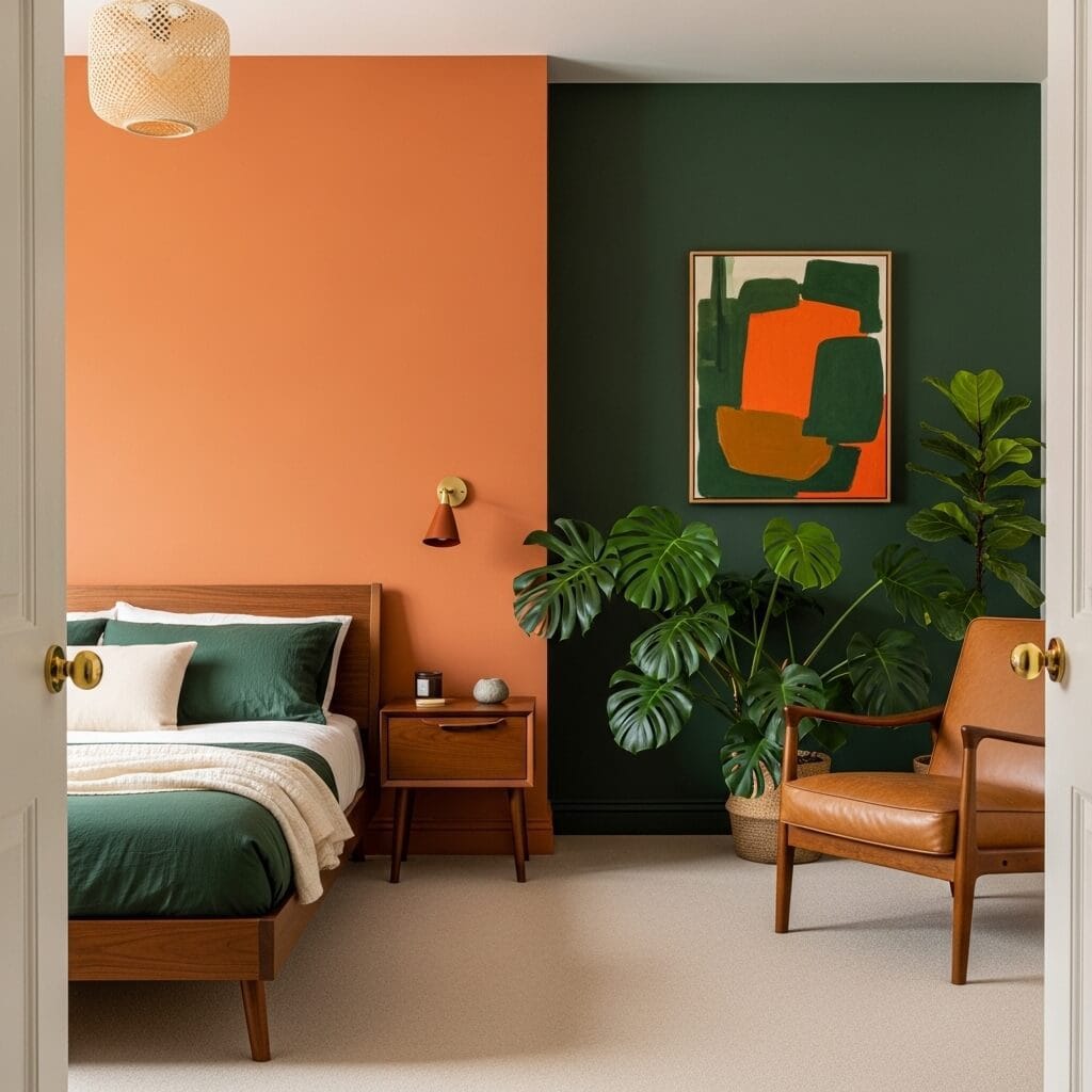
Burnt orange and forest green is the combination that most faithfully translates the specific beauty of autumn into an interior — which sounds like a limitation but is precisely the opposite, because what autumn does is demonstrate that warmth and depth can coexist without either cancelling the other out. The orange, at burnt rather than bright, reads as fire seen through smoke: rich, complex, genuinely warming. The forest green reads as the darkness of old trees, not the freshness of new growth, and this specificity matters enormously. You’re not pairing orange with spring green, which would be jarring; you’re pairing it with green that has aged and deepened, which is the green that shares autumn’s vocabulary.
The specific detail that distinguishes a sophisticated version of this combination from a merely thematic one is what happens on the floor and in the textiles. If everything in the room reinforces the autumn narrative — deep oranges, greens, warm browns, amber — the room becomes a costume rather than a space. The version that works introduces one element that steps outside the palette: a pale cream or warm white that gives the eye somewhere to rest, or a natural material like unlacquered brass or raw linen that is neither orange nor green but sits comfortably between them. This interruption of the theme is what separates a thoughtfully designed room from a mood board that hasn’t been edited.
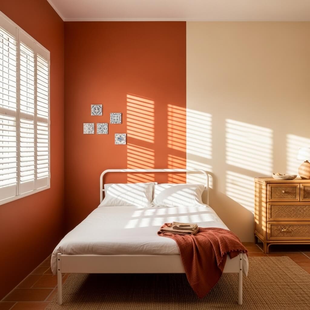
7. Terracotta and Warm Cream — The Combination That Feels Like the Mediterranean in Summer
Terracotta and warm cream is the combination that most completely evokes the specific quality of Mediterranean architecture — the sun-warmed plaster walls of Greek island houses, the painted interiors of Andalusian farmhouses, the faded grandeur of Italian coastal villas — and the reason it works so well is that both colours are, at their core, expressions of heat: the terracotta is heat absorbed into clay, and the cream is heat reflected from lime-washed stone. Together they create a room that feels warm in a geological, ancient sense rather than a decorated one. This is not warmth achieved through accessories; it’s warmth embedded in the walls themselves, which is a fundamentally different and more satisfying experience.
The specific material consideration in this combination is the finish on the terracotta walls. A standard eggshell or satin finish will look correct but flat — it will read as paint doing an impression of terracotta rather than the thing itself. The versions of this combination that feel most authentic use a limewash or Venetian plaster finish on the terracotta walls, which introduces the slight variation in depth and texture that makes plaster surfaces look as though they’ve been there for decades. Portola Paints’ limewash range or Bauwerk’s colour wash products achieve this specifically; the investment is considerable but the difference between a limewashed terracotta wall and a standard painted one is the difference between a room that reads as Italian and a room that reads as trying to be Italian.
8. Vivid Orange and Pure White — The Combination That Is Pure Confidence
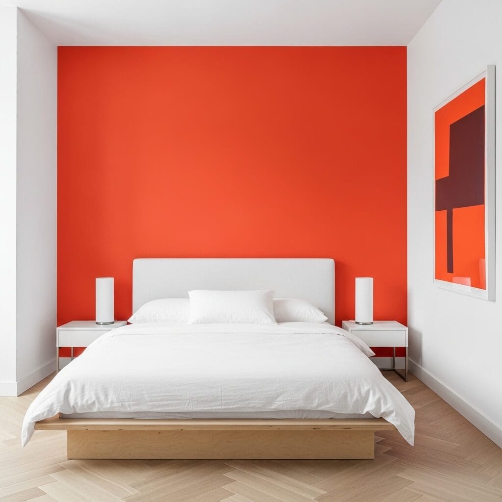
Vivid orange against pure white is the combination that requires the most conviction to commit to and delivers the most clarity when you do — because it operates on a completely different principle from all the warmer, more graduated combinations on this list. This is not about harmony or atmosphere; it is about contrast and confidence, about a room that knows exactly what it is and makes no effort to soften that. The orange, at full saturation against cool white, has no undertone to hide behind: it reads as orange, completely and without qualification, which is its specific power. Most orange combinations ask the colour to be other things simultaneously — earthy, warm, sophisticated, historical. This one asks it only to be itself.
The specific risk here is in the bedding and textiles. If you introduce warm tones — cream bedding, amber textiles, wooden accessories — you begin to soften the sharpness that is this combination’s entire reason for being. The version that works keeps the secondary elements as cool and clean as the white walls: pure white cotton, pale birch or painted white furniture, chrome or brushed nickel hardware. The orange wall does all the warming work the room requires; the remaining elements support the contrast rather than blurring it. This is a combination that rewards restraint in every decision except the paint choice itself.
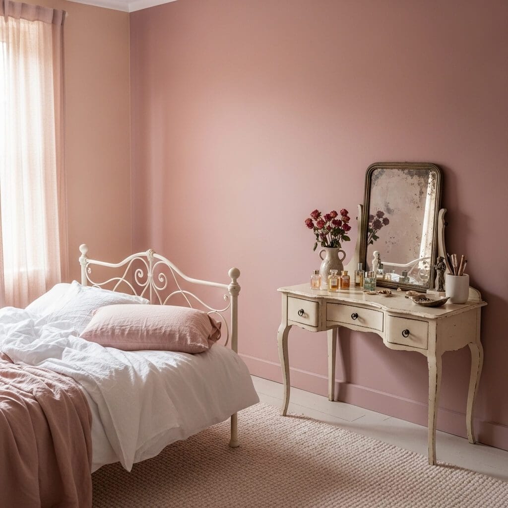
9. Peach and Warm Grey — The Combination for People Who Think They Don’t Like Orange
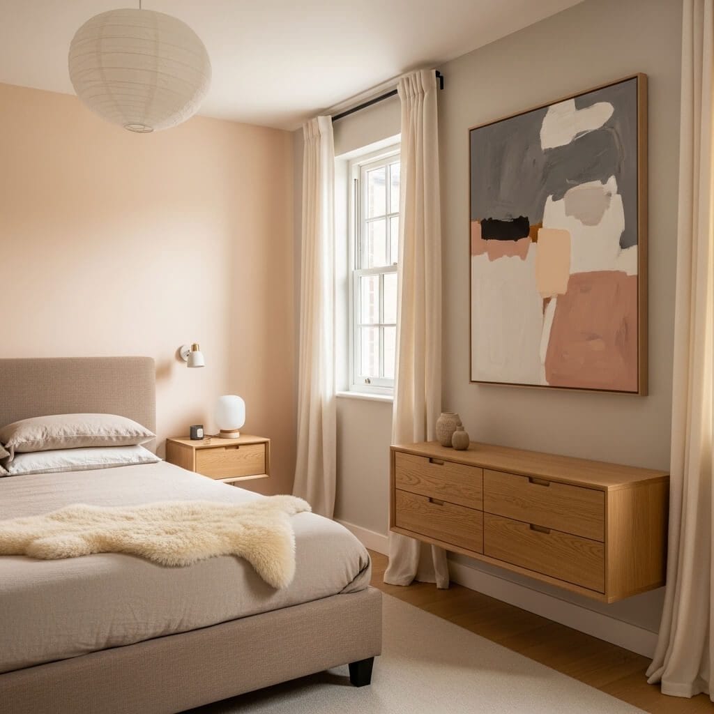
Peach and warm grey is the combination for people who believe they don’t like orange — or who have been told that orange is too much for a bedroom — because it delivers everything orange is actually good at: skin-flattering warmth, a quality of golden light absorption that makes a room glow in the evening, an aliveness that is the opposite of the deadness that too much grey can produce. At the peach end of orange’s range, the colour is so desaturated toward blush that it functions effectively as a warm neutral, which is precisely its value in this combination. The warm grey beside it reads differently than it would beside cool white or blue-white: it reads as grounded and earthy rather than merely grey, because the peach pulls its yellow undertone to the surface.
The specific thing to avoid in this combination is choosing a grey that leans too far toward blue or purple. These grey undertones, which appear in enormous numbers of commercially popular greys — Dulux’s Polished Pebble, Benjamin Moore’s Stonington Gray — will create a cool-warm tension with even the most desaturated peach that reads as visual discomfort rather than sophisticated contrast. The grey to choose is one that laboratory analysis would identify as containing yellow or brown rather than blue: Farrow & Ball’s Elephant’s Breath, with its unmistakable warm undertone, works; so does Benjamin Moore’s Revere Pewter, which remains one of the most successfully warm greys in commercial paint ranges. The undertone is everything, and you cannot see it accurately on a small chip — always test a large sample on the actual wall in your specific light before committing.
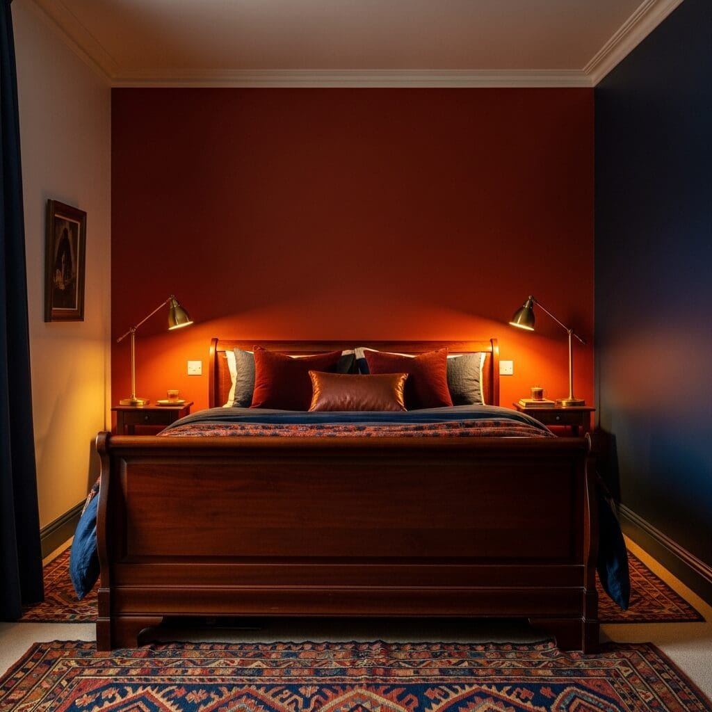
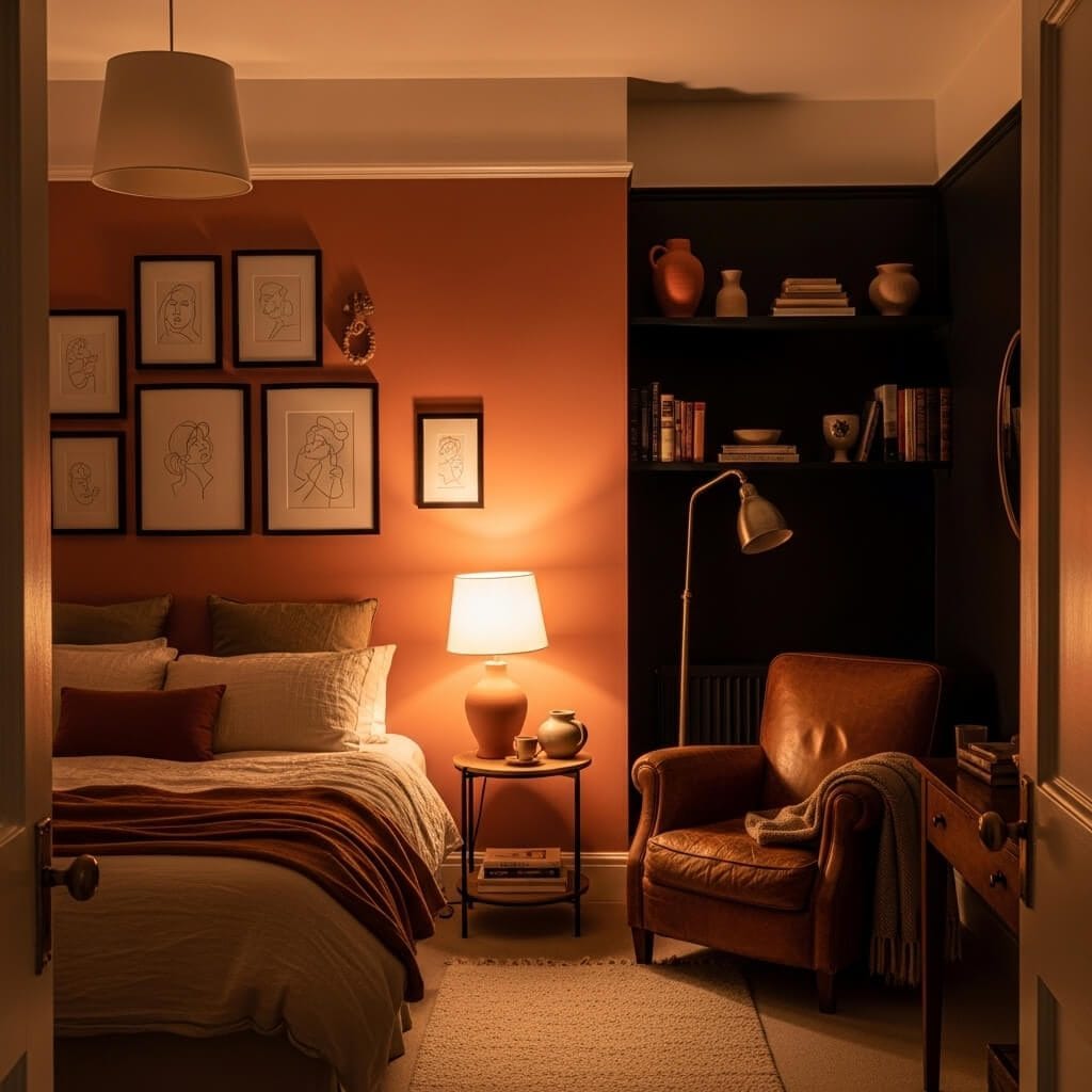
10. Deep Rust and Chocolate Brown — The Combination That Feels Genuinely Ancient
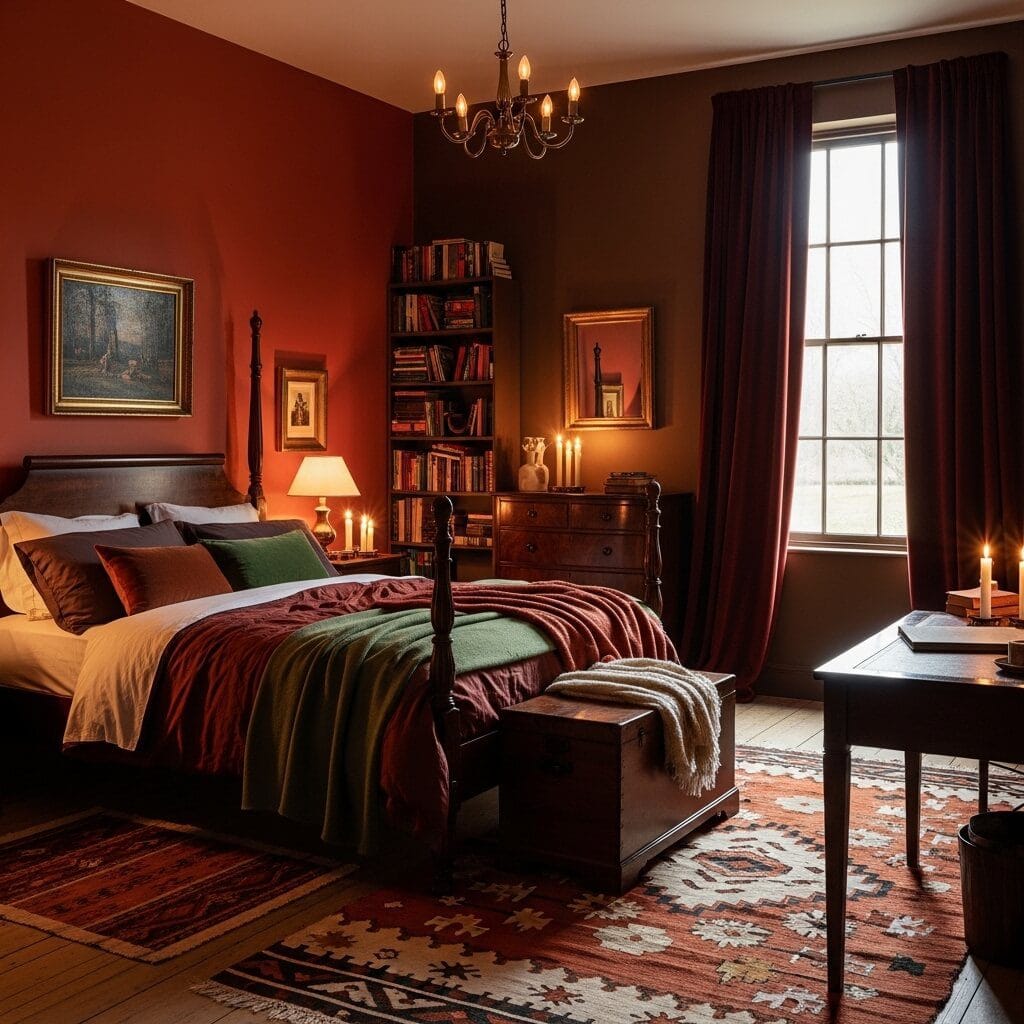
Deep rust and chocolate brown is the darkest, most enveloping combination on this list — and the one most frequently rejected before it’s considered, because the instinct is to worry that two dark warm colours will make a bedroom feel oppressive. What they actually create, in a bedroom where the lighting is warm and low and the textiles are appropriately rich, is exactly the opposite: a quality of enclosure that is specifically protective rather than suffocating, the feeling of being held inside somewhere deliberate and serious. Libraries have been painted this way for centuries. Studies and smoking rooms have operated in this territory for as long as people have wanted to create spaces for thought and rest. The bedroom, the most private room in a house, has specific precedent for this quality of enveloping warmth.
The specific detail that prevents this combination from feeling oppressive is the ceiling. In a dark two-colour scheme of this intensity, the ceiling must remain light — the warmest white available, not cream, not off-white, but proper white — and this white ceiling functions as the visual sky that the room’s atmosphere requires. Without it, the darkness closes in from above and the room begins to feel like a cave. With it, the room reads as a deliberate interior — cocooning rather than claustrophobic — because the eye has somewhere to go. Additionally, the lighting must be warm: LED bulbs in the daylight spectrum will flatten and grey-out these colours, while incandescent-equivalent warm bulbs (2700K or lower) will pull their red and amber tones forward, which is the version of this combination that works.
11. Burnt Orange and Slate Blue — The Combination That Lives at Sunset
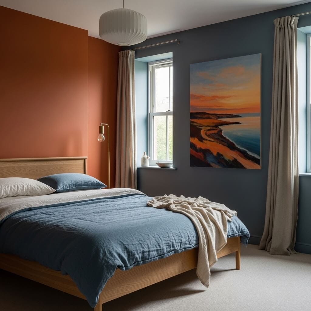
Burnt orange and slate blue is the combination that captures the specific visual phenomenon of sunset over water — the warmth of the sky against the cool of the sea — and translates it into an interior that operates on the same emotional principle: warmth and coolness held in genuine balance, neither dominating, each making the other more beautiful by contrast. This is the most sophisticated of orange’s cool-colour pairings specifically because slate blue sits in the middle ground between warm and cool, carrying green and grey within its blue, which means it doesn’t oppose the orange aggressively. It provides cool relief without visual conflict. You feel the contrast rather than see it, which is a more refined and ultimately more liveable experience than combinations that make their contrast the primary statement.
The specific quality that elevates this combination from pleasing to exceptional is the choice of slate’s undertone. Slate that leans toward green — Oval Room Blue, Farrow & Ball’s Stone Blue — reads warmer and softer against burnt orange than slate that leans toward purple or navy, which would create a harder, less atmospheric contrast. The green undertone in the blue connects it subtly to the yellow-red of the orange, finding common ground that allows the two colours to coexist without effort. Getting to this level of specificity in colour selection requires large painted samples tested at different times of day — the green undertone in a blue that reads grey in the morning can become clearly visible by afternoon, and that visible quality is precisely what makes the combination work.
12. Terracotta and Soft Black — The Combination That Is Surprisingly Tender
Terracotta and soft black is a combination that challenges the instinct that pairs black with sterility or minimalism — because in this specific pairing, the black reads as something else entirely: as depth, as shadow, as the darkness at the edge of firelight. The terracotta pulls the black away from its cool associations and toward its warmer ones, revealing the brown and red that exist within a black that has been mixed with warmth rather than blue. What results is not the stark black-and-white contemporary combination most people picture when they think of black walls, but something more complex and more tender: two colours that share warmth, one expressed through saturation and one through depth.
The specific black that makes this work is critical. Blue-black — which includes most architectural blacks sold commercially, including Dulux’s Black Beauty and Benjamin Moore’s Black — will read as cool against terracotta, creating contrast of a colder and less harmonious kind. The version to choose is explicitly warm-black: Farrow & Ball’s Pitch Black or Off-Black, both of which contain brown undertone; or Annie Sloan’s Graphite, which sits in warm charcoal territory that reads as black in context. The difference between warm black and cool black is a difference of approximately three degrees of colour temperature on the wall, but it’s the difference between a combination that breathes together and one that fights.
13. Bright Orange and Mustard Yellow — The Combination That Refuses to Be Ignored
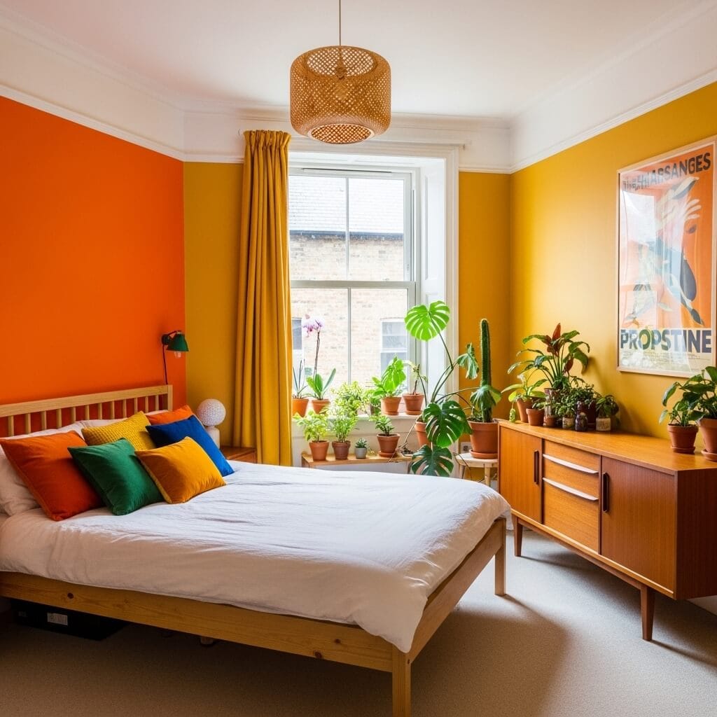
Bright orange and mustard yellow is the combination that most fully commits to colour’s capacity for joy — which makes it the most divisive combination on this list and also, in the right hands, the most genuinely uplifting. These two colours share the warm end of the spectrum: they’re both expressions of the same impulse, solar and generous and communicative. Where most two-colour combinations operate through contrast — warm against cool, light against dark, saturated against muted — this one operates through abundance, piling warmth on warmth until the room simply radiates. The risk is obvious; the reward, for people whose sensibility genuinely extends here, is a bedroom that feels like nowhere else in the world.
The specific thing that prevents this combination from becoming chaotic is proportion and restraint in everything else. Two walls of intense warm colour is the maximum; the other two must be held in warm white, not cream (which adds yet more yellow) and not grey (which flattens the warmth). The furniture must be restrained in scale and simple in character — the colours are doing all the work, and heavily ornate furniture would compete rather than support. The one place to add complexity is in the textiles, where a mix of patterns in the same warm palette — vintage kilims, embroidered cushions, woven throws — can add exactly the richness that makes two-colour rooms feel complete rather than merely painted.
14. Peach and Powder Blue — The Combination That Feels Like Early Morning Light
Peach and powder blue is the combination that disappears into light — which is its specific and remarkable quality. At their palest register, both colours approach white but retain just enough temperature — the peach warm, the blue cool — to keep the room from reading as blank. The result is a room that seems to be lit from within, where the walls appear to reflect the specific quality of early morning sky rather than merely to be painted. This is orange’s most ethereal expression: so far from the vivid, earthy, fire-adjacent qualities usually associated with the colour that it barely announces itself as orange at all. But the warmth is present, quietly and crucially — remove the peach and replace it with pure white, and the powder blue room suddenly feels cold in a way that requires adding colour back.
The specific technical consideration in this combination is the paint sheen. Both colours, at this level of delicacy, should be in the flattest possible finish — absolutely matte, with no sheen whatsoever — because the slightest sheen in such pale colours catches light in ways that reveal brush marks, roller texture, and wall imperfections that a richer colour would absorb. Dead flat paint finishes (as opposed to eggshell or satin) also make colours look more pigmented and less washed-out than they actually are, which is precisely the quality needed when working with colours this close to white. The walls should look like washed colour has been absorbed into plaster, not like paint has been applied over drywall.
15. Deep Rust and Olive Green — The Combination That Feels Dug From the Earth
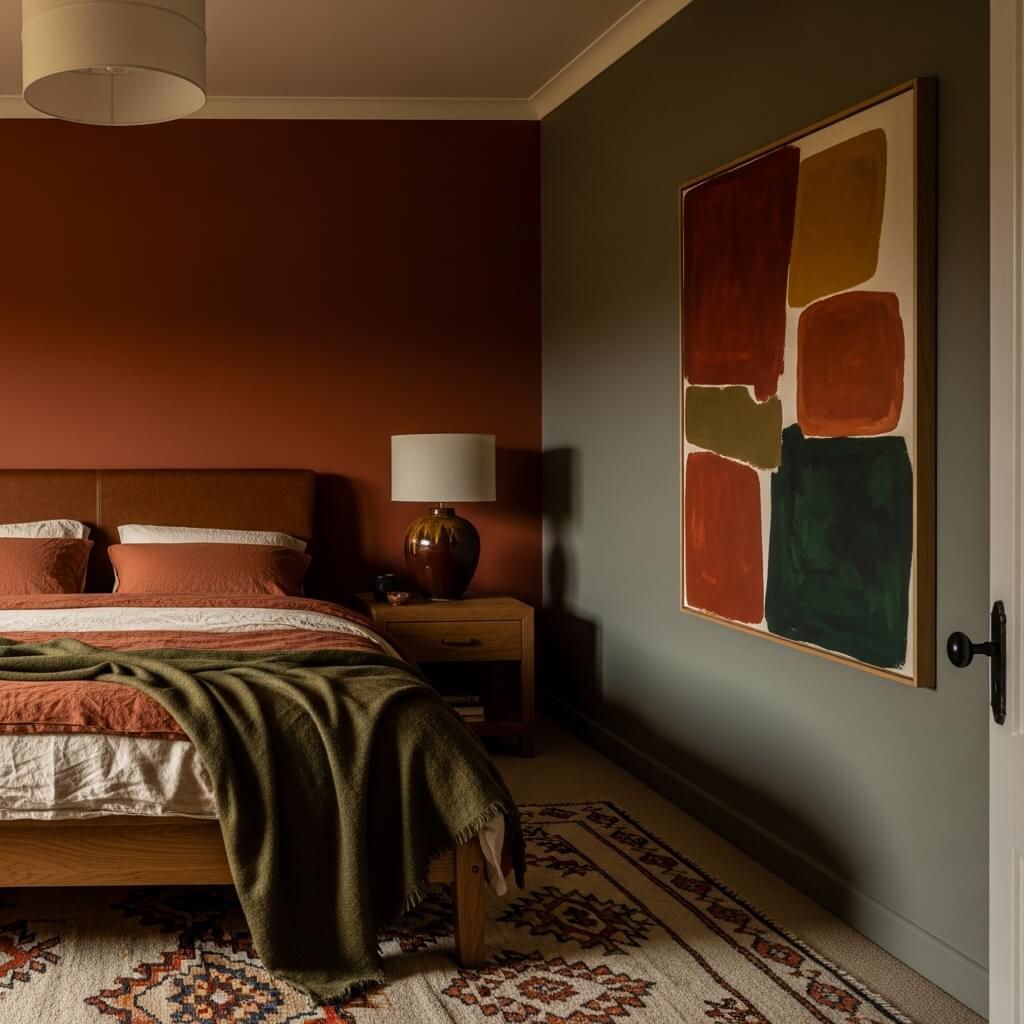
The specific contrast that makes this combination work better than rust-and-sage or rust-and-forest-green is the grey in the olive. Olive green, unlike forest green or sage, carries a significant grey component — it’s a green that has been mixed with brown and grey, pulling it away from the freshness of other greens and toward the dried, aged quality that shares rust’s vocabulary. It’s the difference between pairing rust with something living and pairing it with something that has also weathered. Both colours in this combination feel old; this shared quality of age is what makes the room feel cohesive rather than merely colourful.
16. Burnt Orange and Warm Gold — The Combination That Glows in Lamplight
Burnt orange and warm gold is the most overtly luxurious combination on this list — specifically because it operates on the principle of amplification rather than contrast, piling warmth on warmth until the room achieves the quality of light you associate with chandeliers and candlelight and the inside of gold treasure boxes. This is not a combination for natural daylight rooms; it is a combination for rooms where the primary experience is nocturnal, where lamplight does the work and the colours respond to it by becoming more themselves: the orange deeper and richer, the gold more luminous, the whole room appearing to generate warmth from within the walls rather than from the light fixtures alone.
The specific consideration here is the gold’s matte quality. Glossy gold paint reads as ostentation — it calls attention to itself as paint doing an impression of metal, which is precisely the quality to avoid. The gold that works in this combination is matte, powdery, almost chalky — a gold that reads as pigment rather than finish, that suggests the colour of gilded manuscripts and old frames rather than the colour of commercial gold spray paint. This quality of matte depth allows the gold to function as a true wall colour rather than an accent, and it keeps the combination reading as sophisticated rather than merely extravagant. The brass hardware and accessories can carry the metallic quality; the walls should carry only the colour.
17. Terracotta and Warm White — The Combination That Is the Simplest and the Most Timeless
Terracotta and warm white is the combination that has been used longest and most consistently across the most cultures — in Moroccan riads, Andalusian cortijos, Tuscan farmhouses, Mexican haciendas, Californian adobe houses, and the painted interiors of Greek island homes — and the reason for this convergence across such different cultures and climates is simply that it works. It works because warm white is the most naturally occurring background against which terracotta reads as warm earth rather than aggressive colour; because the two share an undertone of yellow that prevents any conflict; and because the combination requires no additional colours to feel complete. It is a room that resolves itself without effort, which is the specific quality of all the most enduring colour combinations.
The specific danger in this combination’s simplicity is that it can tip toward blankness if the terracotta is too pale. The terracotta needs enough pigment to read as a definite colour — not a stained white, not a blushed beige, but genuine terracotta — and this means choosing a paint colour that feels slightly bold on the chip. In context, against warm white, the eye adjusts and the colour reads as warmer and more nuanced than it appeared alone. Benjamin Moore’s Moroccan Spice and Fired Earth’s Adobe both have the necessary depth; anything noticeably lighter than these will read as beige rather than terracotta, and the specific quality of the combination — that feeling of warm earth held against warm light — will be lost along with the colour depth.
18. Spice Orange and Warm Linen — The Combination That Gets Better Every Year
Spice orange and warm linen is the combination that improves with time, and this is its most specific and unusual quality: unlike bolder combinations that make their impact immediately and completely, this one reveals itself gradually — first as warmth and comfort, then, over weeks and months of living with it, as a depth and richness that you begin to wonder how you lived without. The spice orange, unlike brighter or darker versions of the colour, sits in the register of found warmth rather than applied warmth: the warmth of old wood, faded silk, dried spices, aged paper. And the linen colour beside it — that not-quite-white, not-quite-cream tone that textiles take on after years of washing — amplifies this quality of comfortable age, of things that have been there long enough to have earned their place.
What makes this combination specifically different from terracotta-and-cream or burnt-orange-and-ivory is the saturation register of the spice orange: brighter than terracotta but not as vivid as true orange, more golden than red, with a quality of dried saffron or turmeric rather than raw clay or fire. It’s the orange that reads most convincingly as a natural material rather than a paint colour — the orange you’d find in aged leather, in the patina of old brass, in the warm edge of linen curtains where the sun has touched them for years. This naturalistic quality is what gives the combination its specific staying power: it doesn’t feel chosen so much as arrived at, which is the highest achievement of any room that intends to feel genuinely liveable.