15 Easter Table Decorations Ideas 2026
Easter tablescapes have this wonderful opportunity to celebrate spring’s arrival through soft pastels, natural textures, and that particular quality of light that only happens this time of year, without needing to lean on anything too literal or cutesy to feel genuinely festive. Whether you’re drawn to a pale, romantic palette of blush and sage, a more sophisticated approach using natural elements like moss and branches, or a playful mix incorporating painted eggs and fresh spring blooms, Easter table styling is fundamentally about capturing that sense of renewal and gathering that defines the holiday. From elegant place settings with hand-painted eggs as individual place cards to abundant centerpieces overflowing with ranunculus and tulips, these ideas prove that Easter decorating can feel genuinely elevated and personal rather than relying on the same predictable bunny and chick imagery everyone associates with the holiday.
I used to dread hosting Easter because my table always ended up looking like a craft store exploded, plastic eggs in garish colors scattered everywhere, dollar store bunny figurines competing for space, and somehow the whole effect felt more like a child’s birthday party than an actual celebratory family gathering. It wasn’t until I started really paying attention to how professional stylists approached spring holiday tables, favoring genuine botanicals, a restrained color palette, and quality materials over quantity of themed decorations, that I understood how to create something that felt both festive and genuinely beautiful rather than costume-like. That shift in approach completely changed how much I actually look forward to setting this table every year.
What I’ve learned about successful Easter table design is that restraint and quality genuinely matter more than abundance and literal holiday imagery. The most beautiful Easter tables I’ve encountered lean into the season’s natural offerings, real eggs, fresh spring flowers, new greenery, rather than manufactured decorations trying to represent those same elements artificially. Understanding how to balance pastel colors without tipping into saccharine territory, how to incorporate eggs in sophisticated rather than juvenile ways, and how negative space and natural texture can carry a table just as effectively as elaborate centerpieces has transformed how I think about seasonal entertaining altogether.
1. Naturally Dyed Eggs in a Nest Centerpiece
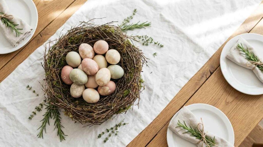
An elegant Easter table centerpiece featuring a low, organic nest woven from natural twigs and moss, cradling a collection of naturally dyed eggs in soft blush, sage, and cream tones achieved through onion skin, beet, and turmeric dyes. The eggs show subtle marbled texture and gentle color variation rather than uniform saturation. White linen table runner provides a clean backdrop. Simple white ceramic plates are set with linen napkins tied with sprigs of fresh rosemary. Soft morning light illuminates the eggs’ natural dye variation, creating gentle highlights. Wide-plank oak table surface adds warmth. A few scattered fresh herb sprigs surround the nest. Shot from above showing the full nested arrangement, with bright, natural lighting emphasizing the soft, organic color palette achieved through natural dyeing methods.
Naturally dyeing my eggs using onion skins, beets, and turmeric instead of artificial food coloring tablets was a project that took an entire afternoon, but the resulting soft, variegated colors have this depth and subtlety that bright chemical dyes simply cannot replicate. Each egg came out slightly different, some more marbled, some deeper in tone, and that natural variation feels so much more sophisticated sitting in the center of my table than the uniform, saturated colors typical of store-bought dye kits. The whole process connected me to this genuinely old-fashioned technique that predates commercial dye entirely.
Nesting these eggs in real twigs and moss rather than plastic grass gave the centerpiece this organic, foraged quality that fits perfectly with the softer, more natural direction I wanted for the whole table. I kept everything else around this centerpiece quite simple, white ceramic and linen napkins, specifically so the eggs’ subtle coloring could be the genuine focal point without competing against busier patterns or brighter colors elsewhere. This centerpiece has become something guests specifically ask about, and it’s taught me that Easter decorating benefits enormously from this kind of genuine, hands-on approach rather than relying entirely on purchased decorations.
2. Fresh Ranunculus and Tulip Table Runner
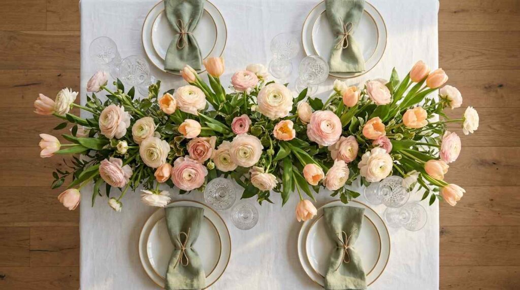
A romantic spring table setting featuring an abundant floral runner running the length of the table, composed of fresh ranunculus in blush pink and cream alongside tulips in soft peach tones. The flowers are loosely arranged directly on the linen tablecloth rather than in a formal vase, creating an organic, garden-fresh quality. White ceramic plates with simple gold rim detailing are set at each place. Linen napkins in soft sage green are tied with twine. Crystal glassware catches natural light throughout the table. Soft afternoon light illuminates the flowers’ delicate petals, creating gentle shadows across the white linen. Wide-plank oak flooring is visible beneath the table. Shot from an elevated angle showing the full floral runner’s abundance and how it anchors the entire table setting, with bright, natural lighting emphasizing the romantic, garden-inspired quality of this loose floral styling technique.
Laying fresh ranunculus and tulips directly along the table as an informal runner, rather than arranging them in a traditional vase, creates this abundant, garden-fresh quality that feels considerably more romantic and current than a single centered floral arrangement ever could. I sourced the flowers the morning of, working with the blush and peach tones already blooming that particular week rather than forcing a specific predetermined color scheme, which meant embracing whatever the season was actually offering rather than fighting against it.
This loose, unstructured styling technique requires less floral arranging skill than you might expect, since the beauty comes from the flowers’ natural, slightly imperfect placement rather than any formal structure. I left gaps and negative space throughout the runner rather than packing every inch densely, which lets individual blooms actually be appreciated rather than blurring together into an undifferentiated mass of color. The sage green napkins pick up the flowers’ subtle greenery, creating cohesion without being overly matched or coordinated. This runner has taught me that some of the most beautiful Easter tables come from working with genuinely fresh, seasonal flowers rather than trying to force a rigid design vision onto whatever happens to be available.
3. Monochromatic White and Cream Tablescape

A sophisticated, restrained Easter table featuring an entirely white and cream color palette. White linen tablecloth serves as the base, topped with cream ceramic plates in varying textures, from matte to glossy finishes. White ranunculus and cream tulips fill simple white ceramic vessels of varying heights down the table’s center. Ivory linen napkins are simply folded at each place setting. Crystal glassware and simple silver flatware add subtle sparkle without introducing additional color. Soft natural light illuminates the tonal variations within this restrained white palette, creating gentle shadows that reveal texture despite the lack of color contrast. Wide-plank white oak flooring grounds the elegant space. Shot from an elevated angle showing the full monochromatic table setting, with bright, soft lighting emphasizing the sophisticated calm achieved through this restrained, tonal approach to Easter styling.
Committing to an entirely white and cream palette for this Easter table taught me how much sophistication comes from genuine restraint rather than the colorful abundance typically associated with the holiday. Every element, from the tablecloth to the ceramic plates to the flowers themselves, exists somewhere within this narrow tonal range, and rather than feeling boring or underdecorated, the effect is genuinely elegant and calming in a way that busier, more colorful tables sometimes aren’t. This approach required real discipline when selecting each component, since the temptation to introduce even small pops of pastel color was constant throughout the planning process.
The varying textures throughout, from matte ceramic to glossy crystal to soft linen, become essential for creating visual interest within this restricted palette, proving that texture can carry a table just as effectively as color contrast when handled thoughtfully. I chose ranunculus and tulips specifically in white and cream varieties rather than the more expected pastel pinks or yellows typically associated with Easter, which kept the whole table feeling more like a sophisticated spring dinner party than a holiday specifically themed around eggs and bunnies. This monochromatic approach has become my preferred direction for hosting more elevated Easter gatherings, proving that restraint often reads as more intentional and elegant than maximalist, colorful abundance.
4. Moss and Botanical Place Card Setting
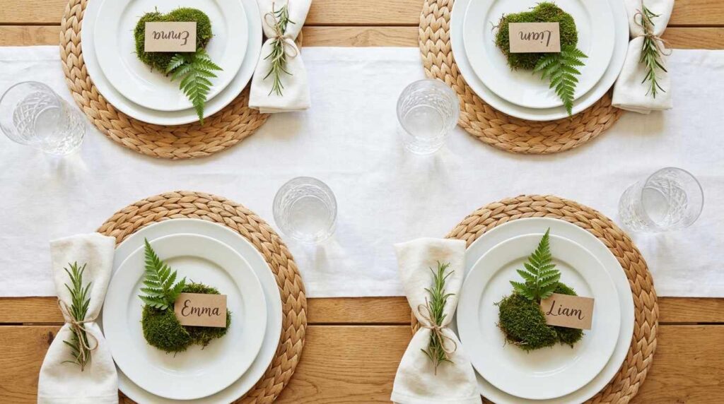
An elegant, nature-inspired Easter place setting featuring small moss-covered bases at each seat, topped with a single fresh sprig of greenery and a hand-lettered place card nestled into the moss. White ceramic plates sit atop woven placemats in natural fiber. Simple linen napkins in soft white are tied with a small sprig of fresh herbs. The moss bases show rich, textured green against the white table linens. Natural light illuminates the organic texture of the moss and the delicate greenery sprigs. Crystal water glasses catch soft reflections. Wide-plank oak table surface is visible at the edges. Shot from above showing several place settings with their moss and greenery details, with bright, natural lighting emphasizing the organic, garden-inspired quality achieved through this detailed personal touch at each seat.
Creating these small moss bases for each place setting was a detail that took considerable time to execute properly, sourcing genuine reindeer moss and cutting it into appropriately sized pieces for each guest’s spot at the table, but the resulting personal touch elevated the whole setting beyond what standard place cards alone could achieve. Nestling a hand-lettered card directly into the textured moss, alongside a small sprig of fresh greenery, creates this miniature garden moment at each place that guests genuinely notice and appreciate as they find their seats.
This approach works particularly well for bringing genuine natural texture to the table without requiring an elaborate central floral arrangement, since the greenery is distributed throughout every place setting rather than concentrated in one area. I sourced fresh herb sprigs, rosemary and thyme specifically, which added subtle fragrance to the whole table as guests settled in, engaging a sense beyond just visual appreciation. This detail requires more prep time than most place card approaches, but the resulting table feels genuinely considered and personal in a way that store-bought place card holders never could achieve, proving that some of the most memorable Easter table details come from this kind of hands-on, natural styling.
5. Pastel Linen Layering with Brass Accents
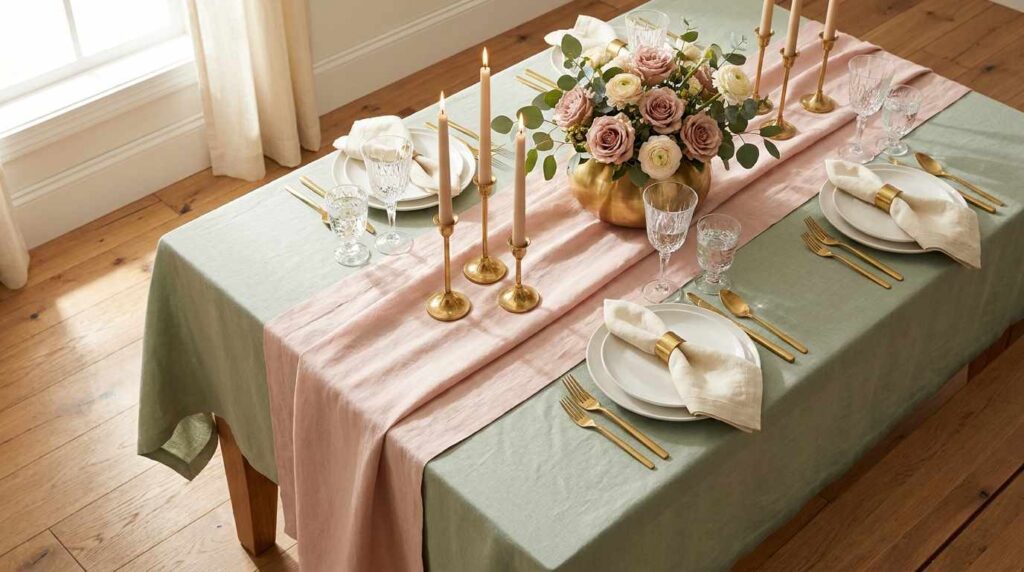
A sophisticated Easter table featuring layered linens in soft pastel tones: a base tablecloth in pale sage green topped with a table runner in blush pink linen. Brass flatware and candlesticks add warm metallic accents throughout. White ceramic plates sit atop the layered linens, with cream linen napkins tied simply with brass rings. Fresh spring flowers in dusty pink and cream fill a low brass vessel centered on the table. Soft natural light illuminates the layered fabric textures and brass details, creating warm highlights. Crystal glassware adds subtle sparkle. Wide-plank oak flooring grounds the elegant space. Shot from an elevated angle showing the full layered linen effect and brass accent details, with warm, natural lighting emphasizing the sophisticated, tonal quality achieved through this thoughtful pastel and metallic pairing.
Layering a blush pink linen runner over a pale sage tablecloth created this soft, tonal foundation that immediately established a sophisticated spring mood before adding any other decorative elements. The two pastel tones work together beautifully without competing, and this layering technique adds visual depth that a single flat tablecloth alone couldn’t achieve. I chose linen specifically for both layers because its natural texture and slight wrinkle feels appropriately relaxed and elegant rather than overly formal or stiff.
Introducing brass throughout, the flatware, candlesticks, napkin rings, and the low vessel holding fresh flowers, added warmth that kept this pastel palette from feeling too soft or saccharine. The metallic accents catch and reflect available light beautifully, adding subtle sparkle without requiring anything overtly sparkly or glittery that might feel out of place for a more understated spring gathering. This combination of layered pastels and warm brass has become my template for elegant holiday entertaining generally, not just Easter specifically, since the formula translates beautifully to other spring and summer occasions. This table taught me that sophisticated pastel styling comes down to thoughtful layering and metallic warmth rather than avoiding soft colors altogether out of fear they’ll read as juvenile.
6. Speckled Egg and Greenery Garland
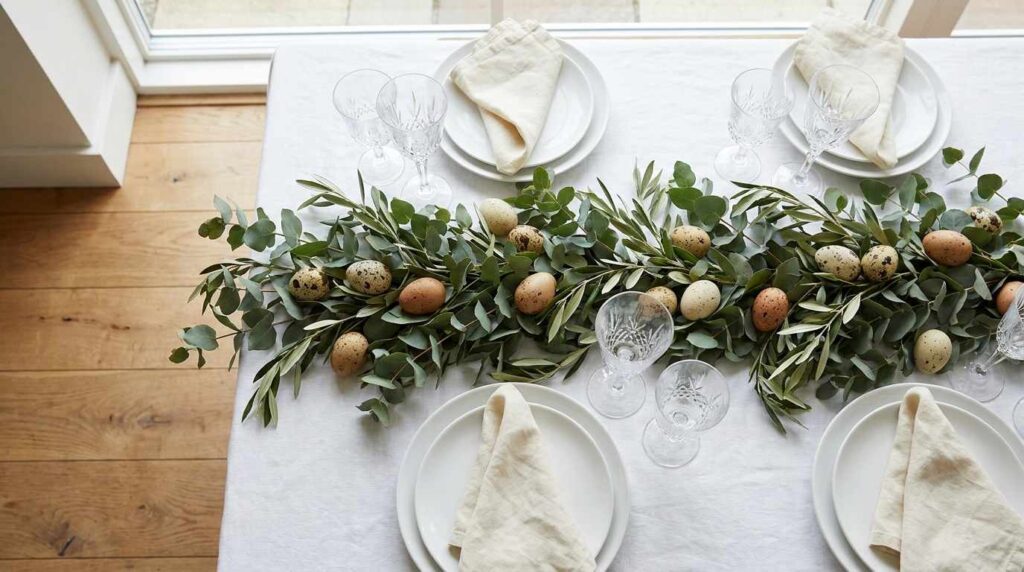
A charming, organic Easter table featuring a loose garland of fresh eucalyptus and olive branches running down the table’s center, interspersed with naturally speckled brown and cream eggs nestled among the greenery. White linen tablecloth provides a clean backdrop. Simple white ceramic plates are set with linen napkins in soft cream. The speckled eggs show authentic, subtle patterning rather than artificial spots. Natural light illuminates the greenery’s varied textures and the eggs’ natural coloring. Crystal glassware catches soft reflections throughout the table. Wide-plank oak flooring grounds the organic, garden-inspired space. Shot from an elevated angle showing the full garland with nestled eggs, with bright, natural lighting emphasizing the authentic, naturalistic quality achieved through this combination of fresh greenery and genuinely speckled eggs.
Sourcing genuinely speckled eggs, the kind with authentic, subtle natural patterning rather than anything artificially decorated, gave this table a naturalistic quality that felt considerably more sophisticated than the bright, uniformly colored eggs typically associated with Easter styling. Nestling them throughout a loose garland of fresh eucalyptus and olive branches created this beautiful, organic centerpiece that looks like it could have been gathered directly from a garden rather than assembled from craft store materials. The greenery’s varied textures, from eucalyptus’s rounded silvery leaves to olive’s narrow, elongated ones, add visual interest even before considering the eggs nestled within.
This approach required sourcing eggs specifically known for their natural speckled patterning, which took more research than simply grabbing whatever was available, but the resulting authenticity felt worth that extra effort. I kept the garland loose and slightly irregular rather than perfectly symmetrical, letting individual branches and eggs fall naturally rather than forcing rigid placement throughout. This centerpiece has taught me that Easter’s traditional egg imagery can absolutely work within a sophisticated, adult table setting when you choose genuinely beautiful natural eggs rather than anything artificially bright or cartoonish, proving the holiday’s classic symbols don’t require abandoning for an elevated aesthetic.
7. Watercolor-Inspired Painted Eggs as Place Settings
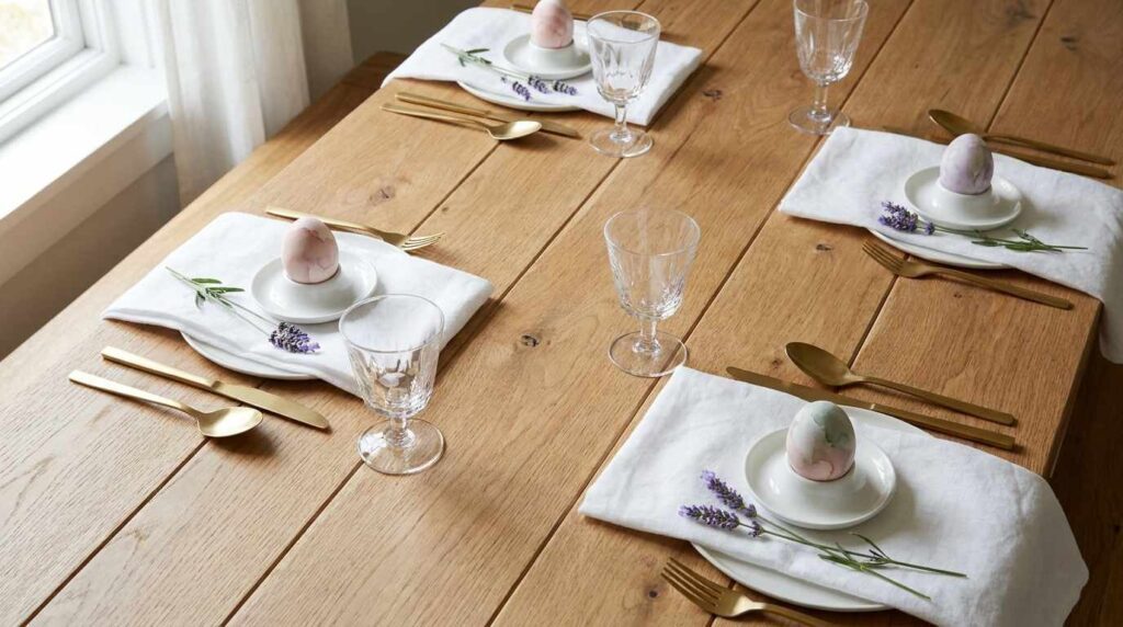
An artistic Easter table featuring individually hand-painted eggs in soft watercolor-style washes of blush, lavender, and sage, each placed atop a small white ceramic egg cup at individual place settings. The painting technique shows delicate, blended color transitions rather than solid, uniform coverage. White linen napkins are simply folded beneath each egg cup. Fresh sprigs of lavender rest beside each setting. Natural light illuminates the eggs’ delicate watercolor patterns, showing the subtle paint blending. Crystal glassware and simple gold flatware complete each place setting. Wide-plank oak table surface is visible beneath the white linens. Shot from above showing several place settings with their individually painted eggs, with soft, natural lighting emphasizing the artistic, delicate quality achieved through this hand-painted watercolor technique.
Hand-painting each egg using a watercolor technique, applying diluted acrylic paint in soft washes that blend and transition rather than creating solid, uniform color blocks, turned this typically simple craft project into something that felt genuinely artistic sitting at each place setting. I practiced this blending technique on several eggs before achieving washes I was happy with, since getting that soft, gradient effect requires working while the paint is still wet enough to blend naturally rather than creating harsh, defined color boundaries.
Placing each finished egg in a simple white ceramic egg cup at individual settings gave every guest their own small piece of edible art to admire before the meal began, creating this personal touch that a shared centerpiece couldn’t replicate. The soft blush, lavender, and sage tones I chose felt appropriately spring-like without veering into anything too bright or cartoonish. This project required considerably more time investment than simply dyeing eggs in solid colors, but the resulting sophistication and individual attention at each place setting made guests feel genuinely celebrated rather than just accommodated. This technique has taught me that Easter eggs, often relegated to children’s craft projects, can become genuinely elegant table elements when approached with more artistic intention and technique.
8. Sage Green and Terracotta Natural Palette
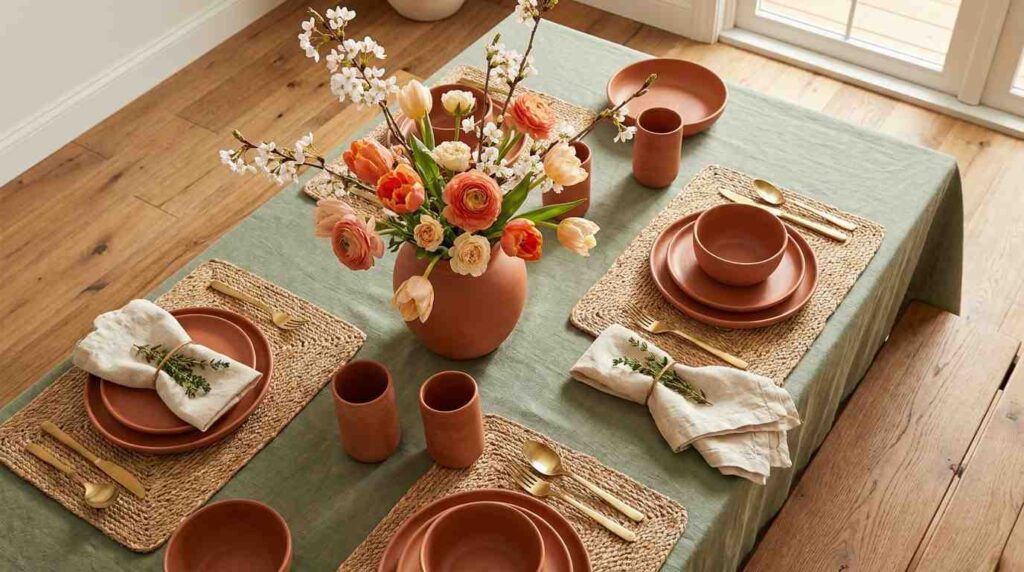
A warm, earthy Easter table featuring sage green linens paired with terracotta ceramic plates and vessels. Fresh spring flowers in warm coral and cream tones fill a terracotta vase centered on the table. Woven placemats in natural fiber add textural warmth beneath each setting. Linen napkins in warm cream are simply folded with a small sprig of fresh herb tucked beneath the fold. Natural light illuminates the earthy color palette, creating warm highlights across the terracotta’s matte surface. Brass flatware adds subtle metallic warmth. Wide-plank oak flooring grounds the warm, grounded space. Shot from an elevated angle showing the full earthy table setting, with warm, natural lighting emphasizing the grounded, Mediterranean-inspired quality achieved through this terracotta and sage color combination.
Pairing sage green linens with warm terracotta ceramics gave this Easter table an earthy, grounded quality that felt distinctly different from the more common pastel pink and lavender palettes typically associated with the holiday. This combination references Mediterranean spring gatherings more than traditional Easter imagery, and I found that grounding approach created something that felt genuinely sophisticated rather than tied to any specific holiday cliché. The terracotta’s warm, matte texture provides such beautiful contrast against the sage’s cooler, more muted tone.
Filling the terracotta vase with coral and cream flowers rather than anything pastel pink continued this warmer, earthier direction throughout the centerpiece, and the woven placemats added another layer of natural texture that complemented the ceramic’s organic quality. I chose brass flatware specifically to add warmth that bridges the sage and terracotta beautifully, its metallic glow picking up the warm undertones in both colors. This palette has taught me that Easter tables don’t need to default to expected pastels to feel seasonally appropriate; sometimes leaning into warmer, more grounded earth tones creates something that feels equally spring-appropriate while standing out from more predictable holiday styling.
9. Vintage China Mismatched Place Settings
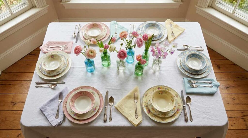
A charming, collected Easter table featuring an eclectic mix of vintage china patterns at each place setting, no two plates matching but all coordinating within a soft pastel color family of pink, blue, and yellow florals. White linen tablecloth provides a unifying backdrop. Fresh spring flowers in a mix of vintage glass vessels of varying heights run down the table’s center. Vintage silver flatware with ornate detailing completes each setting. Cloth napkins in coordinating pastel tones are simply folded. Natural light illuminates the varied china patterns, showing their individual character and subtle age-related patina. Wide-plank oak flooring grounds the collected, nostalgic space. Shot from an elevated angle showing the mismatched china arrangement’s overall harmony, with warm, natural lighting emphasizing the collected, heirloom quality achieved through this intentionally eclectic vintage approach.
Mixing genuinely different vintage china patterns at each place setting, rather than using a single matched set, created this collected, heirloom quality that immediately makes the table feel more personal and storied than anything purchased as a coordinated collection. I sourced these pieces gradually from estate sales and antique shops over several years, always keeping an eye toward soft pastel florals that would coordinate within the same general color family even though no two patterns actually matched precisely. This approach requires a good eye for what will work together rather than clash, focusing on similar color intensity and scale of pattern even as the specific designs vary.
The white tablecloth beneath provides essential visual calm that lets all these different patterns coexist without the table feeling overwhelming or chaotic. I filled a mismatched collection of vintage glass vessels with fresh flowers rather than one uniform centerpiece, continuing this collected, eclectic theme throughout rather than just at the place settings alone. This approach has taught me that some of the most charming Easter tables come from this kind of patient collecting over time rather than purchasing an entire coordinated tablescape in one transaction, and there’s something genuinely special about using pieces that carry their own history and previous life before joining your particular celebration.
10. Minimalist Single Stem Bud Vases
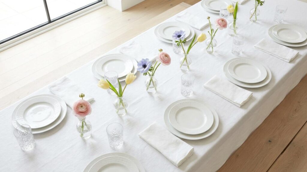
A refined, modern Easter table featuring individual small glass bud vases at each place setting, each holding a single fresh spring stem, ranunculus, anemone, or tulip in soft pastel tones. White linen tablecloth provides a clean, minimal backdrop. Simple white ceramic plates with subtle textural detailing sit at each setting. Linen napkins in soft white are minimally folded. Crystal water glasses add subtle sparkle without additional color. Natural light illuminates each individual stem, creating soft shadows from the delicate glass vessels. Wide-plank white oak flooring grounds the restrained, elegant space. Shot from an elevated angle showing the repeated bud vase detail across multiple place settings, with bright, natural lighting emphasizing the sophisticated, minimal quality achieved through this restrained single-stem styling approach.
Placing one single, perfect flower stem in a small glass bud vase at each individual place setting, rather than relying on one large centerpiece arrangement, created this refined, minimal quality that let each flower actually be appreciated individually rather than blending into a larger floral mass. I varied the specific flower type slightly between settings, some ranunculus, some anemone, some tulip, while keeping everything within the same soft pastel color family for overall cohesion despite this variety.
This approach requires investing in quality individual stems rather than a larger, more economical bulk arrangement, but the resulting sophistication and personal touch at each place setting felt worth that different allocation of floral budget. The small glass vessels take up minimal table space too, which left plenty of room for serving dishes and passing platters without the table feeling overcrowded with decor competing against the actual meal. This minimal styling technique has become my preferred approach for more intimate Easter gatherings specifically, proving that sometimes the most elegant solution isn’t more abundant decoration but rather this kind of restrained, repeated simplicity that lets quality and thoughtful placement carry the visual impact instead.
11. Blush and Gold Elegant Formal Setting
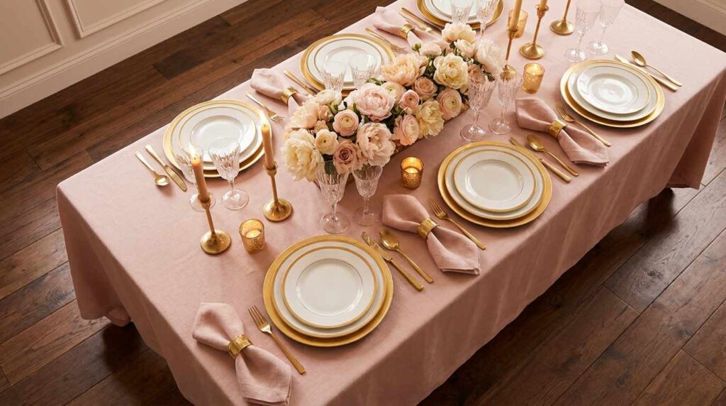
A luxurious, formal Easter table featuring blush pink linens paired with gold flatware and charger plates. White china with a delicate gold rim sits atop the gold chargers at each place setting. Fresh peonies and ranunculus in blush and cream fill an elegant low arrangement running down the table’s center. Crystal glassware catches and reflects light throughout the sophisticated setting. Blush linen napkins are elegantly folded with a small gold ring accent. Soft candlelight from gold candlesticks adds warm, romantic illumination. Wide-plank dark wood flooring grounds the formal space. Shot from an elevated angle showing the full luxurious table setting, with warm, romantic lighting emphasizing the elegant, formal quality achieved through this sophisticated blush and gold color pairing.
Combining blush pink linens with gold flatware and charger plates created this genuinely luxurious, formal quality that elevated our Easter gathering into something feeling more like a celebratory event than a casual holiday meal. The gold accents throughout, chargers, flatware, candlesticks, napkin rings, add this consistent metallic warmth that makes the soft pink linens feel sophisticated rather than overly sweet or juvenile. This combination requires investing in quality gold-toned pieces, since anything too bright or obviously faux gold would undermine the elegant effect I was aiming for.
Filling the centerpiece with peonies and ranunculus specifically, both flowers known for their romantic, full-petaled appearance, continued this luxurious direction throughout the table’s floral element. I lit gold candlesticks for the actual meal, creating warm, flattering candlelight that made the whole gold and blush palette practically glow once evening arrived. This formal approach has become reserved for our most special Easter gatherings, when hosting extended family or marking a particularly significant celebration, and it’s taught me that Easter entertaining can absolutely support this level of elegant formality when the occasion calls for it, moving well beyond casual holiday decorating into genuine special-occasion table design.
12. Woven Basket Centerpiece with Fresh Herbs
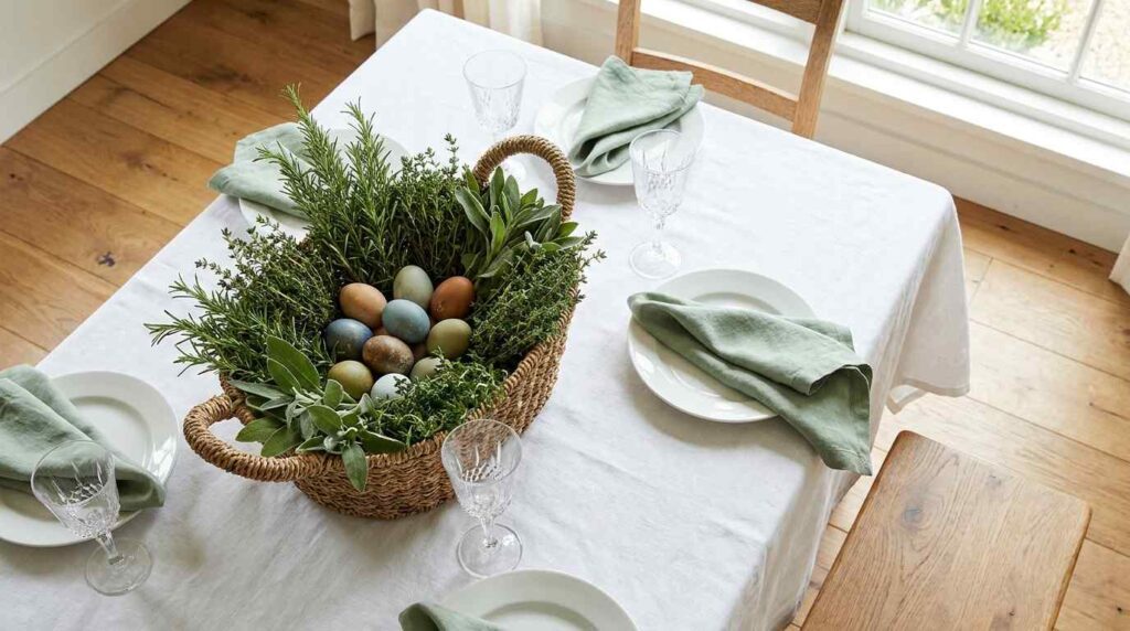
A rustic-elegant Easter table featuring a substantial woven basket centerpiece filled with fresh herbs, rosemary, thyme, and sage, alongside a few naturally dyed eggs tucked among the greenery. White linen tablecloth provides a clean backdrop. Simple white ceramic plates are set with linen napkins in soft sage green. The herbs’ varied textures, from rosemary’s needle-like leaves to sage’s soft, fuzzy foliage, create dimensional interest within the basket. Natural light illuminates the herbs’ natural coloring and the basket’s woven texture. Crystal glassware adds subtle sparkle. Wide-plank oak flooring grounds the organic, garden-inspired space. Shot from an elevated angle showing the full herb-filled basket centerpiece, with bright, natural lighting emphasizing the fragrant, rustic-elegant quality achieved through this herb-focused styling approach.
Filling a substantial woven basket with fresh herbs instead of conventional cut flowers gave this centerpiece genuine fragrance alongside its visual appeal, and guests couldn’t help but comment on how wonderful the table smelled as rosemary and sage released their scent throughout the meal. This approach also meant I could actually use the herbs afterward in cooking, giving the centerpiece practical purpose beyond just decoration, which felt appropriately resourceful and connected to the garden-fresh spirit I wanted for the whole gathering.
The varied textures between different herb types, rosemary’s narrow needles, sage’s soft fuzzy leaves, thyme’s delicate small foliage, created genuine dimensional interest within the basket without needing any flowers at all. I tucked a few naturally dyed eggs among the greenery, adding just enough Easter reference without the centerpiece feeling overly focused on holiday imagery. This herb-based approach has become my preferred centerpiece style for more casual, rustic gatherings, proving that beautiful Easter centerpieces don’t require expensive cut flowers when fresh herbs can provide equally compelling texture, color, and this wonderful bonus of genuine fragrance that flowers alone typically can’t match.
13. Yellow and White Cheerful Spring Palette
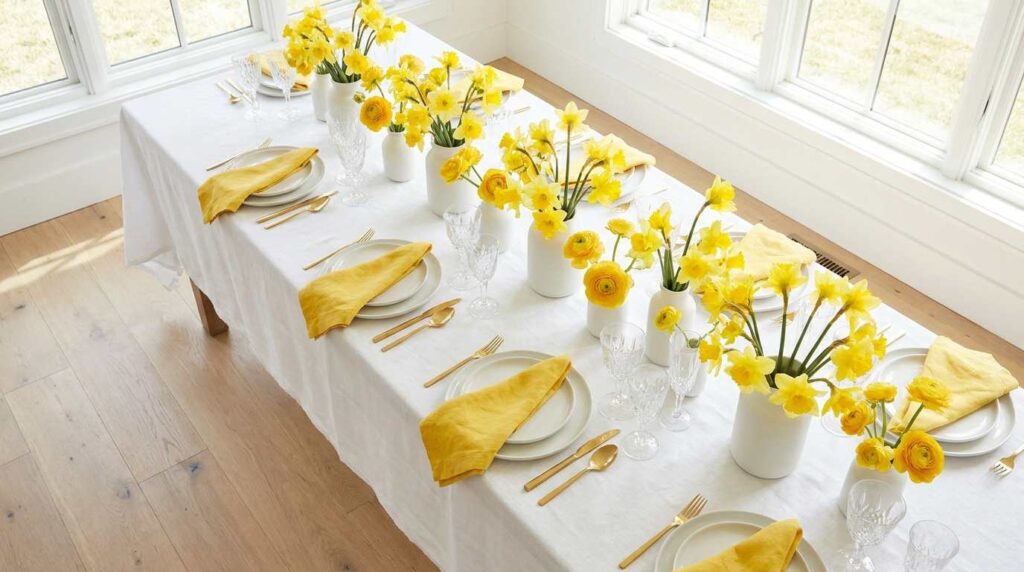
A bright, cheerful Easter table featuring crisp white linens accented with sunny yellow details throughout. Fresh daffodils and yellow ranunculus fill simple white ceramic vessels down the table’s center. Yellow linen napkins are simply folded at each white ceramic place setting. Simple gold flatware adds subtle warmth. Natural light floods the table, emphasizing the bright, energetic yellow and white color combination. Crystal glassware catches and reflects the abundant natural light. Wide-plank white oak flooring grounds the bright, airy space. Shot from an elevated angle showing the full cheerful table setting, with bright, abundant natural lighting emphasizing the joyful, sunny quality achieved through this classic yellow and white spring color pairing.
Choosing yellow and white as this Easter table’s primary color story tapped into that classic, cheerful spring energy that daffodils and forsythia naturally bring to the season, creating a table that feels genuinely joyful and optimistic rather than overly precious or subdued. The crisp white linens provide clean visual space for the yellow accents, napkins, flowers, and touches of gold, to really pop without the whole table feeling overwhelming or too saturated in any single direction.
Filling simple white vessels with daffodils and yellow ranunculus continued this sunny theme throughout the centerpiece, and I specifically chose flowers with genuine yellow rather than anything too orange or muted, wanting that true, bright spring color that photographs beautifully in natural light. This palette works particularly well for daytime Easter gatherings specifically, since abundant natural light really makes the yellow elements glow in a way that evening entertaining wouldn’t showcase as effectively. This cheerful color combination has taught me that sometimes the most successful Easter tables lean fully into the season’s natural cheerfulness rather than trying to sophisticate or subdue that inherent springtime joy, proving that bright, happy colors can absolutely read as intentional and elegant rather than juvenile when executed with a clean, considered hand.
14. Textured Neutral Layers with Dried Botanicals
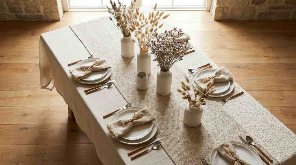
A sophisticated, textural Easter table featuring layered neutral linens in varying weaves and textures, from smooth linen to nubby cotton. Dried botanicals including bunny tail grass and dried statice fill simple ceramic vessels of varying heights down the table’s center. White ceramic plates with organic, irregular edges add textural interest. Natural fiber napkins in cream are simply tied with jute twine. Natural light illuminates the varied textures throughout the neutral palette, creating subtle shadow and dimension despite the lack of color contrast. Simple wood-handled flatware adds organic warmth. Wide-plank oak flooring grounds the textural, sophisticated space. Shot from an elevated angle showing the full neutral, textured table setting, with bright, natural lighting emphasizing the sophisticated depth achieved through texture variation rather than color contrast in this restrained palette.
Building this entire table around textural variation within a strictly neutral palette taught me how much sophistication comes from touch and dimension rather than color when executing genuinely elevated holiday styling. Layering different linen weaves, smooth against nubby, alongside organic-edged ceramic plates and wood-handled flatware created this rich sensory experience that a flatter, more uniform table setting couldn’t achieve, even within this narrow cream and white color range.
Using dried botanicals like bunny tail grass instead of fresh flowers was a practical choice that let me prepare this centerpiece well in advance without worrying about wilting, while the dried textures actually complemented this texture-focused approach even better than fresh flowers might have. I resisted introducing any actual color, trusting that the varied materials, linen, ceramic, wood, dried grass, would provide enough visual interest on their own. This table has taught me that Easter styling doesn’t require pastels or bright spring colors to feel seasonally appropriate; sometimes the most sophisticated, magazine-worthy approach comes from this kind of textural restraint that photographs beautifully and feels genuinely considered rather than defaulting to expected holiday color choices.
15. Abundant Wildflower and Grass Table Garden
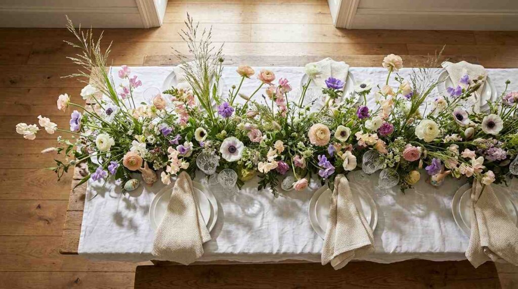
A whimsical, garden-inspired Easter table featuring an abundant, loosely arranged wildflower display running the full length of the table, mixing tall grasses, ranunculus, anemones, and sweet peas in a naturalistic, just-picked style. White linen tablecloth provides a soft backdrop for this abundant floral display. Simple white ceramic plates are set with cream linen napkins. The flowers spill slightly beyond the table’s edges, creating an overflowing, garden-fresh quality. Natural light illuminates the varied textures and colors within this wildflower mix, creating dappled shadows. Crystal glassware peeks through the abundant greenery. Wide-plank oak flooring grounds the whimsical, natural space. Shot from an elevated angle showing the full abundant wildflower table display, with soft, natural lighting emphasizing the romantic, just-picked garden quality achieved through this loose, overflowing floral styling technique.
Creating this abundant, overflowing wildflower display along the entire table length was about capturing that genuine just-picked-from-the-garden quality that feels so authentically spring rather than anything formally arranged or overly structured. Mixing tall grasses with ranunculus, anemones, and sweet peas created this naturalistic variety in height, texture, and bloom shape that a more curated, matched floral selection wouldn’t achieve. Letting the flowers spill slightly beyond the table’s actual edges added to this abundant, overflowing feeling that suggests genuine garden abundance rather than careful floral arrangement.
This loose, maximalist approach required sourcing considerably more flower stems than a formal centerpiece would need, but the resulting effect feels genuinely celebratory and joyful in a way that smaller, more restrained arrangements sometimes lack. I worked with whatever was blooming seasonally rather than forcing specific flower varieties, embracing that genuine connection to what spring was actually offering during that particular week. This wildflower approach has become my favorite for larger, more festive Easter gatherings specifically, when the occasion calls for genuine abundance and celebration rather than restraint, proving that sometimes the most memorable Easter tables come from this kind of joyful, overflowing botanical abundance rather than anything more controlled or minimal.