15 Ways to Make Your Living Room Look Expensive
There’s this particular quality that expensive-looking living rooms share, even when you can’t immediately name what it is, some combination of quality materials, restrained color choices, and thoughtful proportions that separates a space that feels genuinely elevated from one that just has nice things in it. The good news is that looking expensive has surprisingly little to do with your actual budget and everything to do with strategic choices around scale, texture, lighting, and editing, the kind of decisions that designers make instinctively but that anyone can learn to apply. From investing in one or two statement pieces rather than spreading your budget thin to understanding how negative space and proper lighting completely change how a room reads, these ideas cover the actual mechanics behind rooms that feel like they belong in a design magazine rather than a big box furniture showroom.
I used to think expensive-looking rooms simply required expensive furniture, so I spent years saving up for pieces I thought would transform my living room, only to bring them home and find the space still looked somehow flat and uninspired despite the investment. It wasn’t until I started actually studying why certain rooms photographed and felt so much more elevated than others that I realized the furniture itself was almost beside the point. The rooms that looked genuinely expensive were the ones with intentional lighting layers, thoughtful negative space, and a level of editing that had nothing to do with how much anything cost and everything to do with restraint and proportion.
What I’ve come to understand is that expensive-looking rooms almost always share this quality of intentionality, where nothing feels random or accidental, every choice from the artwork height to the curtain length to the lamp placement seems deliberate rather than default. This is honestly the most democratizing realization in design, because it means anyone paying close attention to these details can achieve that elevated look regardless of what they’re actually spending. The gap between a room that looks expensive and one that doesn’t often comes down to a handful of specific, learnable techniques rather than a mysterious, unattainable sense of taste that only wealthy people possess.
1. Hang Curtains High and Wide
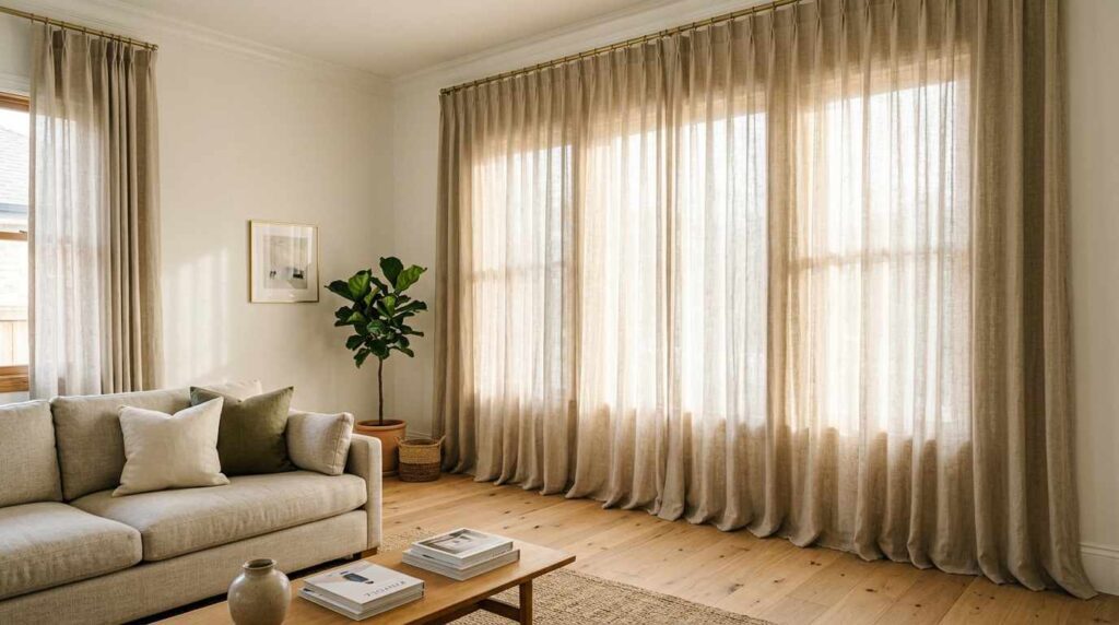
A sophisticated living room showing dramatic floor-to-ceiling linen curtains mounted just below the ceiling line, extending well beyond the window frame on either side. The curtains pool slightly at the floor in soft folds. Soft white walls provide a clean backdrop. A neutral linen sofa sits nearby, allowing the full height of the curtains to be appreciated. Warm afternoon light filters through the curtains, creating soft diffused illumination throughout the room. Wide-plank oak floors ground the elevated space. A simple brass curtain rod is barely visible against the ceiling. The proportions create an illusion of significantly higher ceilings and larger windows than actually exist. Shot from a low angle emphasizing the dramatic height and flowing quality of the curtains, with soft, warm natural lighting highlighting how this simple installation trick transforms the room’s perceived scale.
Mounting my curtain rods just below the ceiling instead of directly above the window frame was the single cheapest change that made the biggest visual difference in my entire living room. The trick creates this illusion of much taller windows and higher ceilings than actually exist, and once you notice this detail in expensive-looking rooms, you’ll start seeing it everywhere, it’s genuinely one of the most consistent markers of intentional, elevated design. Extending the rod width beyond the actual window frame lets the curtains stack fully to the side when open, maximizing light and avoiding that cheap, skimpy look of fabric barely covering the glass.
The length matters just as much as the height, letting curtains either just kiss the floor or pool slightly creates this soft, luxurious quality that curtains hovering awkwardly above the floor never achieve. I spent maybe an extra thirty dollars on a longer rod and slightly more fabric than my window technically required, and the return on that small investment has been dramatic. This single adjustment photographs so well specifically because it changes the room’s fundamental proportions, and it’s proof that some of the most impactful design moves have nothing to do with your furniture budget and everything to do with understanding these small but consequential installation details.
2. Invest in One Substantial Statement Piece
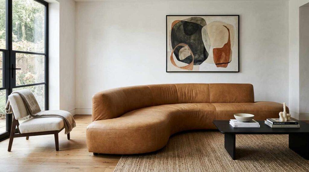
An elegant living room centered around one significant investment piece: a sculptural, curved sofa in rich camel leather with substantial, architectural presence. The remaining furniture stays simple and understated, a low black coffee table and a single accent chair in neutral linen. Soft white walls provide a clean backdrop that lets the statement sofa command attention. Wide-plank oak floors ground the space. A single piece of abstract art hangs above the sofa. Natural light from large windows illuminates the leather’s rich texture and sculptural curves. The overall room feels editorial and considered specifically because of the restraint around the one significant piece. Shot from an angle showing how the substantial sofa dominates the room appropriately while everything else remains simple, with bright, natural lighting emphasizing the sophisticated quality achieved through this concentrated investment strategy.
Choosing to spend significantly more on one substantial, well-designed sofa rather than distributing my furniture budget evenly across many pieces completely changed how expensive my living room reads. This camel leather sofa has genuine sculptural presence, the kind of curved, architectural silhouette that immediately signals quality and intention rather than looking like something ordered from a catalog without much thought. Everything else in the room stays intentionally simple and restrained, which lets this one significant piece actually be appreciated rather than competing with lots of other mediocre furniture for attention.
This strategy required real patience, since I lived with mismatched, budget furniture for almost a year while saving for this piece rather than settling for something adequate immediately. But the psychological and visual impact of having one genuinely excellent item versus an entire room of merely acceptable pieces is completely different, expensive rooms almost always have this hierarchy where certain pieces clearly matter more than others. I’ve noticed that guests specifically comment on this sofa, whereas nobody ever used to comment on my previous living room despite it technically having more furniture in it. This approach has taught me that concentrated investment beats distributed budget every time when the goal is creating a genuinely elevated look.
3. Layer Multiple Light Sources at Different Heights
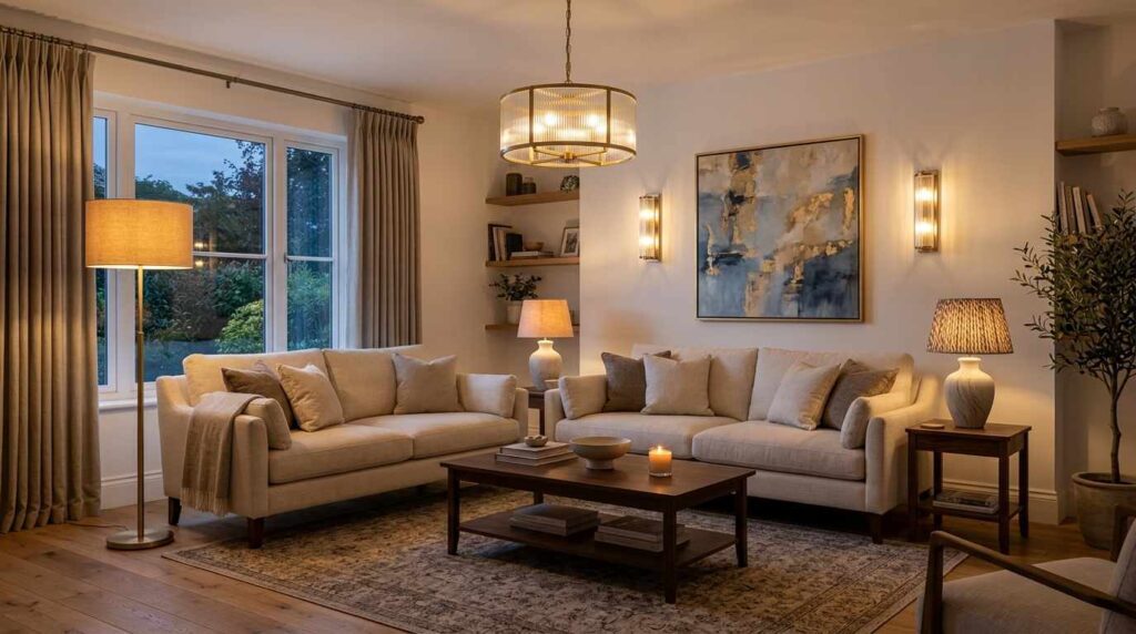
A warm, sophisticated living room demonstrating layered lighting design with at least four distinct light sources at varying heights: a floor lamp with a linen shade beside the sofa, a sculptural table lamp on a side table, wall sconces flanking a piece of artwork, and a statement pendant light overhead. No single overhead fixture provides all the illumination. Soft white walls create a warm backdrop for the layered lighting design. A neutral sofa sits centrally, appropriately illuminated by multiple sources rather than harsh overhead light. Evening ambient lighting shows the room’s warm, inviting glow from all four light sources working together. Wide-plank oak floors ground the sophisticated space. Shot in evening lighting conditions to demonstrate how layered light sources at different heights create depth and warmth, with atmospheric lighting emphasizing the hotel-like sophistication achieved through thoughtful lighting layers rather than a single harsh source.
Understanding that expensive-looking rooms almost never rely on a single overhead light source was probably the most technical lesson I learned in this whole process, but implementing it made an enormous difference in how my living room actually feels in the evening. I added a floor lamp, a table lamp, wall sconces, and kept the overhead pendant as just one layer among several rather than the primary light source, and the resulting warm, dimensional quality feels genuinely like a boutique hotel rather than a room lit by a single harsh bulb from above.
Each light source sits at a different height, which creates these varying pools of illumination throughout the room rather than one flat, even wash of light that overhead fixtures alone typically produce. I put everything on dimmers too, which lets me adjust the mood depending on the time of day or occasion, something that a single overhead light simply can’t replicate. This layered approach required investing in a few more lamps than I originally planned for, but lighting is genuinely one of those details that separates spaces that feel considered from ones that don’t, and it’s remarkable how much warmer and more sophisticated the exact same furniture arrangement feels once proper lighting layers are in place.
4. Choose a Restrained, Cohesive Color Palette
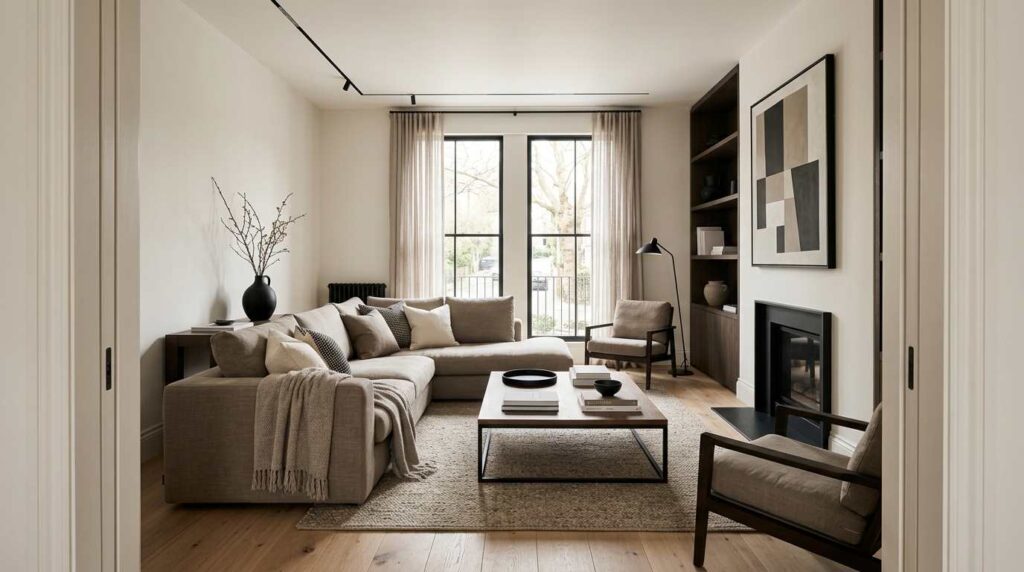
A sophisticated living room demonstrating masterful color restraint, built entirely around three coordinating tones: warm white walls, a taupe linen sofa, and black accent details throughout. Every element in the room, from the throw pillows to the artwork frames to the coffee table, fits within this narrow palette. A single black vase holds dried branches on a wood side table. Wide-plank oak floors add warmth without introducing additional color. Natural light emphasizes the subtle tonal variations within this restrained scheme. No single element interrupts the cohesive color story. Shot from the doorway showing the full room’s disciplined color consistency, with bright, even lighting emphasizing the sophisticated calm achieved through genuine restraint rather than an abundance of coordinated but competing colors.
Restricting myself to just three coordinating tones throughout my entire living room required more discipline than almost any other design decision I’ve made, but the resulting sense of calm sophistication has been worth every moment of restraint. Every single item I considered bringing into the room had to pass this test: did it genuinely fit within my established palette, or was I just excited about it in the moment? This filtering process eliminated so many impulse purchases that would have introduced visual chaos and diluted the overall cohesive effect I was after.
Expensive-looking rooms almost never feel busy or visually chaotic, and I’ve realized this comes down almost entirely to color discipline rather than furniture quality alone. When everything exists within the same narrow tonal family, even budget pieces start looking more elevated simply because they’re not fighting against clashing colors or competing patterns for attention. This approach requires genuinely evaluating whether something serves the room’s overall cohesion before purchasing it, which has actually saved me money over time since I’m no longer buying random decor items that seemed appealing individually but never quite worked together as a whole.
5. Use Substantial, Quality Hardware and Fixtures
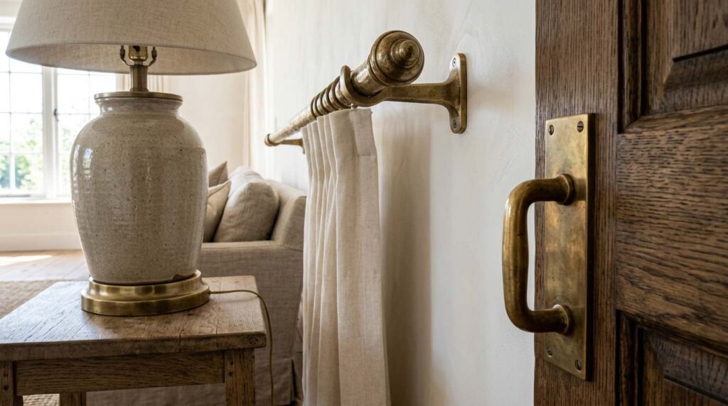
A detail shot of a sophisticated living room emphasizing substantial hardware and fixtures throughout: a weighty brass door handle, thick brass curtain rod brackets, and a substantial ceramic and brass table lamp base. The materials show genuine weight and quality craftsmanship rather than lightweight, mass-produced alternatives. Soft white walls provide a clean backdrop for these detailed elements. Natural light catches the brass finishes, creating warm highlights that emphasize their quality and craftsmanship. A neutral linen sofa is visible in the background, softly out of focus. Wide-plank oak floors ground the space. Shot in close detail to show the substantial weight and quality of these often-overlooked hardware elements, with warm, focused lighting emphasizing how genuine material quality in small details elevates the entire room’s perceived value.
Upgrading the small hardware details throughout my living room, doorknobs, curtain rod brackets, even the switch plates, taught me that these tiny, often-overlooked elements genuinely register on some subconscious level even when guests can’t articulate exactly why a room feels elevated. Substantial, weighty brass hardware feels completely different in your hand compared to the lightweight, hollow alternatives that come standard in most builder-grade homes, and somehow that quality translates visually even before anyone actually touches these pieces.
I gradually replaced these details over several months rather than all at once, prioritizing the items people interact with most directly like door handles and light switches. This project required more patience and attention to sourcing than I initially expected, since genuinely substantial hardware costs more and requires more research to find compared to whatever’s readily available at big box stores. But I’ve noticed that expensive-feeling spaces almost always have this quality of substance in their details, nothing feels flimsy or like an afterthought. This lesson has taught me that sometimes the most impactful upgrades aren’t the big, visible furniture choices but these smaller, tactile details that most people never consciously notice yet somehow still feel.
6. Embrace Negative Space Instead of Filling Every Surface
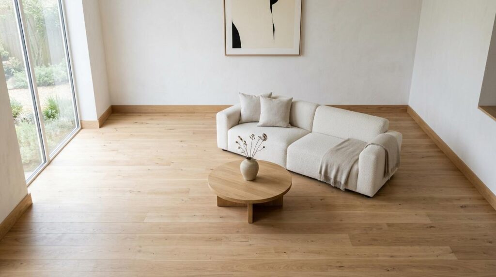
A calm, elegant living room demonstrating intentional negative space, with a single substantial sofa and one coffee table positioned with generous breathing room around them. Soft white walls remain mostly bare except for one large piece of art. Empty floor space surrounds the seating area rather than being filled with additional furniture or decor. A single ceramic vase sits alone on the coffee table, deliberately unaccompanied by other objects. Wide-plank oak floors are visible and uncluttered. Natural light fills the generous open space, emphasizing the room’s sense of calm and restraint. Shot from an elevated angle showing the intentional emptiness and breathing room throughout the space, with bright, even lighting emphasizing how negative space itself functions as a sophisticated design element in this restrained room.
Learning to leave genuine empty space throughout my living room rather than filling every available surface and corner with decor was counterintuitive at first, since my instinct had always been that more furniture and accessories signaled more value and effort invested in the space. But expensive-looking rooms almost universally feature this quality of restraint, generous breathing room around furniture, surfaces that aren’t crowded with knickknacks, walls that aren’t covered edge to edge with art. This negative space actually functions as a design element itself, creating calm and allowing the pieces you do include to actually be appreciated.
I had to consciously resist the urge to fill every empty corner or bare wall section, reminding myself that this emptiness was intentional rather than unfinished. The coffee table holding just one significant object instead of a cluttered collection of smaller items required real discipline, especially when I had plenty of pretty things I wanted to display. This restraint has genuinely transformed how sophisticated the room feels, proving that expensive design often has less to do with what you add and more to do with what you consciously choose to leave out, letting each remaining element command appropriate attention rather than getting lost in visual noise.
7. Add Architectural Molding or Trim Details
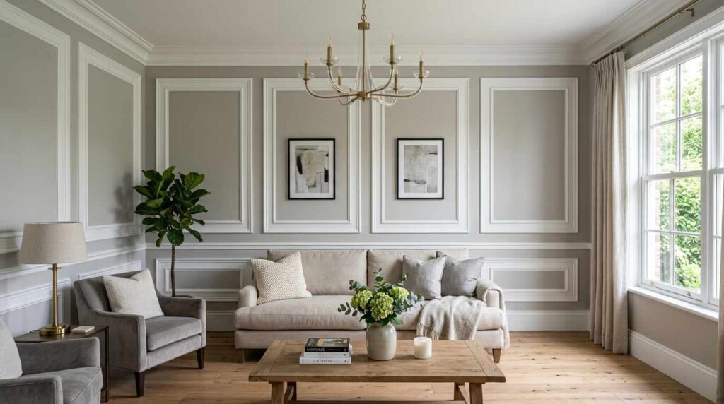
A refined living room featuring classic picture-frame wall molding in crisp white, creating architectural definition and dimension against soft grey walls. The molding forms rectangular panels at consistent intervals around the room. A neutral sofa sits against one molded wall section. Crown molding at the ceiling line adds further architectural detail. Natural light creates subtle shadows within the molding’s dimensional panels, adding depth and visual interest. Wide-plank oak floors complement the architectural details. A simple chandelier hangs from the center of the room. Shot from an angle showing the full molding detail and how it transforms the plain walls into something architecturally significant, with soft, even lighting emphasizing the shadows and dimension created by this classic architectural addition.
Adding picture-frame molding throughout my living room was a genuine investment in architectural detail that instantly elevated what had been a completely plain, builder-grade space into something with real character and dimension. This kind of trim work signals a level of intentional craftsmanship and investment that plain drywall simply cannot communicate, and it’s a detail you consistently see in genuinely high-end homes and hotels but rarely in standard rental or new construction properties. The rectangular panels create shadow and depth that changes throughout the day as natural light shifts across the room.
I hired a finish carpenter for this project since getting the proportions and spacing correct requires real precision to look intentional rather than haphazard, and mistakes in molding installation are immediately noticeable in ways that other design errors might not be. This addition required a more significant investment than most items on this list, but the architectural transformation has been dramatic, walls that were previously flat and forgettable now have genuine presence and sophistication. This project taught me that sometimes looking expensive requires actually changing your space’s underlying architecture rather than just decorating within existing constraints, and molding is one of the most impactful ways to achieve that transformation.
8. Choose Furniture with Visible Legs Instead of Skirted Bases
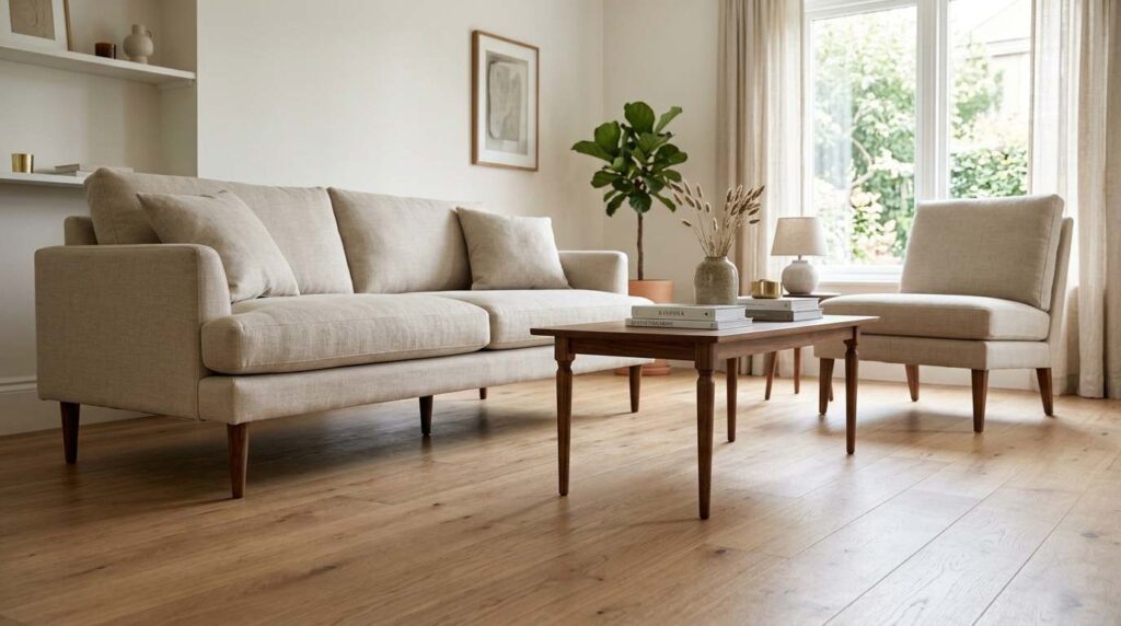
A light, elegant living room featuring furniture with visible, tapered wood legs throughout: a sofa with exposed walnut legs, a matching accent chair, and a coffee table with slender turned legs. The visible legs create airiness and allow light to pass beneath each piece. Soft white walls provide a clean backdrop. Wide-plank oak floors are visible beneath the furniture, uninterrupted by skirting or valances. Natural light illuminates the space fully, including the floor area beneath the furniture pieces. A neutral linen upholstery tops each piece, keeping the focus on the elegant leg silhouettes. The overall room feels light and spacious specifically because furniture doesn’t visually anchor heavily to the floor. Shot from a low angle emphasizing the visible legs and the light, airy quality they create throughout the room, with bright, natural lighting highlighting how this furniture choice makes the space feel larger and more refined.
Choosing furniture with visible, tapered legs instead of pieces with skirted bases that touch the floor completely changed how spacious and refined my living room feels, even though the actual square footage never changed. This detail lets light pass beneath each piece of furniture, creating this airy quality that skirted furniture, no matter how nice, simply cannot achieve since it visually anchors heavily to the floor and blocks sightlines throughout the room. Exposed legs, especially in a beautiful wood like walnut, also showcase actual craftsmanship in a way that hidden furniture bases never can.
I specifically sought out pieces with this leg detail when furniture shopping, sometimes passing on options I otherwise liked because they had skirted bases that would have compromised this airy effect I was after. The visual weight distribution throughout the room feels completely different with furniture legs visible, everything reads as lighter and more elevated rather than heavy and dated. This choice has taught me that expensive-looking furniture often shares this quality of appearing to almost float rather than being solidly planted on the floor, and it’s a detail worth prioritizing specifically when shopping for major pieces like sofas and chairs that will anchor your entire room’s aesthetic.
9. Layer an Area Rug Under Furniture Properly
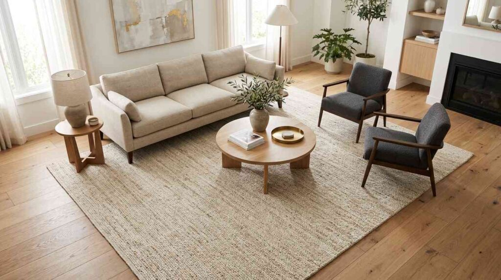
A sophisticated living room demonstrating proper rug sizing and placement, with a substantial area rug extending well beyond the seating area so that all furniture legs, including the sofa and two accent chairs, sit fully on the rug rather than just the front legs. The rug is a subtle, textured neutral in warm cream tones. Wide-plank oak floors are visible around the rug’s generous perimeter. Soft white walls provide a clean backdrop. A round coffee table sits centered on the rug. Natural light emphasizes the rug’s texture and proper scale relative to the furniture arrangement. The overall seating area feels grounded and intentional because of the rug’s correct, generous sizing. Shot from an elevated angle showing how all furniture pieces sit properly within the rug’s boundaries, with bright, even lighting emphasizing the professional, considered quality achieved through correct rug scale.
Learning the correct way to size and place an area rug beneath my living room furniture was a lesson that immediately separated my space from looking like a typical furniture showroom arrangement. The rule that changed everything was ensuring all furniture legs, not just the front two, sit fully on the rug rather than having pieces perch awkwardly with only front legs touching down while back legs sit on bare floor. This single sizing correction instantly makes the whole seating area feel grounded, cohesive, and intentional rather than randomly assembled.
I ended up needing a significantly larger rug than I initially budgeted for, since properly sizing to accommodate an entire sofa and multiple chairs requires much more square footage than most people instinctively choose. This investment felt substantial at the time, but the visual difference between a properly scaled rug and an undersized one is honestly one of the most dramatic, immediately noticeable differences between amateur and professional-looking room design. Expensive-looking living rooms almost universally get this detail right, and once you start noticing improperly sized rugs in other spaces, floating awkwardly beneath furniture with legs hanging off the edges, you’ll understand why this seemingly small detail carries so much visual weight.
10. Display Books and Objects with Intentional Styling
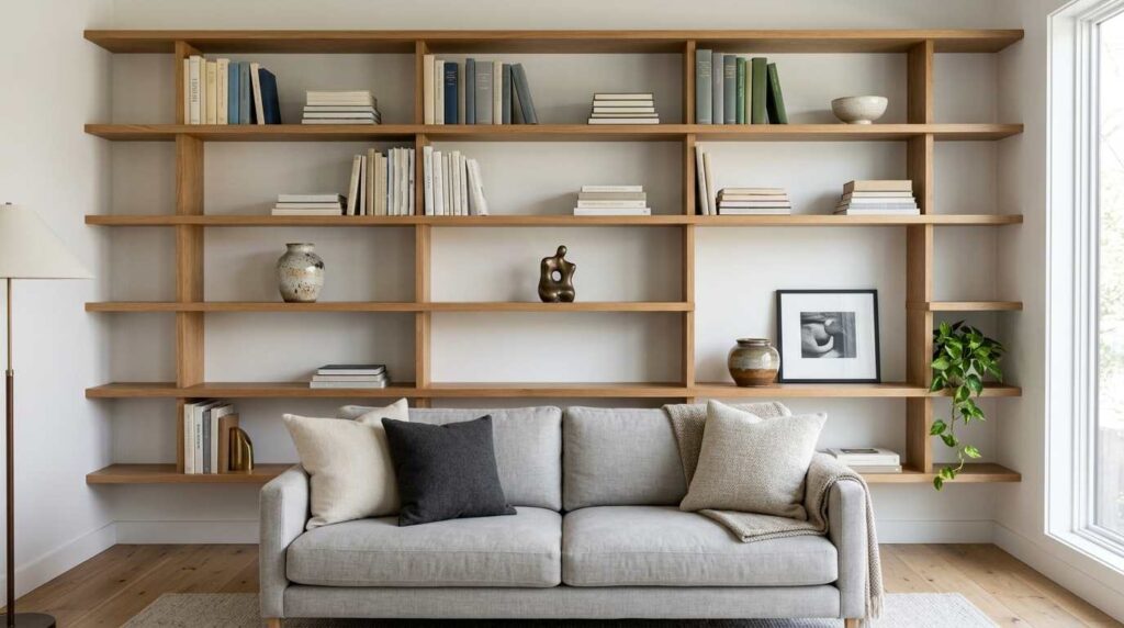
A refined living room featuring open wood shelving styled with genuine intention: books arranged both vertically and stacked horizontally, interspersed with a few carefully chosen ceramic objects and a small piece of sculpture. Generous negative space exists between groupings rather than the shelf being completely filled. Soft white walls provide a clean backdrop. Natural light illuminates the curated objects, creating soft shadows that emphasize their careful arrangement. A neutral sofa sits below the shelving. Wide-plank oak floors ground the space. The styling shows clear intentionality through varied heights, thoughtful color coordination among the objects, and appropriate breathing room. Shot straight-on to show the full styled shelving arrangement, with bright, even lighting emphasizing the curated, gallery-like quality achieved through thoughtful object placement rather than simply filling every available shelf space.
Learning to actually style my bookshelves and open shelving with genuine intention, rather than just placing books and objects wherever they happened to fit, transformed these areas from cluttered storage into genuine design features that photograph beautifully. This required understanding basic principles like varying heights, mixing vertical and horizontal book stacking, and leaving deliberate negative space between groupings rather than cramming every available inch with stuff. Professional stylists clearly think about this differently than most of us naturally do, and once I started applying these same principles, my shelving immediately looked more considered.
I spent an embarrassing amount of time rearranging the same handful of books and objects, testing different groupings and heights until something finally clicked into place looking intentional rather than random. Removing about half of what I originally had displayed made a bigger difference than adding anything new, proving again that editing matters more than accumulation. This practice has taught me that expensive-looking rooms treat even functional storage like books as genuine styling opportunities, understanding that how you arrange existing items often matters more than what those individual items actually cost.
11. Choose a Sculptural, Statement Coffee Table
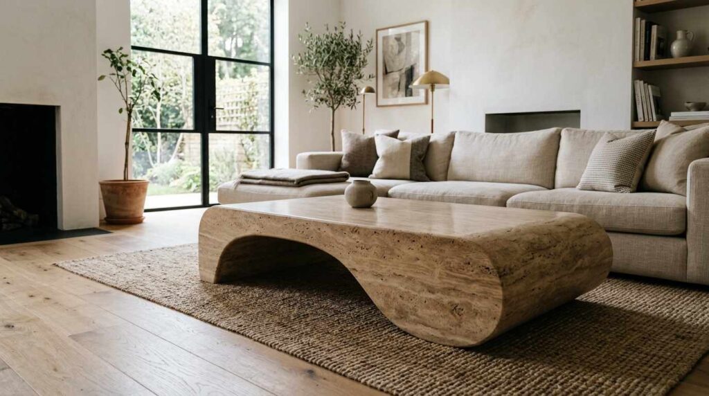
A sophisticated living room centered around a sculptural coffee table with an organic, curved form in warm travertine stone. The table’s substantial presence and artistic silhouette make it a genuine focal point rather than merely functional furniture. A neutral linen sofa sits nearby, allowing the table’s sculptural quality to be fully appreciated. Soft white walls provide a clean backdrop. Wide-plank oak floors ground the elevated space. A single small ceramic object sits atop the table, chosen specifically not to compete with its sculptural form. Natural light emphasizes the stone’s natural variation and the table’s organic curves. Shot from a low angle emphasizing the table’s sculptural presence and how it functions as functional art within the room, with bright, natural lighting highlighting the sophisticated quality achieved through this considered furniture choice.
Investing in a genuinely sculptural coffee table rather than a standard rectangular piece transformed this typically overlooked furniture item into an actual focal point within my living room. The organic, curved travertine form functions almost like a piece of art that happens to also be functional, and its substantial presence commands attention in a way that conventional coffee tables never could. This single piece has become the item guests specifically comment on and photograph, proving that even secondary furniture pieces deserve genuine design consideration rather than being treated as afterthoughts.
I deliberately kept the table’s surface mostly clear, adding just one small object rather than the typical stack of coasters, remote controls, and coffee table books that usually accumulate. This restraint lets the table’s sculptural quality actually be appreciated rather than getting visually buried under clutter. The natural stone’s variation and texture catches light beautifully throughout the day, creating this sense of genuine luxury that a mass-produced table simply couldn’t achieve. This investment taught me that thinking of every furniture piece as a potential design statement, not just the obvious ones like sofas, is exactly the kind of thinking that separates expensive-feeling rooms from merely furnished ones.
12. Use Wall-to-Wall or Large-Format Flooring

A sophisticated living room featuring wide-plank white oak flooring installed in a herringbone pattern, creating visual interest and craftsmanship through the flooring itself rather than relying solely on rugs or furniture for visual impact. The herringbone pattern extends throughout the entire visible room. Soft white walls provide a clean backdrop. A neutral sofa and coffee table sit atop the dramatic flooring. Natural light emphasizes the wood grain and the geometric pattern created by the herringbone installation. The floor’s sophisticated pattern adds architectural interest even in areas without furniture or rugs. Shot from an elevated angle showing the full herringbone pattern throughout the room, with bright, natural lighting emphasizing the craftsmanship and visual sophistication achieved through this upgraded flooring choice.
Installing herringbone hardwood flooring instead of standard straight-plank installation was a significant investment that transformed the most fundamental element of my living room into something genuinely sophisticated on its own merits. This pattern requires considerably more skilled labor and material to install correctly, and that craftsmanship shows in ways that immediately register as more elevated than standard flooring, even to people who couldn’t necessarily articulate why the floor looks different or better. The geometric pattern adds visual interest throughout the entire room, including areas without furniture or rugs covering the surface.
This upgrade required working with an experienced flooring installer specifically skilled in pattern work, since herringbone demands precise cutting and placement that standard installation doesn’t require. The investment was substantial, definitely more than basic flooring would have cost, but this foundational element affects literally every square foot of the room rather than being confined to a single furniture piece or decorative object. This project taught me that sometimes looking expensive requires investing in these underlying architectural elements rather than focusing exclusively on furniture and decor that sits on top of a mediocre foundation, since flooring genuinely sets the tone for everything else happening in the space.
13. Incorporate Natural Materials Like Stone and Wood
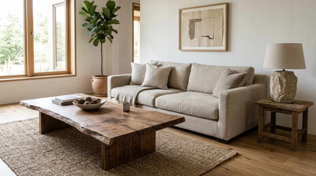
A grounded, sophisticated living room featuring genuine natural materials throughout: a live-edge wood coffee table showing authentic grain, a stone-based table lamp, and a jute area rug made from natural fibers. Soft white walls provide a clean backdrop that lets these organic materials show their authentic texture and variation. A neutral linen sofa sits nearby. Wide-plank oak floors continue the natural material story. Natural light emphasizes the genuine texture and variation in the wood grain and stone surface. No synthetic or obviously mass-produced materials appear in the space. Shot from an angle showing the interplay of different natural materials throughout the room, with warm, natural lighting emphasizing the authentic, grounded quality achieved through genuine material choices rather than synthetic alternatives.
Prioritizing genuine natural materials, real wood, actual stone, authentic natural fibers, over synthetic alternatives throughout my living room created this grounded, authentic quality that mass-produced materials simply cannot replicate. Each piece shows genuine variation and character, the live-edge coffee table’s grain pattern is completely unique, the stone lamp base has natural mineral variation, and this authenticity registers on some subconscious level even for people who couldn’t necessarily identify why these pieces feel more substantial than laminate or plastic alternatives.
This commitment to natural materials required more research and often more budget than synthetic options, since genuine stone and solid wood cost more than engineered alternatives designed to mimic their appearance. But the tactile and visual difference is immediately apparent, natural materials have this depth and complexity that manufactured surfaces trying to replicate wood grain or stone veining never quite achieve convincingly. I’ve noticed that expensive-feeling spaces almost universally prioritize these authentic materials, understanding that genuine texture and variation communicate quality in ways that even excellent synthetic reproductions can’t fully replicate. This principle has become one of my core filters when evaluating potential purchases for the room.
14. Frame and Elevate Your Artwork Properly
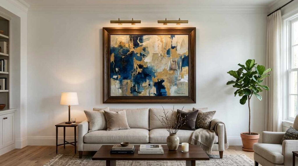
A refined living room featuring large-scale artwork in a substantial, well-proportioned frame hung at proper eye level above a sofa. The frame itself shows quality craftsmanship with a deep, museum-style profile. Soft white walls provide a gallery-like backdrop. A neutral linen sofa sits below the properly hung artwork. Picture lights mounted above the frame provide dedicated illumination for the piece. Wide-plank oak floors ground the sophisticated space. Natural light supplements the dedicated picture lighting, creating layered illumination for the artwork. The proper scale and hanging height create a gallery-quality presentation. Shot straight-on to show the properly framed and hung artwork with its dedicated lighting, with warm, gallery-style lighting emphasizing the museum-quality presentation achieved through thoughtful framing and installation.
Learning proper artwork scale, framing, and hanging height completely transformed how sophisticated my living room’s art display feels, regardless of what the actual artwork itself cost. I discovered that most people, myself included previously, hang art too high and choose frames too thin or flimsy for the piece’s actual presence. Upgrading to a substantial, deep-profile frame gave my artwork this museum-quality weight and presentation that a standard thin frame from a big box store never could have achieved, even displaying the exact same print or painting.
Adding dedicated picture lighting above the frame was a detail I hadn’t initially considered necessary, but this small addition creates this gallery-quality illumination that makes even a modestly priced print look genuinely significant and intentionally displayed. Getting the hanging height correct, generally with the artwork’s center around eye level rather than too close to the ceiling, required actually measuring rather than guessing, which made an immediate difference in how proportional and considered the whole arrangement looks. This experience taught me that art presentation matters nearly as much as the artwork itself when it comes to creating that expensive, curated feeling, proper framing and lighting can elevate even affordable prints into something that reads as genuinely valuable.
15. Keep Cords and Technology Hidden
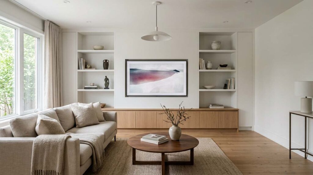
A clean, sophisticated living room where all visible technology and cords have been thoughtfully concealed. A wall-mounted television sits flush against the wall with no visible cables, integrated into a custom built-in unit. Cord management channels run invisibly behind furniture and along baseboards. Soft white walls remain uninterrupted by visible outlets or cable boxes. A neutral sofa sits facing the seamlessly integrated media area. Wide-plank oak floors are completely clear of any visible cords or cables. Natural light illuminates the clean, uninterrupted sightlines throughout the room. Shot from an angle showing the seamless integration of technology without any visible cords or cable clutter, with bright, even lighting emphasizing the clean, uncluttered sophistication achieved through thoughtful cord management.
Investing time and modest money into properly concealing every visible cord and cable throughout my living room removed this constant source of visual clutter that I hadn’t fully appreciated was undermining the whole room’s sophistication. Running cord management channels behind furniture and within walls where possible, plus using in-wall cable kits for the television, eliminated that tangle of visible wires that instantly signals a space wasn’t fully considered or finished. This detail is subtle enough that most guests won’t consciously notice its absence, but they’ll definitely register if cords are visible and cluttering the space.
This project required some minor electrical work and patience threading cables through walls, but the resulting clean sightlines throughout the room make an enormous difference in how polished everything feels. Expensive-looking spaces, whether in magazines or actual high-end homes, never show visible technology clutter, and once you notice this consistent absence, you’ll understand why rooms with exposed cords and visible cable boxes read as somehow less sophisticated regardless of the actual furniture quality. This final detail taught me that sometimes achieving that expensive look requires addressing these practical, unglamorous problems rather than just adding more beautiful things, since even gorgeous furniture can’t fully compensate for a tangle of visible cables undermining the room’s overall polish.