15 Ways to Mix Wood Tones in Home Decor
Mixing wood tones used to be one of those design rules everyone was terrified to break, with strict advice to match every wooden surface in a room to avoid visual chaos, but that thinking has completely shifted as homes now celebrate the rich, layered look that comes from combining warm oak with cool ash, deep walnut with pale birch, or reclaimed barnwood with sleek modern maple. The secret that designers have known for years is that wood tones actually behave more like neutrals than colors, meaning they can coexist beautifully as long as you approach the mixing with some intentionality around undertones, proportions, and the overall balance of light versus dark. From using a dominant tone as your foundation to strategically placing contrasting pieces throughout a room, these ideas prove that a home filled with mismatched wood furniture inherited over years, or intentionally sourced pieces in different finishes, can look curated and sophisticated rather than accidental or thrown together.
I spent years agonizing over whether my inherited walnut dining table would ever work in the same room as my grandmother’s honey oak hutch, convinced that these mismatched pieces made my whole house look disorganized and unfinished no matter what else I did. It took visiting a friend’s home, where she’d combined at least five distinct wood tones across her open-concept living and dining space with total confidence, for me to realize that this fear of mixing wood was holding me back from actually using furniture I already owned and loved. She explained that she thought of her different wood pieces almost like she’d think about mixing metals or textures, focusing on balance and repetition rather than trying to match everything perfectly.
What I’ve learned since then is that successfully mixing wood tones comes down to a few consistent principles that apply regardless of which specific tones you’re working with. You need enough repetition of each tone throughout the space so nothing feels like a random, isolated mistake, you need to pay attention to undertones since warm and cool woods require slightly different handling, and you need at least one connecting element, whether that’s a black metal accent, a specific finish, or consistent hardware, that ties everything together. Once you understand these underlying mechanics, mixing wood tones stops feeling like a risk and starts feeling like one of the most natural, collected-looking approaches to furnishing a home that actually reflects how most of us live, with pieces gathered over time rather than purchased as a single matched set.
1. Choose a Dominant Wood Tone as Your Foundation
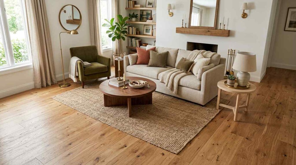
A warm, layered living room featuring wide-plank white oak flooring as the dominant wood element covering the entire floor. Against this foundation, a dark walnut coffee table and a lighter ash wood side table introduce contrasting tones in smaller doses. The oak floor’s warm, medium tone ties the whole room together while the darker and lighter accent pieces add visual interest without competing. A neutral linen sofa sits centered on a jute rug. Soft white walls provide a clean backdrop. Natural light emphasizes the varied wood grain patterns across the different tones. Brass accents add warmth that bridges the wood variations. Shot from an elevated angle showing how the oak flooring serves as the unifying foundation for the other wood tones, with bright, natural lighting highlighting the intentional hierarchy between dominant and accent wood elements.
Establishing my white oak flooring as the clear dominant wood tone throughout the house gave me this foundation that every other wood piece could relate back to, rather than trying to balance multiple competing tones equally. This hierarchy matters more than people initially realize, once you have one wood tone covering the majority of visual real estate in a room, whether that’s flooring, a large media console, or extensive built-ins, the smaller accent pieces in different tones read as intentional layering rather than mismatched clutter.
I chose my darker walnut coffee table and lighter ash side table specifically because they represented tones on either side of my oak floor’s warmth, creating this sense of range rather than everything blending into sameness. The key was ensuring these accent pieces stayed smaller in scale compared to the dominant oak flooring, since if the darker or lighter woods had equal visual weight, the whole hierarchy I was trying to establish would collapse into competing statements instead. This approach has made incorporating new wood furniture pieces so much less stressful, since I always know my oak floor provides the steady foundation that virtually any other wood tone can work against as long as I’m thoughtful about proportion.
2. Repeat Each Wood Tone at Least Three Times
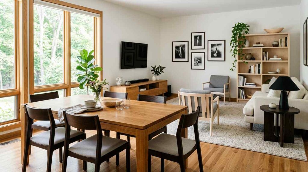
A sophisticated dining and living room combination featuring three distinct wood tones repeated throughout the space for visual rhythm: warm honey oak appears in the dining table, a media console, and window trim; deep espresso wood appears in dining chairs, a side table, and picture frames; pale birch wood appears in a bookshelf, a side chair, and decorative bowls. Soft white walls unify the varied tones. Natural light illuminates the different wood grains throughout the connected spaces. A neutral area rug anchors the seating zone. The repetition of each tone at multiple points throughout the room prevents any single piece from feeling like an isolated mistake. Shot from an angle showing multiple instances of each wood tone across the connected dining and living space, with bright, even lighting emphasizing the intentional rhythm created through repetition.
Understanding that each wood tone needs to appear at least three times throughout a room was the single most important technical lesson that took my mixed wood spaces from looking accidental to looking genuinely intentional. A single walnut side table sitting alone amid otherwise all-oak furniture reads as a mistake or an afterthought, but that same walnut tone repeated in a picture frame, a small side table, and perhaps a decorative bowl creates this sense of rhythm and purpose that makes the mixing feel deliberate rather than random.
I started auditing my rooms specifically counting how many times each wood tone appeared, and this exercise revealed exactly where my mixed wood approach was failing versus succeeding. Rooms where I only had isolated single instances of certain tones felt chaotic, while areas where I’d naturally repeated tones through smaller accessories like frames, bowls, or trim details felt considered even though I hadn’t consciously planned that repetition initially. This principle has become my go-to test whenever I’m evaluating whether to bring a new wood piece into a room, if I can’t identify at least two other places where that same general tone appears, I know I need to either skip the piece or find ways to echo its tone elsewhere in the space through smaller decorative choices.
3. Separate Contrasting Tones with a Neutral Buffer
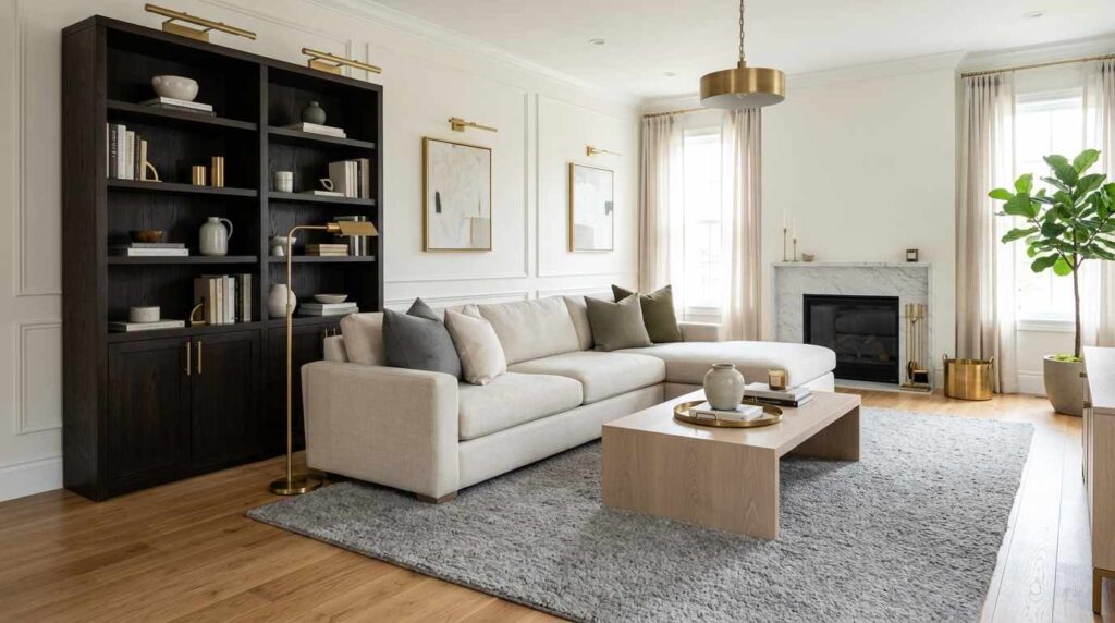
A sophisticated living room demonstrating buffer technique for mixing wood tones: a dark espresso wood bookshelf and a light white oak coffee table are positioned with a neutral cream sofa and a plush grey rug between them, preventing the two contrasting wood tones from touching directly. Soft white walls provide additional visual breathing room. Natural light illuminates both wood tones without them competing directly. Brass accents provide a metallic connection between the pieces. The neutral textiles and negative space between the dark and light wood elements allow both to be appreciated individually rather than clashing. Shot from an angle showing the buffering effect between the contrasting dark and light wood pieces, with bright, even lighting emphasizing how strategic spacing prevents visual conflict between dramatically different tones.
Learning to use neutral textiles and negative space as buffers between my most dramatically contrasting wood tones solved the biggest challenge I faced when combining my nearly black espresso bookshelf with much lighter white oak pieces. Rather than placing these two extremes directly adjacent to each other, where the contrast felt jarring and competitive, I positioned neutral elements, a cream sofa, a grey rug, empty floor space, between them so each wood tone gets its own moment to be appreciated rather than fighting for attention in direct proximity.
This buffering technique taught me that the most dramatic tonal contrasts, nearly black paired with nearly white wood, require more careful handling than moderate variations that naturally sit closer together on the color wheel. I’ve found that even a few feet of visual breathing room, or a substantial upholstered piece positioned between contrasting wood furniture, completely changes how successfully these tones coexist in the same space. This approach has been particularly useful in open-concept rooms where sight lines mean multiple wood tones are visible simultaneously, giving me a strategy for incorporating pieces I love even when their tones initially seem too far apart to work together in the same room.
4. Mix Warm and Cool Undertones Intentionally
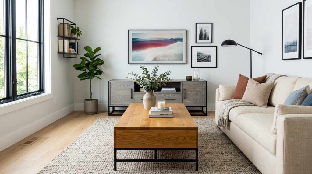
A thoughtfully balanced living room showing the intentional mixing of warm and cool wood undertones: a warm honey oak coffee table with golden undertones sits alongside a grey-washed ash media console with cooler, more neutral undertones. Soft white walls with a slight cool undertone bridge both wood temperatures. A neutral linen sofa in warm cream provides transitional color. Natural light illuminates both the warm and cool wood tones, showing their distinct undertones clearly. Black metal accents provide a cooling counterpoint that complements the grey-washed wood. Brass accents warm up the space in balance. The room demonstrates successful integration of both wood temperatures without either feeling out of place. Shot from an angle showing the interplay between warm and cool wood undertones, with bright, natural lighting emphasizing how thoughtful balance prevents either temperature from dominating uncomfortably.
Understanding the difference between warm and cool wood undertones, and learning to actually identify which category my various furniture pieces fell into, was a revelation that explained why some of my previous wood combinations felt off despite the tones technically being similar in overall darkness or lightness. My honey oak coffee table has these obvious golden, warm undertones, while my grey-washed ash console leans distinctly cool and neutral, and once I recognized this distinction, I could balance the room intentionally rather than randomly hoping pieces would work together.
The key was ensuring neither temperature completely dominated the space, using black metal accents to support the cooler grey-washed pieces while brass elements warmed up areas where the golden oak tones needed reinforcement. This balancing act required genuinely looking closely at each piece of furniture I already owned, sometimes discovering that pieces I’d assumed were simply light or dark actually had much more specific warm or cool characteristics that explained their compatibility or conflict with other items. This lesson has fundamentally changed how I shop for new wood furniture now, since I actively consider undertone alongside actual tone depth, understanding that two medium-toned wood pieces can still clash badly if one leans warm and the other cool without any bridging elements to unite them.
5. Use Black or Metal Accents as Visual Connectors
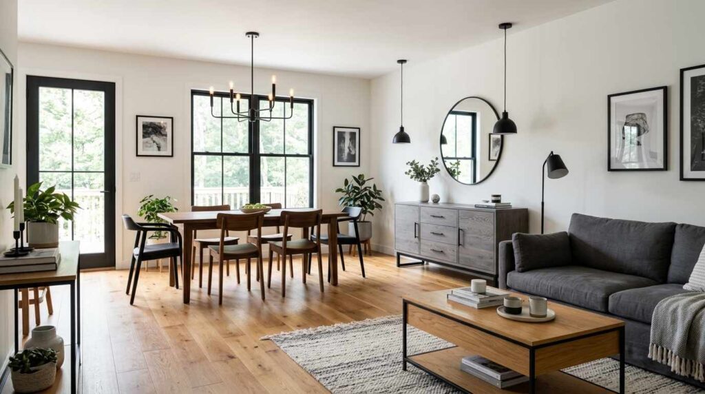
A modern living room demonstrating how black metal elements unify diverse wood tones: a warm walnut dining table, a cool grey-washed oak sideboard, and honey-toned oak flooring are all connected through consistent black metal hardware, black-framed windows, and black pendant lighting throughout. Soft white walls provide a clean backdrop. Natural light illuminates the varied wood tones while the black accents create visual continuity. A black metal chandelier hangs centered. Black cabinet hardware appears consistently across different wood pieces. The black elements act as a unifying thread connecting otherwise disparate wood tones into a cohesive whole. Shot from an angle showing how the black metal accents create visual rhythm across different wood furniture pieces, with bright, even lighting emphasizing the successful integration achieved through this consistent connecting element.
Introducing black metal accents consistently throughout my home, hardware, light fixtures, window frames, became the connecting thread that let me confidently mix wood tones that otherwise might have felt disjointed sitting in the same space. This technique works because black functions almost like punctuation, creating this consistent visual rhythm that your eye follows throughout the room regardless of what specific wood tone each piece happens to be. Once I committed to this strategy, incorporating new wood furniture in different tones became so much less anxiety-inducing since I knew the black accents would help tie everything together regardless.
I specifically chose matching black hardware across furniture pieces in completely different wood tones, and this consistency creates cohesion even when the actual wood colors vary dramatically from piece to piece. The black window frames and pendant lighting throughout the space continue this connecting strategy at an architectural level too, ensuring the unifying thread appears not just on furniture but throughout the room’s fixed elements as well. This approach has taught me that successfully mixing wood tones often requires this kind of strategic, consistent accent color working in the background, providing just enough visual continuity that the wood variation reads as intentional layering rather than a disconnected assortment of mismatched pieces.
6. Layer Different Woods Through Flooring and Furniture Separately
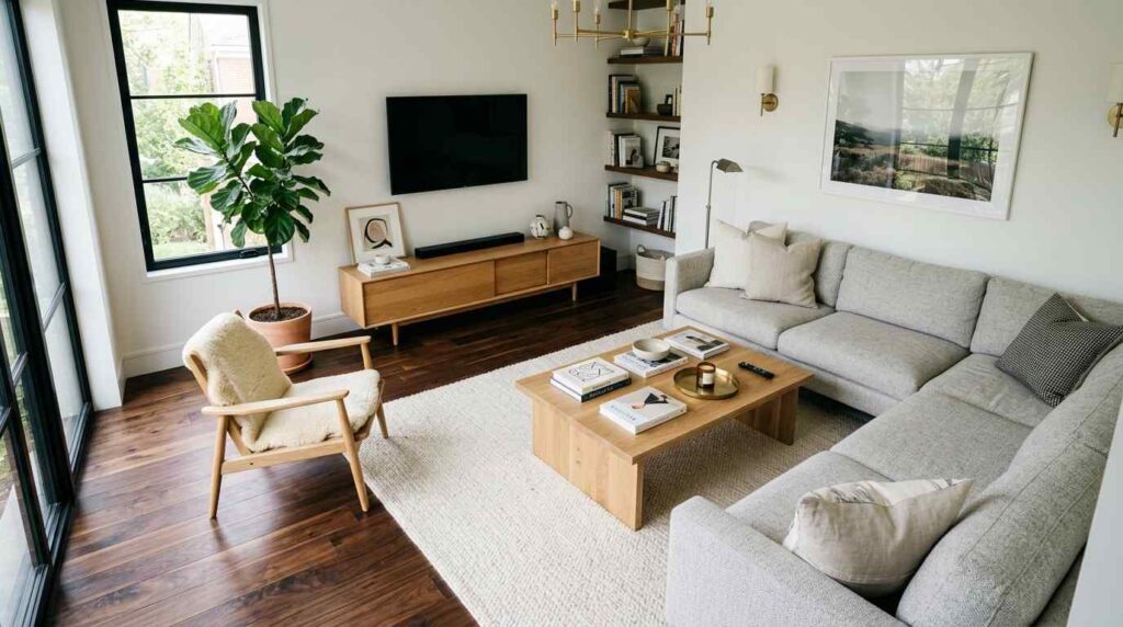
A sophisticated living room featuring dark walnut hardwood flooring as one distinct wood layer, with furniture pieces in a completely different lighter oak tone sitting atop it, creating clear separation between architectural and furniture wood elements. The dark floor provides dramatic contrast beneath a lighter oak coffee table and media console. Soft white walls unify the two wood layers. A plush cream rug partially covers the dark floor beneath the seating area. Natural light emphasizes the contrast between the dark flooring layer and lighter furniture layer. Brass accents bridge both wood tones. The clear delineation between floor and furniture wood tones creates intentional layering rather than competing textures. Shot from an elevated angle showing the distinct separation between dark flooring and lighter furniture wood tones, with bright, natural lighting emphasizing the sophisticated layering achieved through this architectural versus furniture wood distinction.
Treating my flooring and furniture as two entirely separate wood layers, rather than trying to match them, opened up so much more flexibility in how I could mix tones throughout my living room. My dark walnut floors provide this dramatic, grounding foundation, while my furniture sits in a completely different lighter oak tone, and rather than feeling like a mismatch, this deliberate separation reads as sophisticated layering precisely because the distinction is so clear and intentional rather than accidental or uncertain.
This approach requires embracing genuine contrast rather than trying to find furniture that awkwardly attempts to match your existing floor tone, which is often impossible to achieve perfectly anyway given how flooring and furniture woods are typically finished differently. I’ve found that keeping a rug between the two wood layers, even a relatively minimal one, helps ease this transition further, providing a buffer zone that makes the dramatic floor-to-furniture contrast feel more considered. This technique has been particularly liberating for anyone dealing with existing hardwood floors they can’t easily change, since it means you’re not restricted to furniture attempting to match that existing tone, instead you can choose furniture wood based on what you love, trusting that the clear floor-versus-furniture distinction will read as intentional rather than mismatched.
7. Incorporate Reclaimed or Textured Wood Alongside Refined Pieces
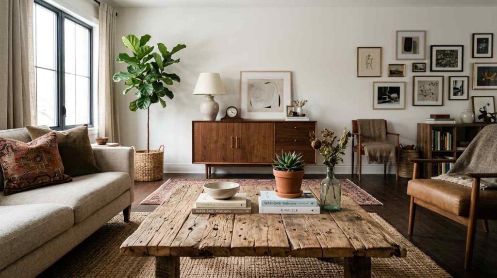
An eclectic, layered living room combining a reclaimed wood coffee table with visible weathering, nail holes, and rustic character alongside a sleek, refined walnut credenza with smooth, polished surfaces. The contrast between rough, textured wood and smooth, refined wood creates visual interest through texture rather than just tone variation. Soft white walls provide a clean backdrop. Natural light emphasizes both the reclaimed wood’s rustic texture and the refined credenza’s smooth finish. A neutral linen sofa sits between both pieces. Brass accents add warmth that bridges the rustic and refined elements. Shot from an angle showing the textural contrast between reclaimed and refined wood pieces, with warm, natural lighting emphasizing how texture variation adds another dimension to successful wood tone mixing.
Combining my reclaimed wood coffee table, with all its authentic weathering and visible history, alongside a much more refined and polished walnut credenza taught me that successful wood mixing isn’t only about color and tone, texture plays an equally important role in creating genuine visual interest. The rough, characterful surface of reclaimed wood provides this wonderful contrast against smooth, contemporary pieces, and honestly, this textural variation often matters more to how successfully wood pieces coexist than whether their actual color tones match precisely.
This combination works because the pieces serve clearly different roles within the room, the reclaimed table brings casual, lived-in warmth while the refined credenza adds a touch of sophistication and polish, and together they create this layered narrative that feels collected over time rather than purchased as a single coordinated set. I’ve learned that when you’re mixing rough and refined wood textures like this, the specific tone matching actually matters less than when you’re combining pieces with similar finish quality, since the textural contrast itself provides enough visual distinction and interest. This principle has given me confidence to bring home reclaimed and vintage pieces that I love, trusting that their inherent character will complement rather than clash with my more polished furniture.
8. Ground Multiple Wood Tones with a Consistent Rug
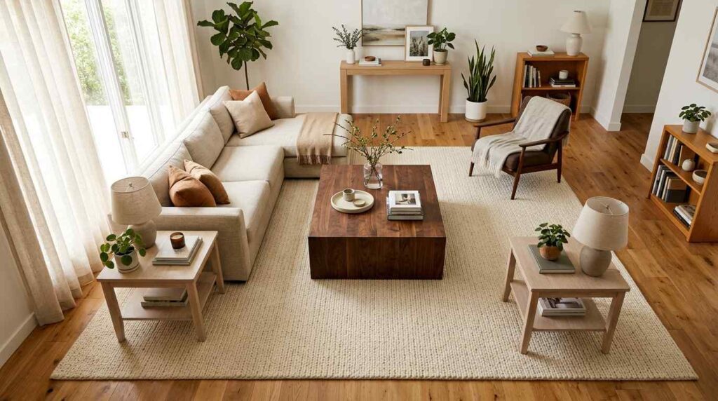
A harmonious living room where a substantial neutral area rug in warm cream anchors and unifies multiple wood tones throughout the space: honey oak flooring peeking around the rug’s edges, a dark walnut coffee table, and lighter ash side tables all sitting within the rug’s visual boundary. Soft white walls provide additional cohesion. Natural light illuminates the varied wood tones equally. The rug’s neutral, warm tone doesn’t compete with any specific wood color, instead providing a unifying visual foundation. A neutral linen sofa continues the cohesive palette. Shot from an elevated angle showing how the substantial rug grounds and unifies the different wood tones within its boundary, with bright, even lighting emphasizing the successful integration achieved through this foundational textile element.
Choosing one substantial, neutral area rug to anchor my entire seating area became the unifying foundation that let my mismatched wood furniture, an inherited dark walnut coffee table alongside newer, lighter ash side tables, coexist without any tension between the different tones. The rug’s warm, neutral cream color doesn’t compete with or favor any particular wood tone, instead providing this consistent visual foundation that every piece of furniture, regardless of its specific wood color, relates back to equally.
I made sure this rug was large enough to encompass the entire seating arrangement, since a rug too small to unite all the mixed wood furniture pieces within its boundary loses much of this grounding effect. This technique has been especially useful in open floor plans where multiple wood tones are visible simultaneously across connected spaces, the rug essentially draws a visual boundary that says these different elements belong together within this defined zone. I’ve found that texture matters here too, choosing a rug with some subtle pattern or texture variation adds interest without introducing another competing color element that might complicate the wood tone balance I’d already carefully established throughout the room.
9. Use Wood Species Variation Within a Single Piece
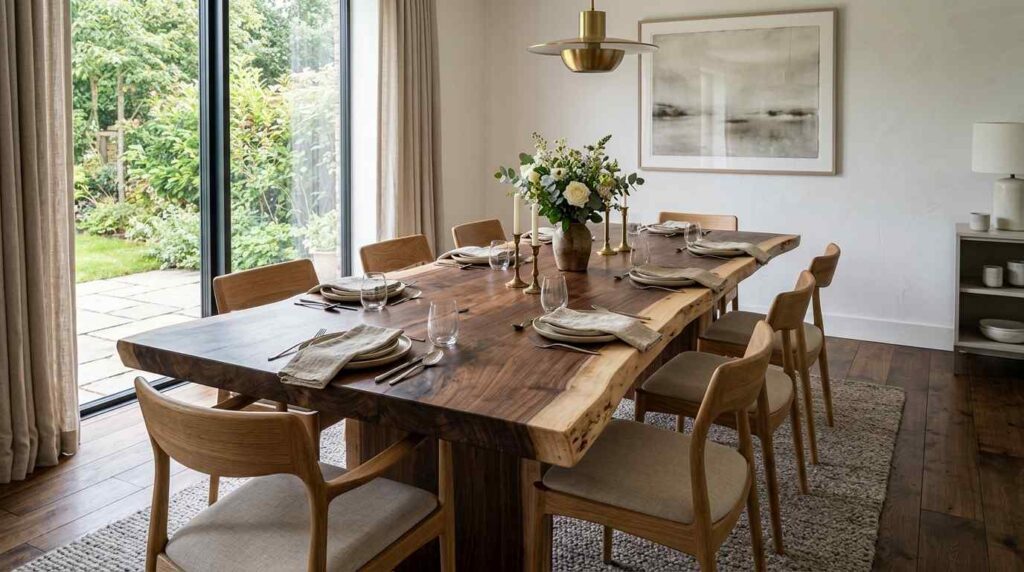
A sophisticated dining room featuring a live-edge dining table crafted from a single wood slab that shows natural variation in tone across its surface, from lighter sapwood edges to deeper heartwood tones toward the center. This single piece demonstrates how natural wood variation exists inherently within quality lumber. Simple wood dining chairs in a complementary but distinct tone surround the table. Soft white walls provide a clean backdrop. Natural light emphasizes the dramatic tonal variation within the single table slab. A pendant light hangs centered above. Wide-plank oak floors ground the space in yet another distinct tone. The room shows how natural wood inherently contains tonal range even within a single furniture piece. Shot from an angle showing the natural tonal variation across the table’s surface, with warm, natural lighting emphasizing the organic beauty achieved through this inherent wood variation rather than artificial matching.
Discovering live-edge furniture that showcases natural tonal variation within a single wood slab taught me an important lesson about how real, unfinished wood inherently contains more range and complexity than the uniform, evenly-toned lumber we typically expect from mass-produced furniture. My dining table shows this beautiful gradient from lighter sapwood at the edges to deeper, richer heartwood tones toward the center, and this natural variation exists within one single piece rather than requiring me to combine multiple separate items to achieve visual interest.
This discovery changed how I think about wood tone mixing generally, recognizing that trying to achieve perfectly uniform, matched wood tones throughout a room is actually working against wood’s natural character rather than embracing it. Once I stopped fighting this inherent variation and started seeking out pieces that celebrated it, like this live-edge table, my whole approach to combining different wood furniture became more relaxed and confident. I chose dining chairs in a complementary but distinct tone specifically because I’d learned that this natural table variation gave me permission to introduce additional wood tones elsewhere in the room without worrying about achieving impossible, artificial uniformity that real, quality wood was never meant to have in the first place.
10. Balance Light and Dark Woods in Roughly Equal Proportion
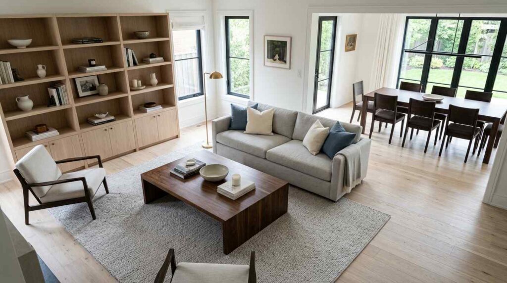
A sophisticated, balanced living room demonstrating roughly equal distribution between light and dark wood tones: pale white oak flooring and a light ash bookshelf balance against a dark walnut coffee table and espresso dining chairs visible in the adjoining space. Soft white walls provide neutral backdrop. Natural light illuminates both the light and dark wood elements equally throughout the connected spaces. A neutral linen sofa sits centrally between the light and dark elements. Brass accents provide warm connection between both wood temperatures. The overall room feels balanced rather than dominated by either extreme, with roughly equal visual weight given to both light and dark wood tones. Shot from an elevated angle showing the balanced distribution between light and dark wood elements throughout the space, with bright, even lighting emphasizing the successful equilibrium achieved through this proportional approach.
Learning to consciously balance the overall proportion of light versus dark wood tones throughout my living space prevented the room from feeling either too heavy and dark or too washed out and pale, both extremes I’d experienced before finding this equilibrium. My pale oak flooring and lighter ash bookshelf balance against darker walnut and espresso pieces elsewhere in the room, and this rough fifty-fifty distribution creates genuine visual interest without either temperature completely overwhelming the space.
I started paying attention to this balance specifically after noticing that rooms feeling either too dark or too light despite having plenty of nice individual pieces, the problem wasn’t the furniture itself but the overall proportion between light and dark elements. Achieving this balance sometimes meant consciously choosing a lighter piece when I might have gravitated toward another dark option, or vice versa, specifically to maintain this equilibrium rather than just following my immediate aesthetic preference in isolation. This principle has become one of my most reliable tools for evaluating whether a room with mixed wood tones is actually working, if I mentally sort all the wood elements into light versus dark categories and one significantly outweighs the other, I know I need to introduce a counterbalancing piece to restore that comfortable proportion.
11. Create a Wood Tone Gradient Across a Room
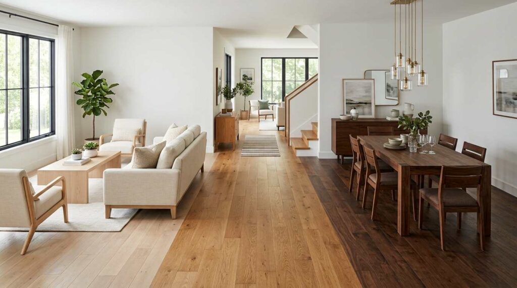
A thoughtfully arranged open-concept living and dining space demonstrating a gradual wood tone gradient: pale white oak appears in the living room flooring and furniture closest to the windows, transitioning to medium honey oak in the connecting hallway area, and finally to deep walnut in the dining room furniture farther from the natural light source. Soft white walls unify the gradual transition. Natural light is strongest near the pale wood elements and diminishes toward the darker dining area. The gradient creates a sense of intentional flow rather than abrupt wood tone changes. Wide-plank flooring transitions subtly between zones. Shot from an elevated angle showing the gradual tonal transition across the connected spaces, with natural lighting emphasizing how the gradient corresponds thoughtfully with the room’s natural light distribution.
Creating a deliberate gradient where wood tones gradually shift from pale near my brightest windows to progressively darker further into the room taught me that thoughtful transition matters more than random distribution when working across a larger, open-concept space. This approach means walking through my connected living and dining area feels like a natural, flowing progression rather than jarring shifts between disconnected wood tones, since each zone relates logically to its neighbors rather than existing in isolation.
I specifically aligned this gradient with my natural light patterns, keeping paler woods in the brightest areas near windows where they’d feel especially luminous, while allowing deeper, richer tones in the dining room that receives less direct natural light and can handle that additional visual weight. This strategy required mapping out my space’s light patterns before making furniture decisions, rather than choosing pieces in isolation without considering how they’d relate to their location within the broader gradient. This technique has proven particularly effective for open floor plans where multiple wood tones would otherwise be visible simultaneously from various vantage points, the gradient provides this underlying logic that makes even dramatic tone differences between the far ends of the space feel like an intentional journey rather than an inconsistent mess.
12. Pair Wood Tones with a Consistent Wood Species
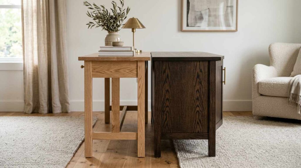
A cohesive living room demonstrating how consistent wood species, despite different stain treatments, creates unity: two oak pieces are shown side by side, one in a natural, light finish and one stained in a deep espresso tone, both showing the same distinctive oak grain pattern despite their different colors. Soft white walls provide a clean backdrop. Natural light emphasizes the shared grain pattern visible in both pieces despite their tonal difference. A neutral sofa sits nearby. The consistent grain pattern, despite different stain colors, creates an underlying unity that pure color matching couldn’t achieve. Shot in close detail showing the shared oak grain visible across both differently-stained pieces, with warm, natural lighting emphasizing the sophisticated cohesion achieved through species consistency rather than color matching.
Discovering that I could stick to a single wood species, oak specifically, while still achieving genuine tonal variation through different stain treatments revealed this sophisticated middle ground between fully matching furniture and completely random wood mixing. My natural, light-finished oak pieces and my deep espresso-stained oak pieces show completely different colors, but they share this identical underlying grain pattern that creates a subtle, almost subconscious sense of unity that pure color coordination alone couldn’t achieve.
This approach requires understanding that wood species have distinctive grain characteristics, oak’s grain looks completely different from walnut’s or maple’s, and when you maintain species consistency while varying only the stain or finish, you’re essentially mixing tones while keeping one crucial variable constant. I’ve found that people who notice something cohesive about my mixed-tone rooms, without being able to articulate exactly why, are often responding to this underlying grain consistency even if they’re not consciously aware that’s what they’re seeing. This strategy has been particularly helpful when I want genuine tonal contrast, like nearly white oak beside deep espresso oak, but still want that underlying sense of connection that pure random wood tone mixing sometimes lacks without this species-level consistency working in the background.
13. Introduce a Painted or Whitewashed Wood Piece as a Palate Cleanser
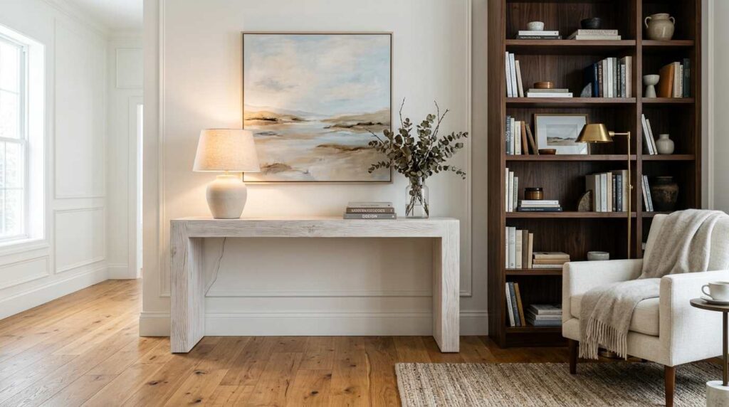
A sophisticated living room featuring a whitewashed wood console table providing visual relief between a warm honey oak floor and a dark walnut bookshelf. The whitewashed piece shows visible wood grain through its pale, translucent finish, distinguishing it from solid paint. Soft white walls complement the whitewashed element. Natural light emphasizes the textural difference between the whitewashed finish and the solid-toned oak and walnut pieces. A neutral linen sofa sits nearby. The whitewashed console acts as a visual breathing point between the two more saturated wood tones. Shot from an angle showing how the whitewashed piece provides relief between the warmer and darker wood elements, with bright, natural lighting emphasizing the sophisticated balance achieved through this palette-cleansing technique.
Adding a whitewashed console table between my warmer honey oak flooring and much darker walnut bookshelf gave the room this necessary visual breathing point that prevented the space from feeling overwhelmed by two competing saturated wood tones sitting too close together. The whitewash technique, which lets wood grain show through a translucent pale finish rather than fully obscuring it with solid paint, maintains that essential wood texture and character while providing genuine tonal relief between more intense colors elsewhere in the room.
This approach works differently than simply adding a painted furniture piece, since fully painted wood loses that grain visibility that keeps a room feeling cohesively wood-toned rather than introducing what reads as a completely different material category. I specifically sought out this whitewashed finish because it bridges categories, technically still wood-toned and grain-visible, but light and neutral enough to function almost like a pause between more saturated tones. This technique has become my go-to solution whenever I’m combining wood tones that feel slightly too intense sitting directly adjacent to each other, introducing this palette-cleansing whitewashed piece creates breathing room without abandoning the overall wood-tone aesthetic I’m trying to maintain throughout the space.
14. Layer Wood Tones Vertically from Floor to Ceiling
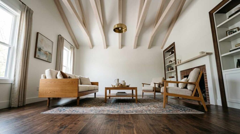
A sophisticated living room demonstrating vertical wood tone layering: dark walnut flooring at the base, medium honey oak furniture at seating height, and pale ash wood ceiling beams overhead, creating a gradual lightening effect from floor to ceiling. Soft white walls provide visual breathing room between the wood layers. Natural light illuminates the ceiling beams most brightly while the darker floor remains more shadowed. A neutral sofa sits at the furniture level. The vertical progression from dark to light creates a sense of visual lift and spaciousness. Shot from a low angle looking upward to emphasize the full vertical progression from dark floor to light ceiling beams, with natural lighting highlighting the intentional tonal gradient created through this floor-to-ceiling layering approach.
Arranging my wood tones vertically, with darker walnut flooring anchoring the room, medium honey oak furniture at the middle seating level, and pale ash ceiling beams overhead, created this gradual lightening effect from floor to ceiling that makes the entire room feel taller and more spacious than it actually is. This vertical layering technique borrows from a principle I’d noticed in nature, where darker earth tones ground us at foot level while lighter sky tones exist overhead, and translating that logic into interior wood tone placement created an intuitively pleasing progression.
This approach required thinking about wood tone placement completely differently than I had before, rather than randomly distributing different tones throughout a room, I specifically considered the vertical relationship between floor, furniture, and ceiling elements. The darker flooring provides necessary visual weight and grounding, while the lighter ceiling beams draw your eye upward, creating this sense of lift that heavier, uniform wood tones throughout wouldn’t achieve. This technique has proven particularly valuable in rooms with lower ceilings, where this deliberate floor-to-ceiling lightening genuinely helps counteract that compressed feeling, proving that successful wood tone mixing isn’t just about horizontal placement throughout a room but can also work vertically to influence how spacious and airy the whole space feels.
15. Trust Your Existing Pieces Rather Than Forcing New Purchases
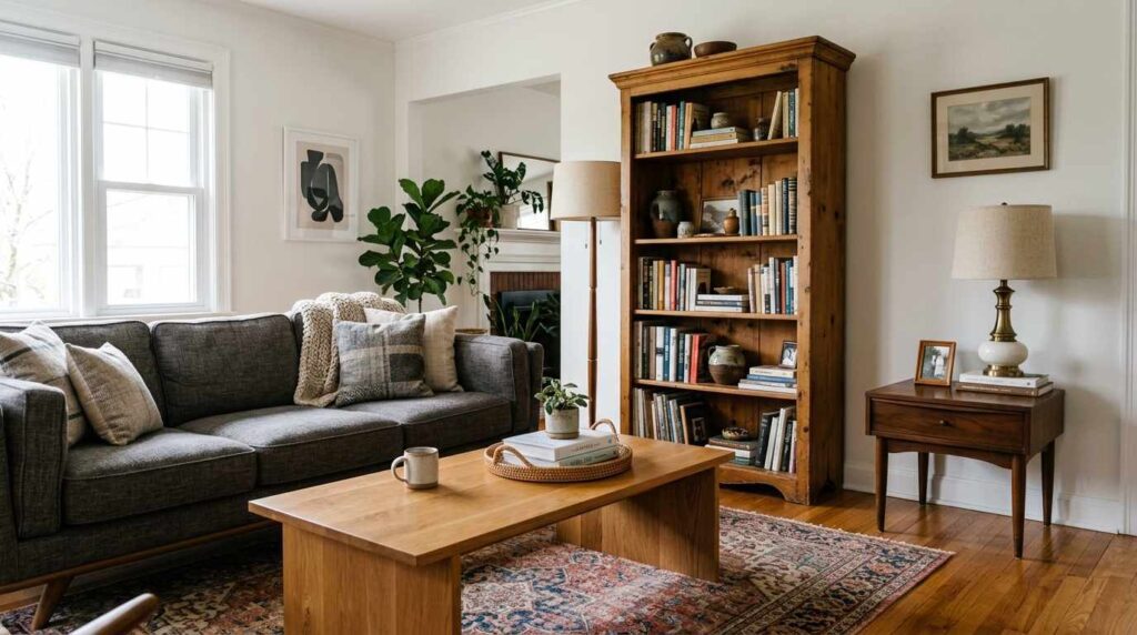
A warm, collected living room featuring an eclectic mix of wood furniture pieces gathered over years: an inherited mid-century walnut side table, a modern honey oak coffee table, and a vintage pine bookshelf with visible patina, all coexisting within the same space without appearing overly coordinated or purchased as a set. Soft white walls provide a cohesive backdrop. Natural light illuminates the varied wood tones and their different histories and origins. A comfortable, worn linen sofa anchors the seating area. The overall effect feels genuinely collected and personal rather than professionally matched. Shot from an angle showing the natural, unforced coexistence of pieces from different eras and origins, with warm, natural lighting emphasizing the authentic, lived-in quality achieved through this trust-based approach to mixing existing wood furniture.
Learning to trust and actually use the mismatched wood furniture pieces I’d accumulated over years, inherited items, vintage finds, newer purchases, rather than replacing everything to achieve some artificial matched coordination, was ultimately the most liberating realization in this entire journey toward comfortable wood tone mixing. My mid-century walnut side table, honey oak coffee table, and vintage pine bookshelf all come from completely different eras and origins, yet they coexist in my living room without needing to pretend they were purchased as a coordinated set.
This final principle ties together everything else I’ve learned, once you understand the mechanics of repetition, undertone balance, connecting accents, and proportional distribution, you can actually trust that pieces you already own and love will likely work together with some thoughtful arrangement rather than requiring wholesale replacement. I’ve found genuine relief in this approach, since chasing perfectly matched wood furniture is both financially impractical and ultimately less interesting than a home that authentically reflects accumulated history and personal taste. This journey has taught me that successfully mixing wood tones isn’t really about achieving some external standard of coordination, it’s about developing the confidence and technical understanding to make your existing collection of pieces, however varied their origins, feel genuinely intentional and cohesive together.