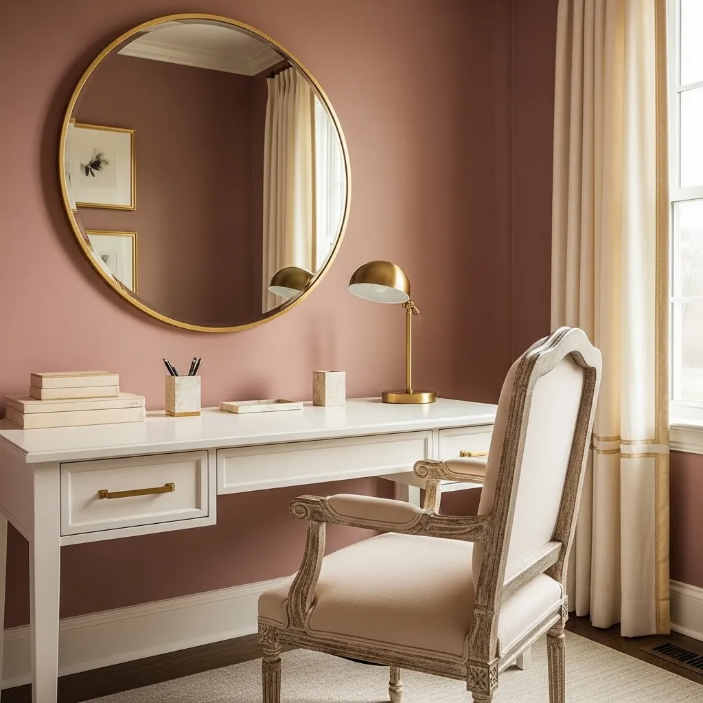
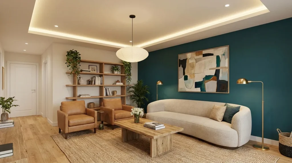
POP, or Plaster of Paris, remains a versatile choice for adding character to modern interiors without making a room feel overly decorated. While ceilings are the most familiar application, contemporary POP color design and painting ideas can also shape walls, niches, panels, borders, and architectural details. The right combination of form, lighting, and paint color can make a compact room appear more spacious, give a large room greater definition, or create a striking focal point with relatively simple materials. From subtle neutral palettes to dramatic two-tone combinations, these ideas can be adapted to living rooms, bedrooms, dining areas, hallways, and entryways. Before choosing a design, consider the room’s natural light, existing furniture, ceiling height, and overall color scheme. The goal is to create a polished feature that complements the architecture rather than competing with it.
1. White POP Ceiling With Warm Beige Walls
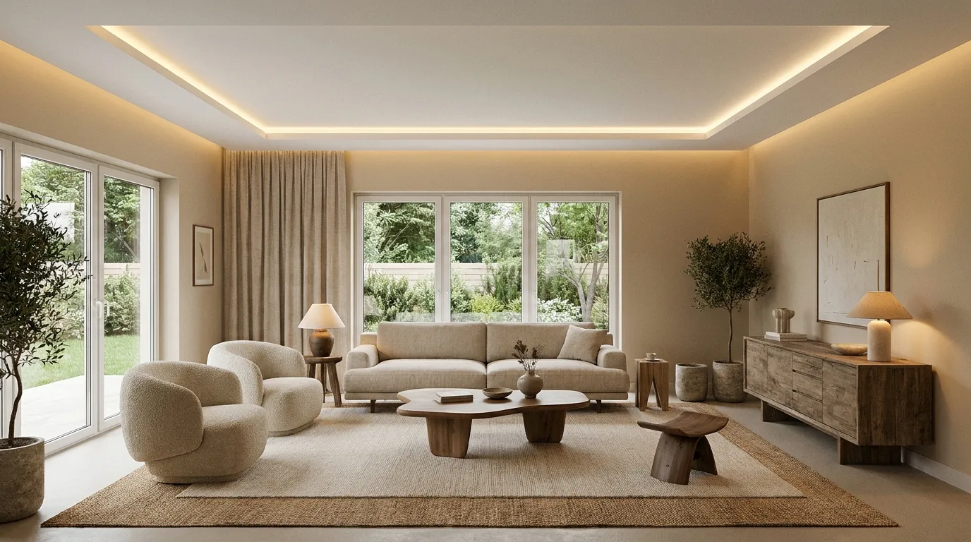
A crisp white POP ceiling paired with warm beige walls is an easy way to create a modern, welcoming interior. The white ceiling reflects light and gives the room a clean sense of height, while beige introduces warmth without overwhelming the furniture or flooring. Consider a simple recessed POP border around the ceiling perimeter for added definition. Concealed LED lighting can be tucked into the recess to produce a soft glow after sunset, while a central pendant can provide a decorative focal point. This combination works particularly well in living rooms and bedrooms where you want an elegant backdrop that will remain relevant for years. Use warm white lighting rather than very cool bulbs so the beige retains its inviting character.
2. Charcoal and White POP Ceiling Design
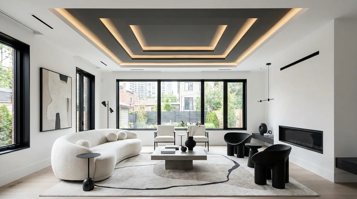
For a stronger contemporary statement, combine a white POP ceiling with carefully placed charcoal-gray sections. Rather than covering the entire ceiling in dark paint, use charcoal inside a geometric recess, narrow border, or central rectangular panel. The contrast creates architectural depth and works especially well with minimalist furniture, black-framed windows, and neutral flooring. Because dark colors can visually lower a ceiling, keep the charcoal area controlled and allow plenty of white space around it. Layered lighting can make the design even more effective: recessed spotlights can illuminate the white areas while concealed LEDs emphasize the darker feature. This approach is particularly suitable for modern living rooms, entertainment spaces, and stylish home offices where a little visual drama is desirable.
3. Pastel Blue POP Design for a Calm Bedroom
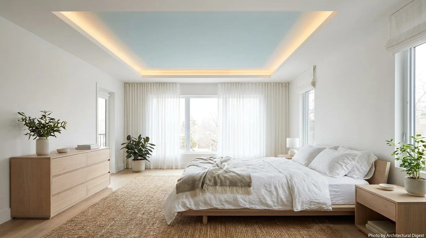
Pastel blue is an excellent choice when you want a bedroom to feel peaceful and airy. A POP ceiling with a shallow central recess painted in a soft blue can become an understated focal point without making the room feel busy. Keep surrounding walls white, cream, or very pale gray so the ceiling remains the primary color feature. This idea works beautifully with light wood furniture, white bedding, linen curtains, and simple metallic accents. If the bedroom receives strong daylight, choose a slightly muted blue rather than an intensely saturated shade. Concealed strip lighting around the POP recess can add a gentle evening glow and emphasize the ceiling’s shape. The result is a relaxing modern bedroom that feels designed rather than overly decorated.
4. Two-Tone POP Ceiling With Terracotta Accents
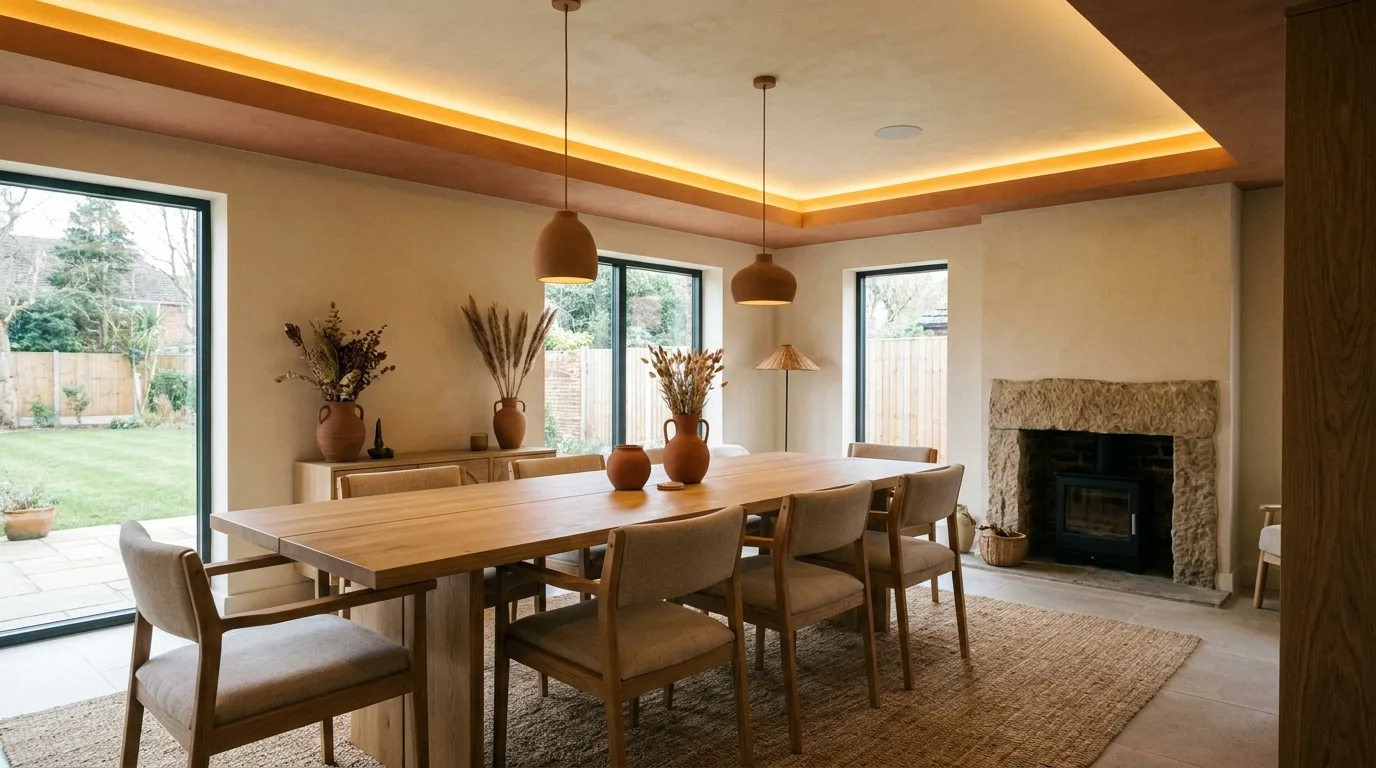
Terracotta brings warmth and personality to contemporary POP designs while remaining more sophisticated than brighter orange shades. Use it as a controlled accent inside a rectangular or circular POP ceiling recess, then surround it with warm white or soft cream. The color pairs naturally with wood, rattan, stone textures, and neutral upholstery, making it useful for living rooms and dining spaces. Because terracotta is visually strong, a small painted section can have more impact than a large one. Repeat the shade in cushions, artwork, ceramics, or a rug to create visual continuity. Warm lighting enhances the earthy character of the color, while simple POP detailing keeps the overall composition modern and prevents the room from looking overly traditional.
5. Soft Gray POP Border With White Center
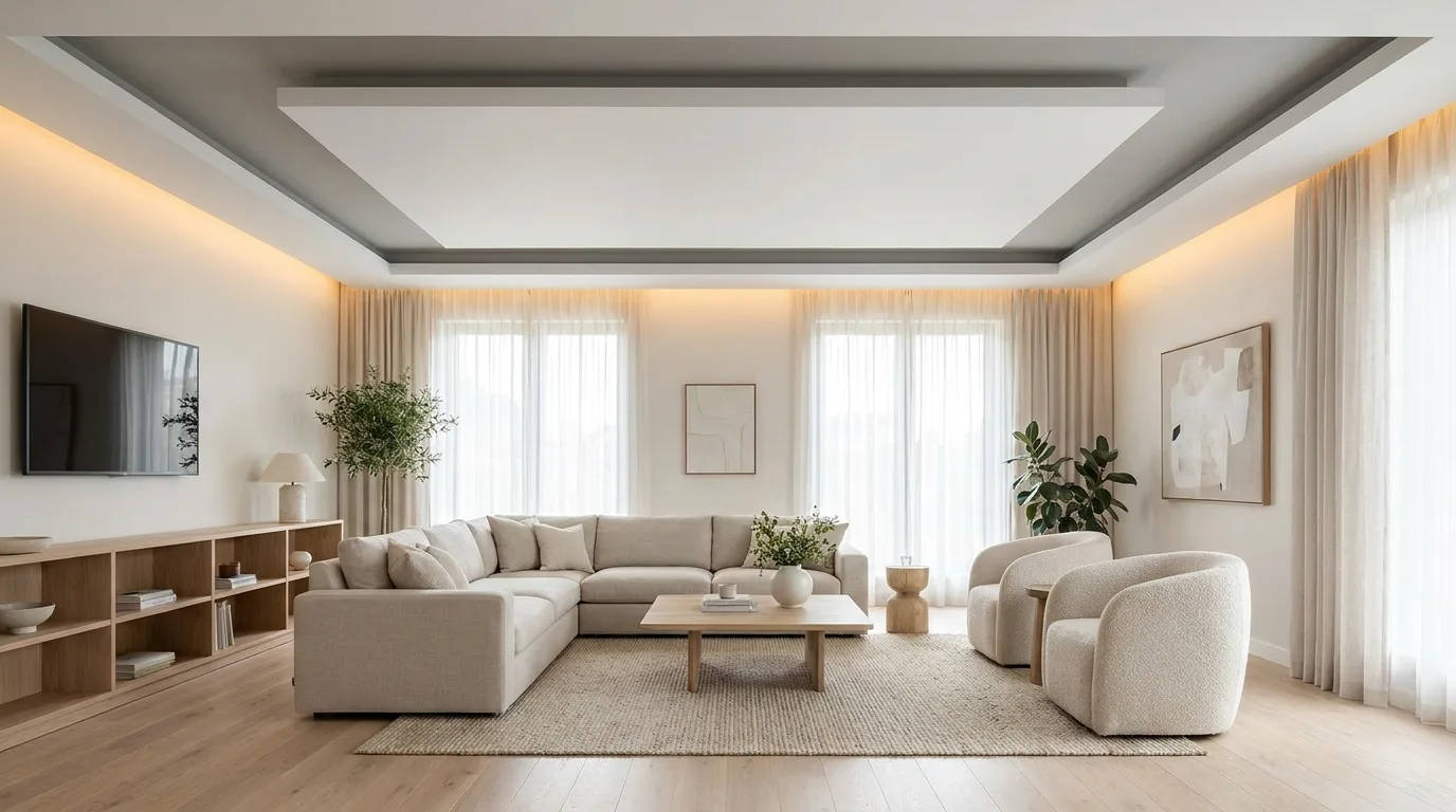
A soft gray POP border is a practical choice for homeowners who want definition without dramatic color. Create a recessed perimeter frame around a white central ceiling and paint the frame in a light or medium gray. The layered effect adds depth while preserving a bright, spacious appearance. This design is particularly useful in rooms with moderate ceiling height because the central white area continues to visually lift the space. Pair it with gray upholstery, white walls, pale wood, or brushed-metal fixtures for a cohesive modern palette. You can also add concealed lighting within the border to make the ceiling appear to float. Choose a gray with an undertone that complements the existing room colors, since cool and warm grays can create noticeably different atmospheres.
6. Sage Green POP Feature for Natural Interiors
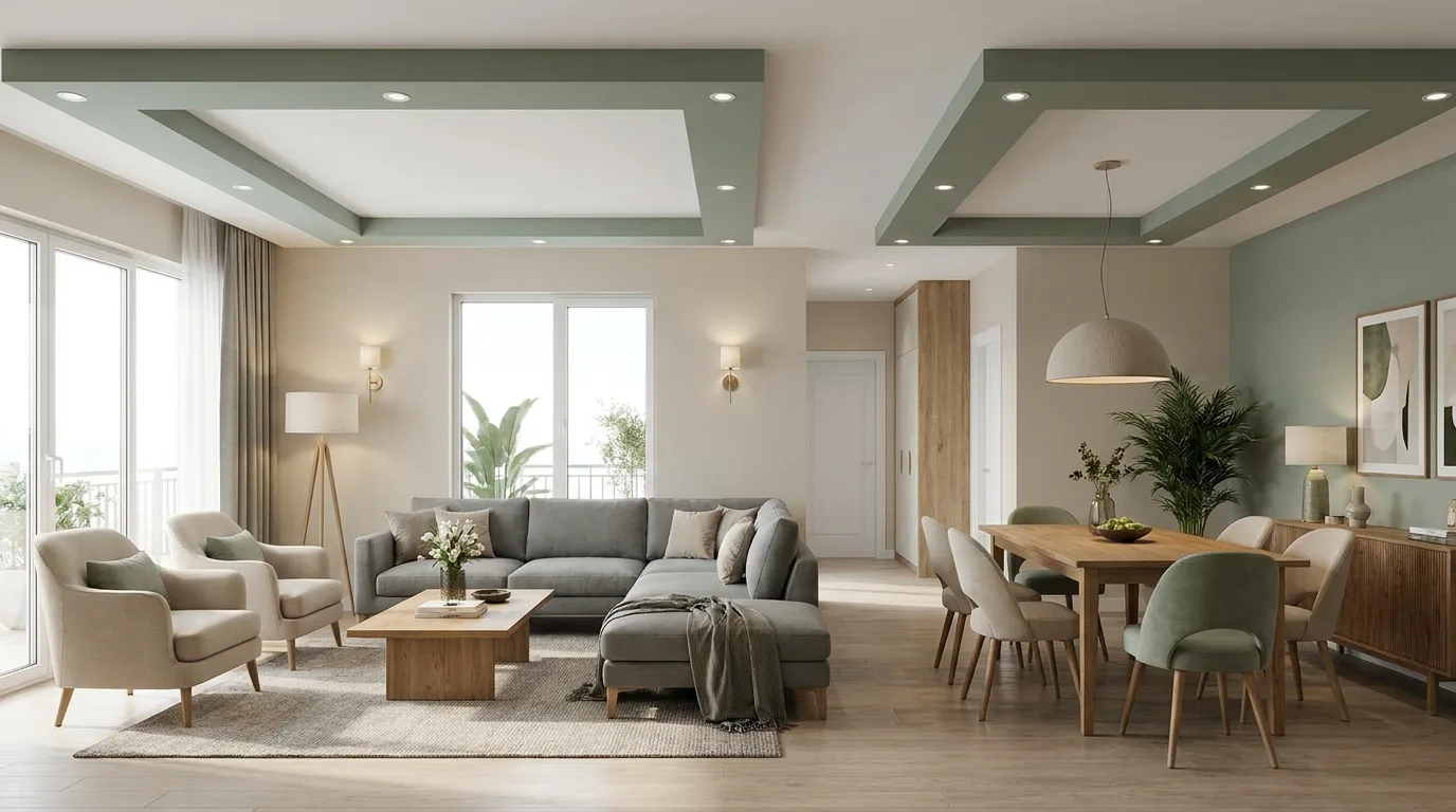
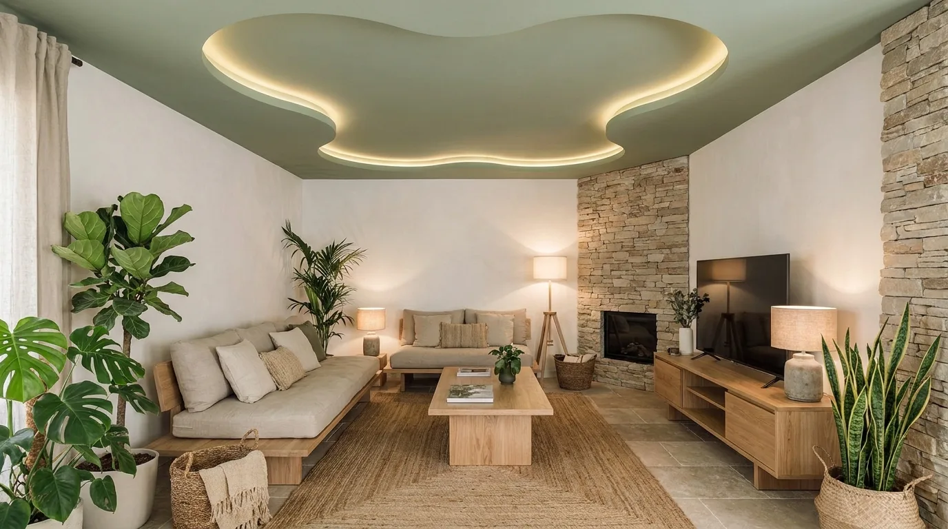
Sage green has become a popular interior color because it adds a connection to nature while remaining subtle enough for modern homes. Use sage inside a POP ceiling panel, wall niche, or recessed rectangular feature rather than applying it indiscriminately throughout the room. The muted green looks especially attractive beside off-white, natural wood, beige, and stone finishes. In a bedroom, it can create a restful atmosphere; in a living room, it can provide a sophisticated focal point. Keep the POP shapes clean and uncomplicated so the color remains the star. Plants, woven textures, and linen accessories can reinforce the natural theme. If the room has limited daylight, test the chosen paint first because sage can appear considerably darker under artificial lighting.
7. Navy Blue POP Panel With Integrated Lighting
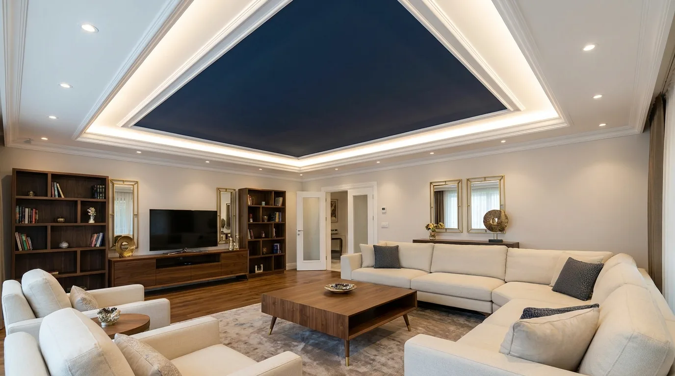
Navy blue can give a POP feature a luxurious appearance without relying on excessive ornamentation. A deep navy panel set within a white POP ceiling or wall frame creates a strong contrast and provides a natural location for integrated lighting. Consider installing a row of recessed downlights around the panel or concealed LED illumination along its inner edge. Navy works well with brass, warm wood, cream upholstery, and light flooring, so it can fit comfortably into both contemporary and transitional interiors. Avoid using too many additional dark surfaces in the same room, especially if the space is small. Instead, let the navy feature remain the main accent and balance it with lighter walls and furnishings. This creates a refined focal point with clear architectural structure.
8. Geometric POP Ceiling With Muted Earth Tones
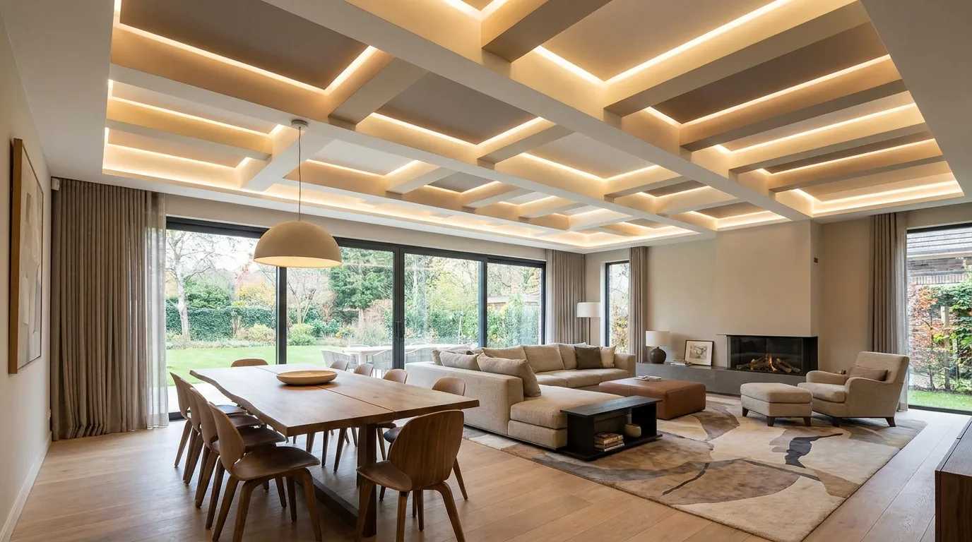
Geometric POP patterns can add architectural interest while keeping a modern room visually organized. Try overlapping rectangles, stepped frames, or a simple linear arrangement, then introduce muted earth tones such as taupe, clay, sand, or warm gray into selected sections. The key is restraint: too many shapes or colors can quickly make a ceiling look dated. Choose one dominant neutral and one accent shade, then use lighting to emphasize the geometry. This approach is especially effective above dining tables, seating areas, or open-plan zones because the ceiling can help define different functions without requiring physical partitions. Keep furniture silhouettes simple so the architectural detail remains prominent. A carefully planned geometric POP design can make an otherwise plain ceiling feel custom-built and intentional.
9. Minimalist Cream POP Ceiling With Cove Lighting
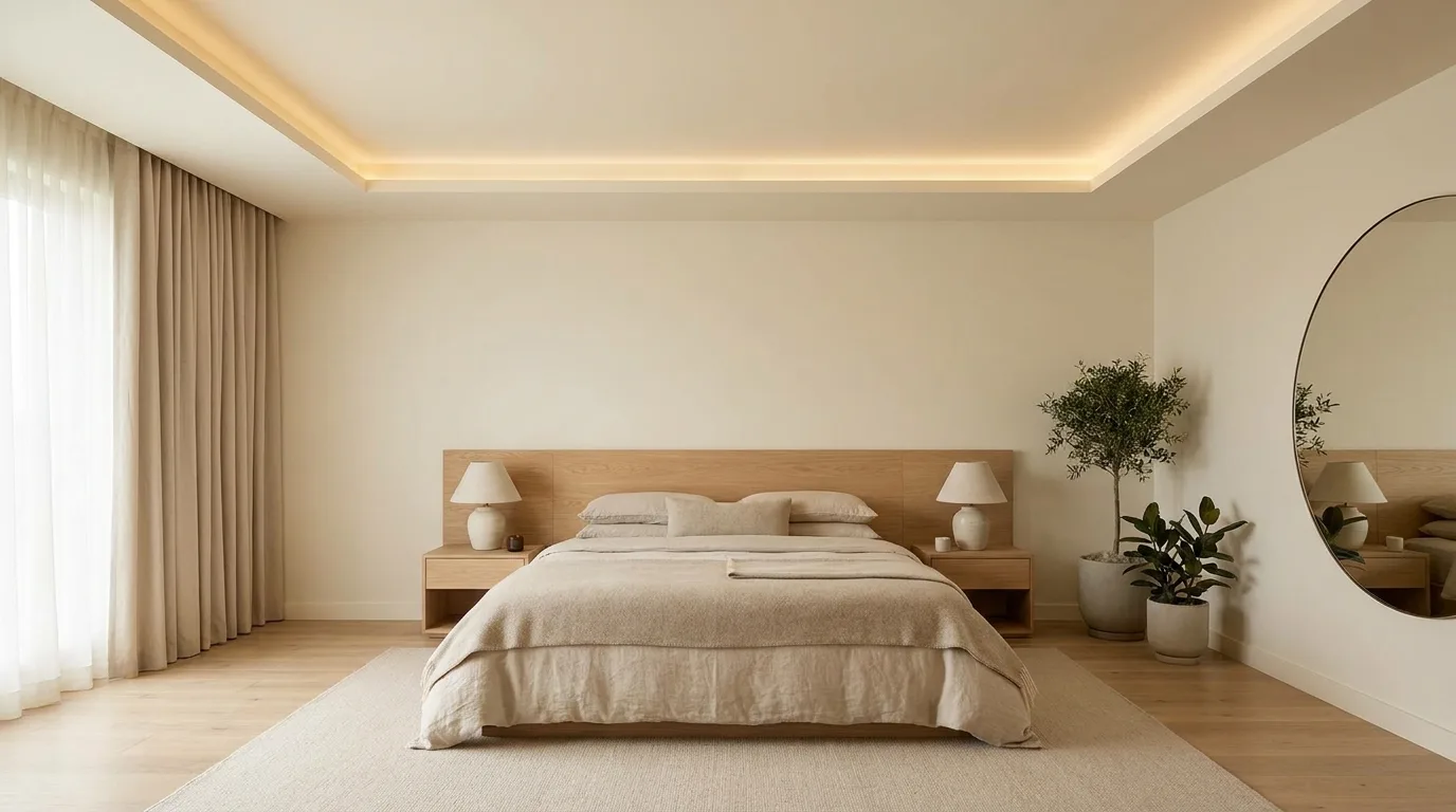
A minimalist cream POP ceiling is ideal for homeowners who prefer subtle elegance over bold color. Instead of using multiple contrasting shades, create a shallow recessed border and paint the entire feature in a warm cream that is slightly deeper than the surrounding ceiling. Add concealed cove lighting inside the recess to create soft indirect illumination. This combination works particularly well in bedrooms, lounges, and open-plan living areas where a calm atmosphere is important. Cream also complements timber, beige upholstery, natural stone, and muted metallic finishes. The design is simple enough to age gracefully while still providing more architectural interest than a completely flat ceiling. For the cleanest appearance, hide wiring and choose lighting with a consistent color temperature across the room.
10. Black and White POP Design for a Contemporary Living Room
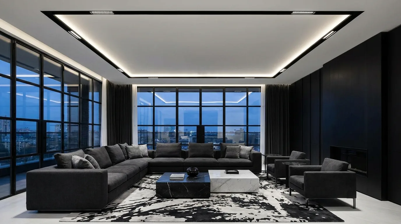
Black and white is a dependable palette for a dramatic contemporary interior, and POP detailing can make the contrast feel architectural rather than decorative. Use white as the dominant ceiling color and introduce black through a narrow recessed frame, linear panel, or selected geometric insert. The design works especially well with black window frames, modern lighting, monochrome artwork, and streamlined furniture. In a smaller room, limit black to thin accents so the ceiling does not become visually heavy. In a larger living room, a broader black feature can help anchor a seating or entertainment zone. Matte paint generally creates a more sophisticated appearance than glossy finishes. Keep the surrounding decor relatively restrained so the strong contrast remains balanced and purposeful.
11. Blush Pink POP Accent for a Soft Modern Look
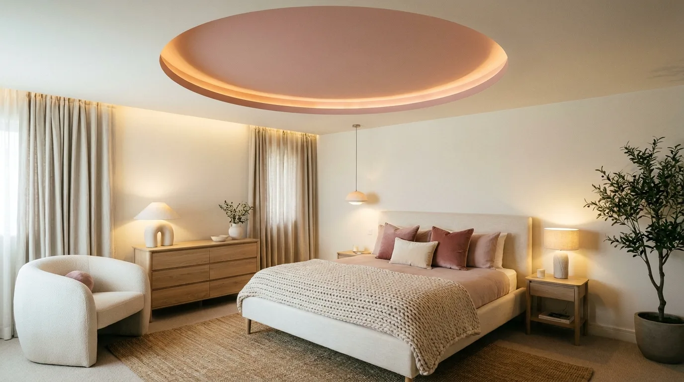
Blush pink can bring warmth and softness to a modern interior when it is used as a controlled POP accent. Consider painting a central ceiling recess or a framed wall panel in a dusty blush rather than using a highly saturated pink. Pair it with warm white, cream, light gray, or pale wood for an elegant palette. The color is particularly effective in bedrooms, dressing areas, and cozy sitting rooms, but it can also work in a sophisticated living room when balanced with neutral furniture. Warm lighting will enhance the welcoming quality of the shade. If you want the design to feel cohesive, repeat the blush tone in small accessories such as cushions, artwork, or decorative objects instead of adding another large colored surface.
12. Olive Green and Off-White POP Combination
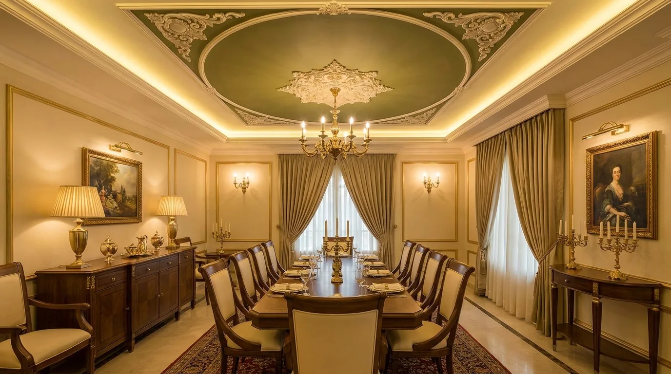
Olive green offers a deeper, more sophisticated alternative to pastel green and works beautifully with off-white POP details. Use olive on a recessed ceiling panel, accent wall section, or framed niche while keeping the surrounding POP structure light. The combination feels grounded and pairs naturally with walnut furniture, brass details, cream fabrics, and natural textures. Because olive can become visually dominant, it is best treated as an accent rather than the primary color throughout the room. This idea can also be adapted to a dining room where the darker tone helps create an intimate atmosphere. Add layered lighting so the color does not appear flat at night. A combination of concealed LEDs and focused decorative fixtures can highlight both the POP structure and the furnishings below.
13. Accent Wall With POP Vertical Panels
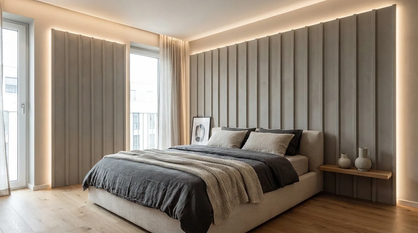
POP is not limited to ceilings. Vertical POP panels can transform a plain wall into a sophisticated architectural feature, particularly behind a television, bed, console, or dining table. Create evenly spaced raised or recessed panels and paint them in a single accent color such as warm gray, muted green, beige, or deep blue. The repeated vertical lines can make a wall appear taller while giving the room a tailored appearance. Keep the panel proportions consistent and avoid excessive ornamentation if the goal is a contemporary look. Integrated LED strips can be positioned within selected recesses to create depth after dark. This approach is also useful for concealing small imperfections or visually organizing a large blank wall without installing bulky furniture or elaborate decorative materials.
14. Wood-Look POP and Neutral Paint Combination
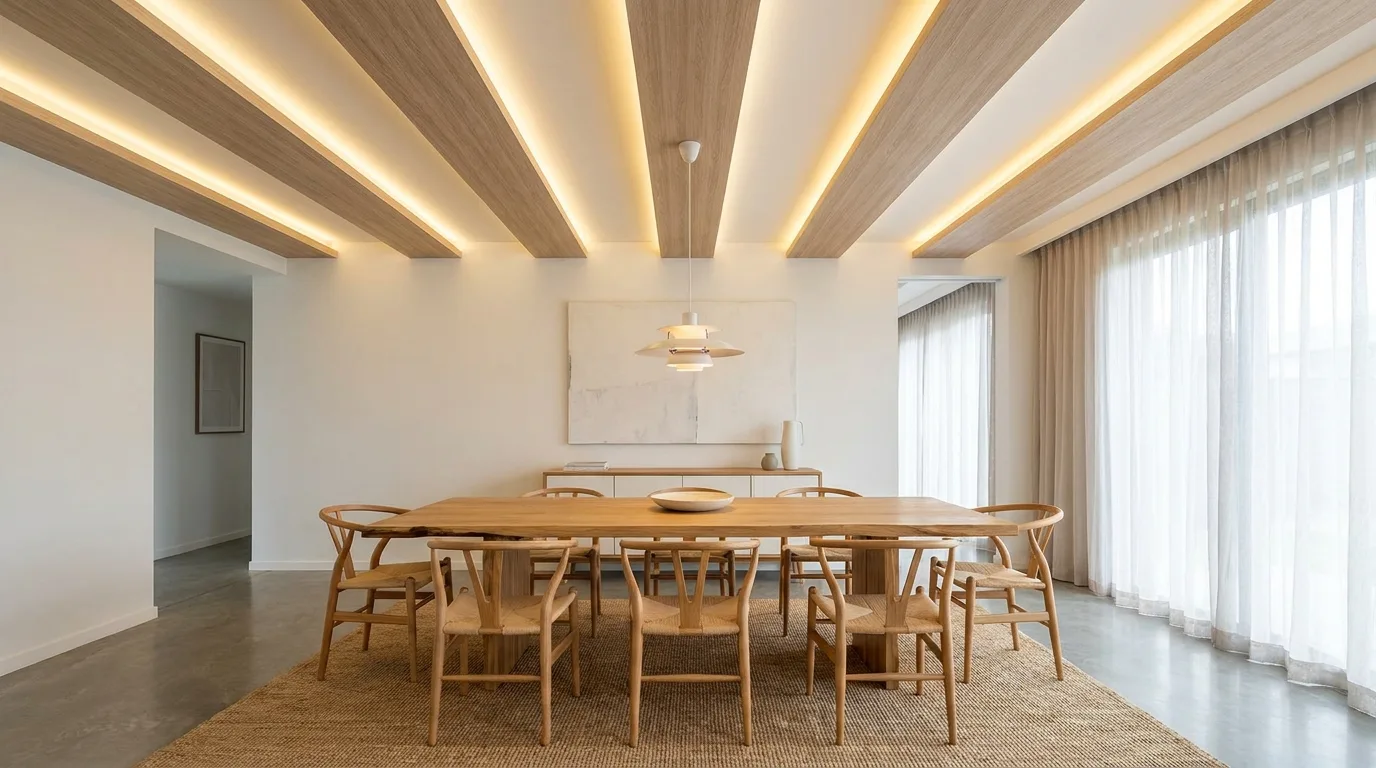
A modern POP design can imitate the visual rhythm of timber without requiring the entire ceiling to be clad in wood. Create long linear POP strips or recessed panels and combine a warm wood-look finish with surrounding off-white or light beige painted sections. The result brings warmth into contemporary interiors while preserving the clean geometry associated with modern design. This combination works particularly well over dining tables, kitchen islands, or living-room seating areas. Use real wood elsewhere in the room, such as furniture or shelving, to reinforce the connection between materials. Keep the lines aligned with the room’s architecture so the ceiling does not feel visually disconnected. Concealed lighting between selected strips can further emphasize the linear pattern and create a comfortable evening atmosphere.
15. Metallic Gold POP Details With Neutral Paint
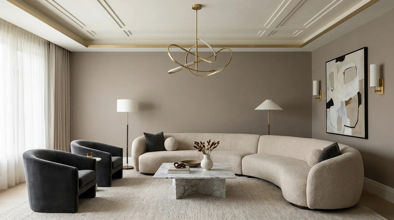
Small touches of metallic gold can make a POP design feel elevated without turning the room into an overly ornate space. Instead of painting large surfaces gold, use it sparingly on narrow POP borders, selected geometric lines, or decorative recesses. Pair the metallic accent with ivory, warm white, taupe, or soft gray for a balanced modern palette. Gold details are particularly effective in dining rooms, entryways, and formal living areas where a slightly more glamorous atmosphere is appropriate. Choose a muted or brushed gold effect when possible, as excessively shiny finishes can dominate the architecture. Coordinate the detail with cabinet handles, light fixtures, mirrors, or small accessories. Keeping the metallic color consistent throughout the room helps the POP feature feel integrated rather than randomly added.
16. Color-Blocked POP Design for Open-Plan Homes
Color blocking is a smart way to give an open-plan home visual organization without building walls. Use POP ceiling frames or panels to divide the visual zones, then assign a restrained color combination to each area. For example, a soft beige frame can define the living zone while a muted gray or sage feature identifies the dining area. The colors should share a common undertone so the spaces still feel connected. Avoid using a different bold color in every section because this can make an open layout appear fragmented. Linear POP details can follow the furniture arrangement and help guide the eye through the space. This approach is especially useful in apartments where the ceiling needs to perform both a decorative and spatial-planning role.
17. Warm White POP Ceiling With Statement Wall Color
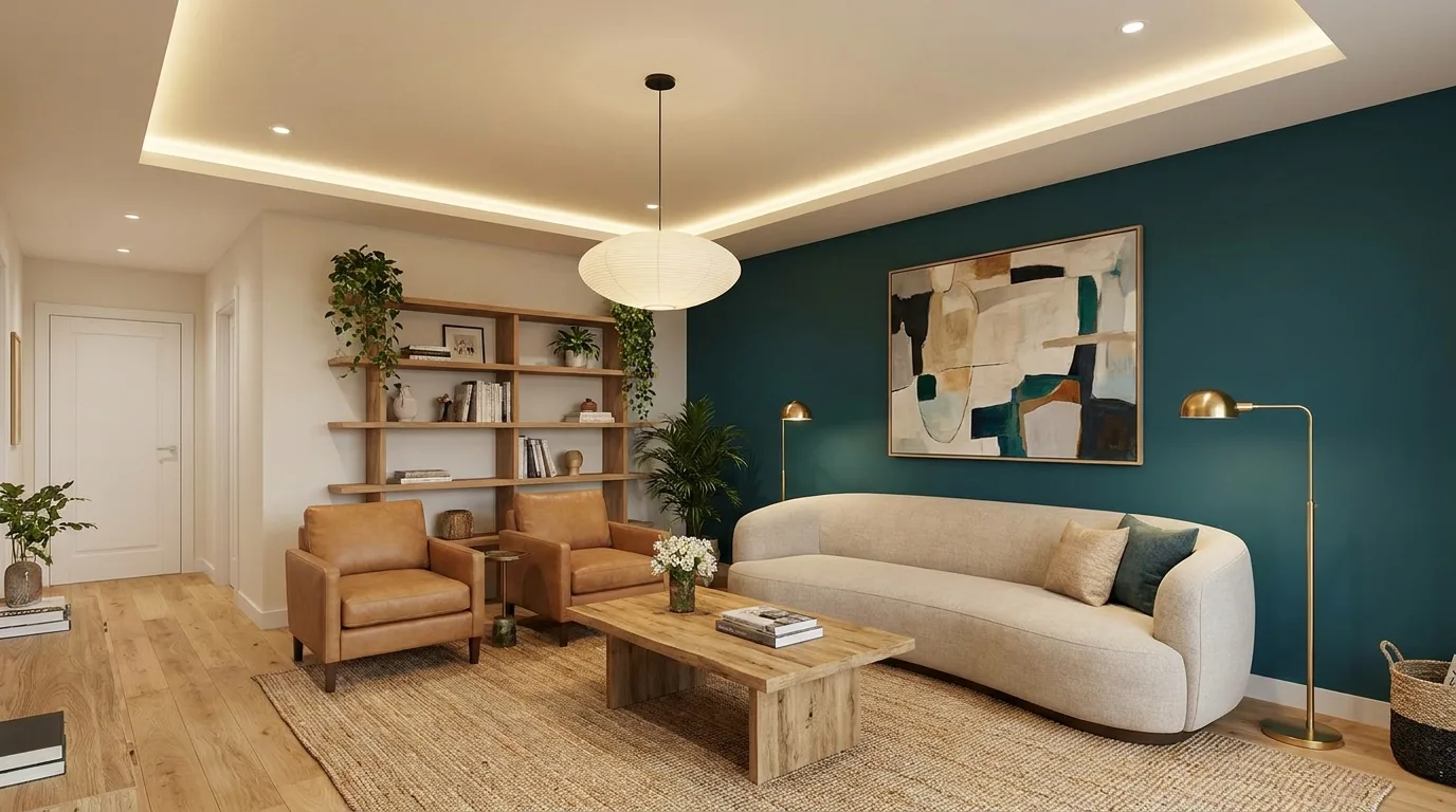
One of the most adaptable approaches is to keep the POP ceiling warm white and let a single wall carry the stronger color. A deep teal, muted terracotta, olive, navy, or sophisticated gray can provide a focal point while the ceiling remains bright and visually light. Add a simple recessed POP border around the ceiling to frame the room without competing with the accent wall. This strategy is easy to update because repainting one wall is much simpler than changing an elaborate multicolor ceiling. Match small decorative elements to the statement wall for cohesion, but avoid repeating the color everywhere. The result is particularly effective in living rooms and bedrooms where you want a noticeable design feature without sacrificing a sense of spaciousness.
How to Choose the Right POP Color Design
The best POP color design should respond to the room rather than simply follow a trend. Start by assessing ceiling height, daylight, room size, furniture colors, and the amount of existing visual detail. Light colors generally help compact rooms feel more open, while deeper accents can add depth and create a focal point in larger spaces. If your furniture already has strong colors or patterns, a restrained POP palette will usually create a more balanced result. It is also important to view paint samples under both daylight and artificial lighting because POP surfaces can look different throughout the day. Finally, plan electrical points before installation so recessed lights, fans, pendant fixtures, and concealed LEDs do not interfere with the design.
Final Thoughts
Modern POP design does not have to mean elaborate ceilings or excessive decoration. The most successful ideas use clean shapes, thoughtful color combinations, and well-planned lighting to improve the character of a room. Whether you prefer calm neutrals, earthy tones, dramatic contrasts, or a single statement color, POP gives you plenty of ways to customize your home’s architecture. Choose a palette that complements your existing finishes, keep proportions appropriate to the room, and use accent colors with intention. With the right balance of structure, paint, and illumination, even a simple POP feature can become a polished centerpiece that makes a modern home feel more cohesive and thoughtfully designed.