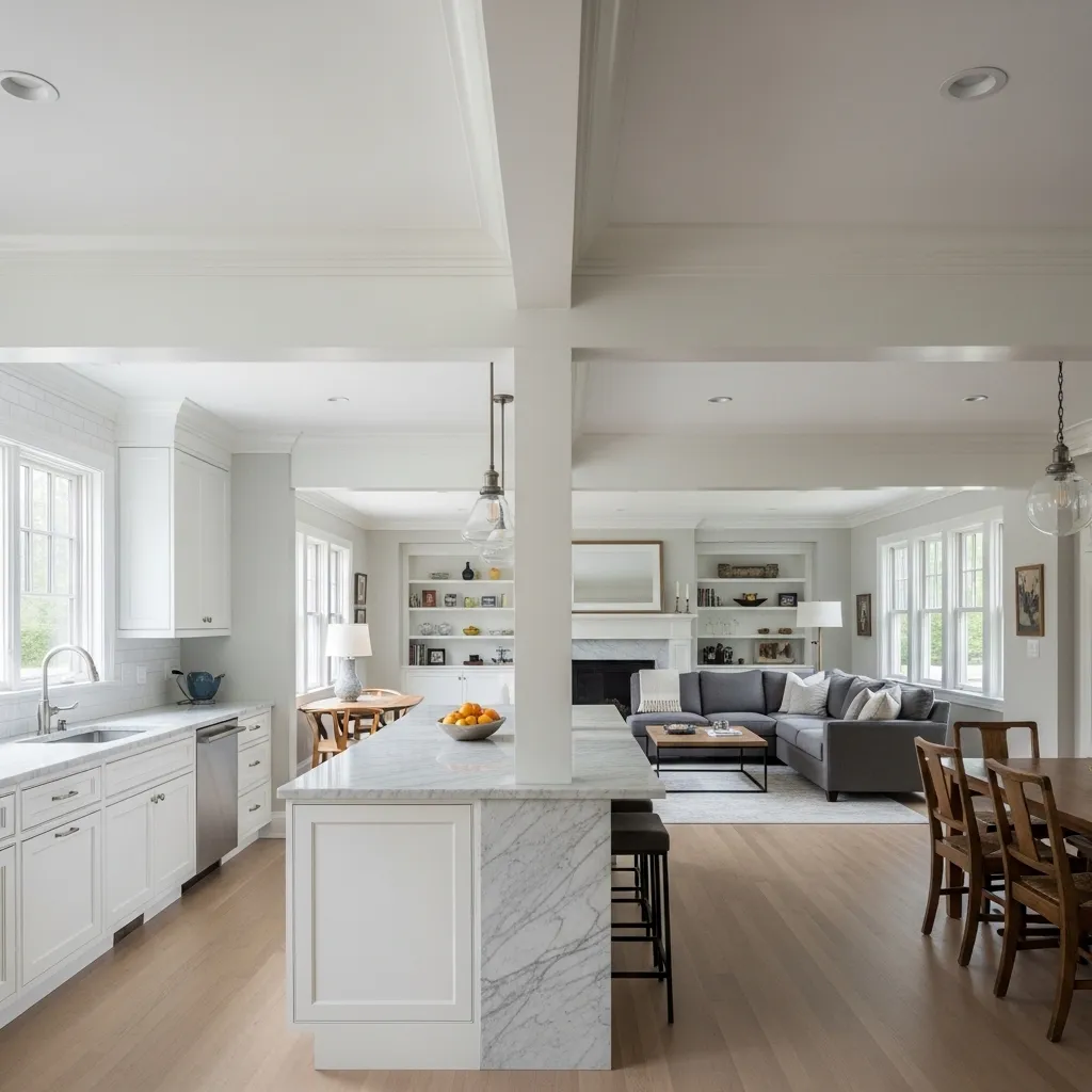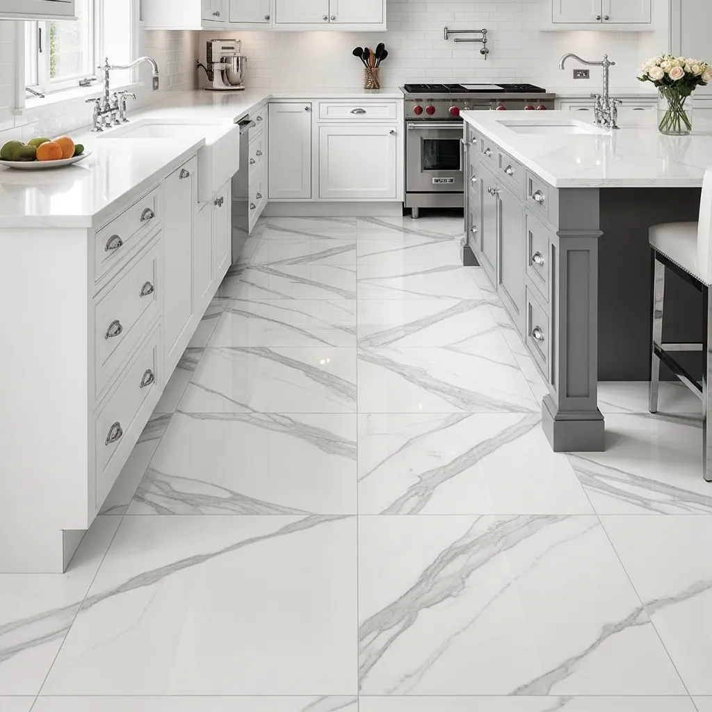
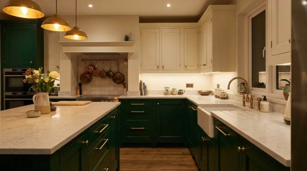
Choosing the right laminate colours can completely change how a kitchen looks and feels. A well-planned two-colour combination can make cabinets appear more spacious, add warmth to a compact cooking area, or create a polished modern look without requiring a full renovation. The key is to balance the colours with your countertop, backsplash, flooring, lighting, and overall home style. From timeless white and wood tones to bolder combinations such as navy and beige, there are plenty of ways to create a kitchen that feels coordinated rather than overly busy. These kitchen laminate colour combinations are designed to give you practical inspiration while helping you choose shades that will remain attractive and easy to live with every day.
1. White and Natural Wood Laminates
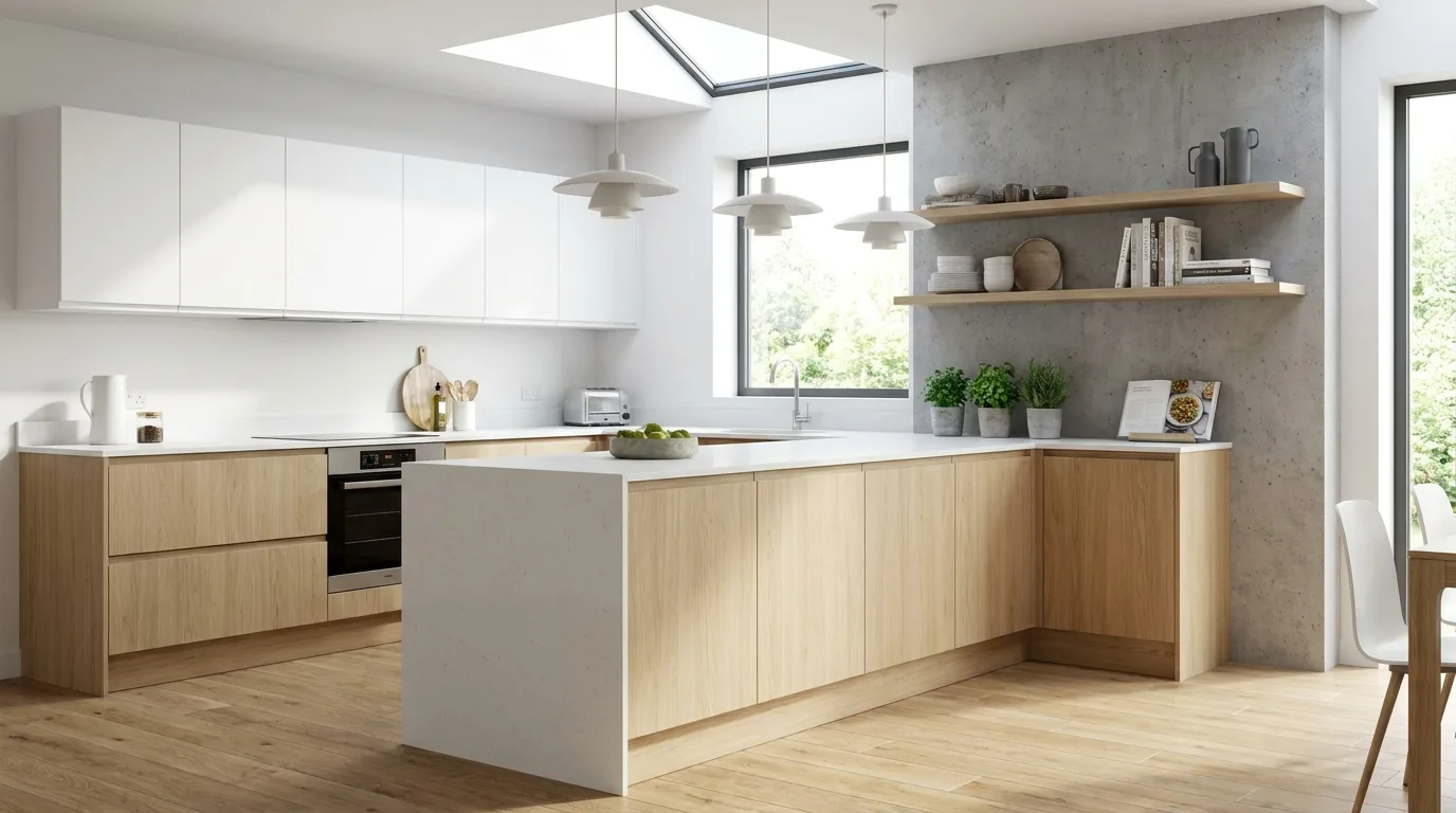
White and natural wood is one of the easiest two-colour combinations for kitchen laminates to use successfully. White keeps the cabinetry feeling bright and spacious, while a wood-effect laminate introduces warmth and texture. Use white on the upper cabinets to visually open the walls and place the wood laminate on lower cabinets or a kitchen island for contrast. This combination works particularly well with white quartz, beige tiles, light grey flooring, and simple hardware. If your kitchen receives limited natural light, choose a warm white rather than a stark blue-white. For a contemporary appearance, select a laminate with subtle wood grain rather than an extremely rustic pattern.
2. Sage Green and Cream
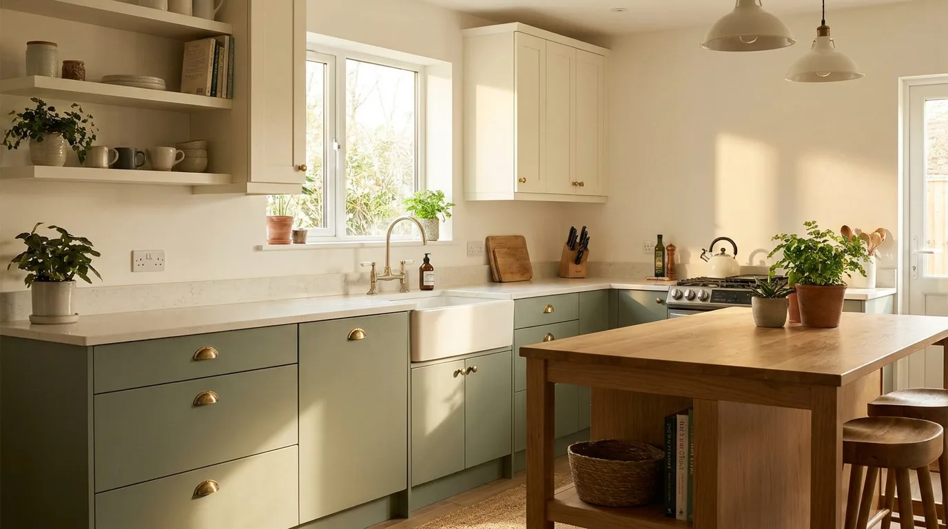
Sage green paired with cream creates a soft, welcoming kitchen with a subtle connection to nature. Cream provides the lightness needed to keep sage from making the room feel dark, while the muted green adds personality without becoming overwhelming. Consider sage for the base cabinets and cream for wall units, or reverse the arrangement if you want the green to be more of an accent. Brushed brass, matte black, or antique-finish handles can all work well with this palette. This combination is especially attractive in kitchens with natural wood flooring, stone-look countertops, or woven decorative accents.
3. Navy Blue and White
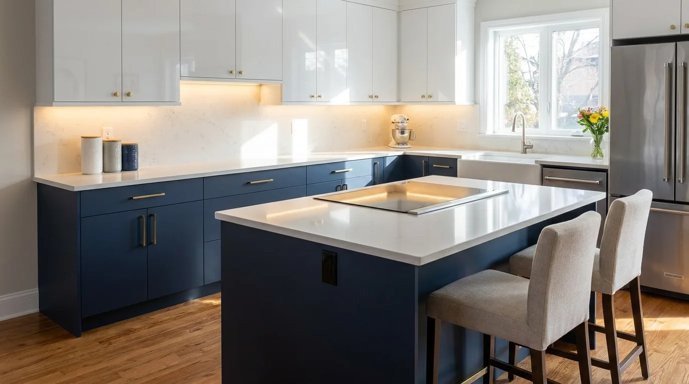
Navy blue and white is a dependable choice when you want kitchen cabinets to have a stronger visual presence. White upper cabinets can make the room feel airy, while navy lower cabinets create depth and definition. The contrast is particularly effective in medium and large kitchens, although a small kitchen can also use it when the walls and countertop remain light. Choose a navy laminate with a smooth matte or satin finish for a sophisticated appearance. White quartz or marble-look countertops complement the pairing beautifully. Keep decorative colours restrained so the navy remains the main feature rather than competing with several other accent shades.
4. Charcoal Grey and Light Oak
For a contemporary kitchen with warmth, combine charcoal grey with light oak laminate. The dark grey gives cabinets a sleek architectural quality, while the pale wood prevents the room from looking cold. This pairing works especially well with minimalist kitchens that use clean-lined cabinetry and simple handles. Place charcoal on the lower cabinets and use oak on open shelving, tall units, or selected upper cabinets. Because charcoal absorbs visual light, balance it with a pale backsplash and good task lighting. Stainless steel appliances can reinforce the modern look, while warm pendant lighting helps soften the darker cabinetry.
5. Beige and Walnut Brown
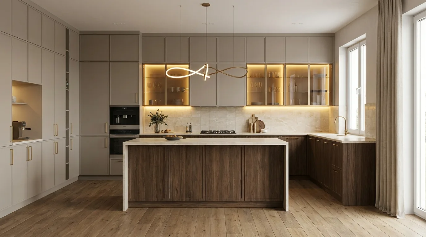
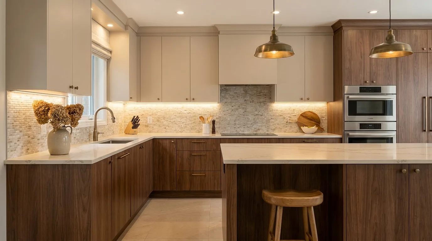
Beige and walnut brown create a warm, elegant kitchen that feels timeless rather than trendy. Beige laminate can brighten upper cabinets and large surfaces, while walnut adds richness to base cabinets or an island. This combination suits kitchens where you want a comfortable, upscale atmosphere without using very bold colours. Pair it with cream stone countertops, warm white walls, and bronze or brushed-gold hardware. If the kitchen is compact, use walnut selectively so the darker wood tone does not dominate the room. A matte beige finish can also help create a softer appearance than glossy cream surfaces.
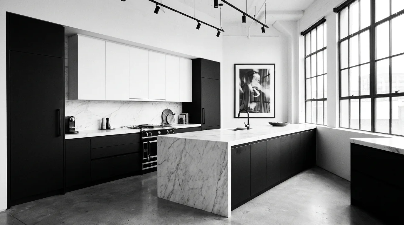
6. Black and White
Black and white is a classic two-colour kitchen laminate combination that works across many design styles. White cabinets keep the kitchen bright, while black provides strong definition and contrast. For a balanced appearance, use black primarily on lower cabinets or a central island and white on upper cabinetry. In larger kitchens, black can be used more generously without making the room feel enclosed. Glossy white paired with matte black creates a crisp contemporary effect, while two matte finishes produce a softer minimalist look. Add natural wood accessories if the contrast feels too stark, but avoid introducing too many additional colours.
7. Dusty Blue and Warm White
Dusty blue and warm white offer a calm alternative to stronger blue-and-white schemes. The muted blue brings colour to the cabinetry without feeling intense, while warm white keeps the overall kitchen comfortable and bright. This palette is especially useful for kitchens with traditional, Scandinavian, coastal, or transitional styling. Try dusty blue on the lower cabinets and warm white above to create a gentle visual transition. Light oak flooring and brushed nickel hardware can complement the cool blue, while warm lighting keeps the room inviting. Avoid pairing this combination with overly cool grey surfaces, which can make the palette feel flat.
8. Olive Green and Light Beige
Olive green and light beige bring an earthy character to kitchen cabinetry. Olive works beautifully as a grounding colour for base cabinets, while beige keeps the upper half of the kitchen visually light. The combination feels particularly natural alongside wood accents, stone countertops, terracotta accessories, and warm metallic hardware. Choose a muted olive rather than a highly saturated green if you want the kitchen to remain timeless. In an open-plan home, this pairing can also create a welcoming transition between the kitchen and living area. Keep the backsplash relatively simple so the laminate colours remain the main design feature.
9. Taupe and White
Taupe is an excellent option when plain grey feels too cool and beige feels too traditional. Combined with white laminate, it creates a refined neutral kitchen that is easy to coordinate with different countertops and flooring materials. Taupe works especially well on lower cabinets, while white upper cabinets make the room appear taller and brighter. Add black hardware for a modern edge or brushed brass for a warmer, more decorative finish. This combination is also practical for homeowners who want flexibility because neutral cabinetry allows future changes to backsplashes, curtains, rugs, and appliances without forcing a complete redesign.
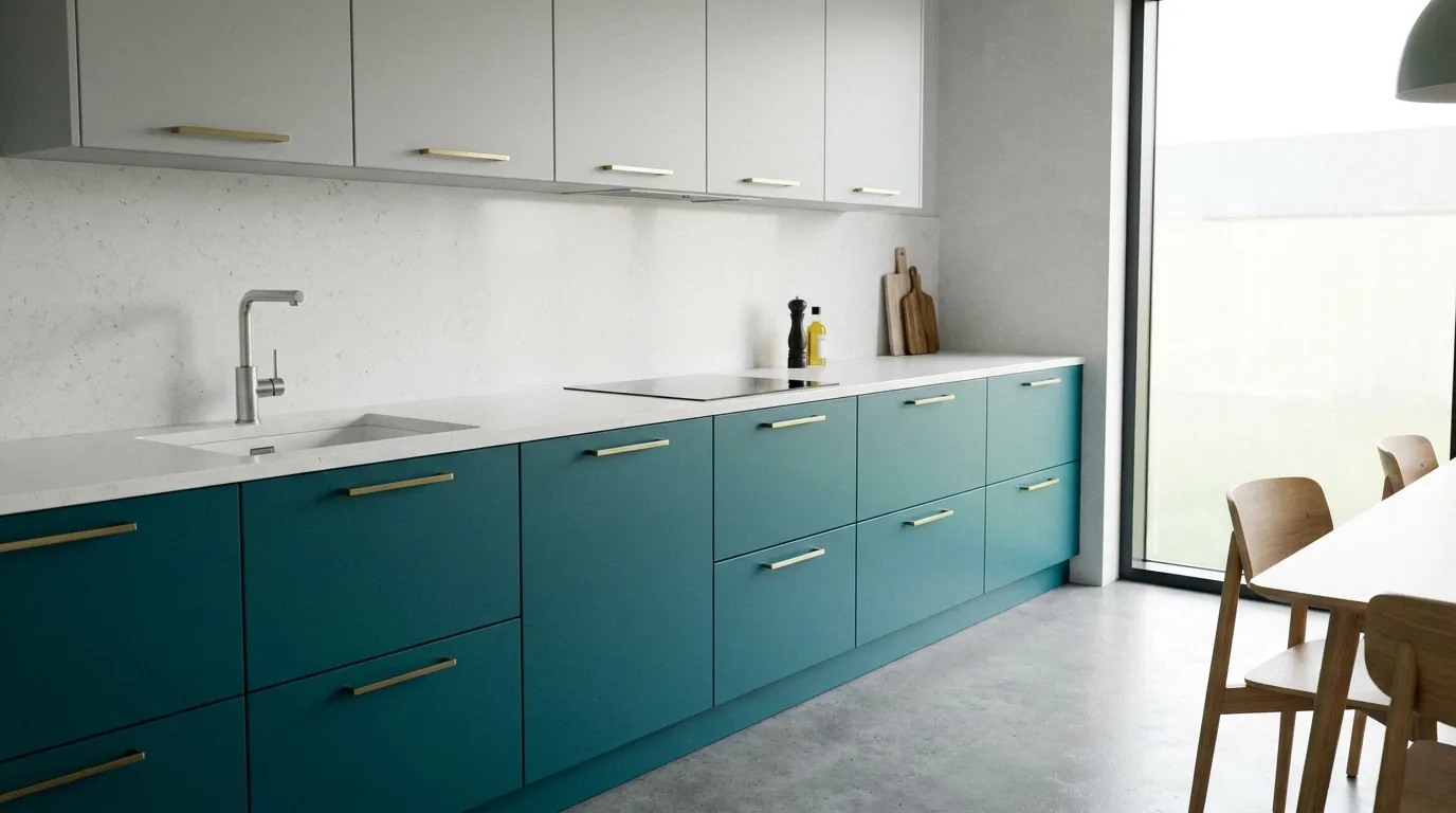
10. Teal and Light Grey
Teal and light grey make a stylish choice for homeowners who want more colour without creating an overly dramatic kitchen. Teal can be used on an island or lower cabinetry to create a focal point, while light grey keeps the surrounding cabinets calm. Because teal is visually strong, select a grey with a warm or neutral undertone so the two shades feel connected. White countertops and simple metallic hardware can keep the look clean. This combination works particularly well in contemporary kitchens where flat-panel doors, integrated appliances, and uncluttered surfaces allow the cabinet colours to stand out.
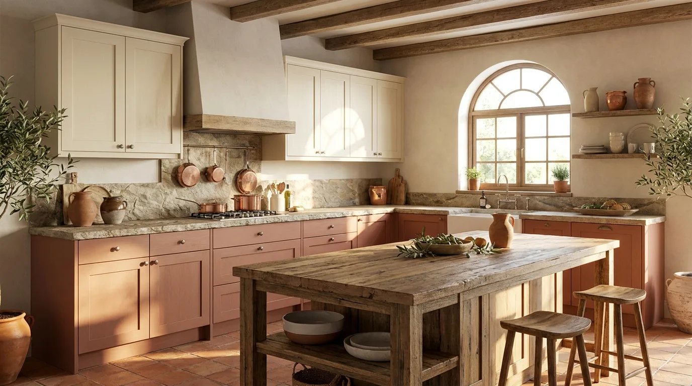
11. Cream and Terracotta
Cream and terracotta create a warm, Mediterranean-inspired kitchen palette. Cream provides a soft neutral foundation, while terracotta introduces earthy colour and personality. Use terracotta sparingly on lower cabinets, a pantry unit, or an island if you want the colour to feel like an accent rather than the dominant shade. Natural wood, stone, handmade-look tiles, and aged brass can reinforce the warm character of the scheme. This combination is particularly appealing in kitchens with plenty of natural sunlight. If the room is already visually busy, choose a plain cream backsplash and simple countertops to prevent the warm tones from becoming overwhelming.
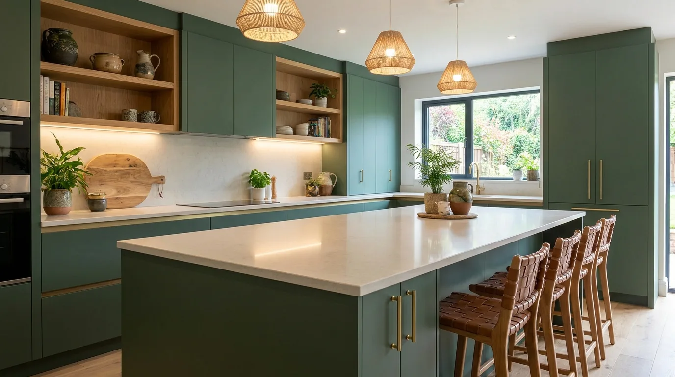
12. Forest Green and Natural Oak
Forest green and natural oak create a rich combination that brings depth and organic warmth to kitchen interiors. The darker green works beautifully on base cabinets or a large island, while oak adds visual lightness through its natural grain. This pairing is best balanced with a pale countertop and warm neutral walls. Matte laminate finishes are particularly effective because they make the colours look sophisticated rather than overly glossy. Use this scheme when you want the kitchen to feel distinctive and grounded. In smaller spaces, limit forest green to one cabinet zone and let oak or another light neutral occupy the remaining surfaces.
13. Blush Pink and Soft Grey
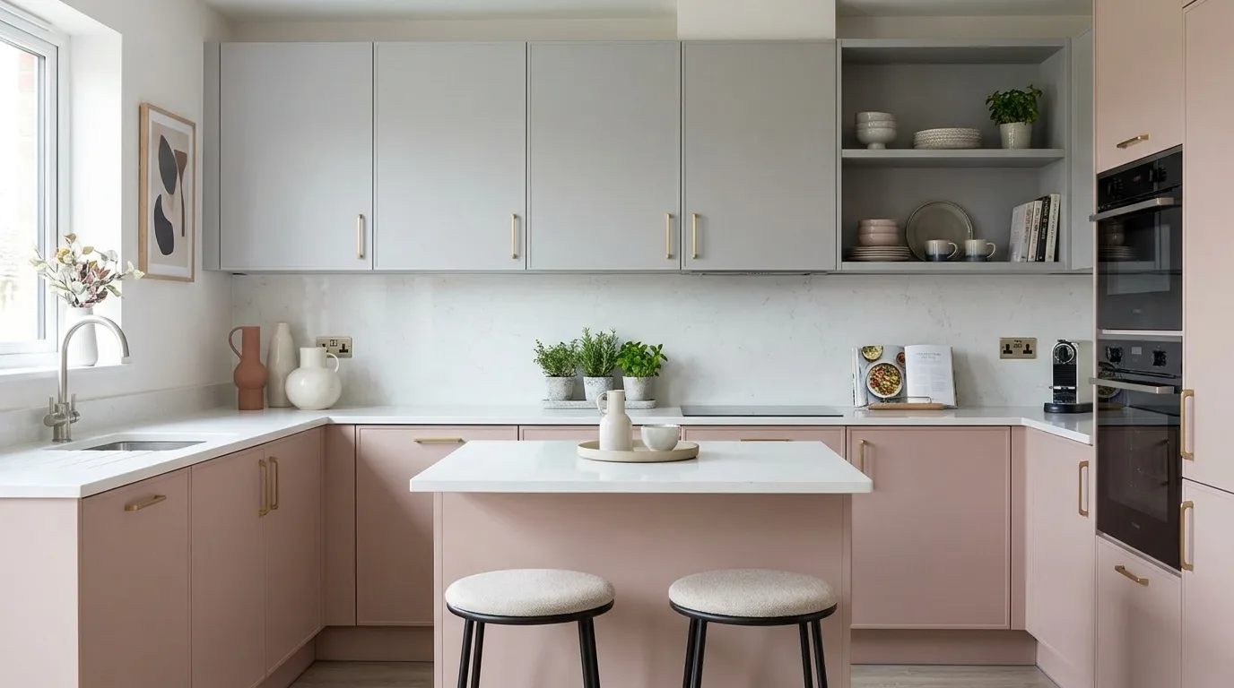
Blush pink and soft grey can create a sophisticated kitchen when both shades are muted rather than overly bright. Soft grey provides a practical neutral foundation, while dusty blush adds warmth and personality. Use blush on selected lower cabinets or a kitchen island and keep larger cabinet runs grey if you want a subtle effect. White countertops and simple chrome, black, or brass hardware can complete the look. This palette works especially well in contemporary apartments and compact kitchens where a gentle colour accent can make the space feel more individual without visually crowding it.
14. Matte Black and Warm Wood
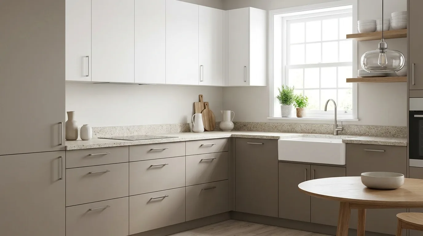
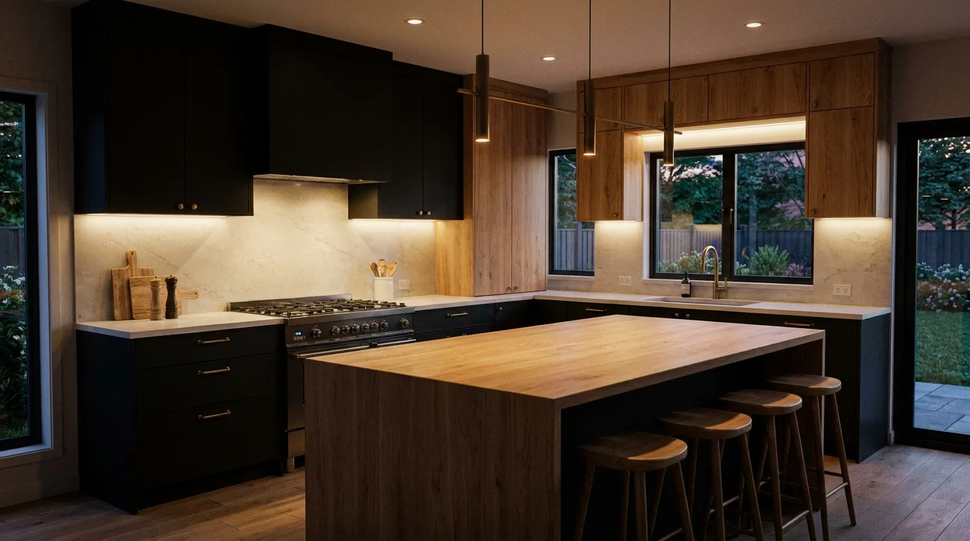
Matte black and warm wood create a dramatic yet inviting kitchen laminate combination. Black gives cabinetry a clean, modern appearance, while wood tones introduce softness and natural texture. Consider black for tall cabinets or lower units and use warm wood on an island or selected upper cabinets. The contrast is strongest when the wood has a noticeable but restrained grain. Good lighting is essential because black surfaces can absorb light, especially in compact kitchens. Pair the scheme with a light countertop and backsplash to maintain balance. This combination is ideal for industrial, modern, Japandi, and contemporary kitchen styles.
15. Mustard Yellow and Off-White
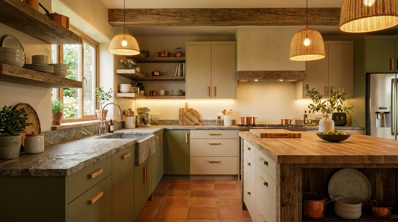
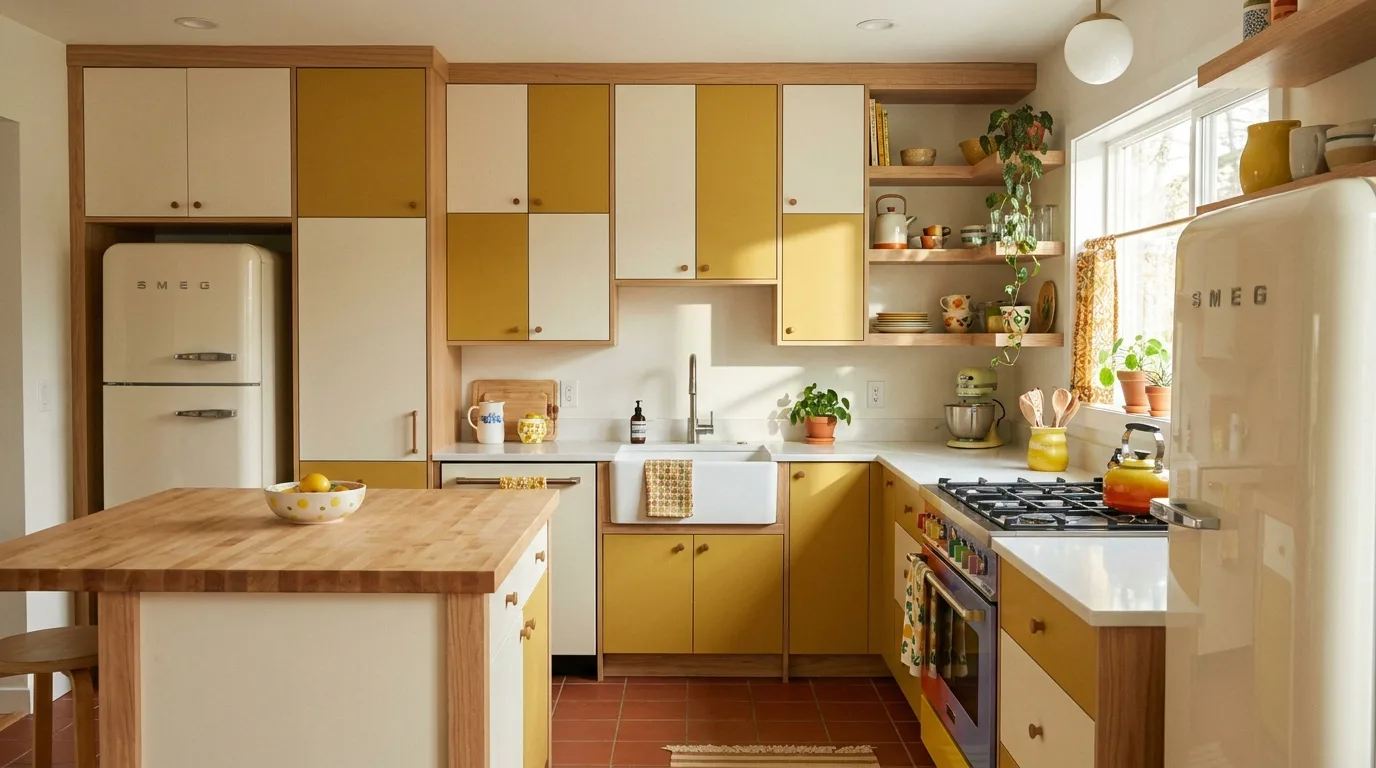
Mustard yellow and off-white are a cheerful option for kitchens that need warmth and personality. Mustard works best as an accent colour rather than covering every cabinet, so consider it for a lower cabinet run, island, or tall storage unit. Off-white balances its intensity and prevents the kitchen from looking overly bright. Natural wood, terrazzo, or simple white countertops can work well with this pairing. Because mustard is distinctive, keep other finishes relatively restrained. This combination is especially effective in retro-inspired and eclectic kitchens, but choosing a muted mustard laminate can make it feel much more contemporary.
16. Greige and Dark Brown
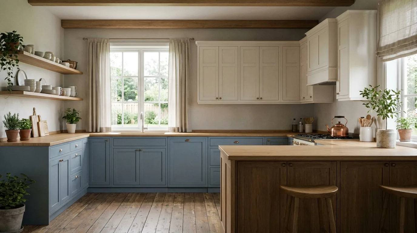
Greige, a balanced blend of grey and beige, pairs beautifully with dark brown when you want a neutral kitchen with more depth. Use greige across most cabinetry and introduce dark brown through a wood-look island, lower units, or tall storage. The result feels warmer than a grey-and-black scheme while remaining polished and contemporary. Creamy countertops, warm lighting, and understated hardware help unify the colours. This combination is particularly useful in open-plan homes because its neutral character can connect naturally with living and dining furniture. Choose finishes with similar undertones so the greige does not clash with the brown.
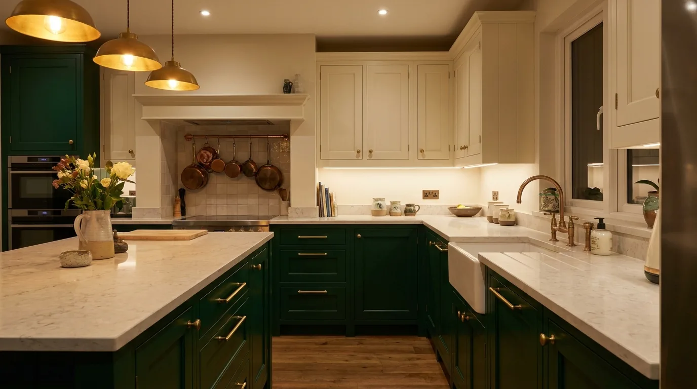
17. Emerald Green and Cream
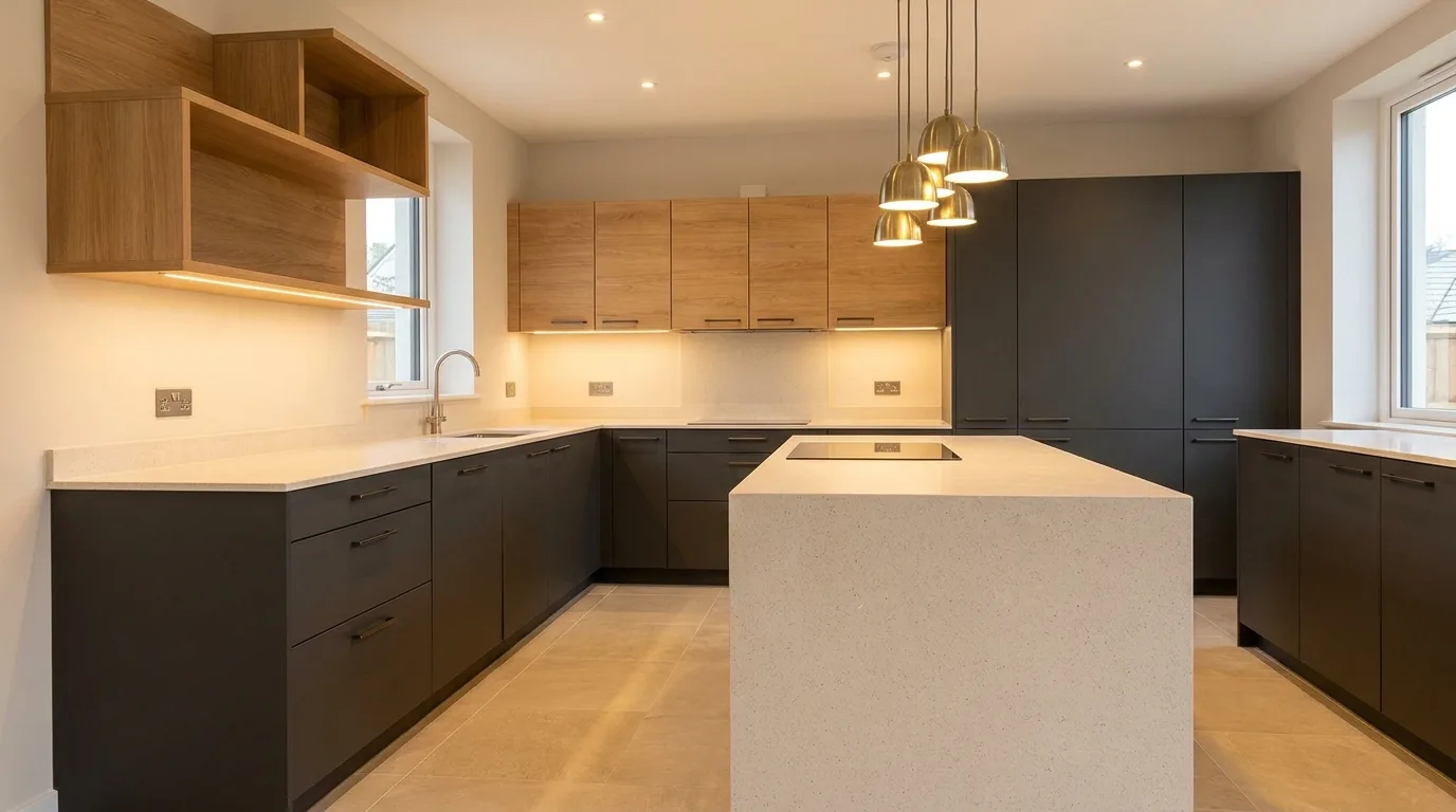
Emerald green and cream make a striking choice for homeowners who want an elegant statement kitchen. Cream provides a soft backdrop that allows emerald cabinetry to become the focal point without making the entire room feel dark. Use emerald on the island or lower cabinets and cream on the upper units for a balanced composition. Brass hardware and warm lighting can enhance the luxurious character, while pale stone countertops keep the overall design fresh. Because emerald is a strong colour, keep the backsplash and flooring relatively quiet. This combination works best when the cabinet design is simple enough to let the colour provide the visual interest.
How to Choose the Best Two-Colour Laminate Combination
Before finalizing your kitchen laminate colours, consider the size of the room, the amount of natural light, and the finishes that are already fixed. In a small kitchen, one light colour usually works best as the dominant shade, while a darker or brighter colour can be reserved for the lower cabinets or island. In a large kitchen, you have more freedom to use deeper colours across wider cabinet areas.
- Choose colours with compatible warm or cool undertones.
- Use the lighter shade on larger surfaces when you want an airy appearance.
- Consider countertop and backsplash colours before ordering laminates.
- Test physical laminate samples under both daylight and artificial lighting.
- Keep strong colours limited to one or two visual zones for a balanced result.
The best two-colour combination for kitchen laminates is ultimately one that complements your home’s architecture, lighting, and daily lifestyle. Whether you prefer calm neutrals, natural wood tones, or a bold statement colour, thoughtful contrast can make your kitchen feel more spacious, coordinated, and distinctly your own.