POP (Plaster of Paris) ceilings are an easy way to give a room architectural character while also creating a clean surface for colour, lighting, and decorative details. The right POP colour design can make a ceiling feel taller, define different zones, highlight a statement feature, or simply add warmth without overwhelming the room. From soft neutral combinations to bold two-tone palettes, painted POP designs can work beautifully in bedrooms, living rooms, dining areas, hallways, and modern office spaces. The key is to balance the ceiling pattern with the room’s walls, flooring, furniture, and lighting. These 18 POP colour design painting ideas combine practical colour choices with decorative layouts so you can find an approach that suits both your interior style and the size of your space.
1. Crisp White POP Ceiling With Warm Beige Accents
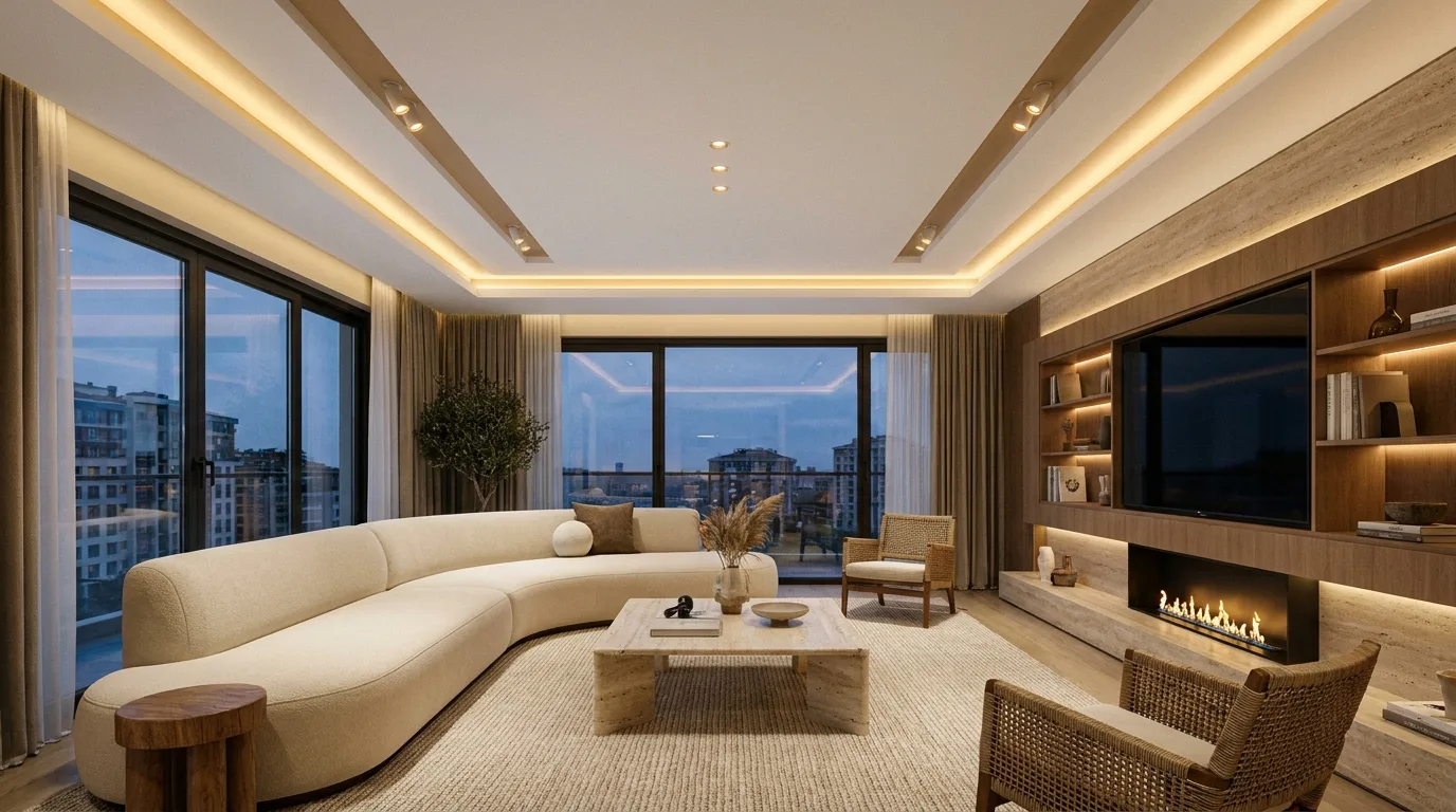
A white POP ceiling remains one of the most versatile choices, but adding warm beige accents can make the design feel considerably more sophisticated. Use clean white across the main ceiling plane and introduce beige along recessed borders, geometric bands, or selected moulding details. This combination works particularly well in living rooms where you want an airy appearance without making the ceiling completely plain. Warm beige also connects naturally with wooden furniture, cream upholstery, woven accessories, and earthy flooring. For a polished result, keep the beige accent relatively narrow so the white still dominates visually. Warm-white recessed lights can reinforce the soft palette, while concealed LED strips placed inside a recessed cove can create a gentle glow around the perimeter.
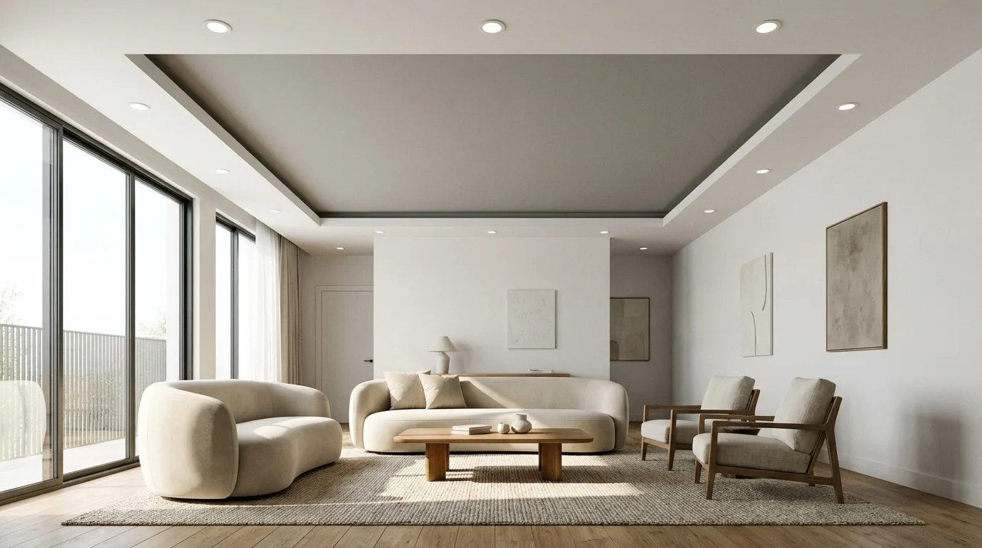
2. Elegant Taupe and Cream POP Design
Taupe and cream create a refined colour pairing for bedrooms and formal sitting rooms. Paint the recessed POP sections in a light cream shade and use taupe on selected panels, borders, or stepped details to introduce depth. Because both colours are muted, the ceiling can have several layers without appearing visually chaotic. This approach is especially effective when the walls are off-white, greige, or another understated neutral. Consider repeating the taupe tone in curtains, cushions, rugs, or upholstered furniture to make the ceiling feel connected to the rest of the room. If the ceiling has a central rectangular or circular feature, leave its innermost section cream and use taupe around it for a subtle framed effect.
3. Navy Blue and White Statement Ceiling
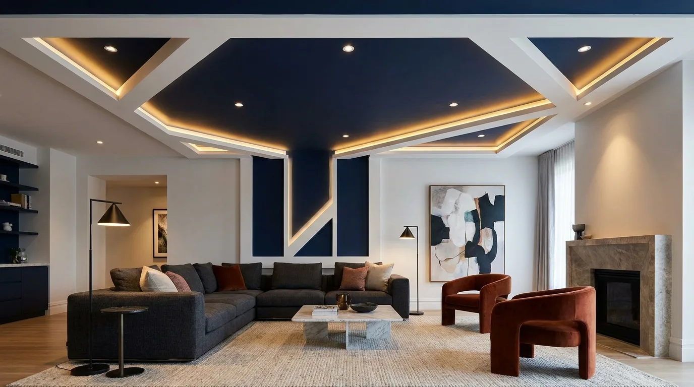
For a dramatic contemporary interior, combine deep navy blue with bright white POP detailing. Rather than covering the entire ceiling in navy, use the darker shade inside a recessed rectangle, central panel, or broad geometric feature. Keep the surrounding POP structure white to prevent the room from feeling too enclosed. This idea works particularly well in larger bedrooms, media rooms, and modern living areas with generous ceiling height. Navy pairs naturally with brass, gold, walnut, grey, and crisp white furnishings. Lighting is important here: use multiple warm recessed fixtures instead of relying on a single central light. A carefully positioned LED strip around the edge of the navy section can also separate the dark colour from the white POP border.
4. Soft Sage Green POP Ceiling
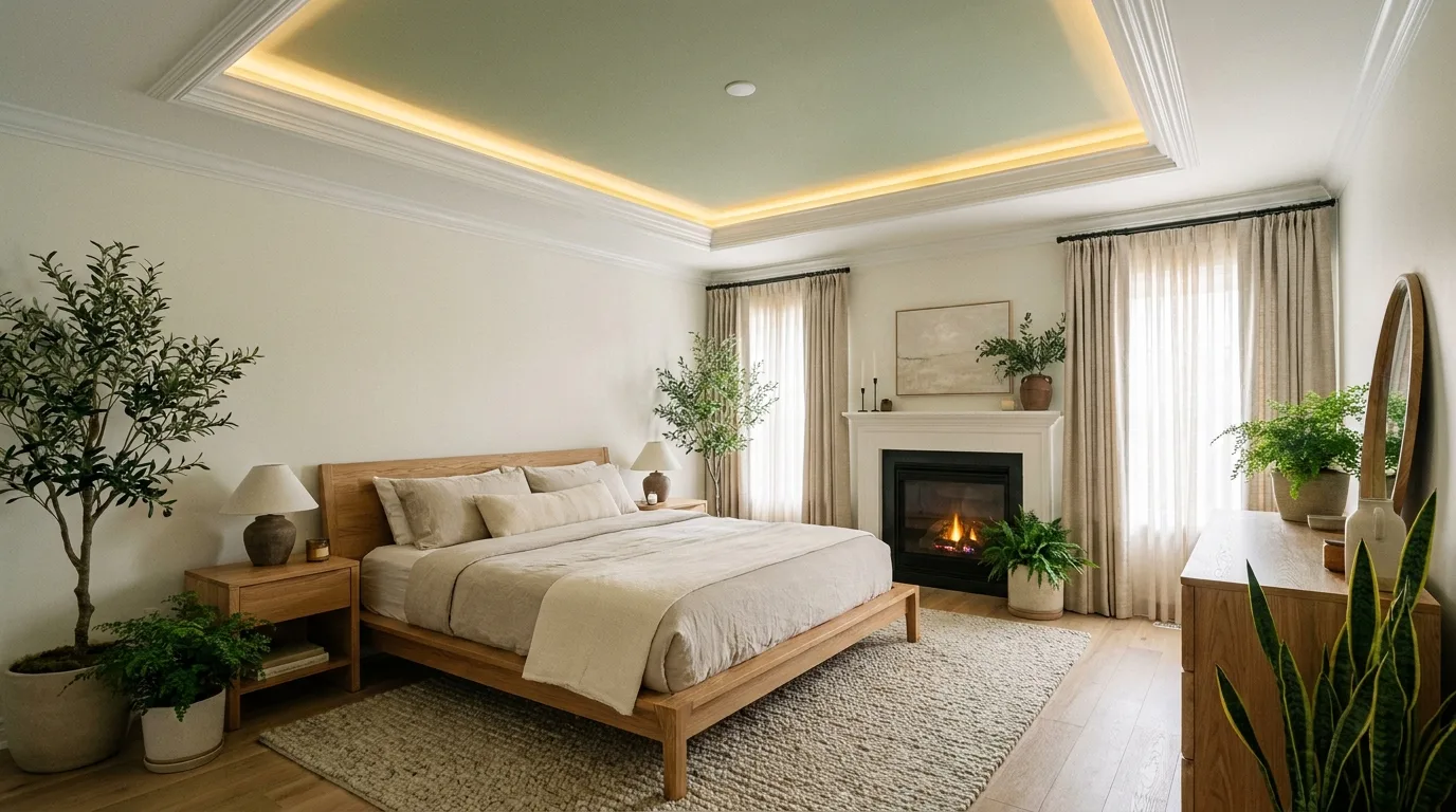
Sage green brings a calm, nature-inspired character to a POP ceiling without the intensity of a bright green. Use sage on a recessed central panel or selected geometric sections, while keeping the surrounding POP work in white or a very pale neutral. This colour scheme is particularly attractive in bedrooms, reading areas, and relaxed living spaces. It pairs well with light oak, rattan, cream textiles, terracotta accessories, and indoor plants. If your room receives plenty of daylight, a slightly deeper sage can create an appealing focal point. In smaller rooms, choose a paler version so the ceiling retains a sense of openness. Keep decorative details simple and let the colour provide most of the visual interest.
5. Charcoal Grey Geometric POP Design
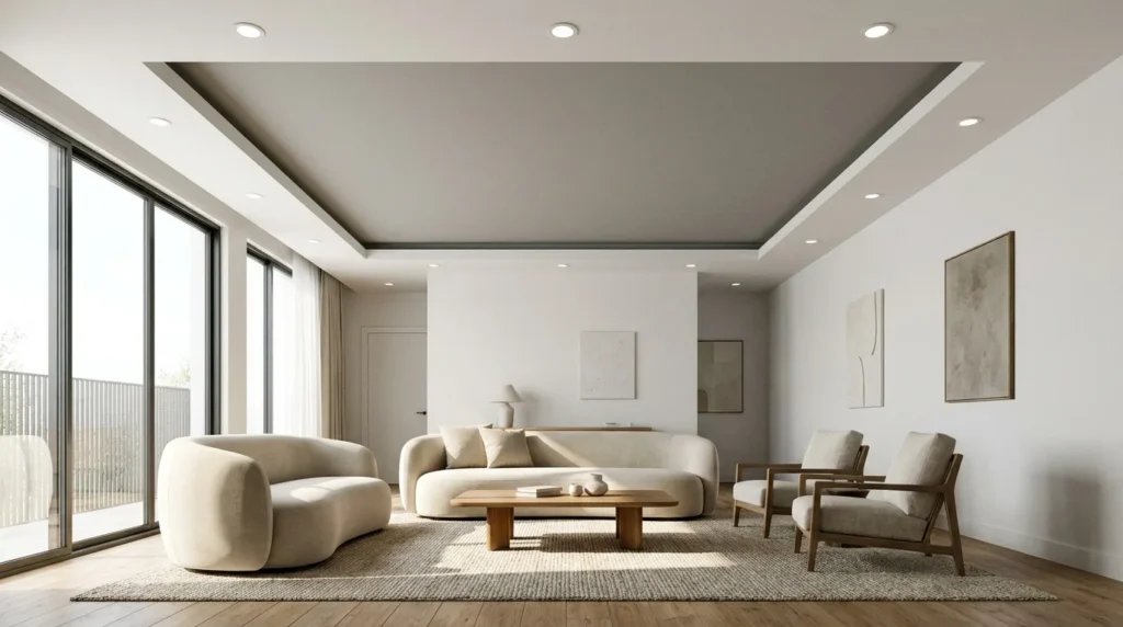
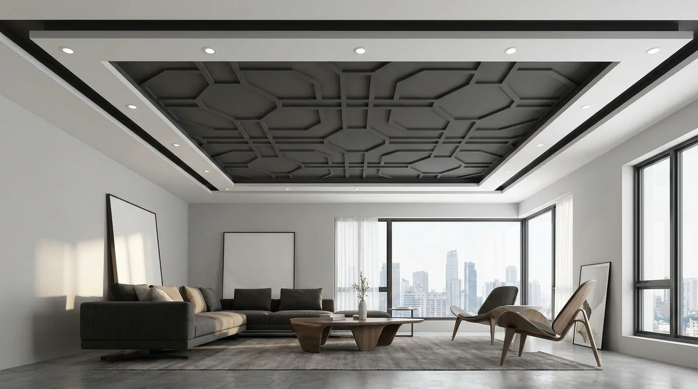
Charcoal grey can transform a simple POP ceiling into a strong architectural feature. Use it selectively inside geometric recessed sections while leaving the raised borders in white or light grey. Squares, rectangles, and linear strips are especially effective because the contrast emphasizes the clean construction of the design. This combination suits contemporary homes with black-framed windows, grey sofas, minimalist furniture, or monochrome accessories. Avoid using charcoal across an entire low ceiling, as the dark tone can make the room feel visually lower. Instead, create one clearly defined charcoal feature and surround it with lighter surfaces. Recessed spotlights arranged symmetrically can highlight the geometric pattern while maintaining the streamlined appearance.
6. Blush Pink and White POP Ceiling
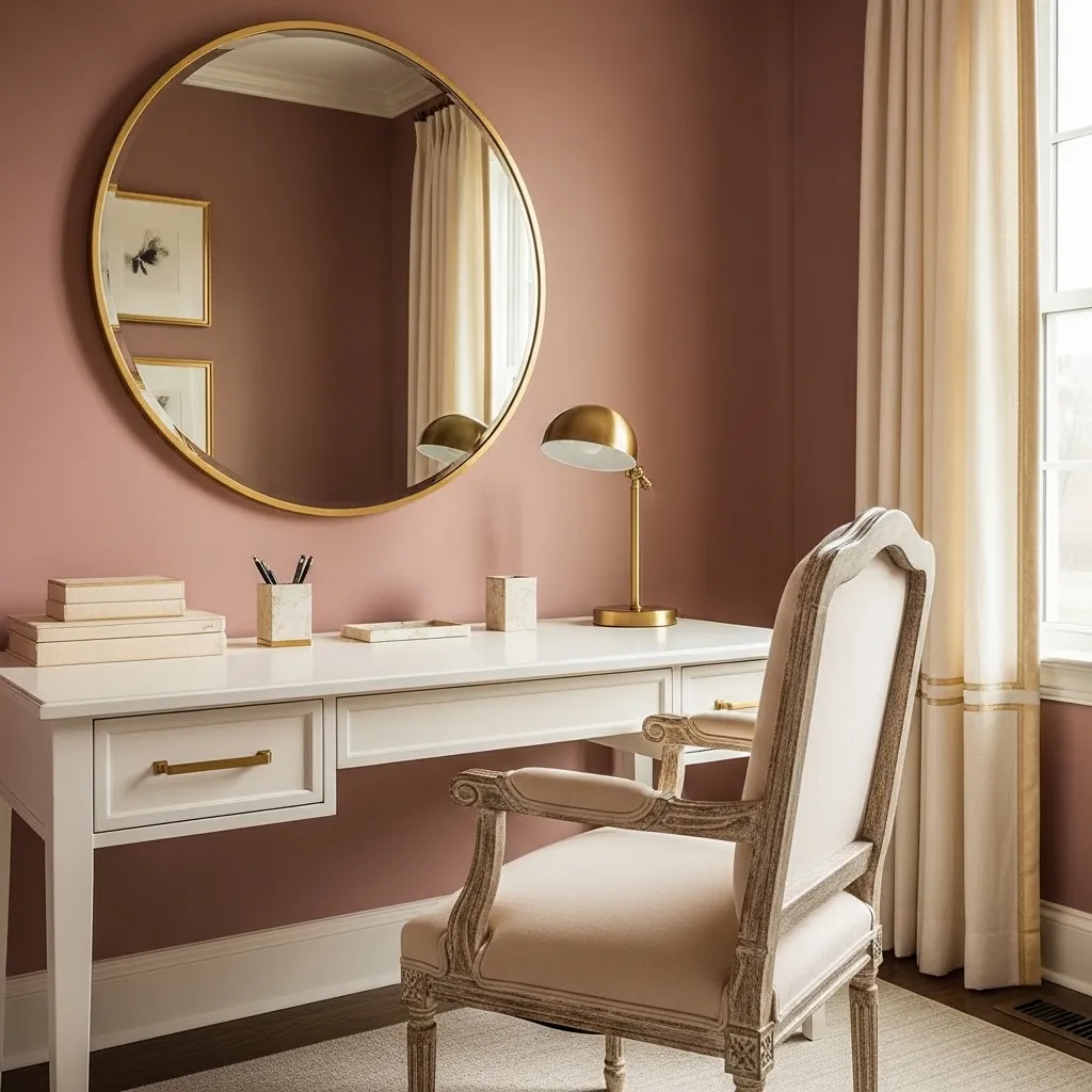
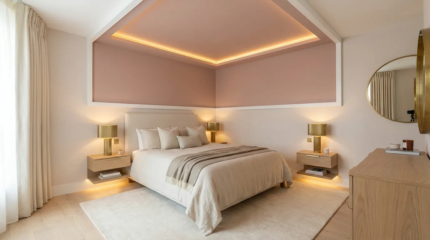
A blush pink and white POP ceiling adds softness while remaining modern when the colour is used thoughtfully. Apply blush to a central recessed panel, curved feature, or narrow decorative border and keep the rest of the ceiling white. The result works especially well in bedrooms, dressing areas, and feminine contemporary interiors, but the palette can also look sophisticated in a neutral living room when paired with beige or warm grey furniture. Choose a dusty or muted pink rather than an extremely bright shade for a more timeless finish. Brass lighting fixtures, cream curtains, and light wood details complement this palette naturally. Use concealed lighting around the pink section to create a subtle evening glow rather than overpowering the colour with harsh illumination.
7. Terracotta and Off-White POP Design
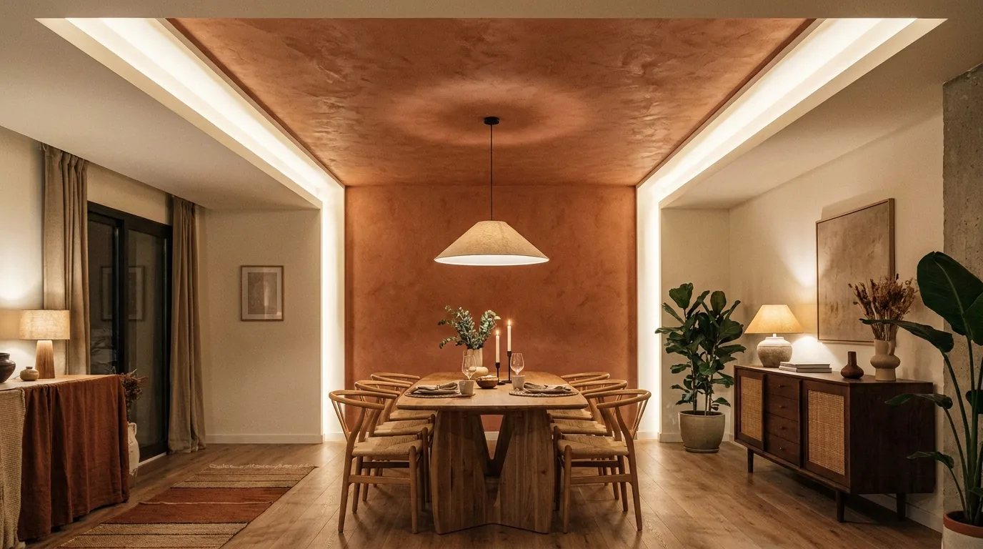
Terracotta introduces warmth and personality to a POP ceiling, making it an appealing choice for earthy and contemporary interiors. Instead of painting every POP element terracotta, use the shade in one recessed panel or along selected bands while keeping the raised portions off-white. The contrast gives the ceiling dimension and allows the warm colour to echo other elements in the room. Terracotta works particularly well with natural wood, cream upholstery, tan leather, woven textures, and ceramic accessories. In a dining room, a terracotta central ceiling panel can visually frame the table beneath it. Use warm lighting to enhance the richness of the colour, but keep the surrounding surfaces relatively light so the ceiling remains balanced.
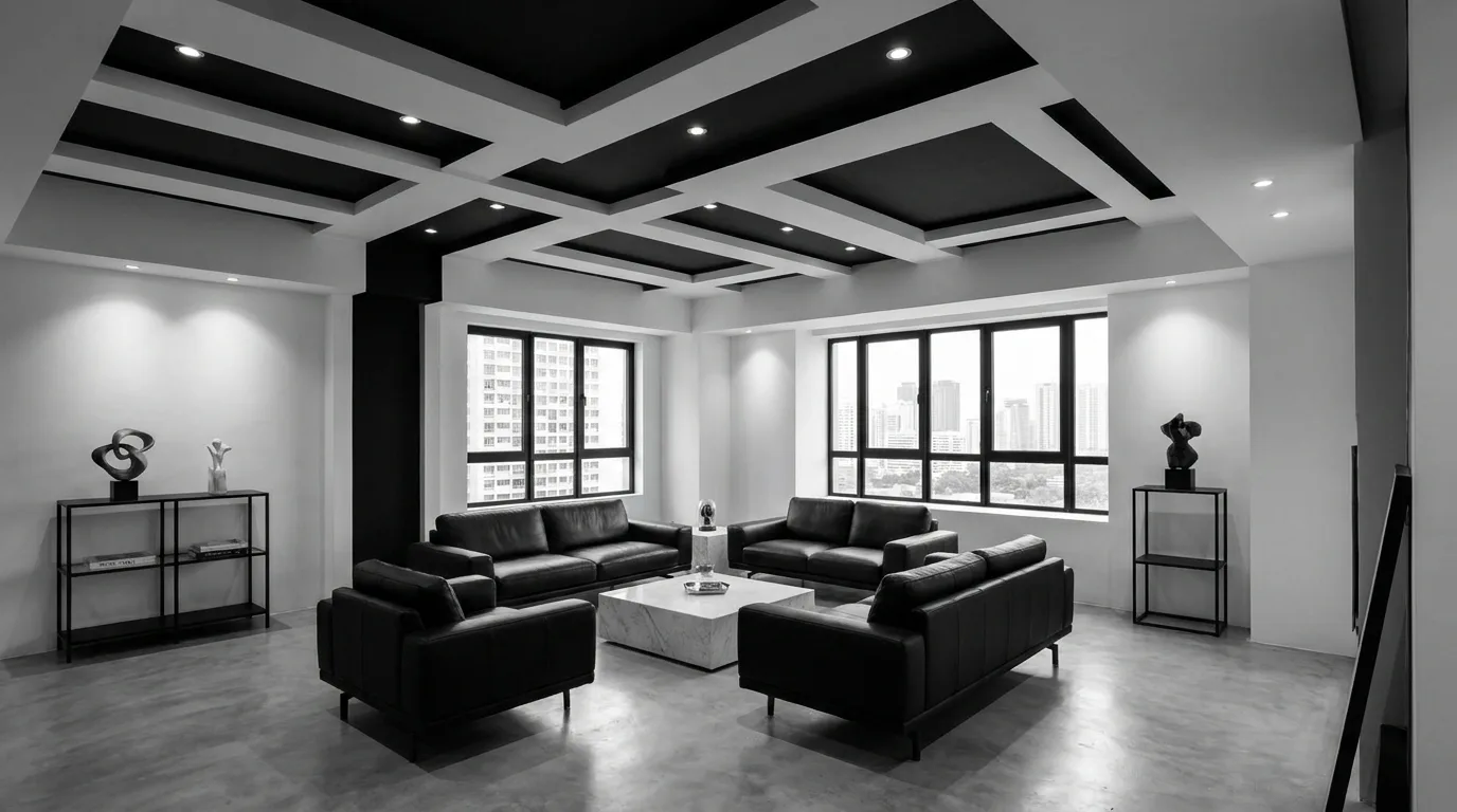
8. Monochrome Black and White POP Ceiling
A black-and-white POP ceiling is a strong choice for modern interiors that favor clean contrast. Use white as the primary colour and introduce black through narrow borders, geometric recessed panels, or linear bands. The most effective designs rely on black as an accent rather than covering large portions of the ceiling. This keeps the room bright while giving the POP structure a graphic appearance. The idea works especially well with black window frames, pendant lights, furniture legs, or minimalist artwork. In an open-plan room, black ceiling lines can also help visually define a dining or seating zone. Use precise lighting placement so the dark accents remain crisp rather than disappearing into shadow after sunset.
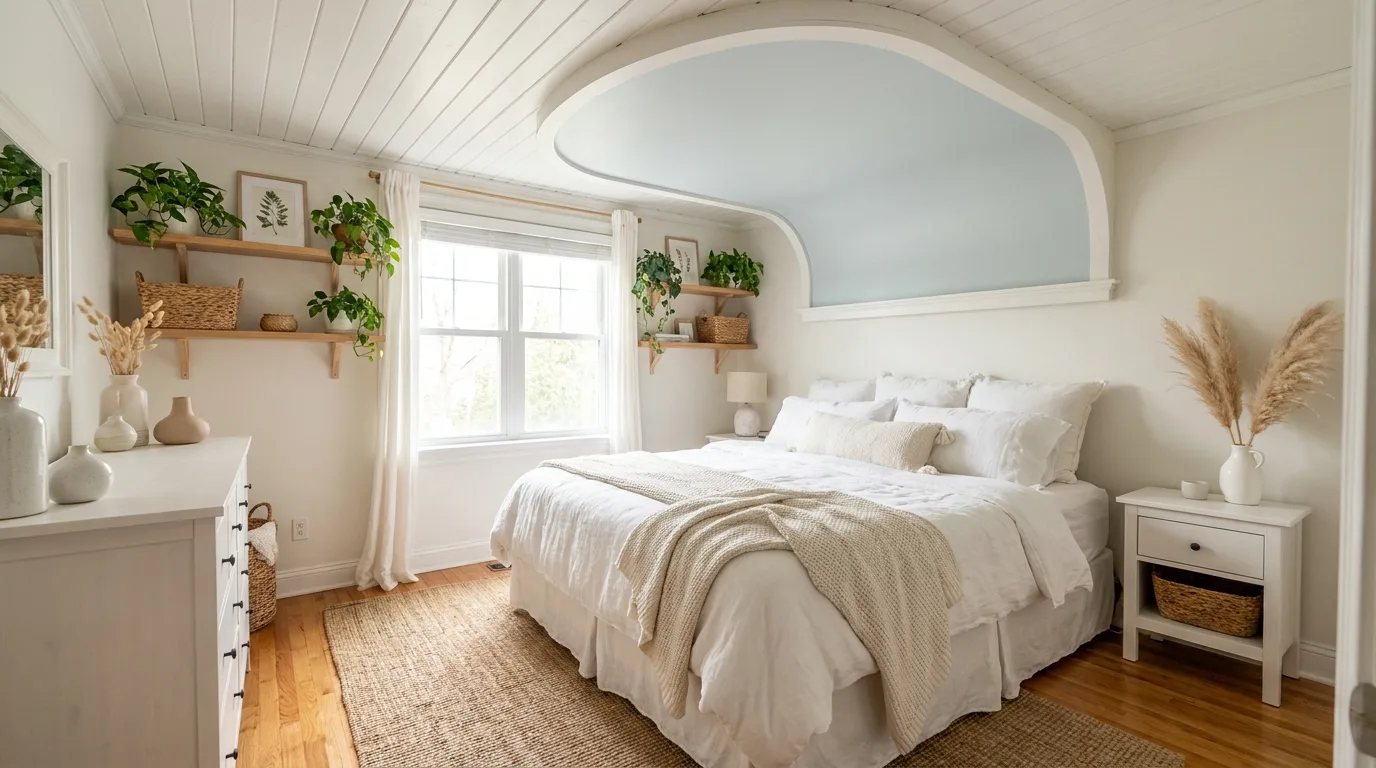
9. Sky Blue and White Cloud-Inspired Design
Sky blue can give a POP ceiling a light and refreshing appearance, especially in bedrooms, children’s rooms, and relaxed family spaces. A pale blue recessed panel surrounded by white POP borders creates a simple architectural interpretation of an open sky without requiring an elaborate painted mural. Curved POP details can soften the design, while a rectangular panel offers a more contemporary look. Pair the ceiling with white furniture, pale timber, soft grey textiles, or small touches of natural green. Keep the blue relatively light if the room is compact. For a cohesive finish, repeat the same blue in cushions, curtains, artwork, or a small accent wall rather than introducing several unrelated colours.
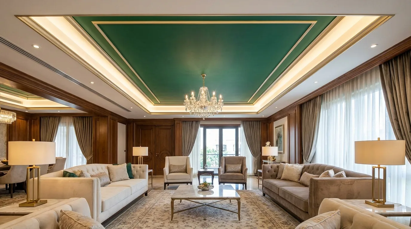
10. Deep Green and Gold Accent POP Ceiling
Deep green paired with restrained gold accents can create a luxurious POP ceiling without relying on excessive decoration. Use forest or emerald green within a central recessed section and reserve gold for thin borders, moulding highlights, or carefully selected trim. This combination is especially suitable for formal living rooms, dining spaces, and bedrooms with rich fabrics. Because both shades have strong visual presence, keep the surrounding ceiling and walls neutral. Warm white lighting helps the green appear rich while allowing metallic details to catch the light. For a more contemporary result, choose a matte green and a subtle champagne-gold finish instead of highly glossy surfaces. Repeat small gold elements elsewhere in the room for visual continuity.
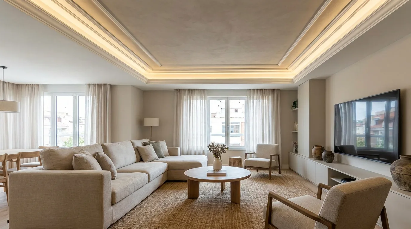
11. Greige POP Ceiling With Layered Borders
Greige, a balanced blend of grey and beige, is ideal when you want a neutral ceiling with more depth than plain white. Paint the main POP surface a soft greige and use a lighter cream or white for layered borders. This technique emphasizes stepped POP construction while maintaining a calm overall palette. It works particularly well in open-plan apartments, modern bedrooms, and understated living rooms. Greige also coordinates easily with wood, stone, black metal, cream upholstery, and muted textiles, making it practical when you frequently update furnishings. For the most polished appearance, keep each border crisp and use consistent spacing between layers. Recessed lights can be positioned within the lighter border to emphasize the stepped effect.
12. Mustard Yellow Accent POP Design
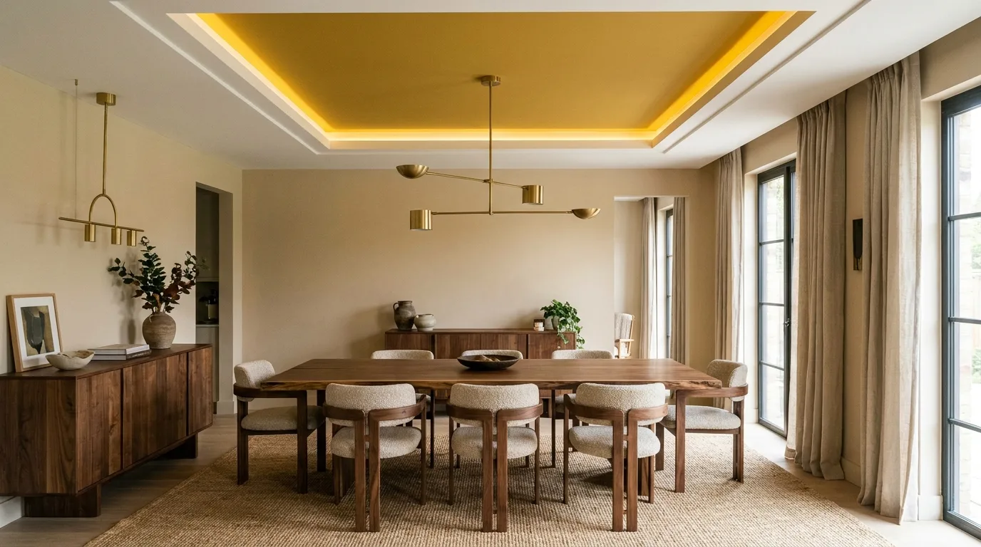
Mustard yellow can inject warmth and energy into a POP ceiling without becoming as intense as a bright primary yellow. Use it as a carefully contained accent inside a central panel, circular feature, or narrow geometric section. Surround it with white or warm cream POP work so the yellow becomes a deliberate focal point. This colour is particularly effective in dining rooms, creative workspaces, and eclectic interiors where richer tones are already present. Pair it with walnut wood, charcoal grey, ivory, terracotta, or muted green. Because mustard is visually strong, avoid scattering several competing colours across the ceiling. One defined mustard feature can make the design feel intentional while keeping the rest of the room comfortable and sophisticated.
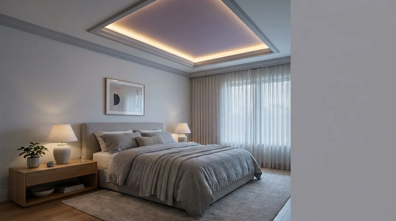
13. Lavender and Soft Grey POP Ceiling
Lavender can give a POP ceiling a gentle decorative quality, especially when combined with soft grey. Use lavender inside a recessed panel and apply pale grey to the surrounding POP framework, or reverse the arrangement for a more subtle effect. This palette suits bedrooms, relaxation spaces, and contemporary interiors that use cool neutrals. Choose a muted lavender rather than a highly saturated purple to keep the ceiling sophisticated. Silver-toned fixtures, white bedding, grey curtains, and pale timber can complete the look without introducing unnecessary colour. If the ceiling includes curves or circular features, lavender can emphasize those shapes beautifully. Soft ambient lighting is preferable because extremely cool light can make the purple tones appear harsher.
14. Wooden-Tone Brown and Cream POP Design
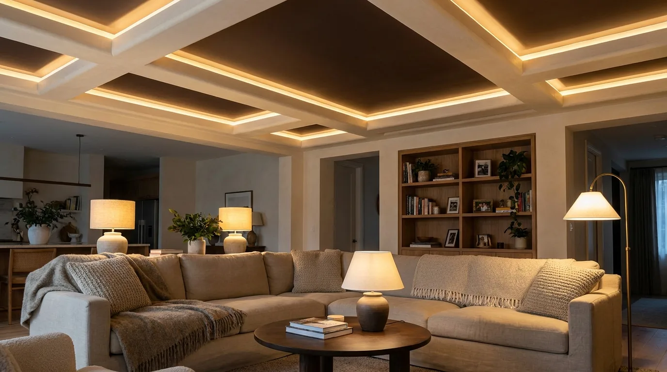
Combining a wood-inspired brown tone with cream can make a POP ceiling feel warm and grounded. The brown does not need to imitate actual wood grain; a matte chocolate, walnut, or coffee shade can provide a similar visual warmth while remaining distinctly painted. Use it inside a central recessed rectangle or along selected linear POP bands, then frame it with cream. This idea works particularly well in rooms containing wooden flooring, cabinetry, or furniture. Keep the brown area proportionate to the room so it functions as an accent rather than visually lowering the entire ceiling. Warm pendant lights or concealed LEDs can reinforce the cozy character, making this palette particularly appealing for bedrooms and family living rooms.
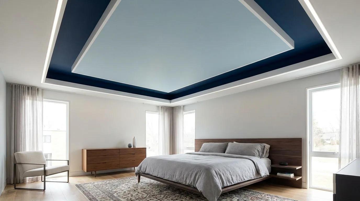
15. Two-Tone Blue POP Ceiling With Linear Details
Two shades of blue can add dimension without requiring a complicated POP structure. Combine a pale blue with a deeper blue inside parallel recessed strips, rectangular panels, or a central ceiling feature. The lighter shade keeps the design open while the darker tone gives the architecture definition. This approach is useful for contemporary bedrooms, children’s rooms, and coastal-inspired interiors. White POP borders can separate the two blues and make each colour easier to read. For a more mature look, choose dusty blue with navy; for a fresher appearance, pair powder blue with a medium blue. Repeat one of the ceiling colours in textiles or artwork to create a connected room scheme.
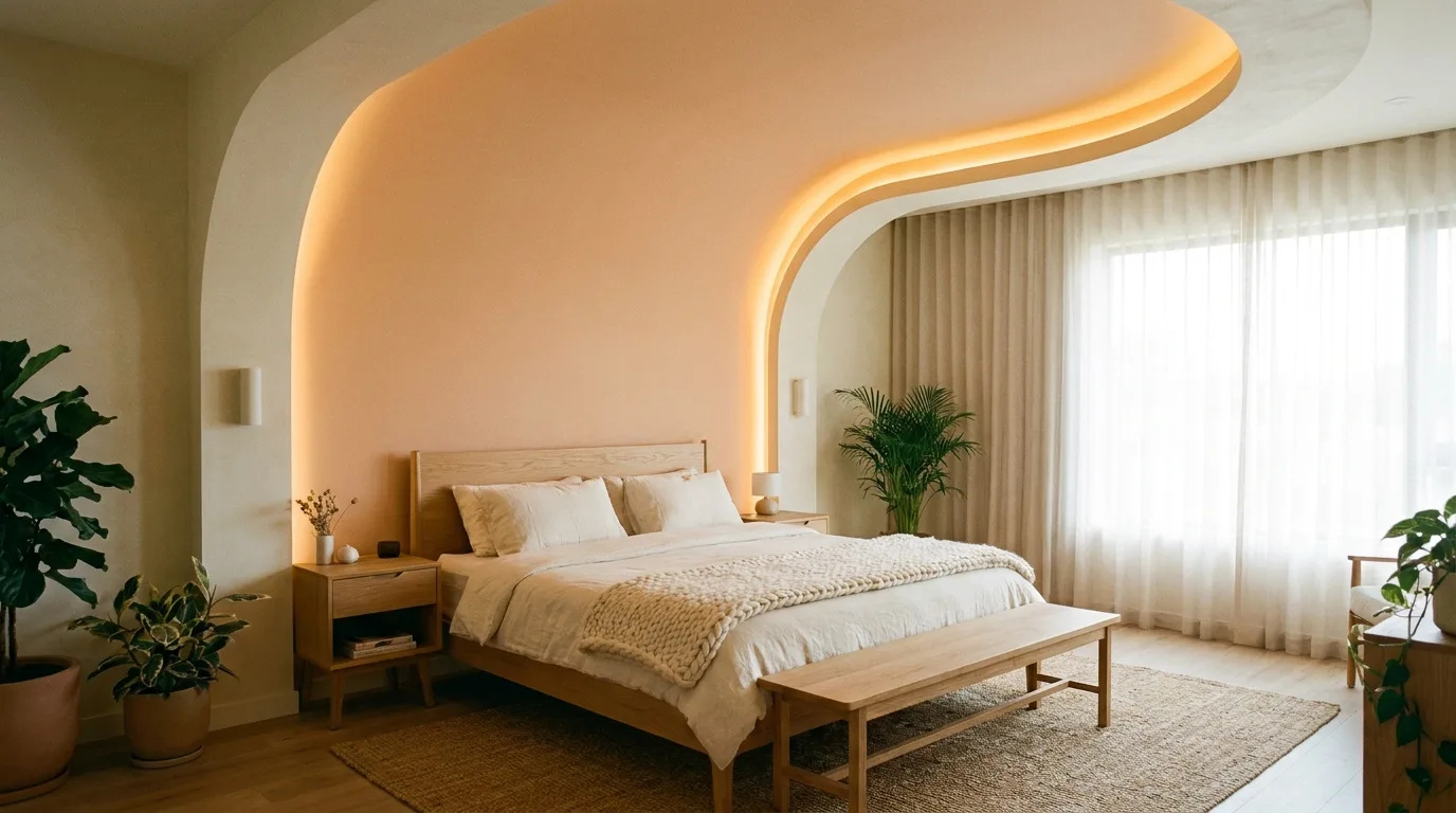
16. Peach and Cream Curved POP Ceiling
Peach and cream are well suited to POP designs featuring curves, arches, circles, or flowing layered details. Use a soft peach shade within the curved feature and surround it with cream or white to keep the overall ceiling bright. The warm colour can make a bedroom or sitting area feel welcoming without the heaviness of deeper reds and oranges. Curved POP lines are especially effective above a bed, seating arrangement, or dining table because they can visually frame the furniture below. Choose a muted peach if the room already contains several decorative elements. Warm lighting, natural wood, ivory textiles, and small terracotta accessories can reinforce the palette while keeping the space cohesive.
17. Teal and White Contemporary POP Design
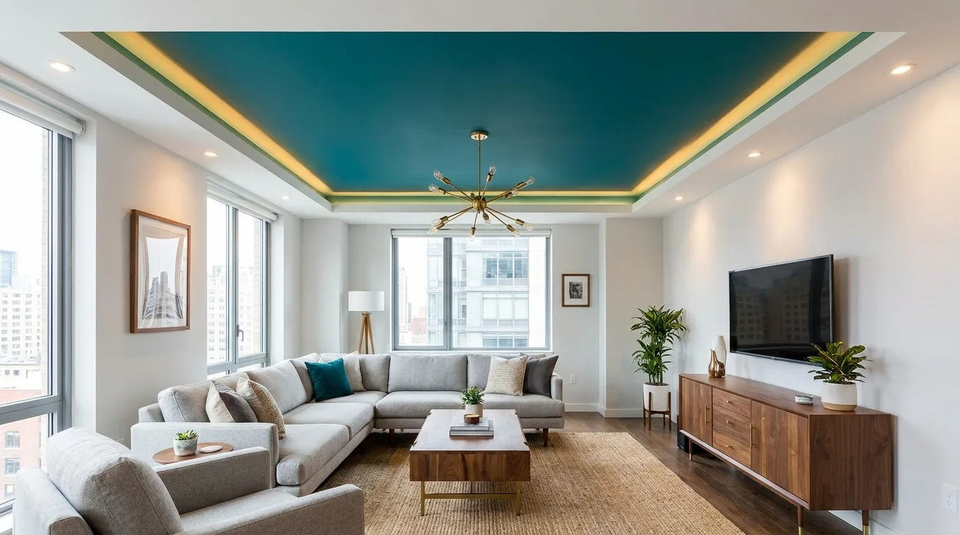
Teal offers a bold but versatile alternative to navy or emerald when you want more colour on the ceiling. Use teal inside a recessed rectangular or circular feature and keep the surrounding POP work white. The contrast creates a clear focal point while allowing the ceiling to remain visually structured. Teal works well with light grey, cream, natural wood, brass, and even small touches of coral or mustard. Because teal can vary significantly under different lighting, test a sample in the actual room before committing to the full ceiling. A matte or low-sheen finish usually looks more architectural than a glossy one. Keep the POP pattern relatively simple so the saturated colour remains the star of the design.
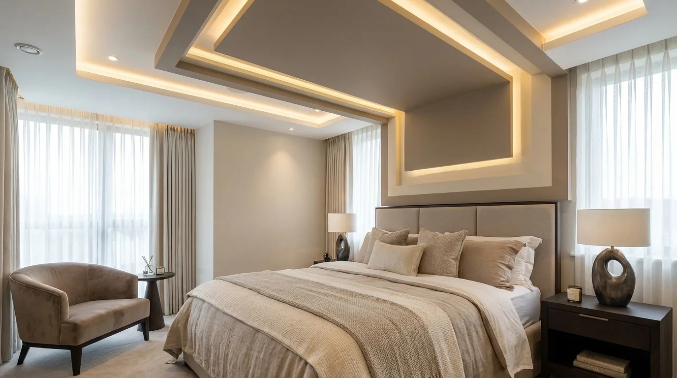
18. Soft Grey and White Minimalist POP Ceiling
For a timeless minimalist approach, combine soft grey with white in a clean, uncomplicated POP layout. Use grey inside a broad recessed panel and white on the raised border, or introduce grey through slim perimeter bands. This colour combination adds enough contrast to reveal the ceiling architecture without competing with furniture or artwork. It is particularly practical for modern apartments, compact living rooms, bedrooms, and home offices. Choose a pale to medium grey so the ceiling retains brightness, especially in rooms with limited natural light. Simple recessed lights can follow the geometry of the POP design, while a central pendant can provide a stronger focal point where needed. The restrained palette also makes it easy to redecorate the room later.